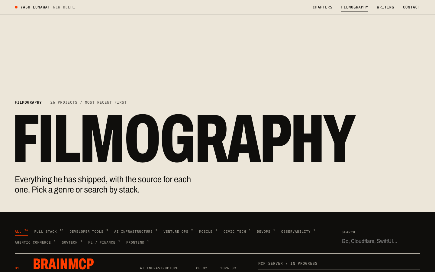
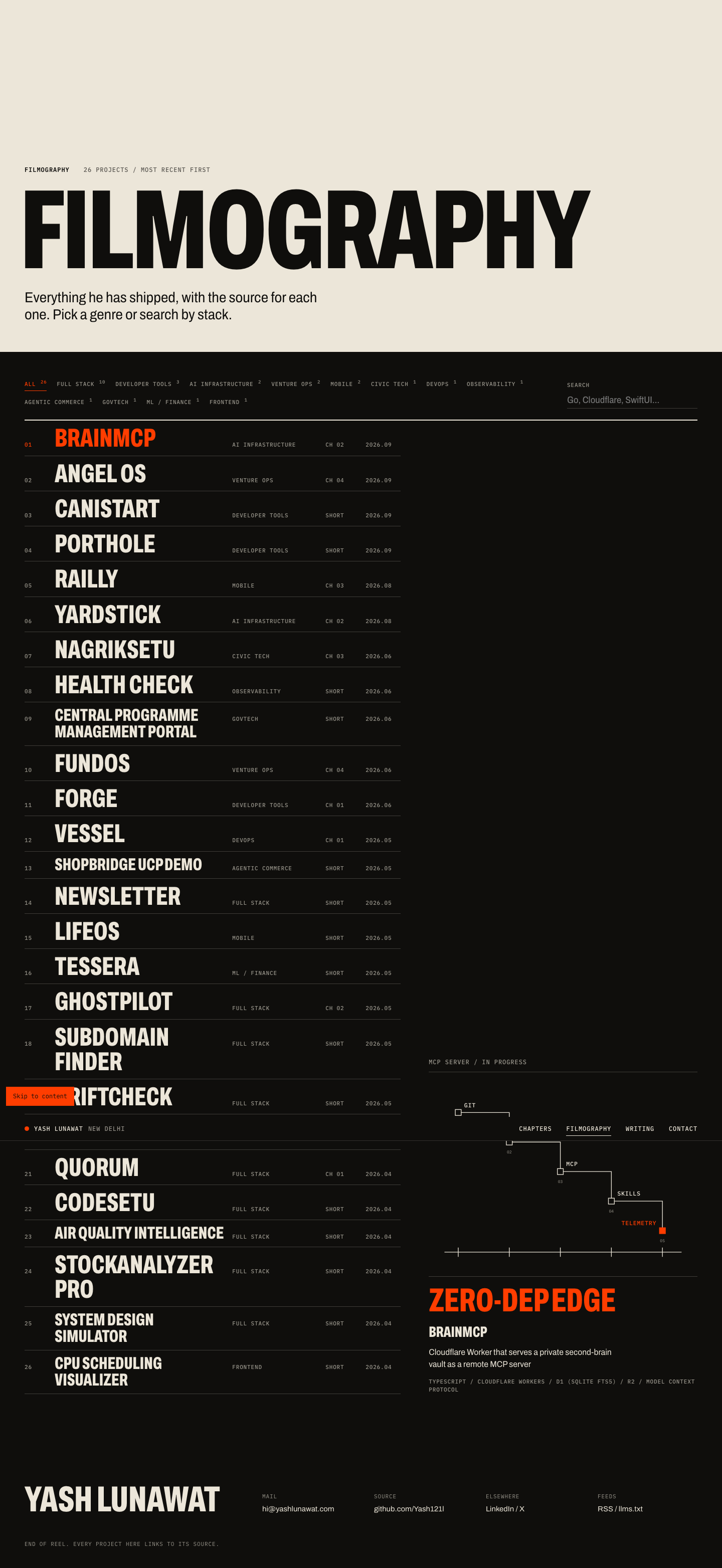
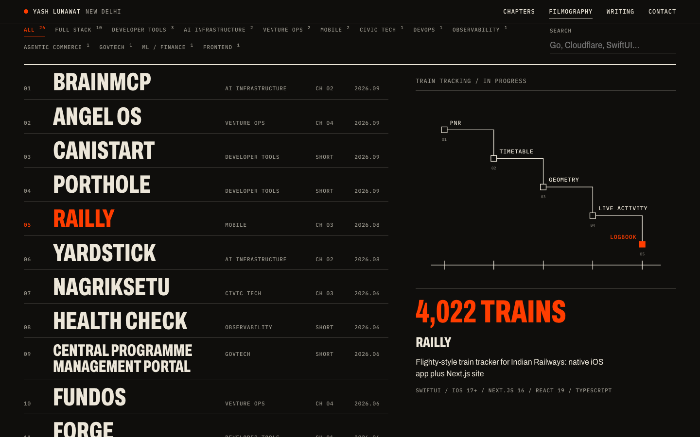
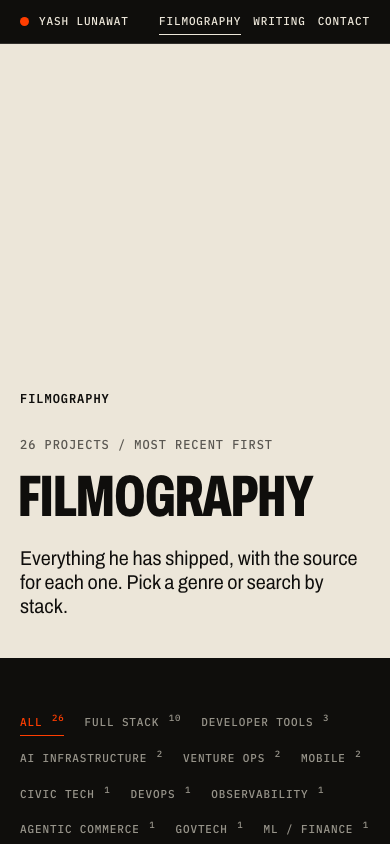
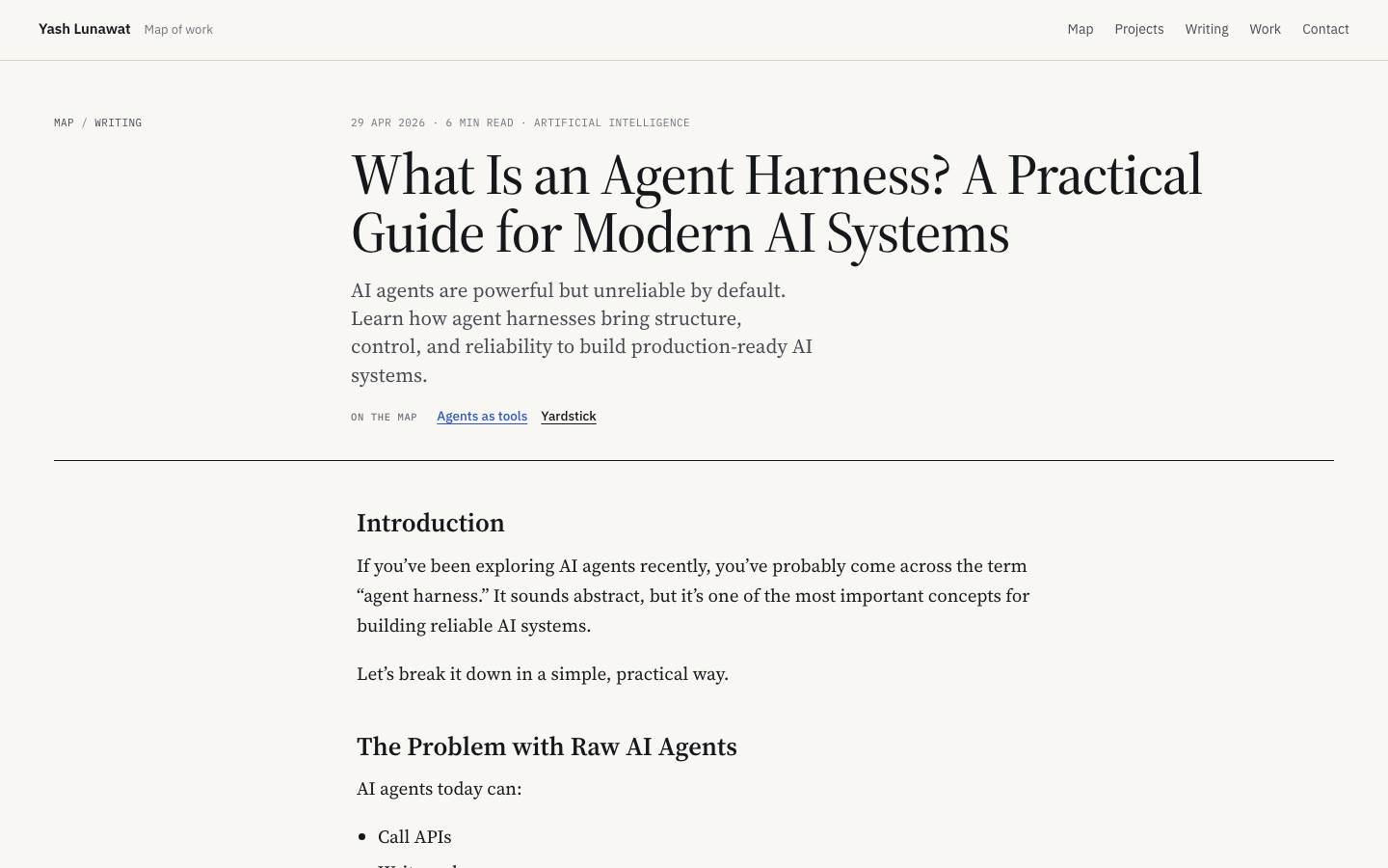
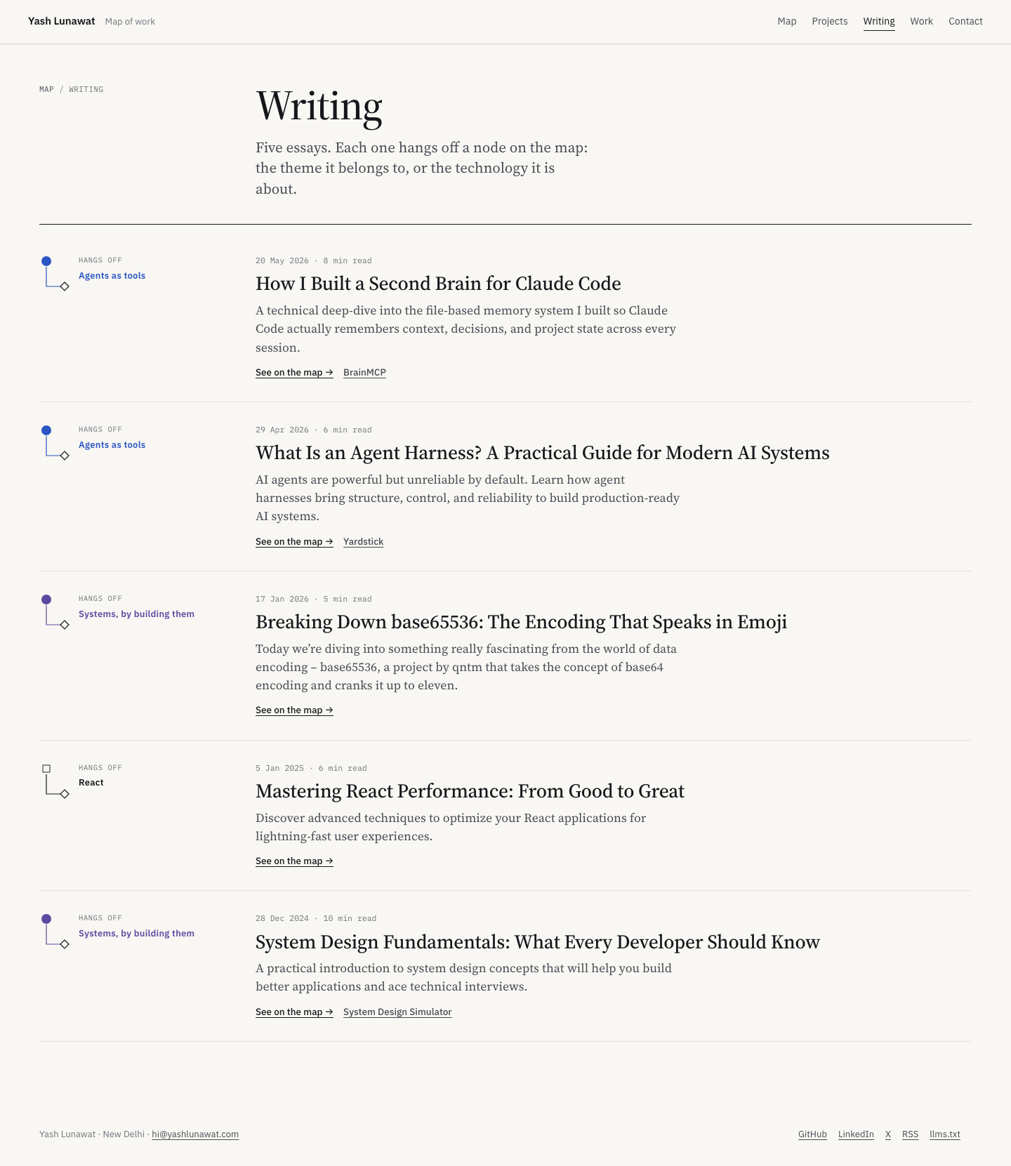
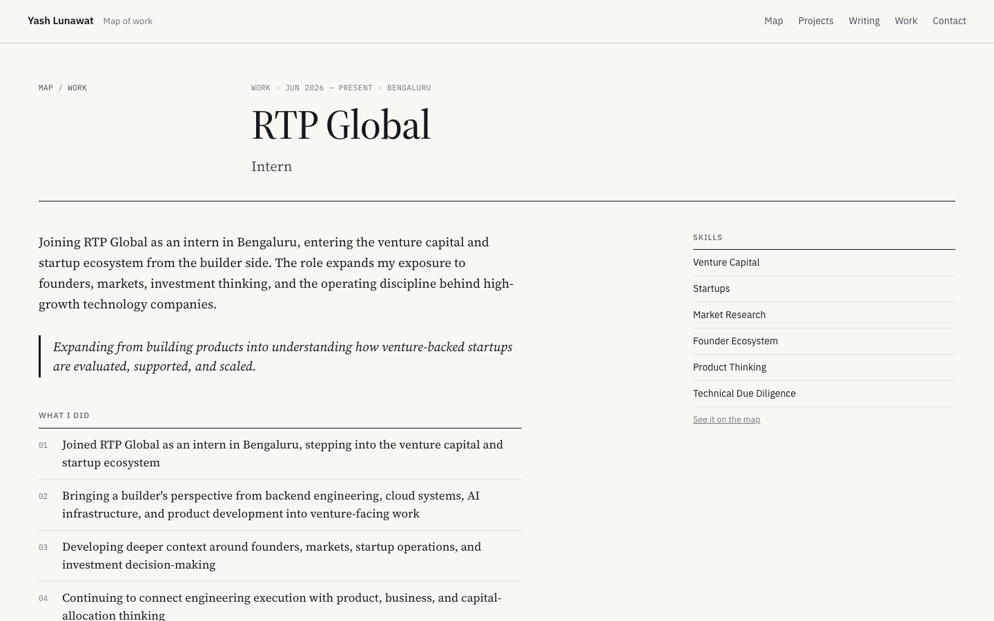
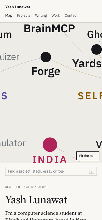
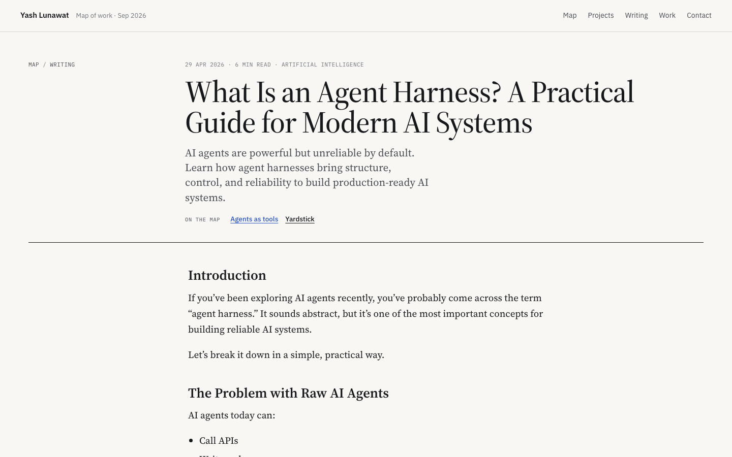
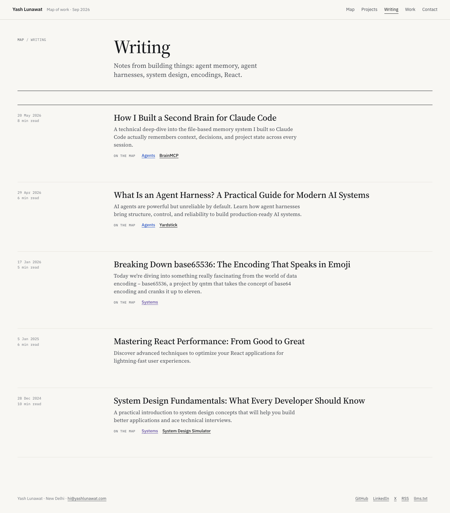
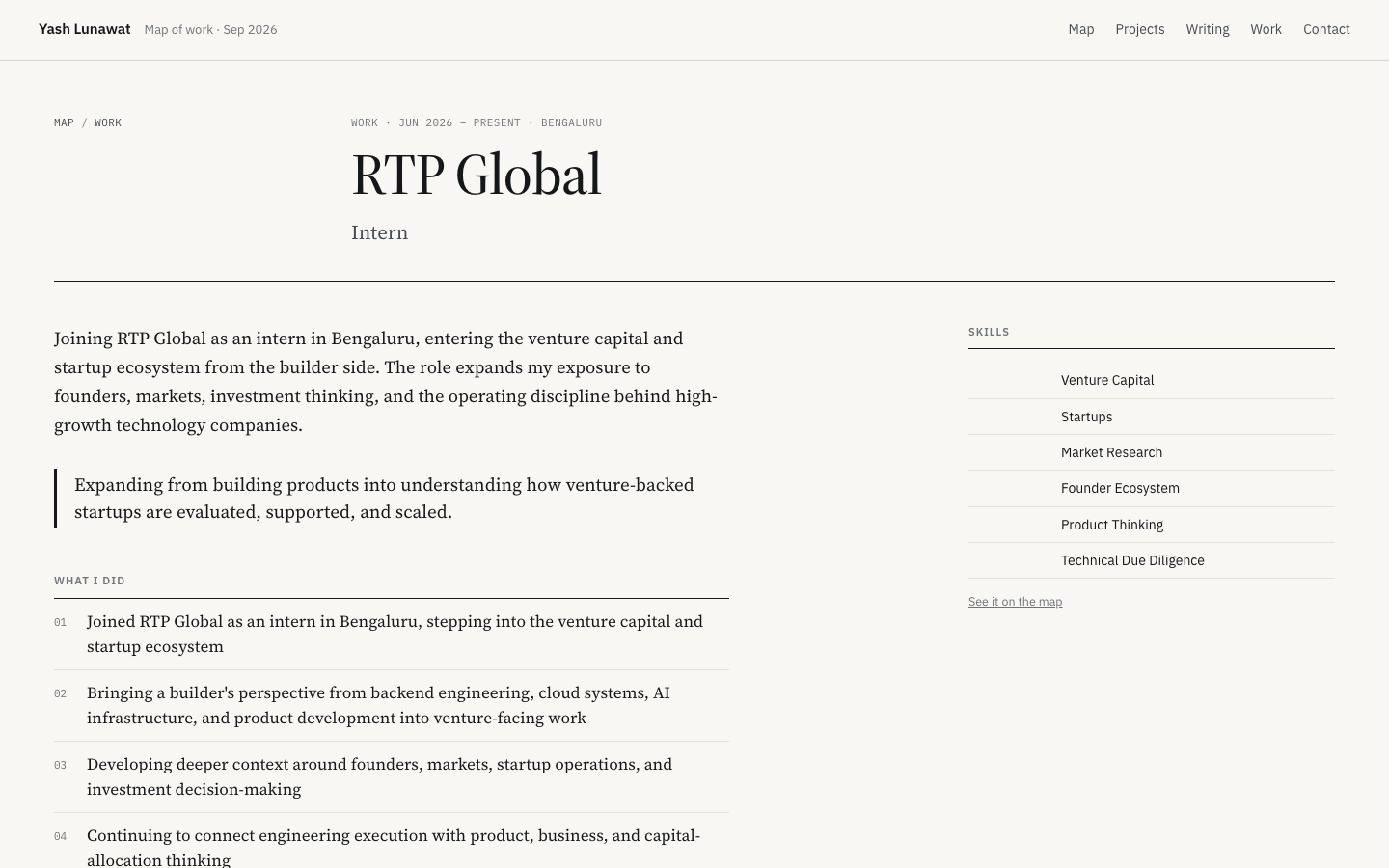
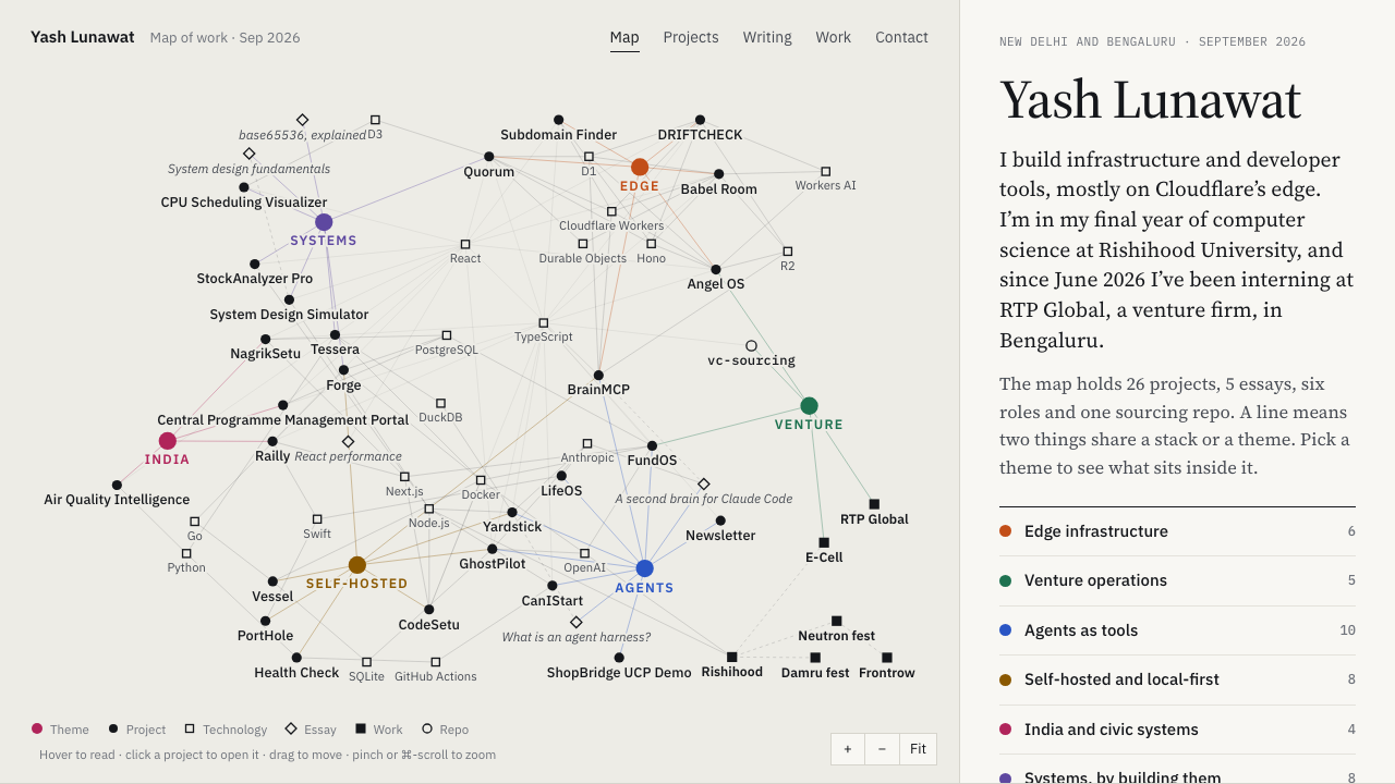
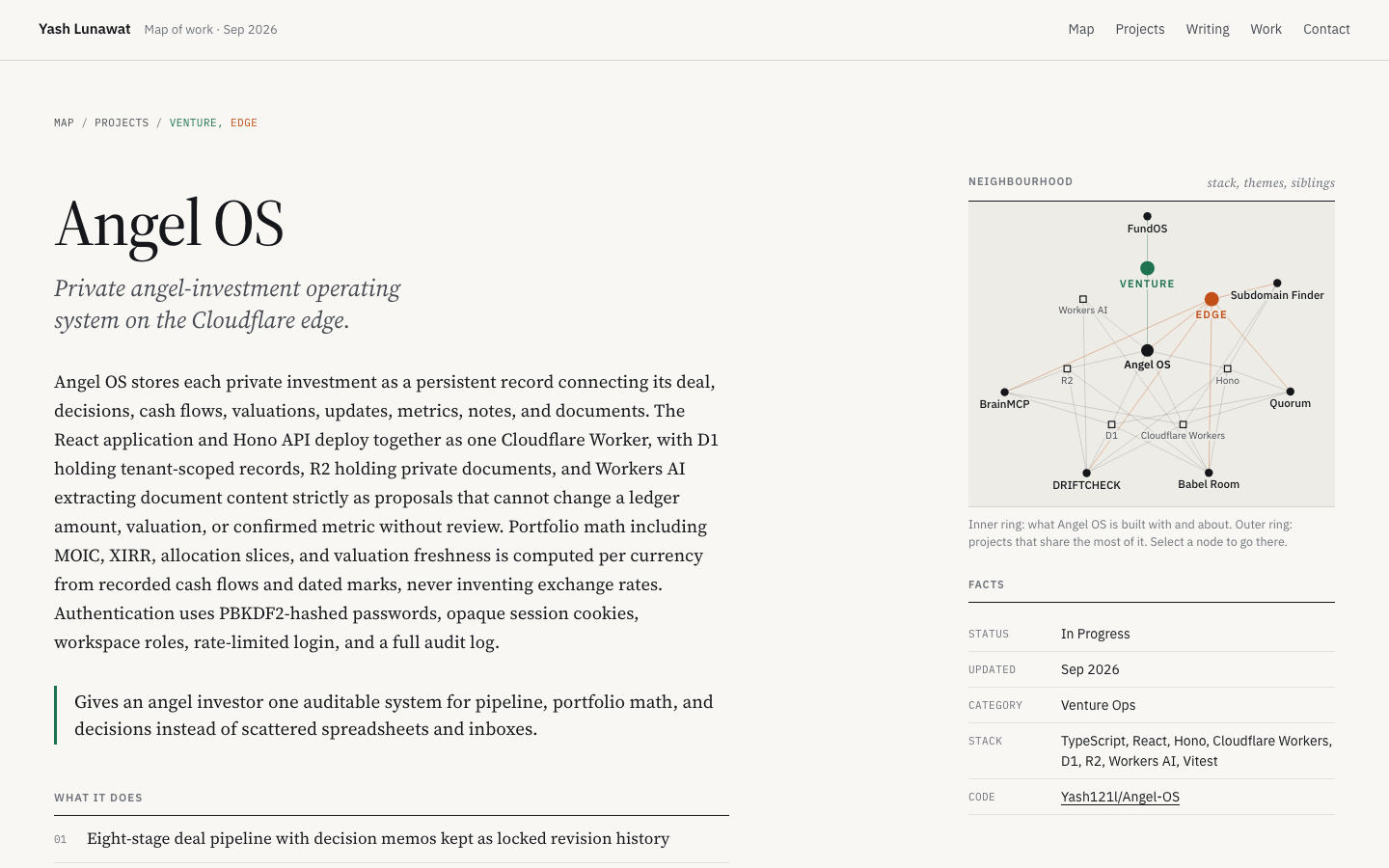
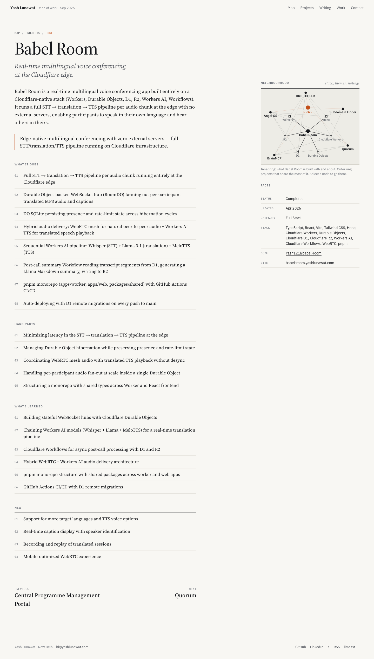
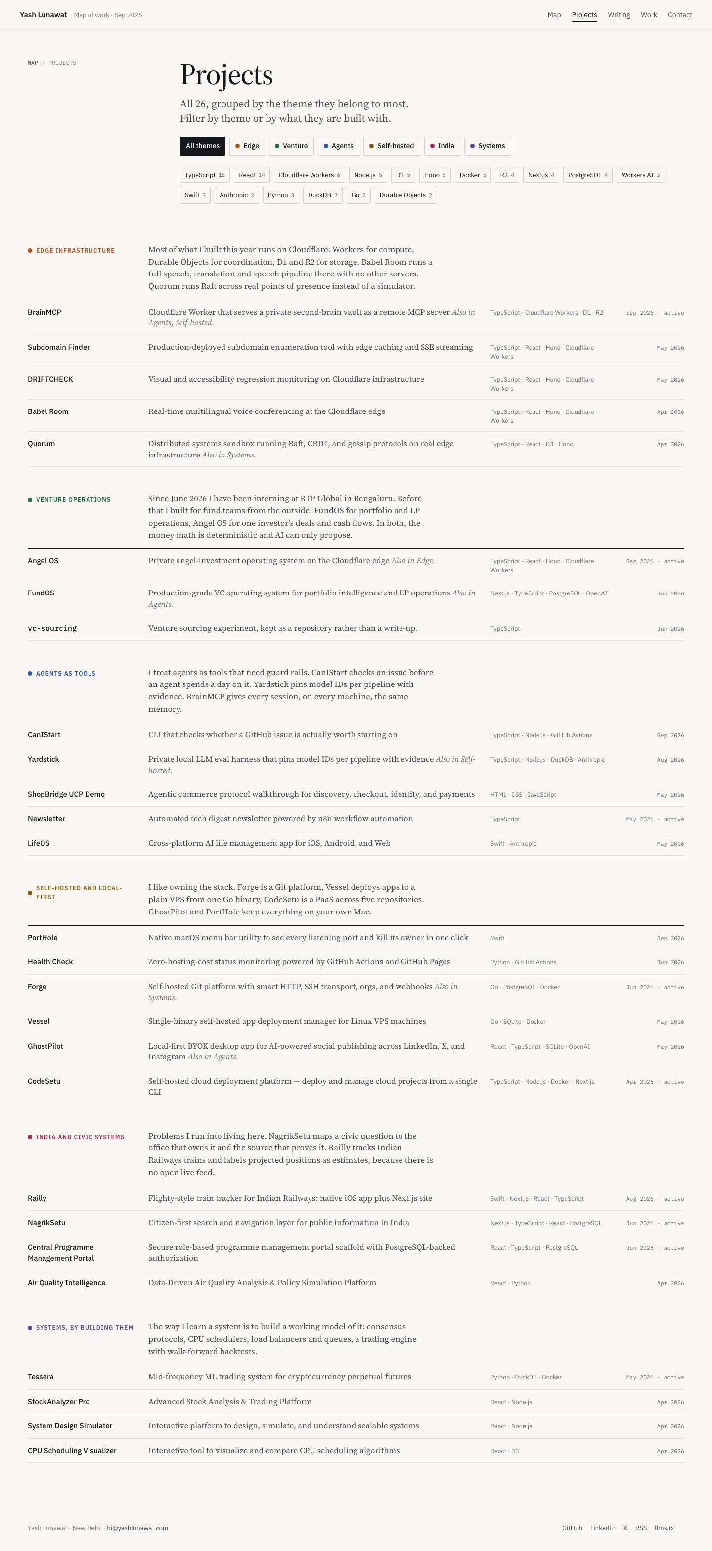
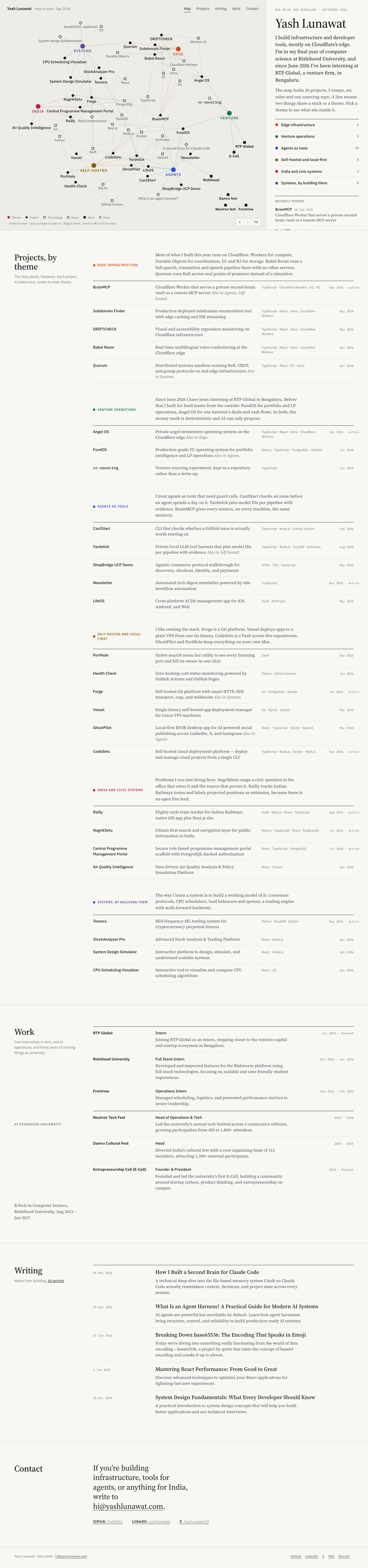
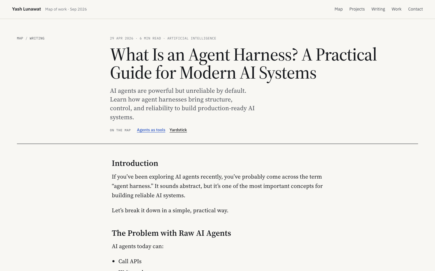
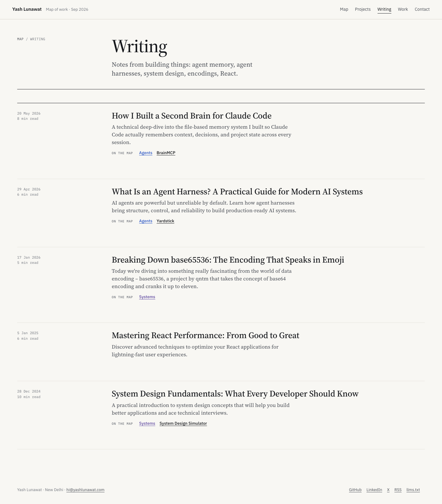
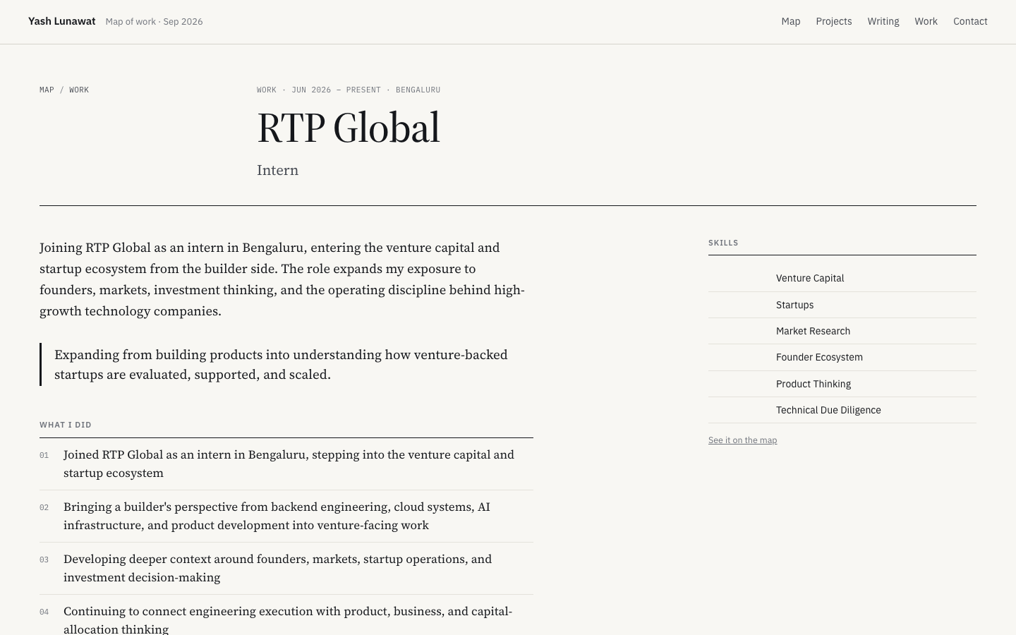
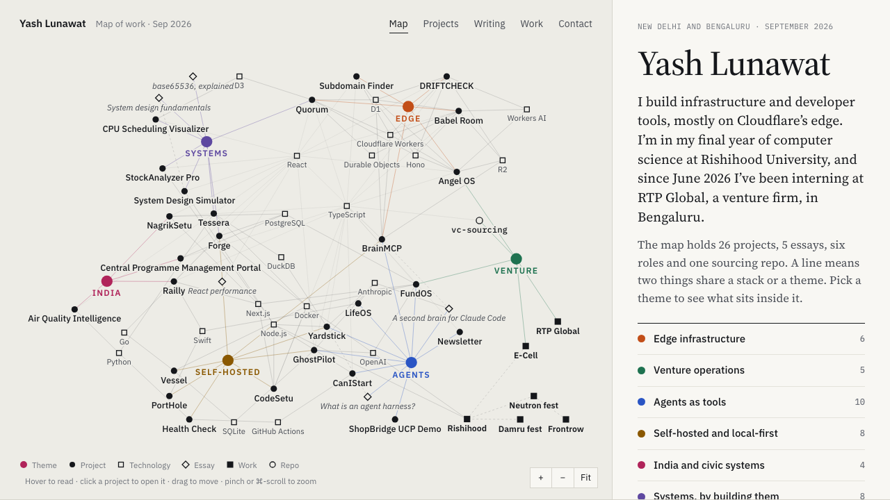
Portfolio design tournament

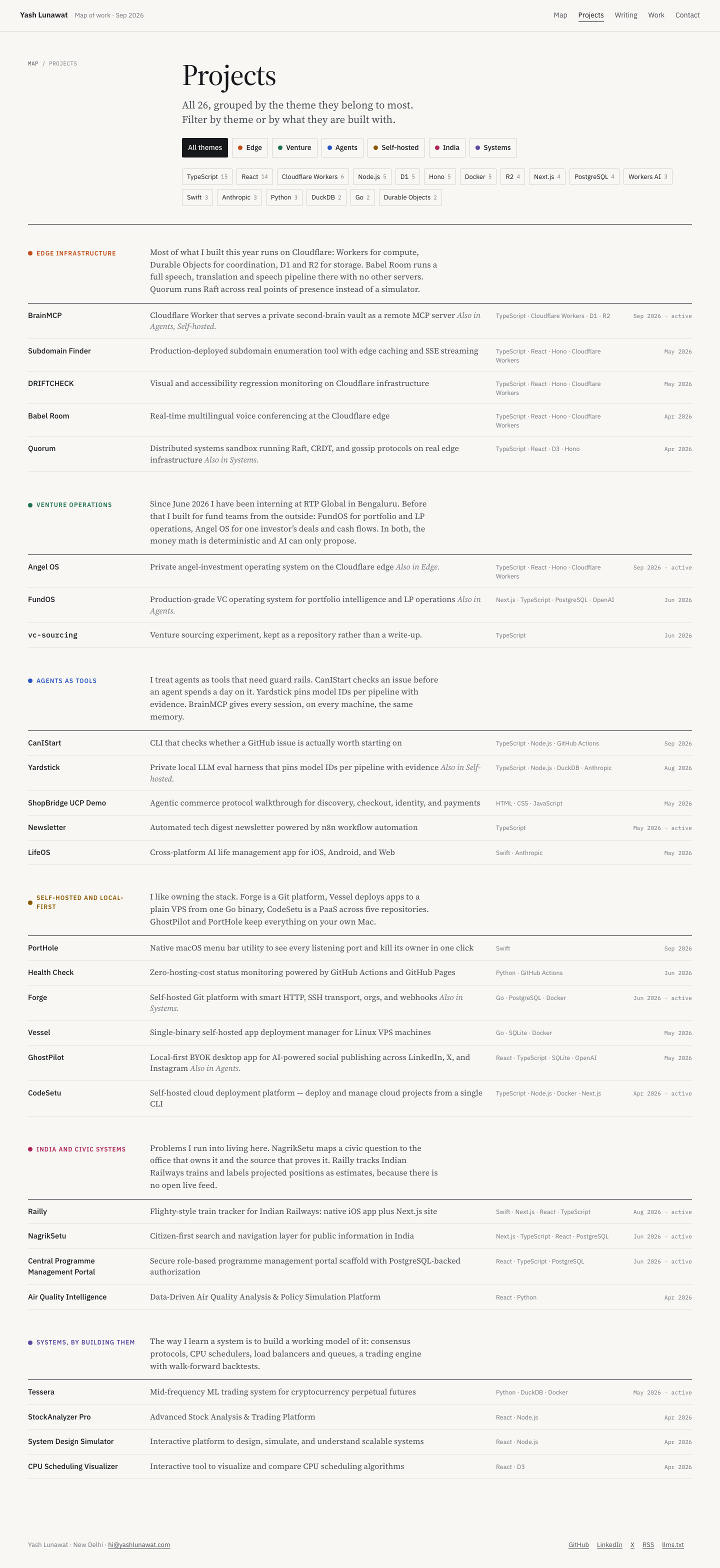
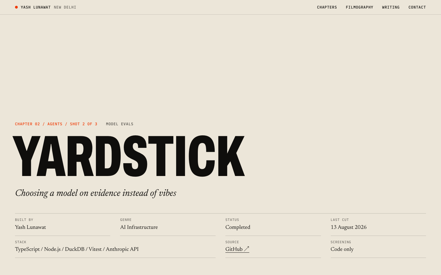
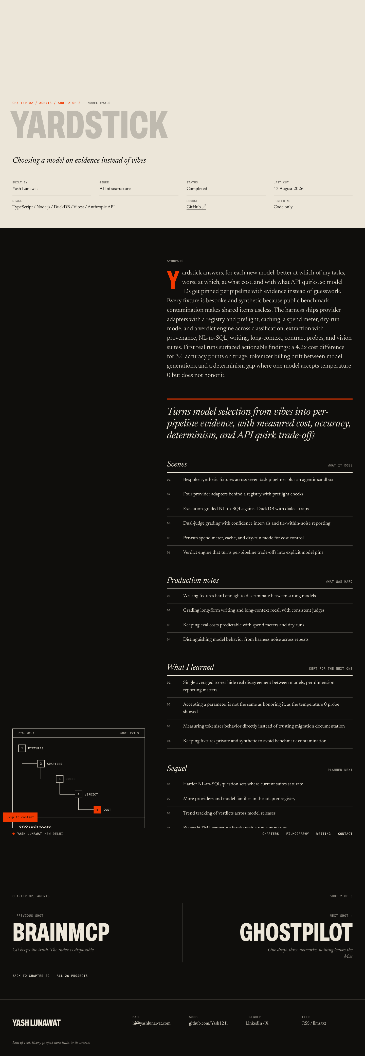
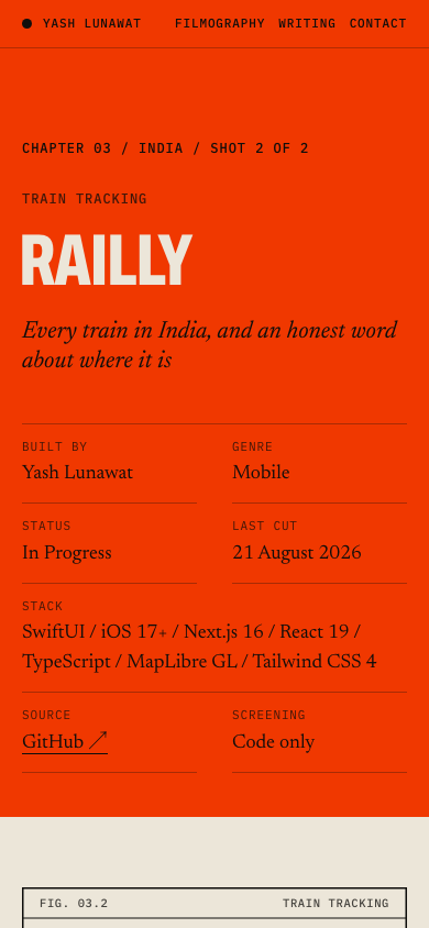
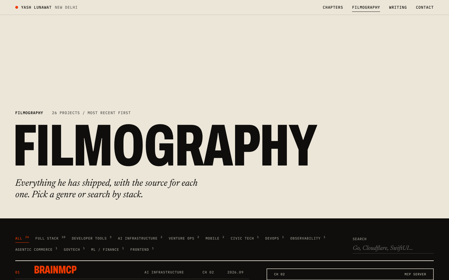
Every concept is live on its own subdomain (link in each header) and also runs from its own worktree under /Users/admin/.t3/worktrees/portfolio. Start any of them with the command in its header, then open the port in a browser. Screenshots below were captured with Playwright at 1440 and 390 wide. Baseline (current site) shots are in shots/baseline.

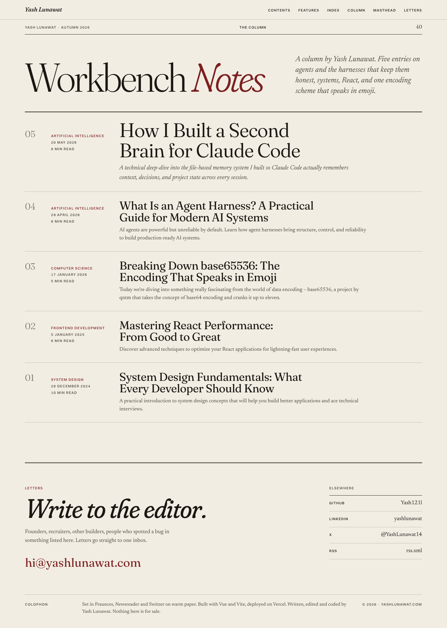
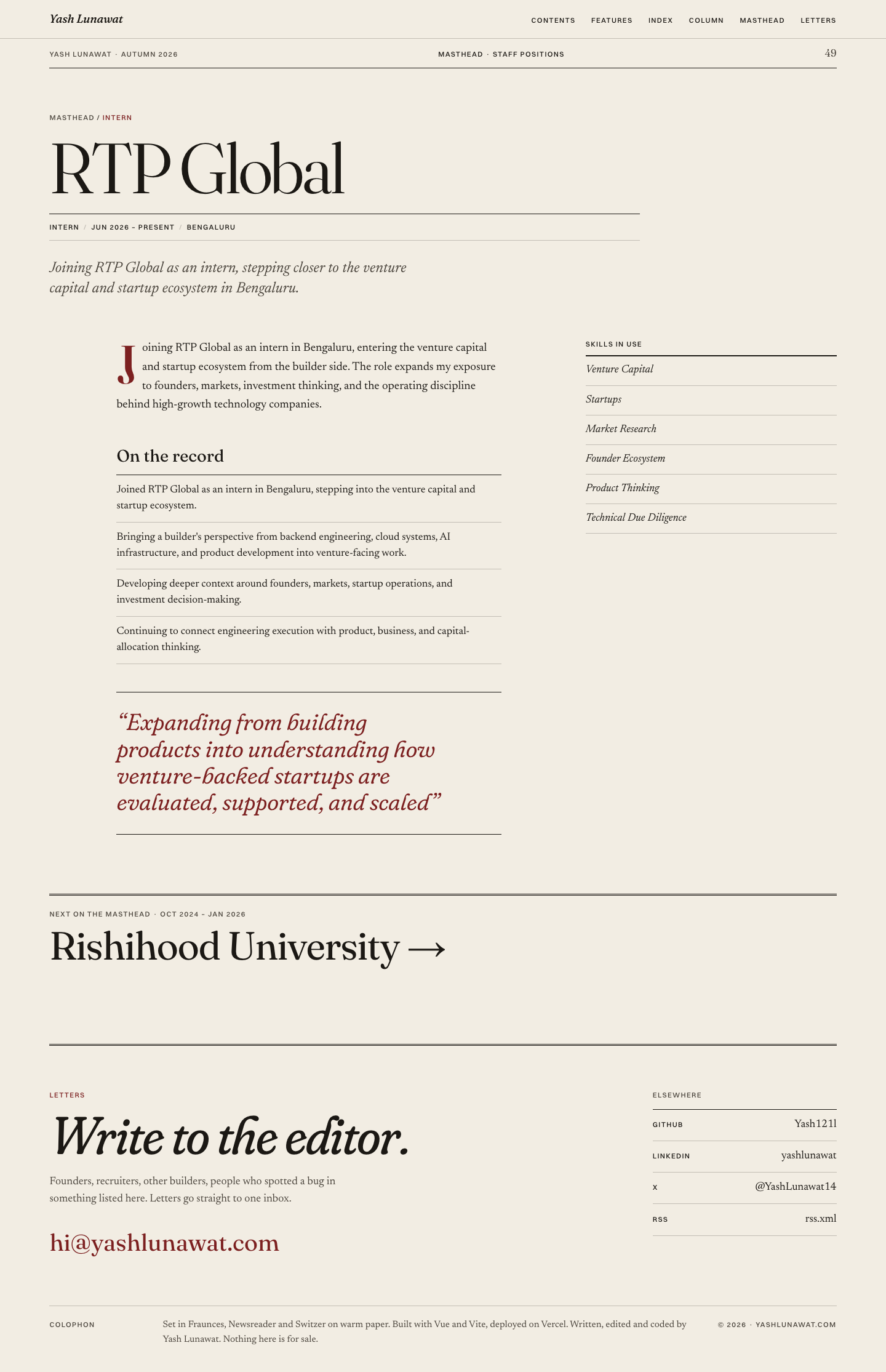
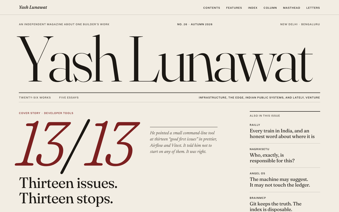
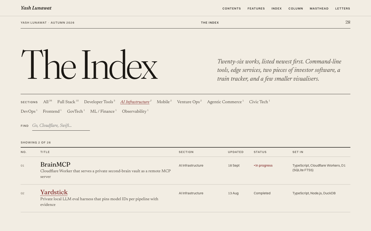
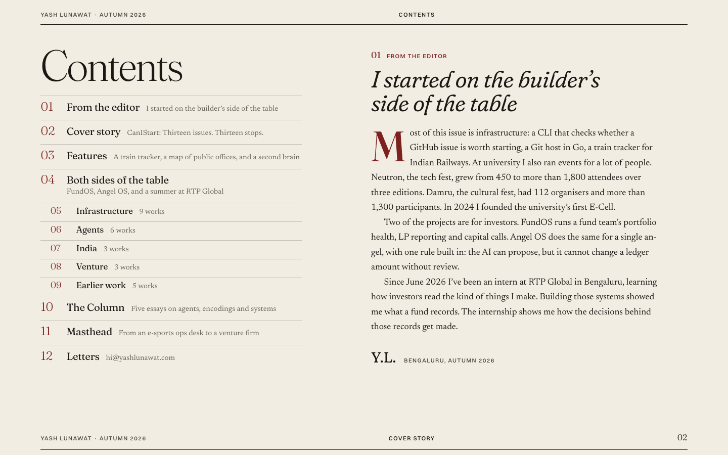
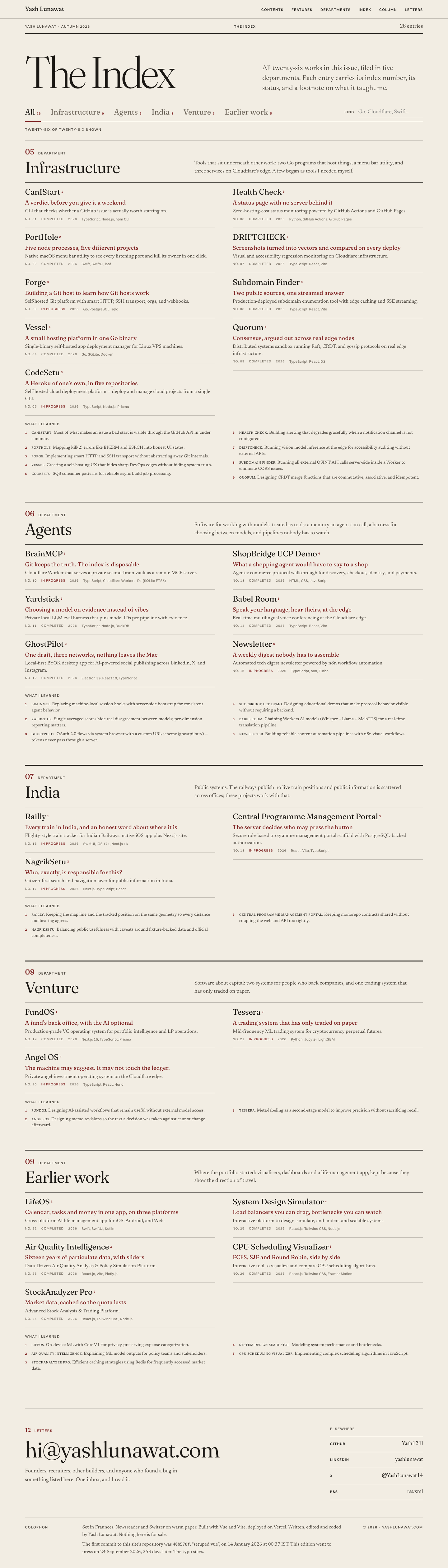
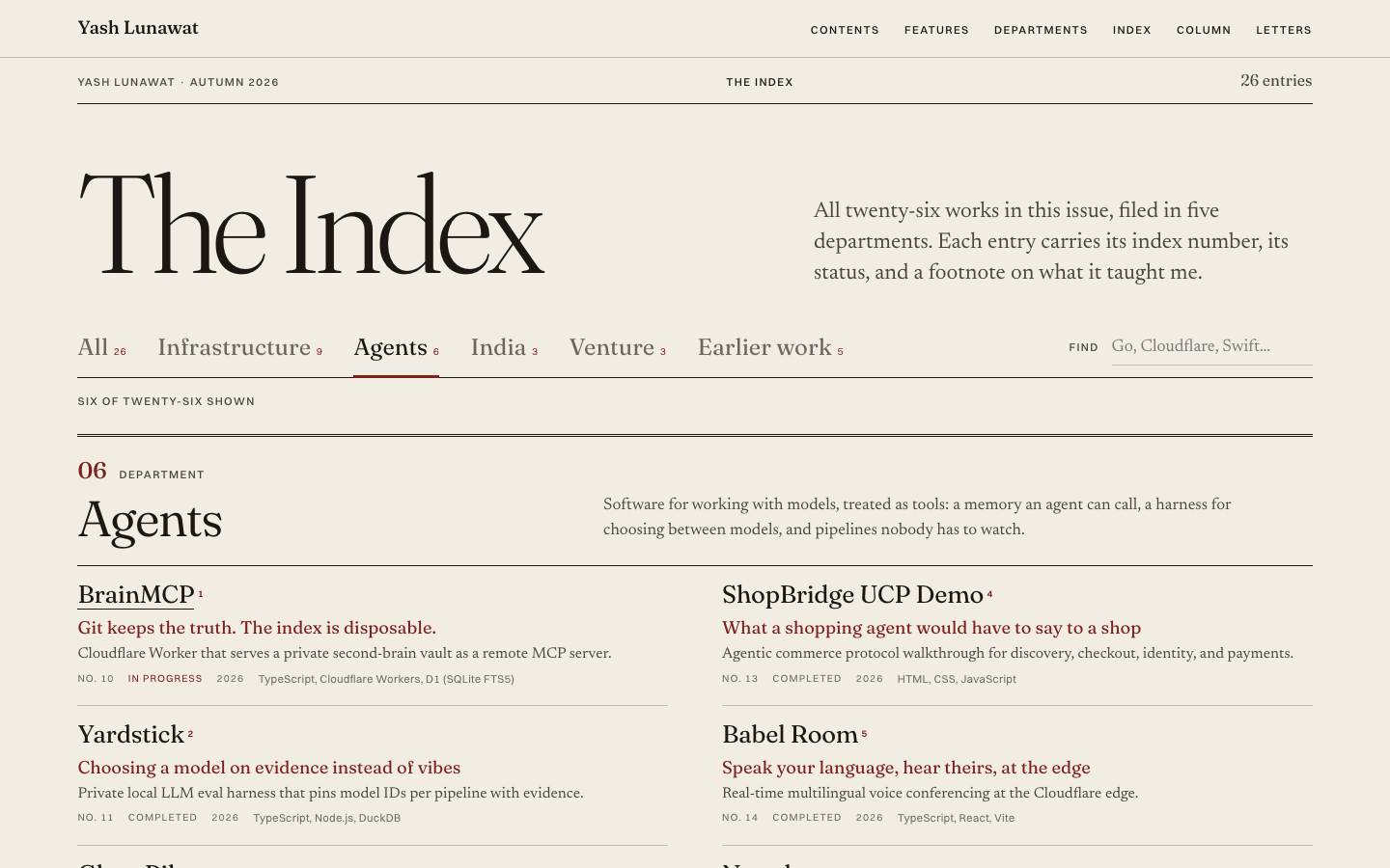
01 Editorial magazine

https://v1.yashlunawat.com/ · worktree portfolio-01 · branch design/portfolio-01 · cd /Users/admin/.t3/worktrees/portfolio/portfolio-01 && npx vite --port 5201

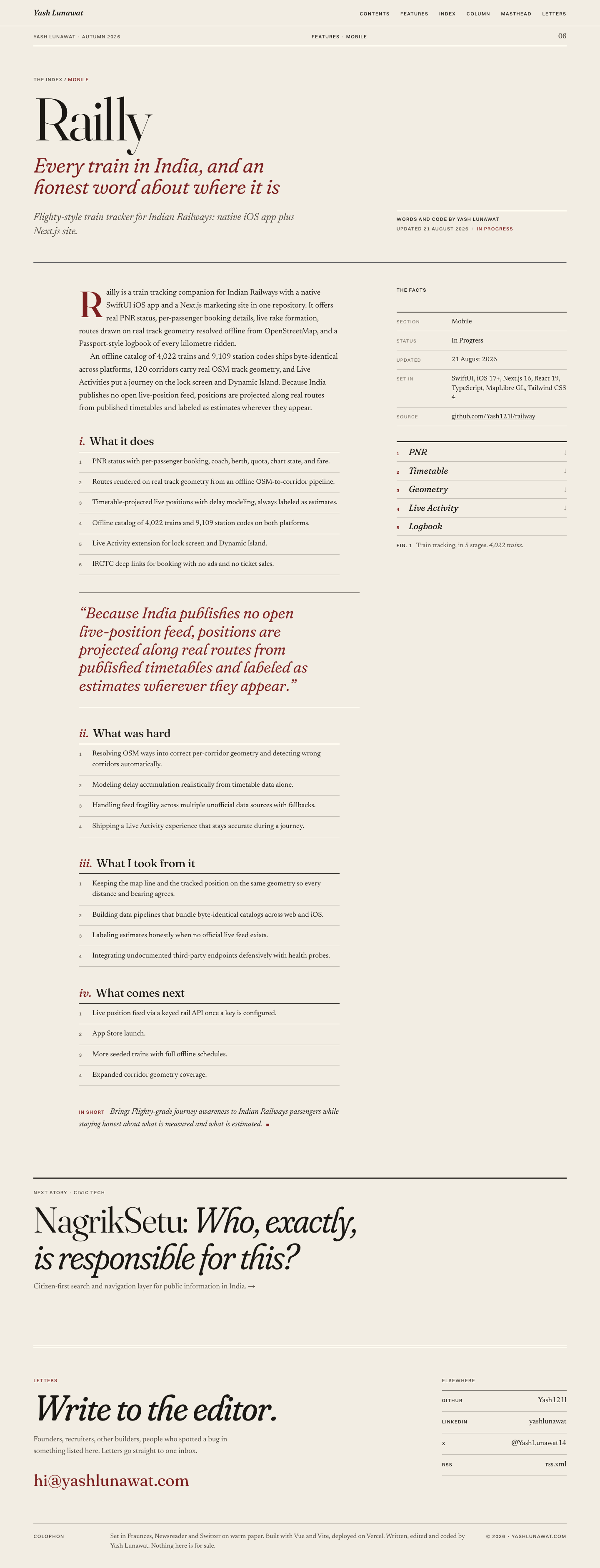
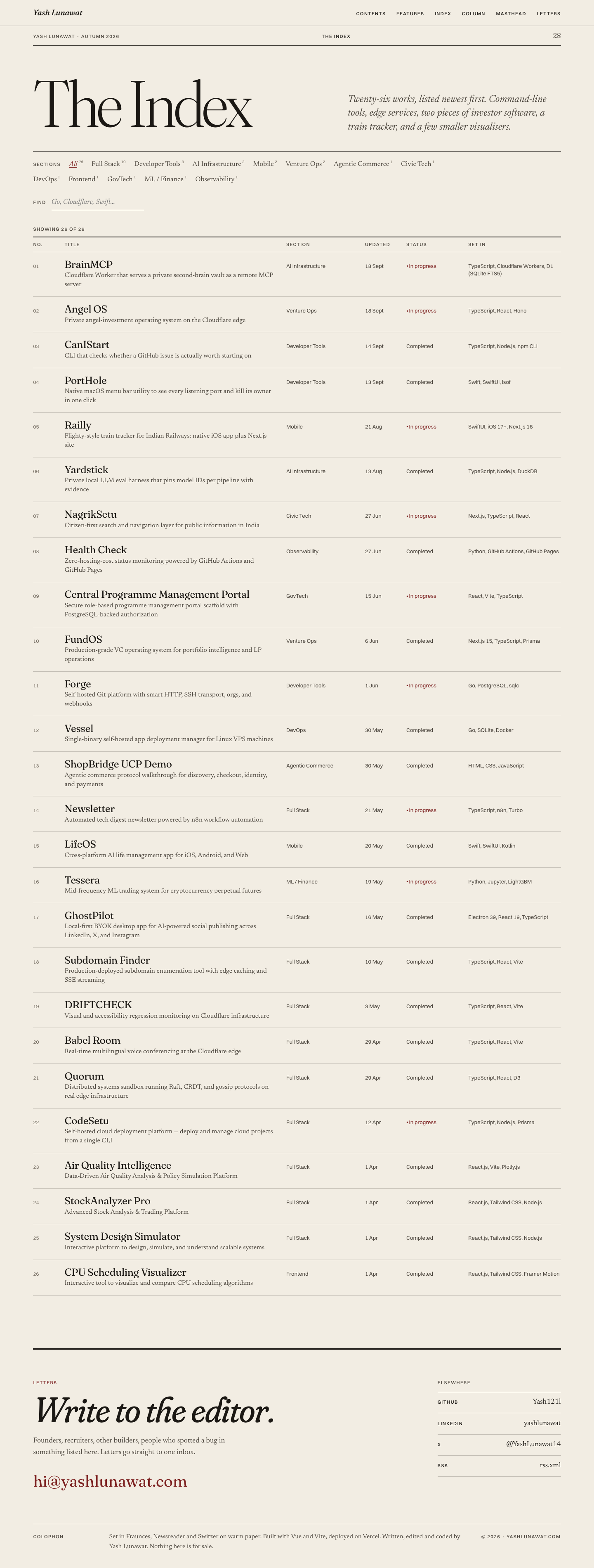
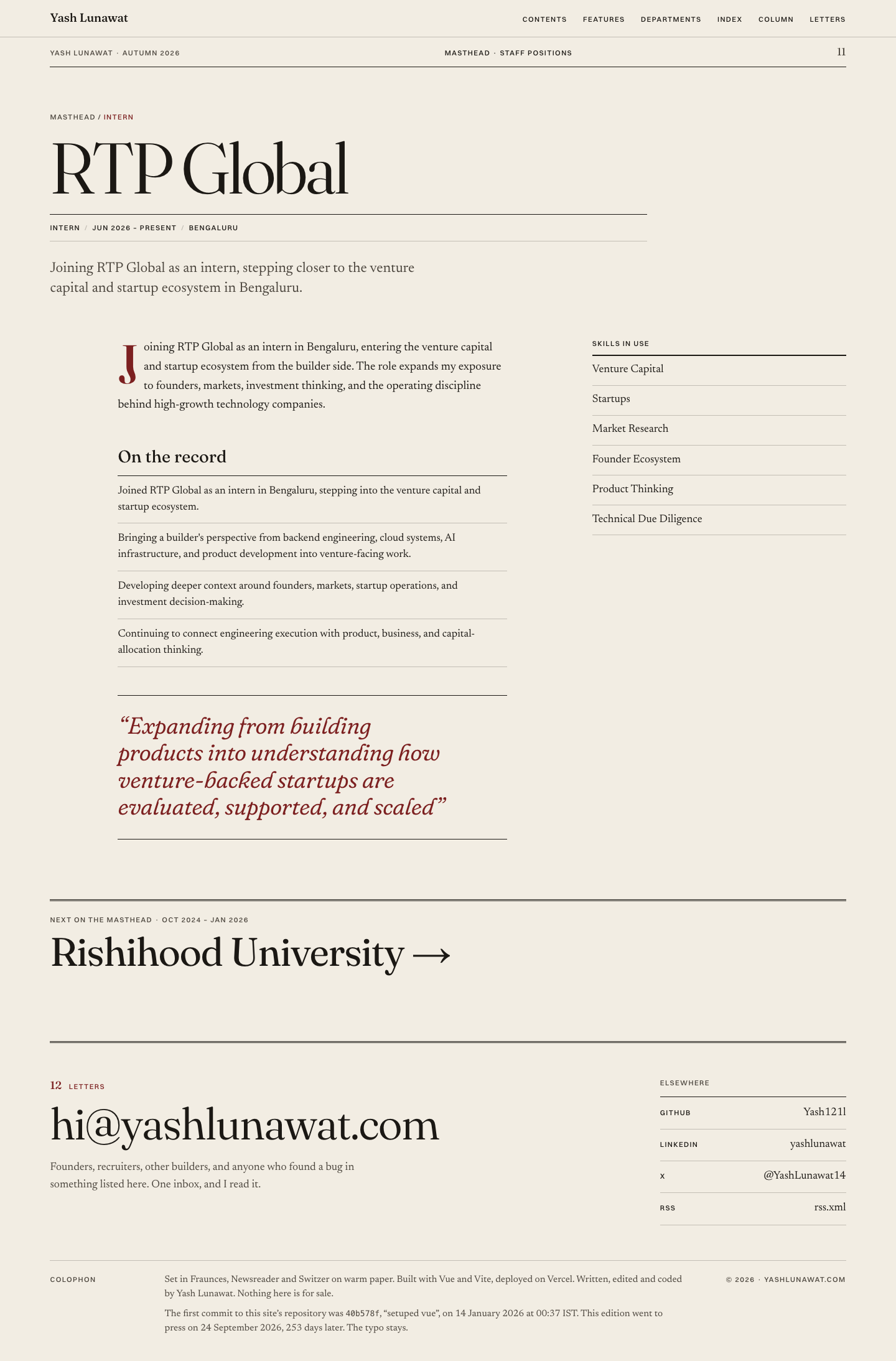
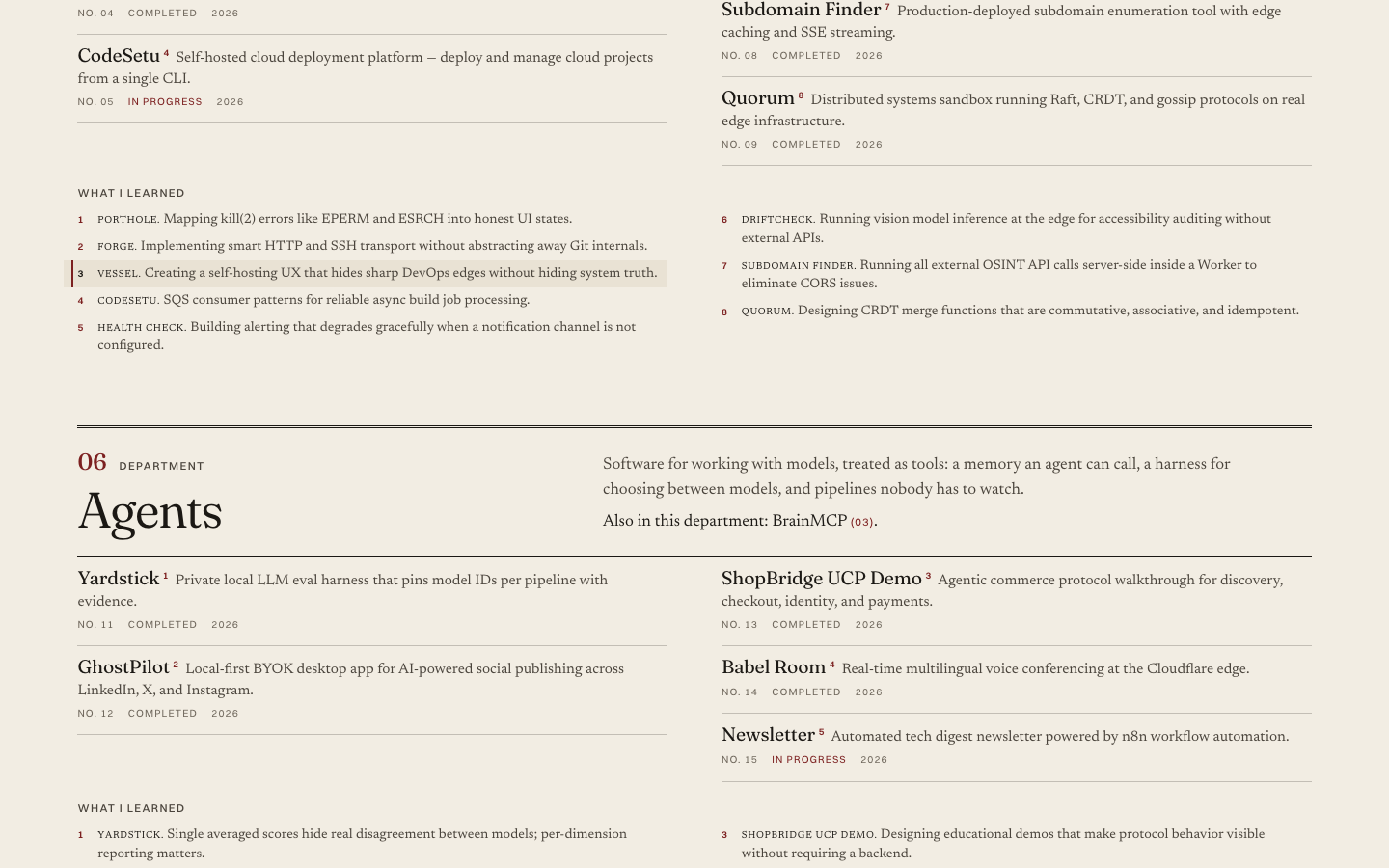
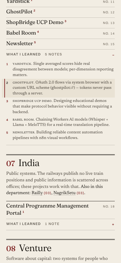
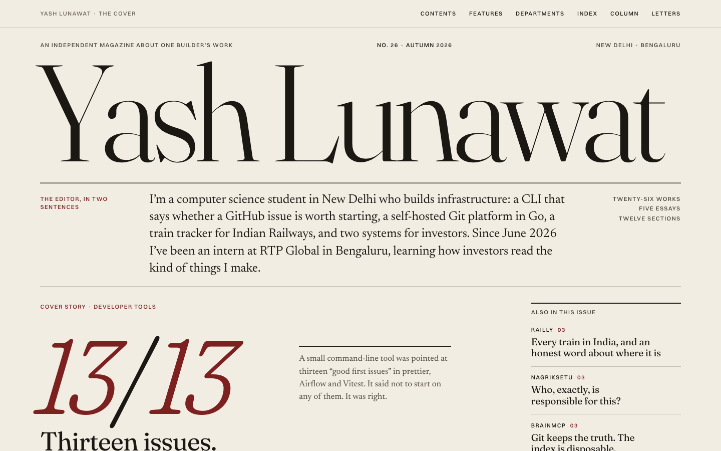
Editorial magazine home

Thesis

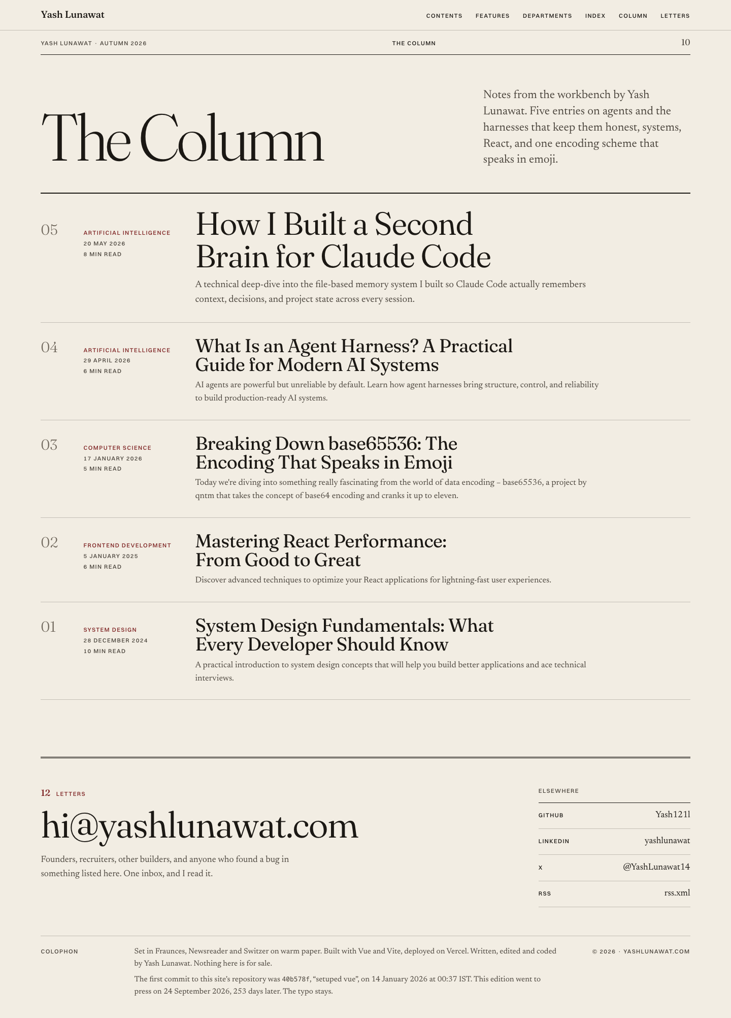
The site is one issue of a small independent maga

Memorable device

The cover: "Yash Lunawat" set as a maga

Self-critique

  • **First impression.** The cover is strong and reads as a maga

Worth stealing

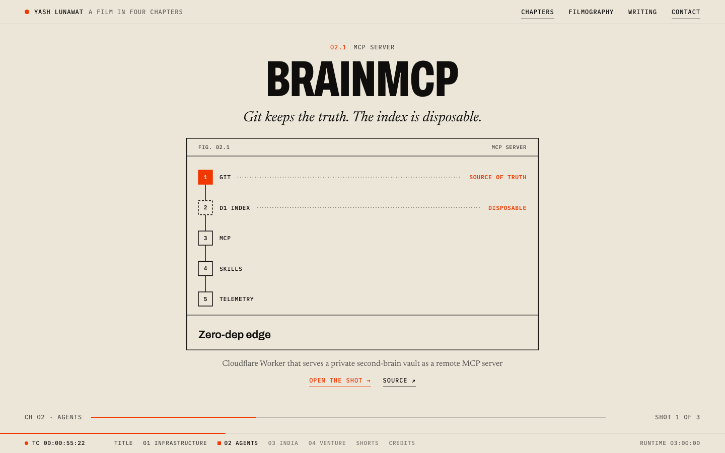
  • **Editorial headlines plus verbatim pull quotes as a presentation layer** (`src/data/editorial.js`). Each project gets an angle ("Git keeps the truth. The index is disposable.") and one sentence taken word for word from its own description. This makes the data file read as stories without inventing facts, and it works under any visual concept.
  • **Using the project's own measured result as the hero graphic** (13/13) instead of a portrait, a 3D shape or a job title, together with the "Fig. 1" figure built from `visual.nodes` as an image-free project illustration.

Also worth taking: the editor's letter as the About section, the masthead page as the Experience section, and "Next story" footers on detail pages.

Coordinator verdict

Finalist. Best storytelling and typography in the set. The 13/13 cover and the headline-plus-quote device for each project make the data read as stories without inventing anything. Weak: the 26-row index runs flat for 2,000px, italics stack three deep at the top of each article, page numbers are decoration, and 19 projects have no editorial angle yet.

10 screenshots
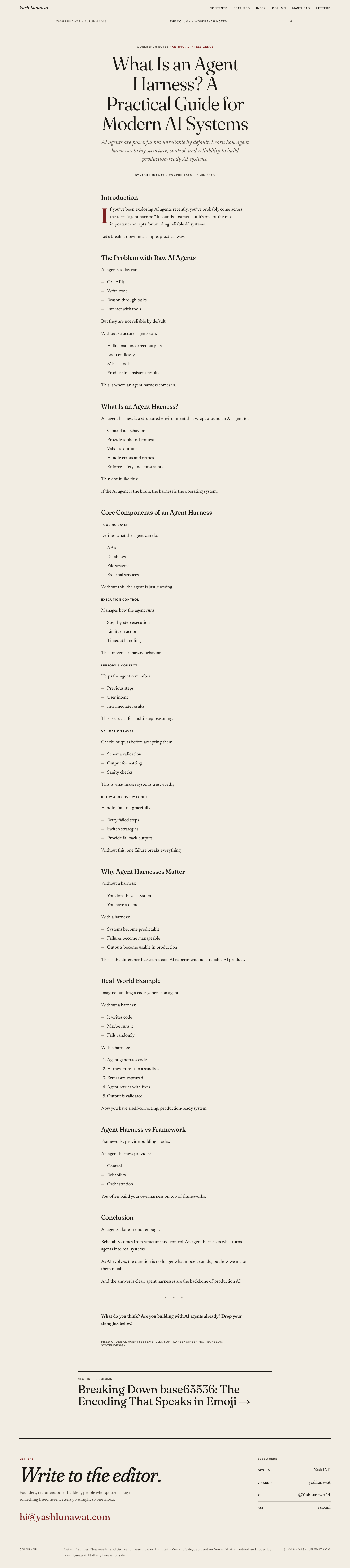
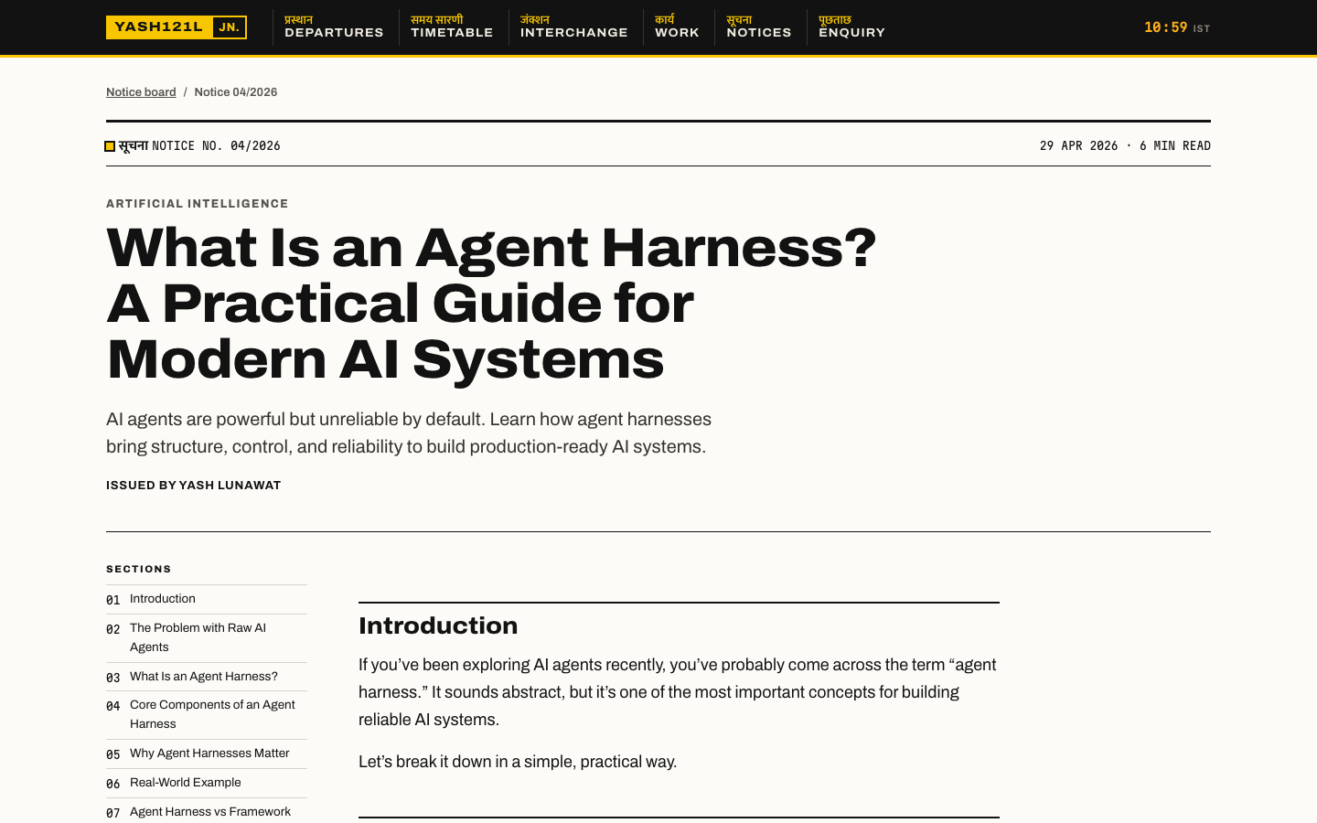
blog-detail-desktop.png
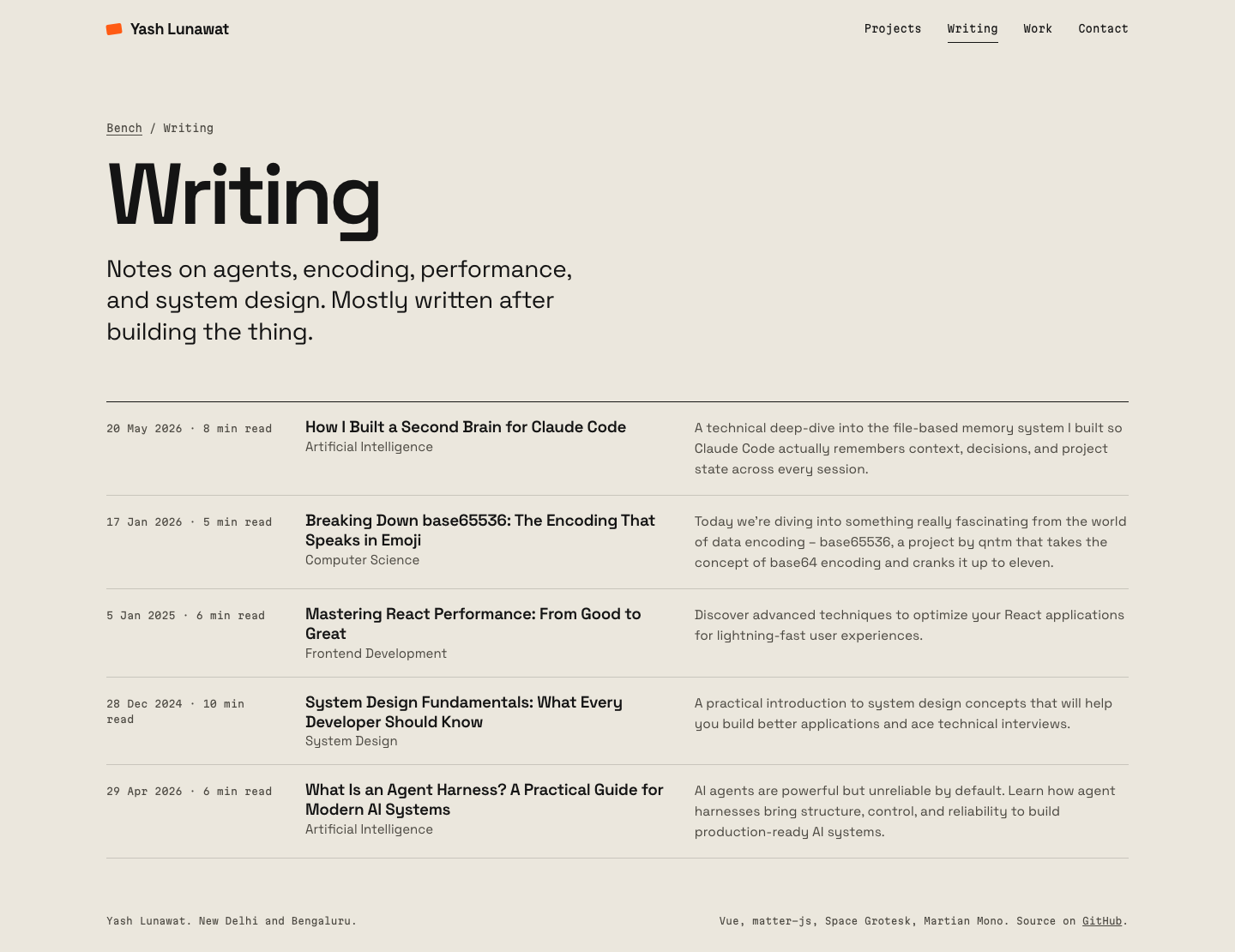
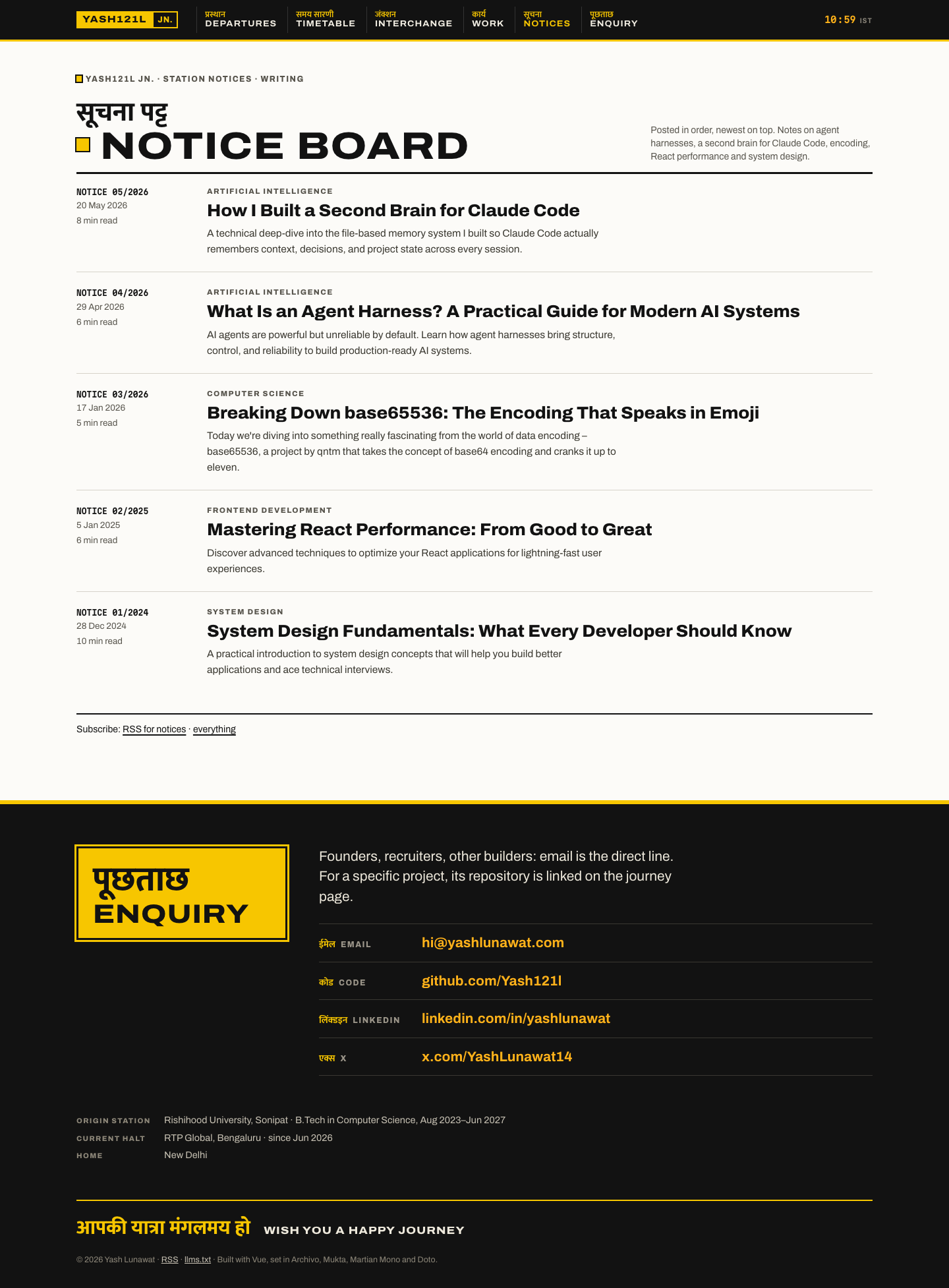
blog-list-desktop.png
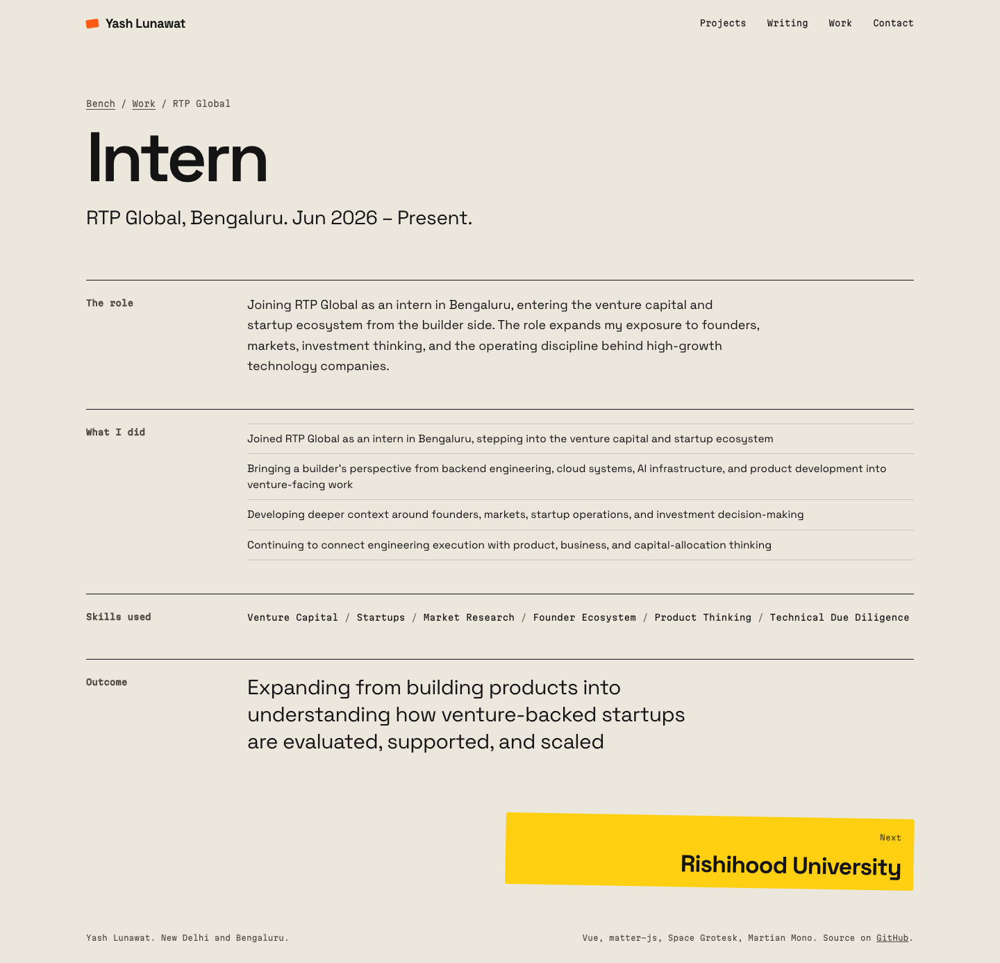
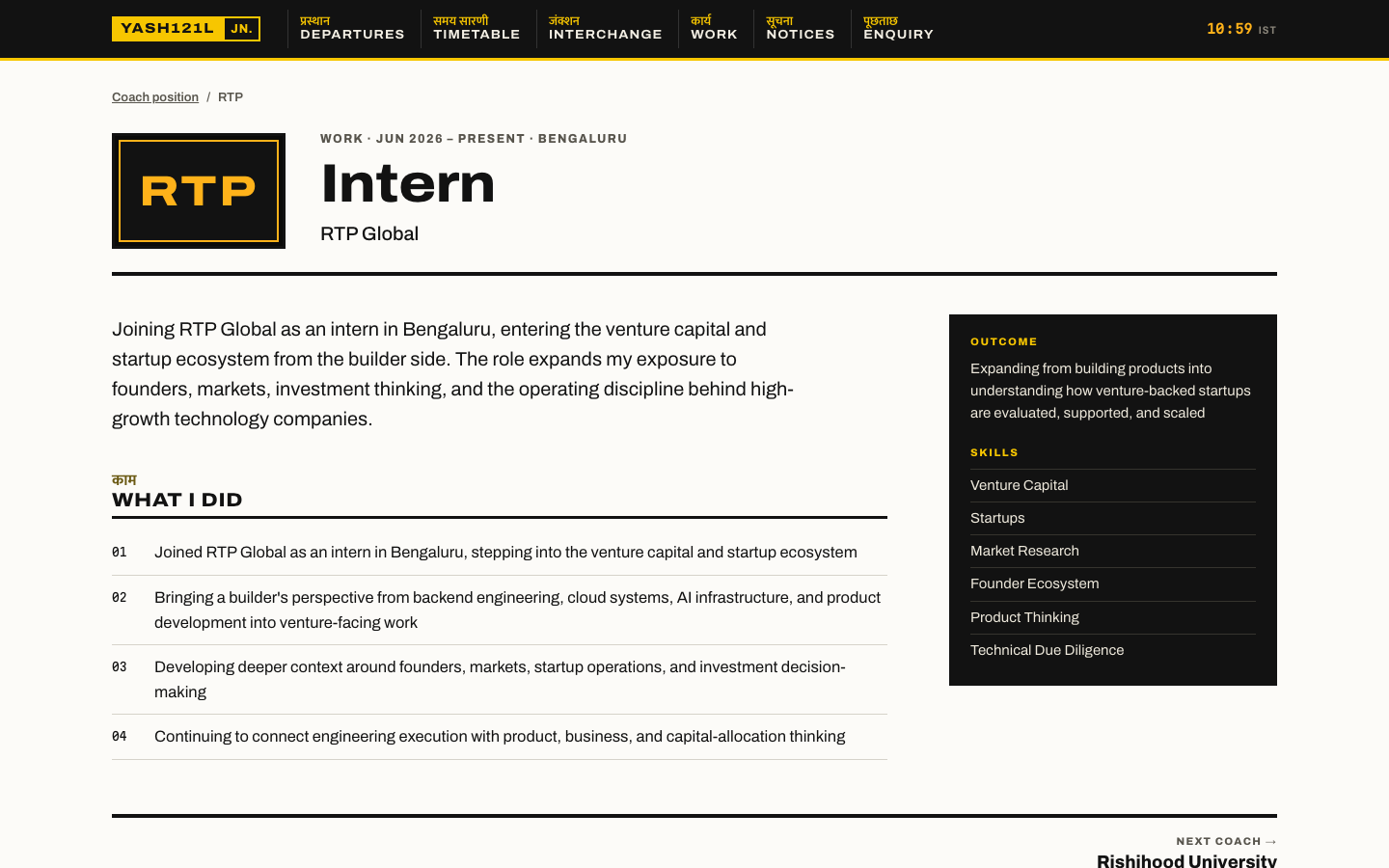
experience-desktop.png
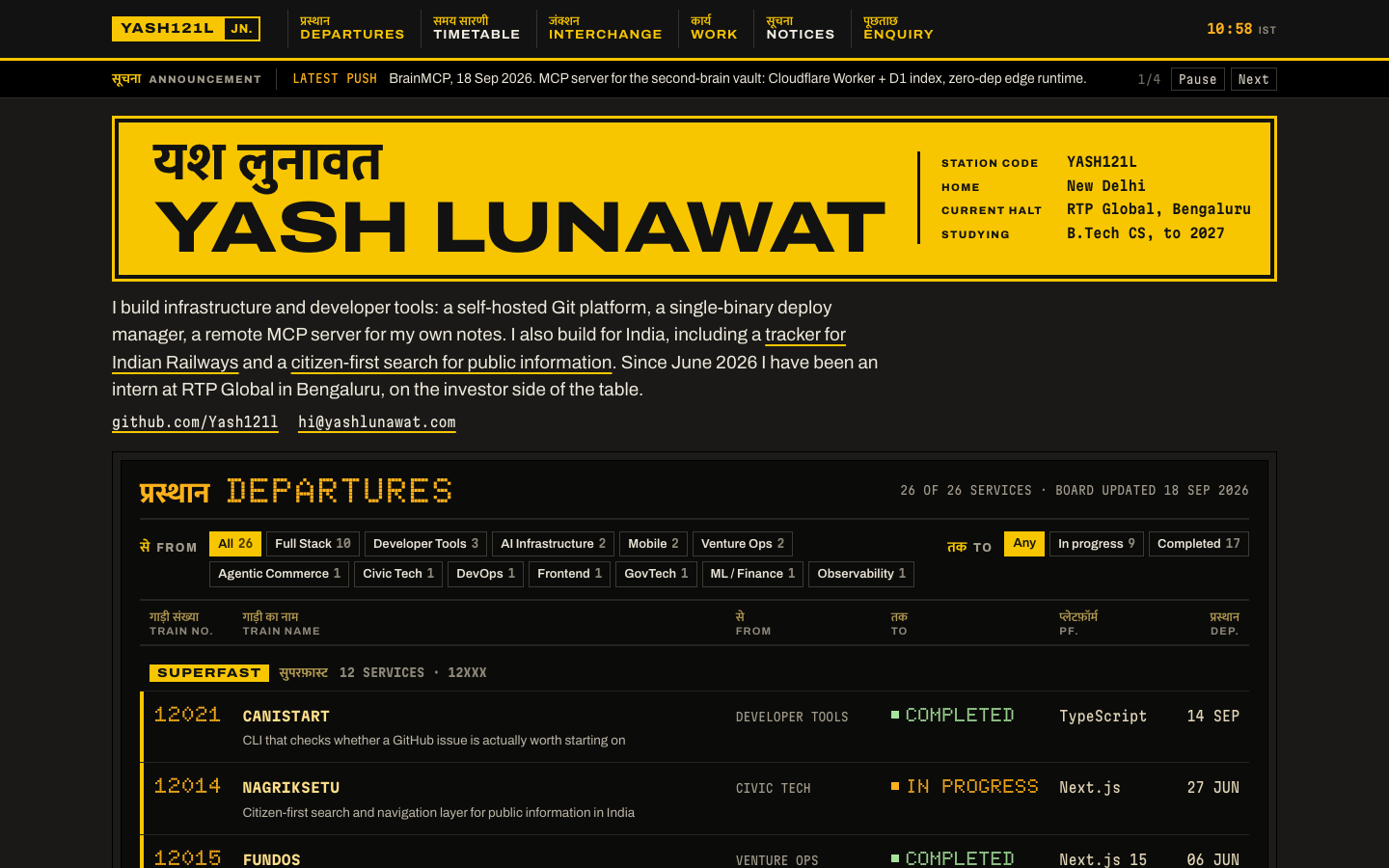
home-desktop.png
home-desktop.png
home-fold-desktop.png
home-mobile.png
home-mobile.png
interaction-index-filter-hover.png
project-detail-desktop.png
project-detail-mobile.png
projects-desktop.png

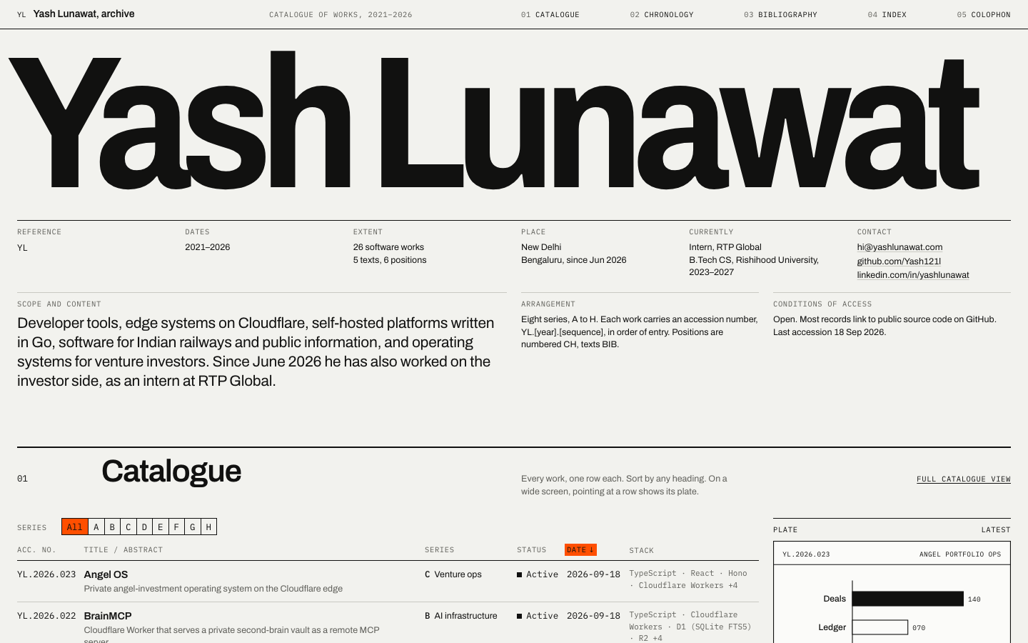
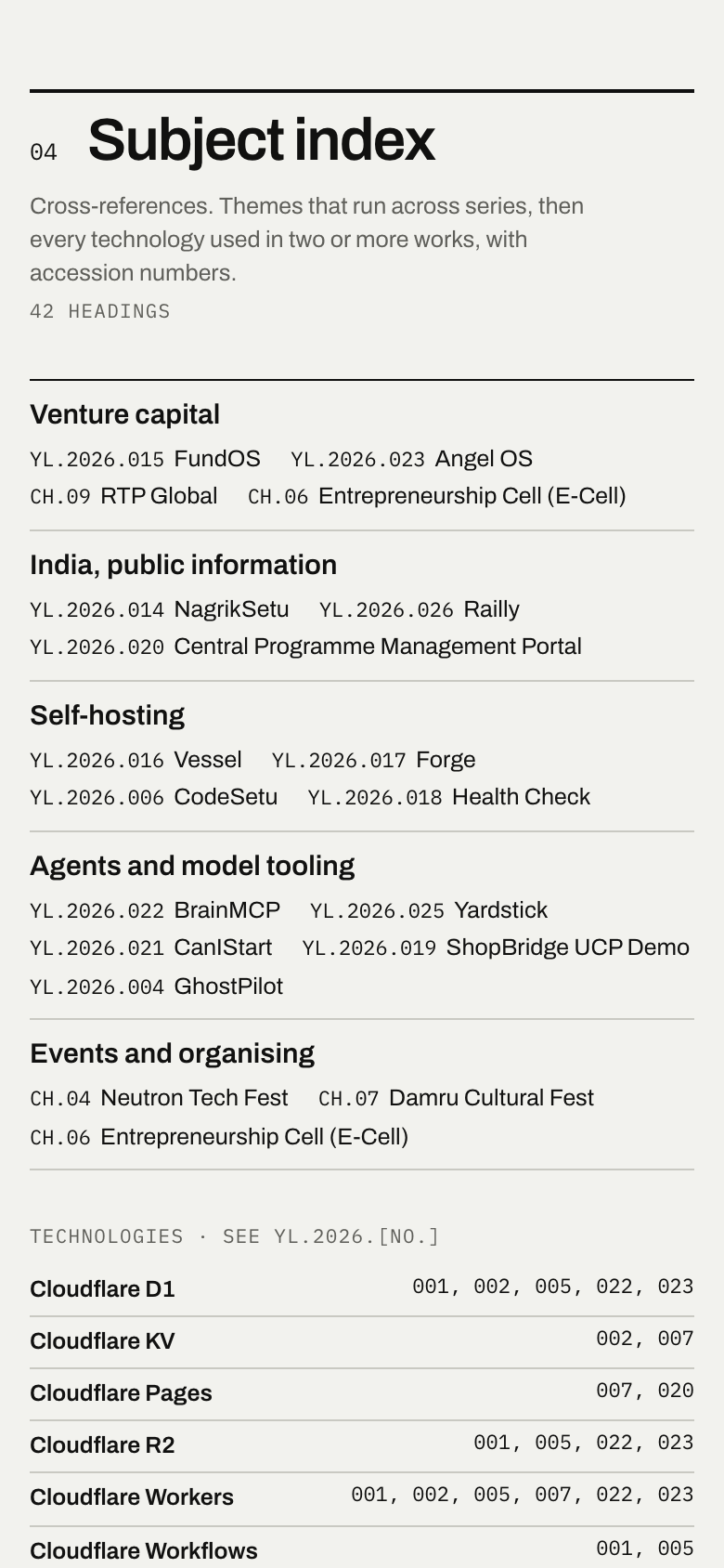
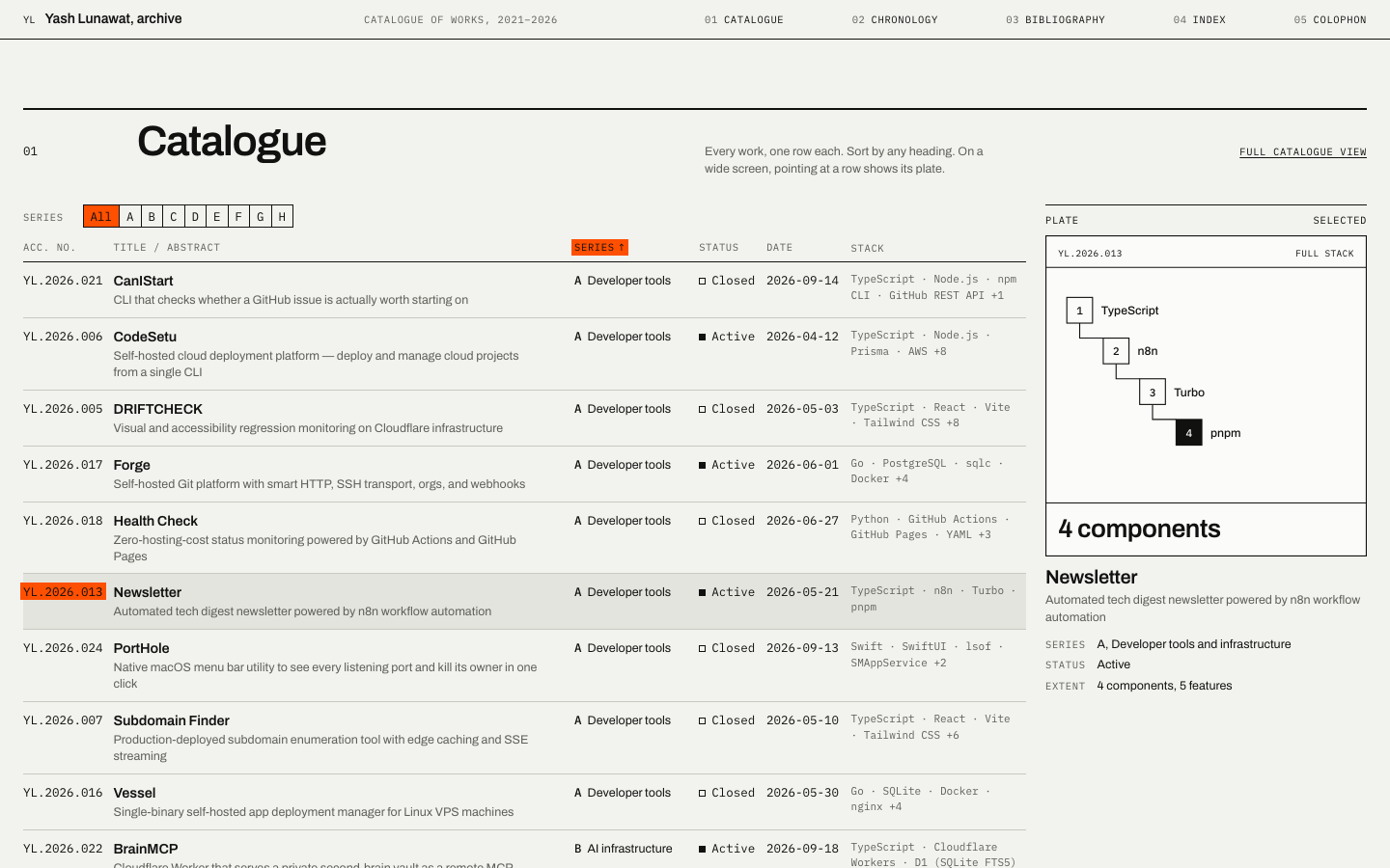
02 Swiss archive

https://v2.yashlunawat.com/ · worktree portfolio-02 · branch design/portfolio-02 · cd /Users/admin/.t3/worktrees/portfolio/portfolio-02 && npx vite --port 5202

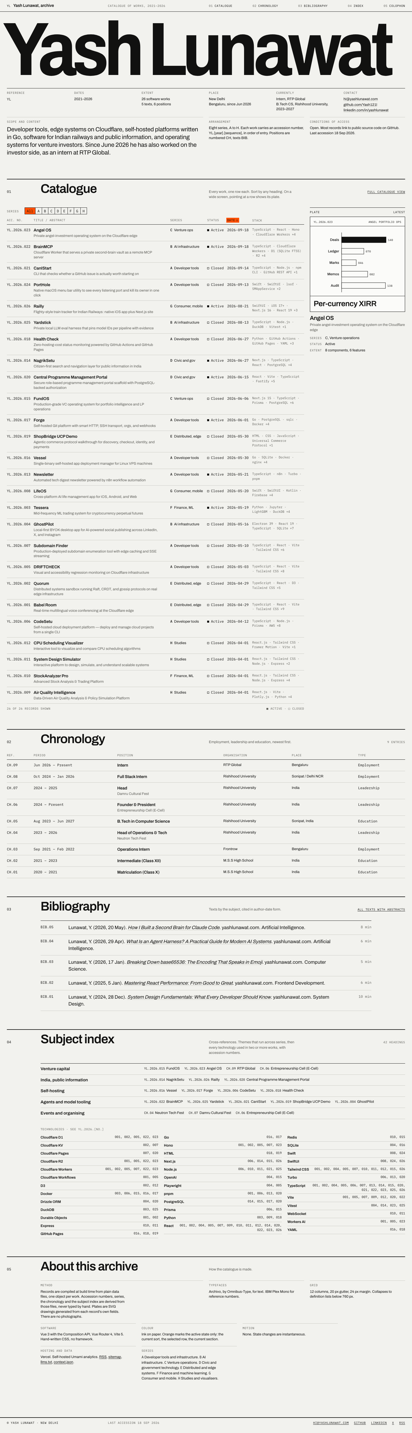
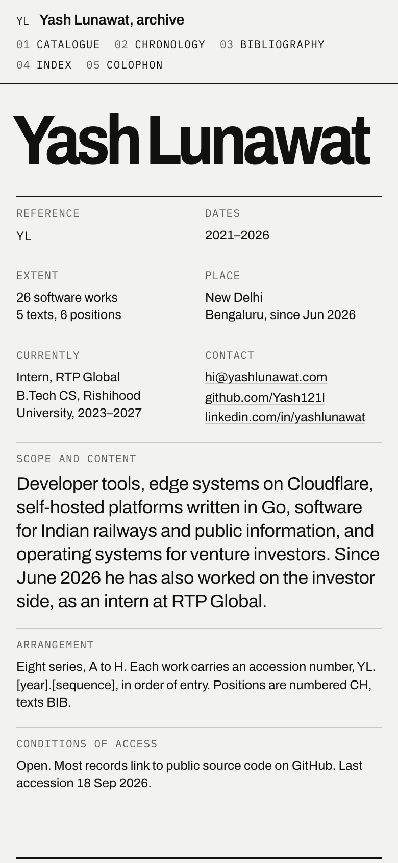
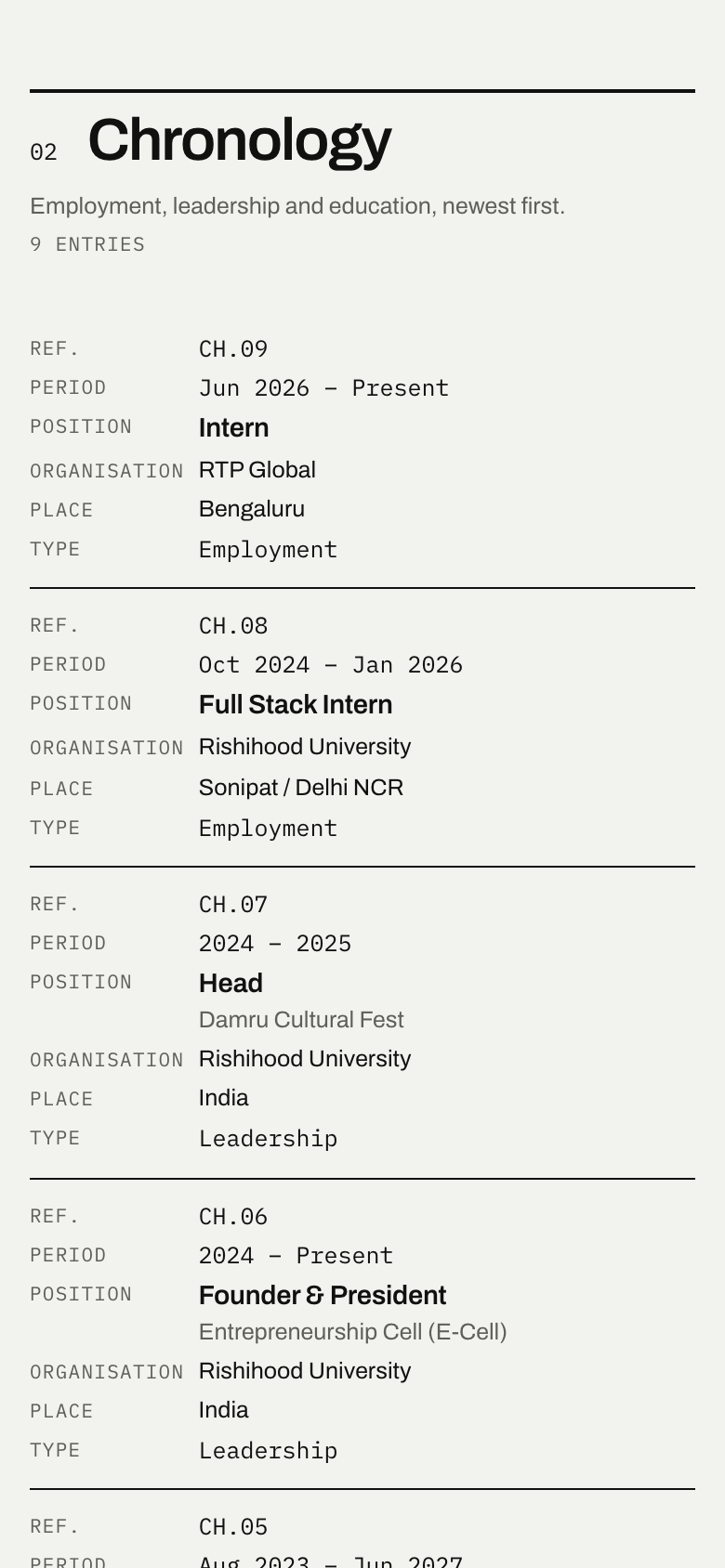
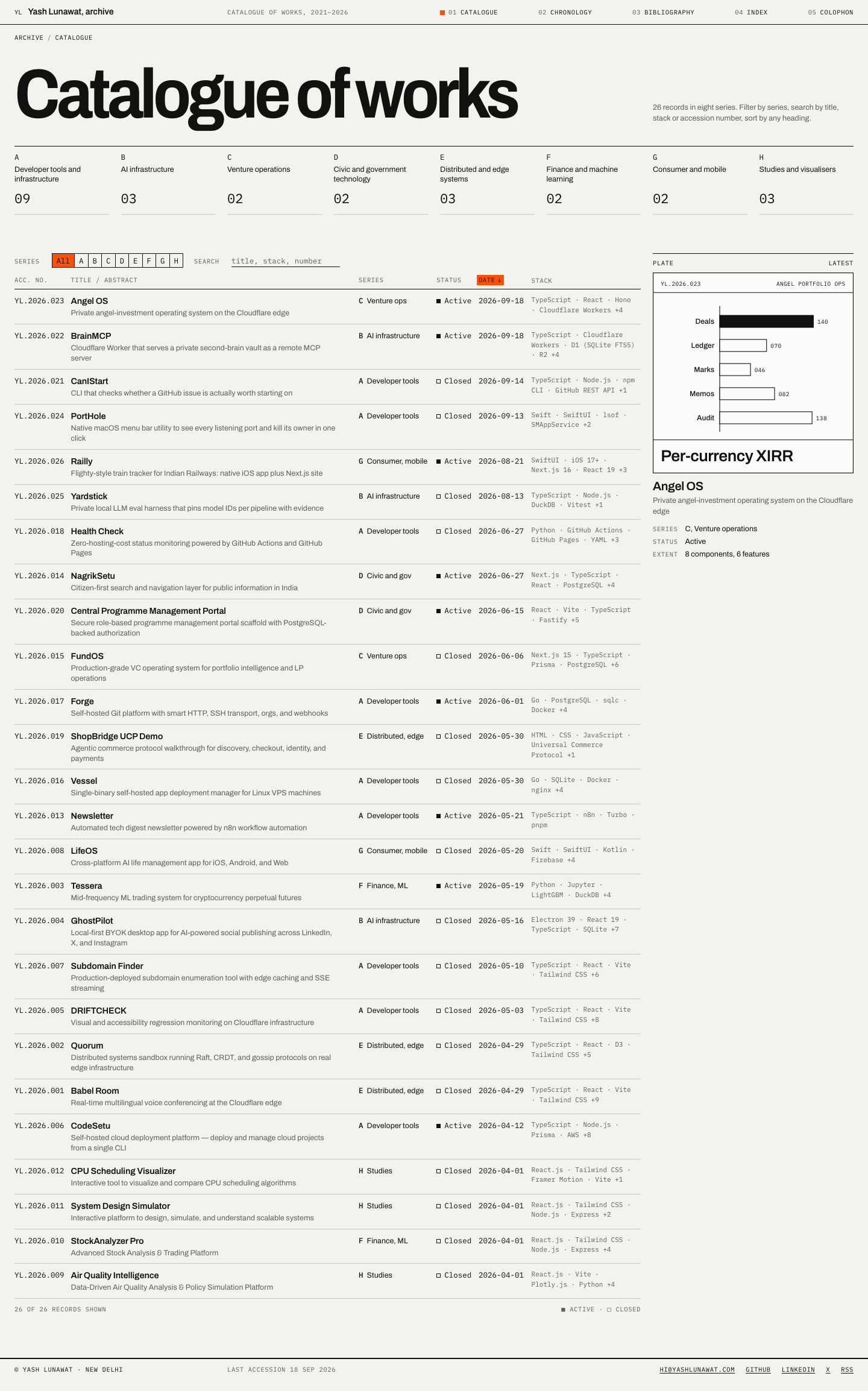
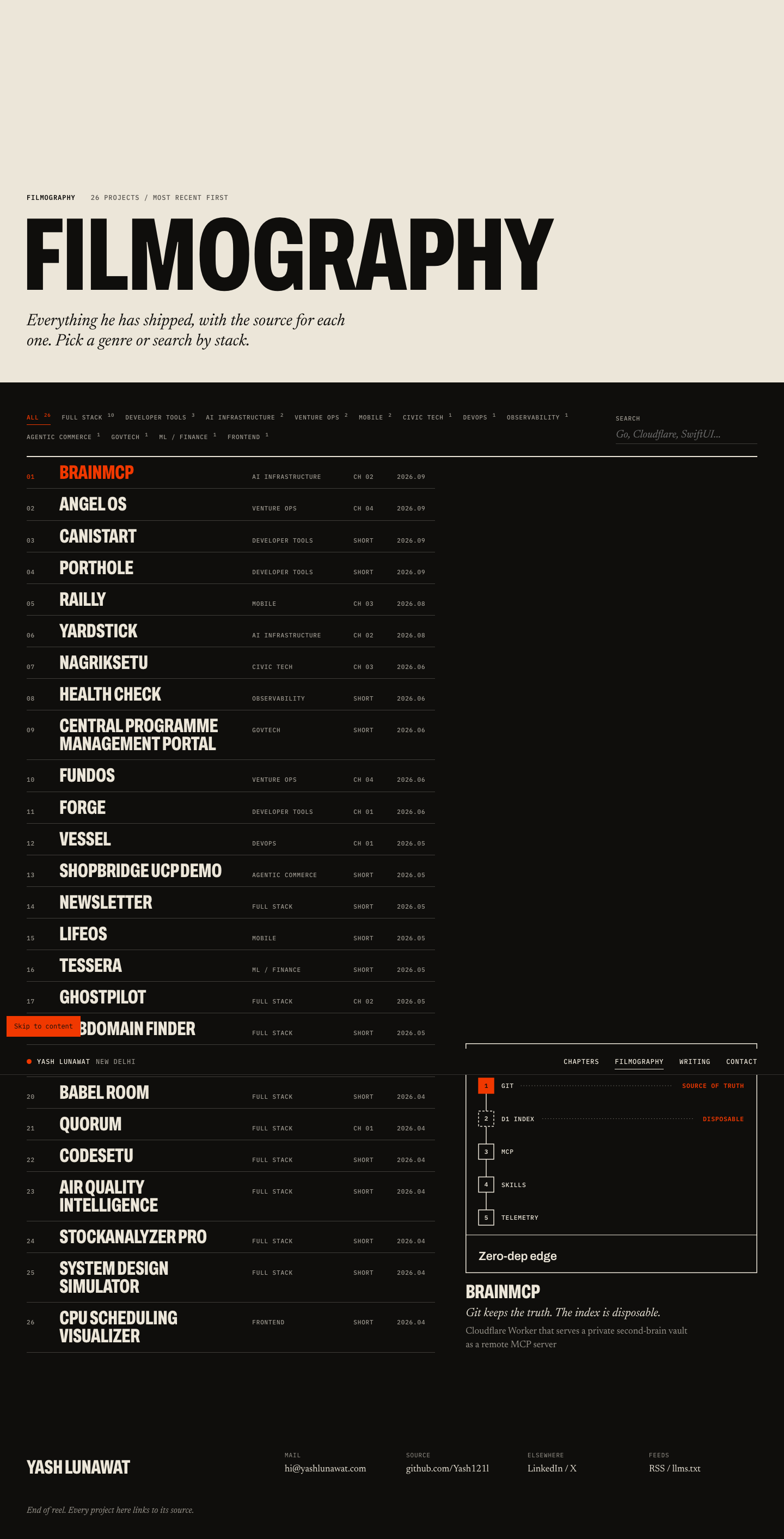
Swiss archive home

Thesis

The portfolio is a catalogue raisonné. Every work Yash has made is numbered, dated, classified and cross-referenced the way a museum archive or an architect's office would do it. After 30 seconds someone should feel: this person has produced a body of work, and he takes it seriously.

Memorable device

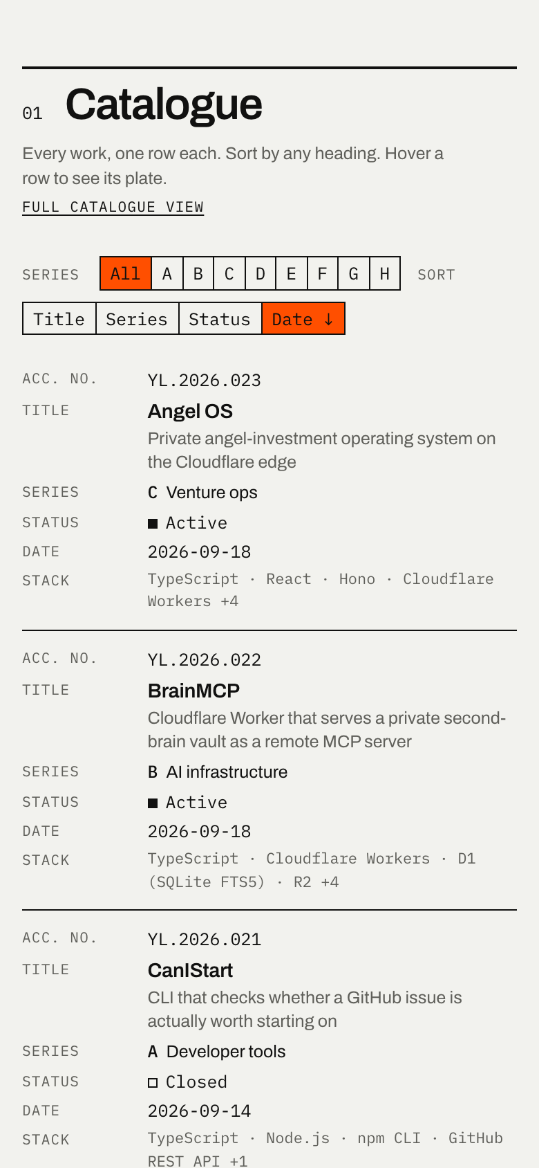
The full-width name sitting on top of a dense, numbered table of 26 works, with orange appearing only where you just clicked. Also the subject index: "Cloudflare Workers: 001, 002, 005, 007, 022, 023".

Self-critique

  • **First impression:** the name is strong at thumbnail si

Worth stealing

  • **The subject index.** An index built from the data, with themes that cut across categories (Venture capital → FundOS, Angel OS, RTP Global, E-Cell) and a technology concordance with record numbers. Any concept can use it as a cross-reference layer, and it's the best argument for breadth that doesn't need a stat row.
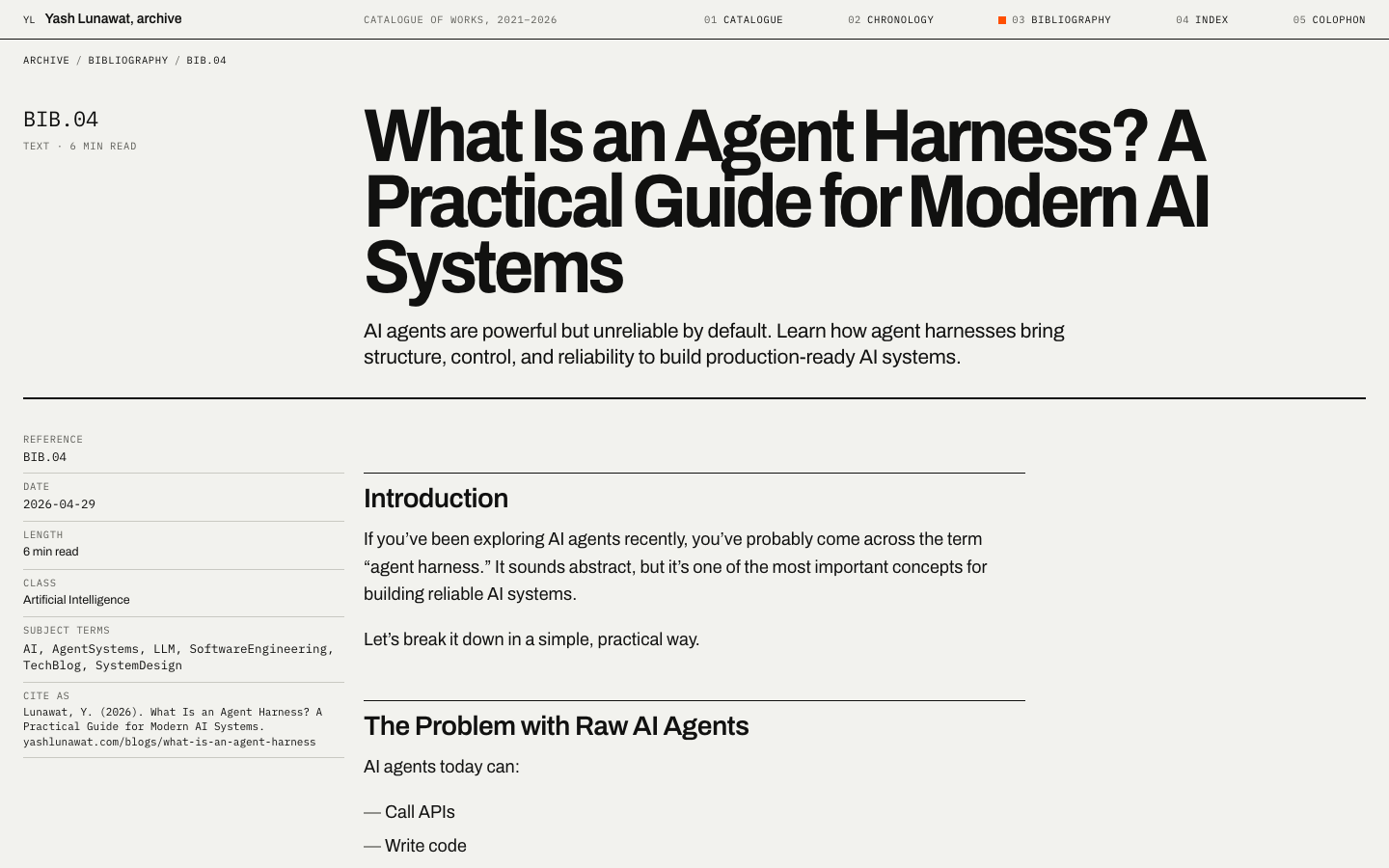
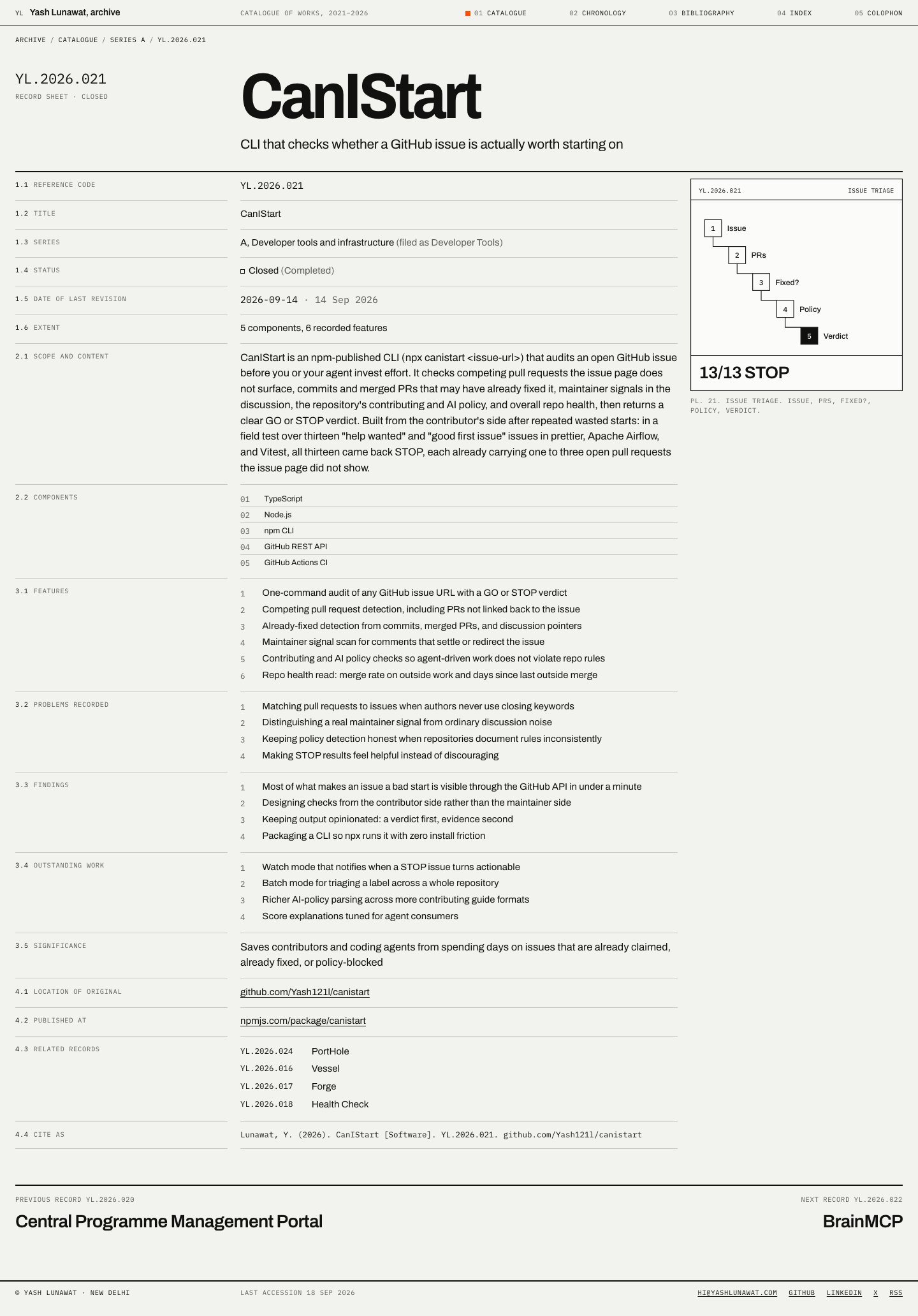
  • **Numbered record sheets with a "Cite as" line.** Turning features/challenges/learnings/enhancements into Features / Problems recorded / Findings / Outstanding work, with stable reference codes, gives the existing data far more authority than cards do.
  • Also: plates generated as SVG from each project's `visual` object, which removes the need for screenshots entirely.
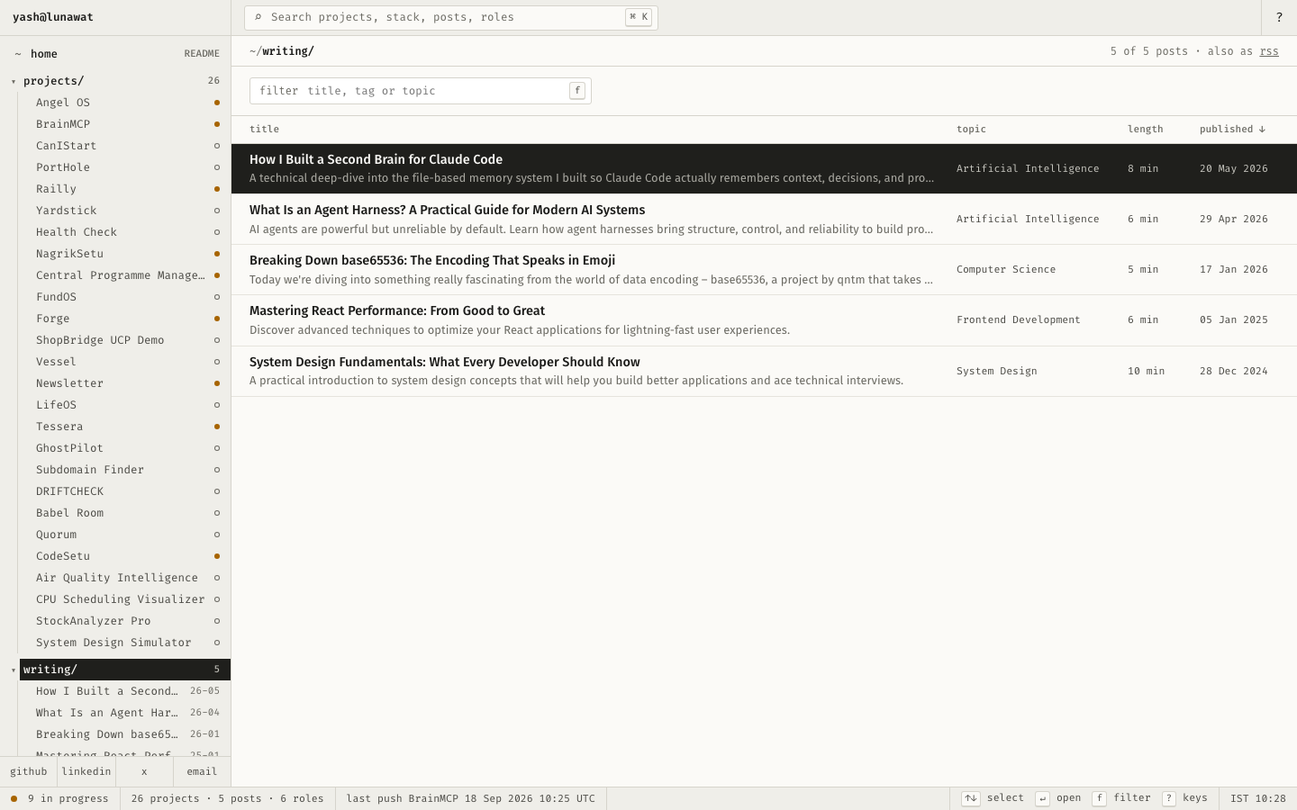
Coordinator verdict

Strong system, not advanced as its own direction. The archival identity block, sortable catalogue with plate panel, and numbered record sheets with a Cite-as line carry real authority. Weak: plates draw fabricated bar values, every accession year is 2026, and it proves volume without warmth. Record sheets and the subject index feed the catalogue hybrid.

15 screenshots
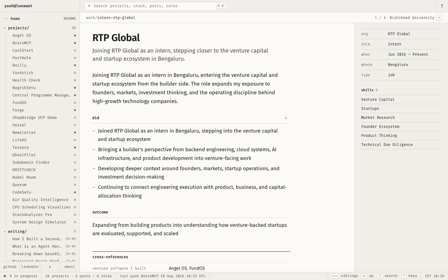
blog-detail-desktop.png
blog-mobile-1.png
blog-mobile-1.png
blogs-desktop.png
blogs-desktop.png
detail-desktop.png
detail-desktop.png
detail-mobile.png
detail-mobile.png
experience-desktop.png
home-desktop.png
home-desktop.png
home-fold-desktop.png
home-mobile-crop-1.png
home-mobile-crop-2.png
home-mobile-crop-3.png
home-mobile-crop-4.png
home-mobile.png
home-mobile.png
interaction-sort-hover.png
projects-desktop.png

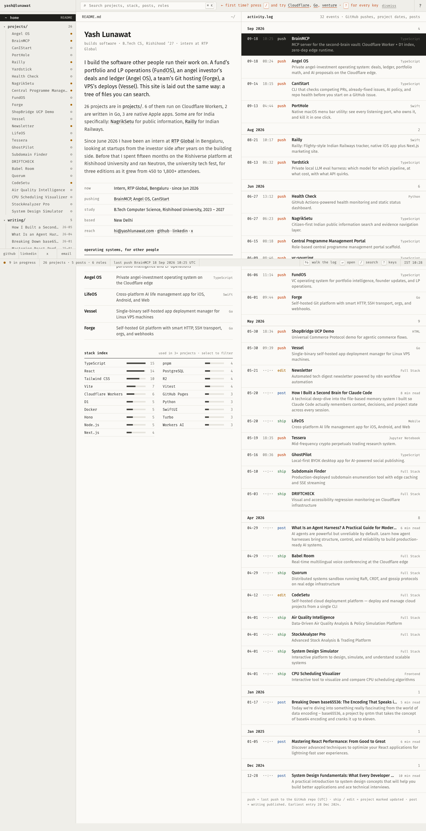
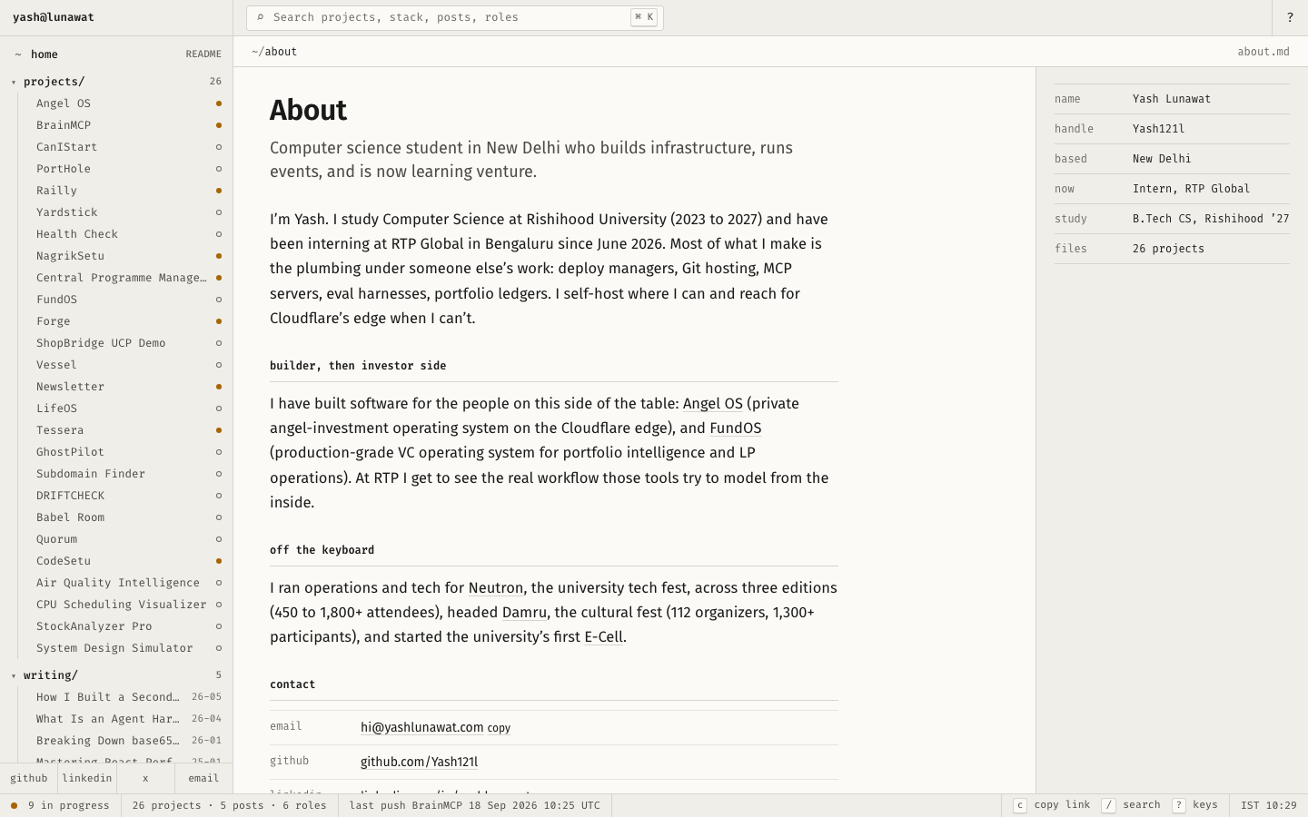
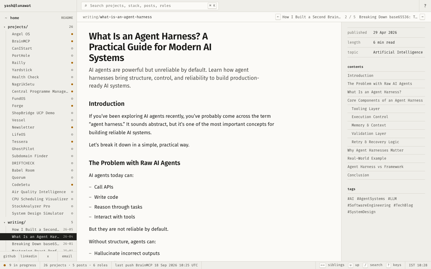
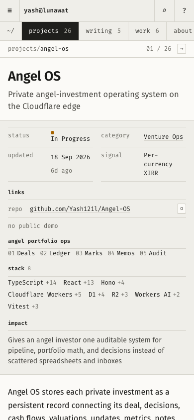
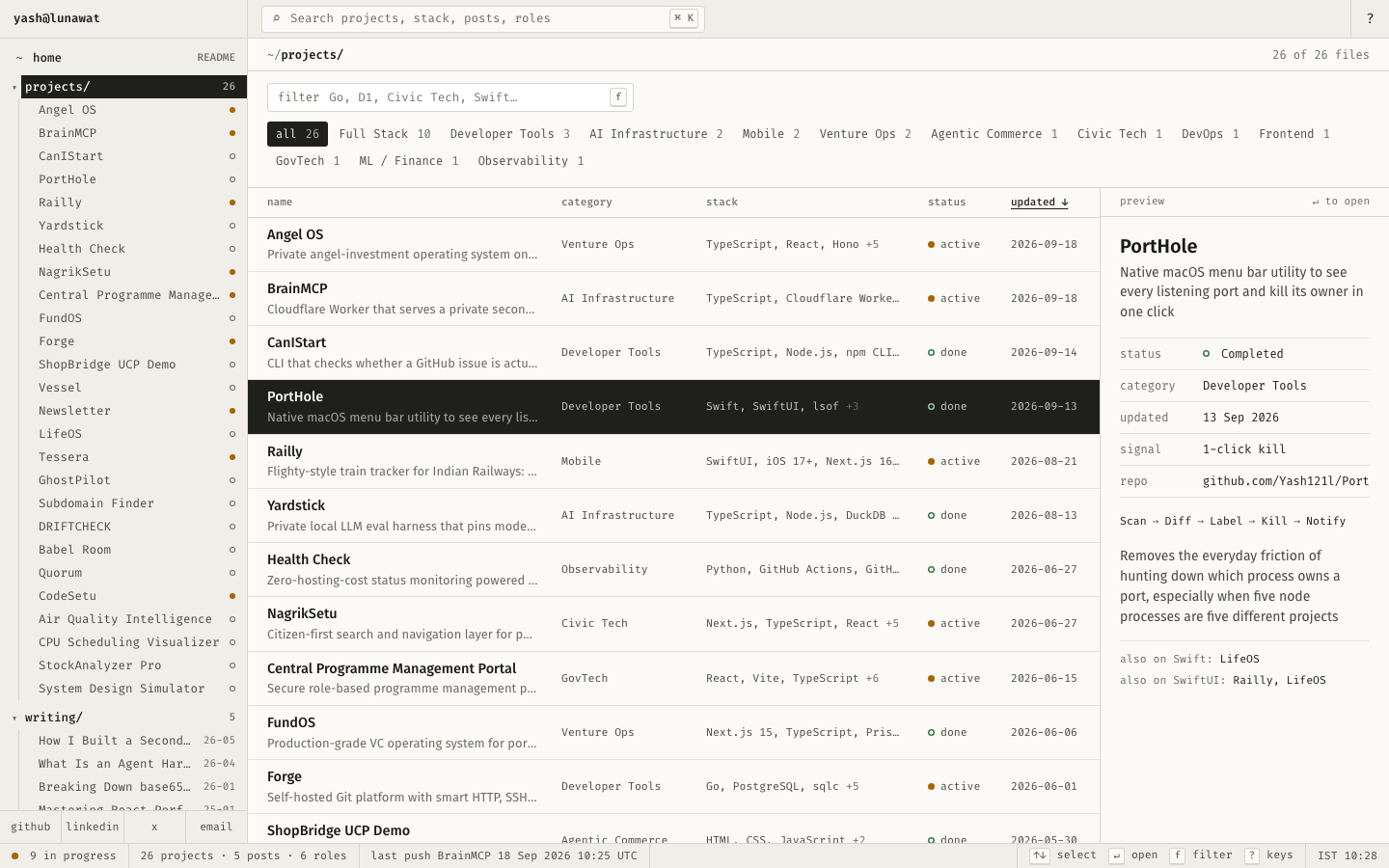
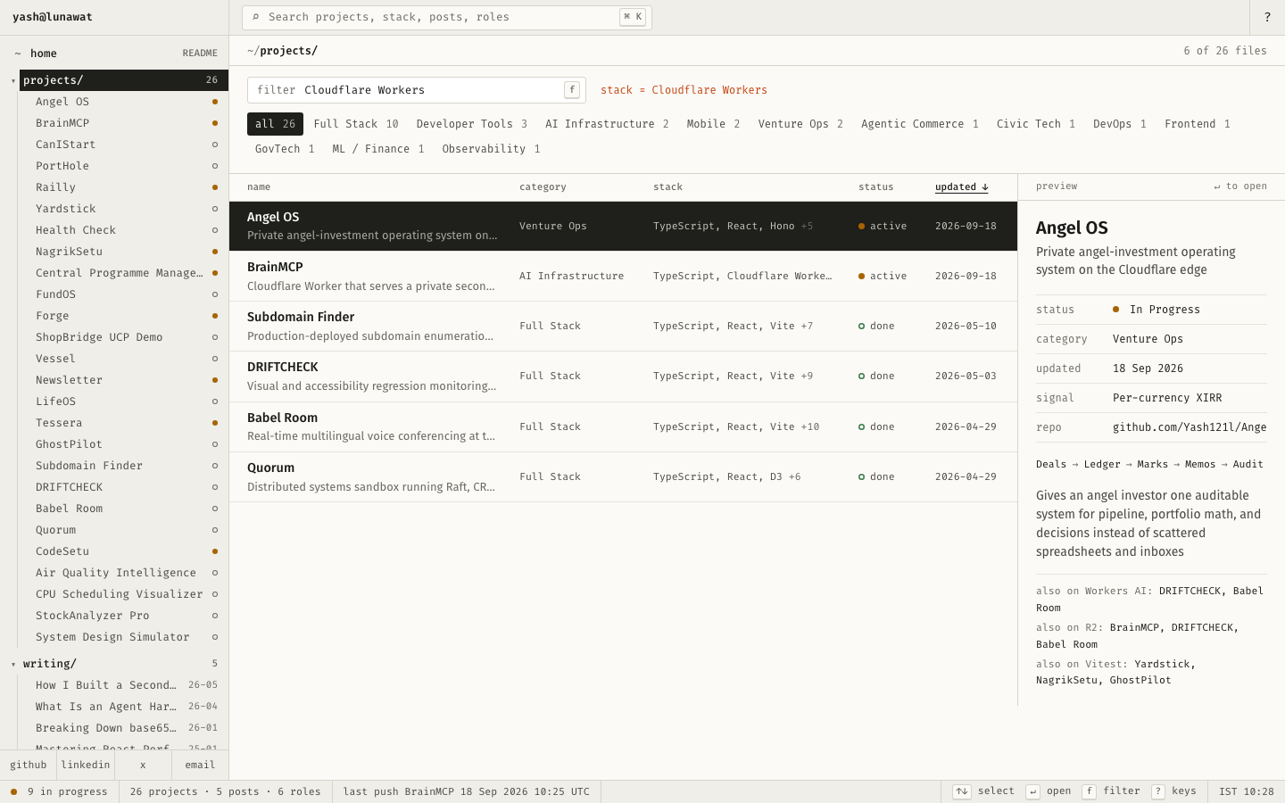
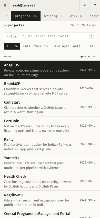
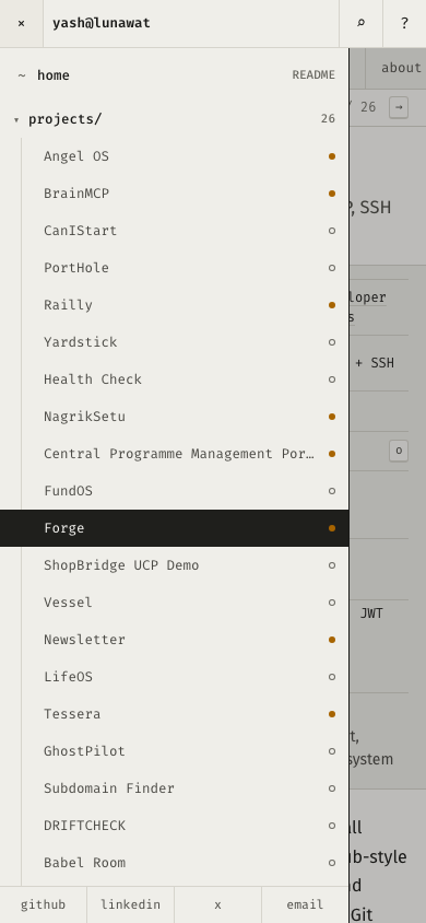
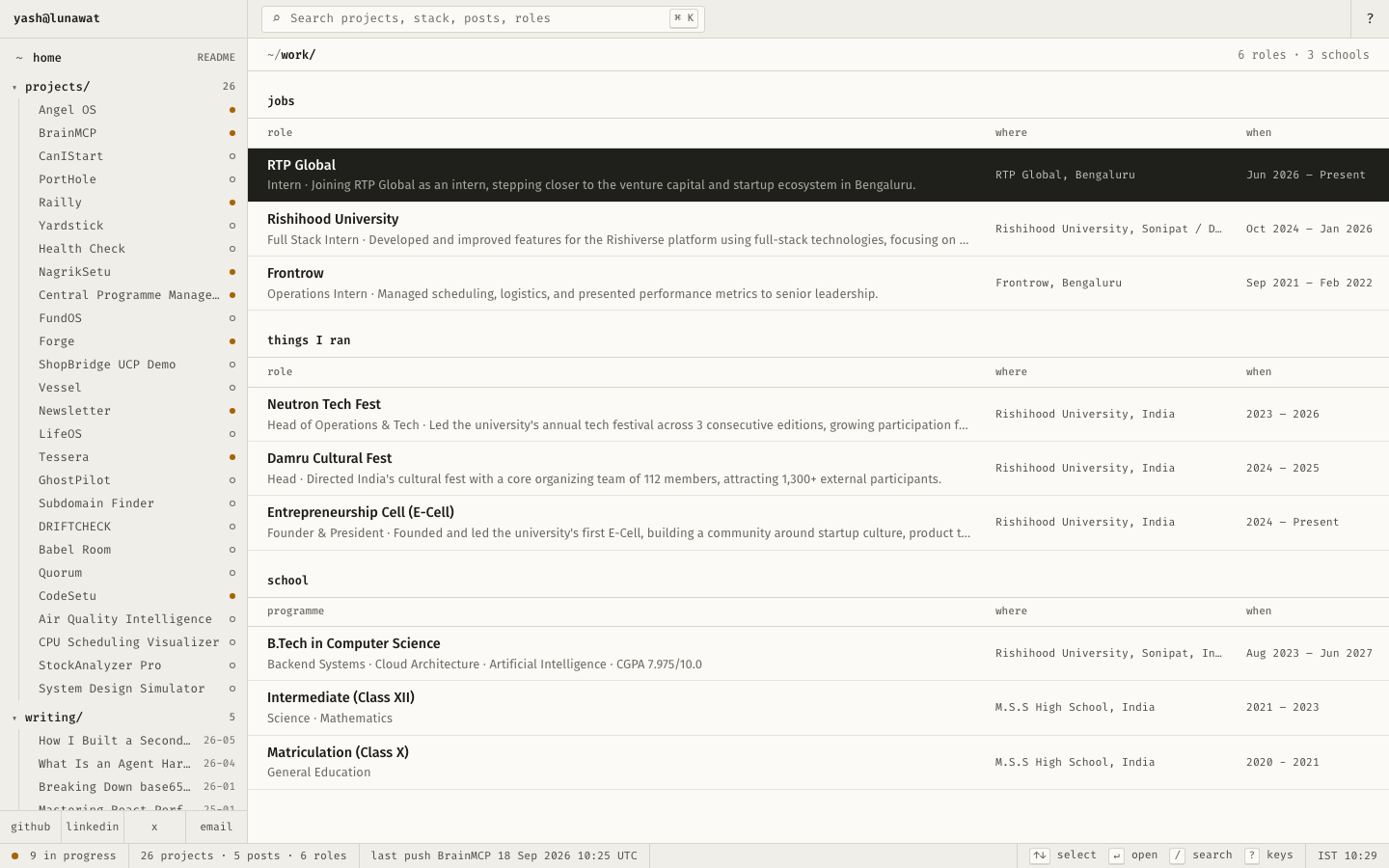
03 Personal OS

https://v3.yashlunawat.com/ · worktree portfolio-03 · branch design/portfolio-03 · cd /Users/admin/.t3/worktrees/portfolio/portfolio-03 && npx vite --port 5203

Personal OS home

Thesis

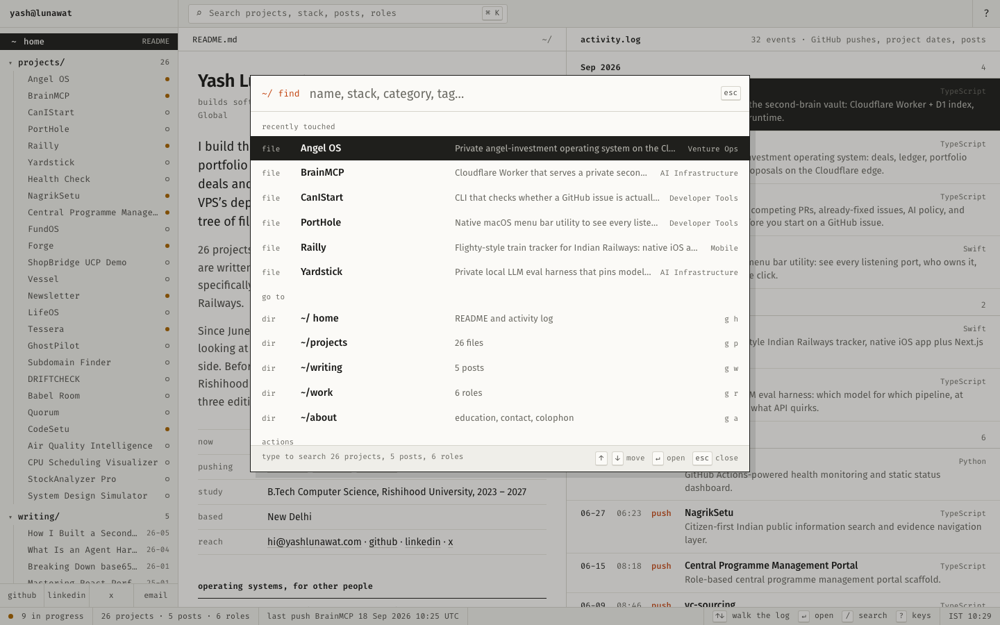
Yash builds operating systems for other people's work (FundOS, Angel OS, LifeOS, Vessel, Forge), so his site is the operating system for his own: a file tree, a command palette, file views with metadata panels, and an activity log built from real push dates. After 30 seconds a visitor should feel "this is a working tool someone lives in, and I can find anything in five seconds."

Memorable device

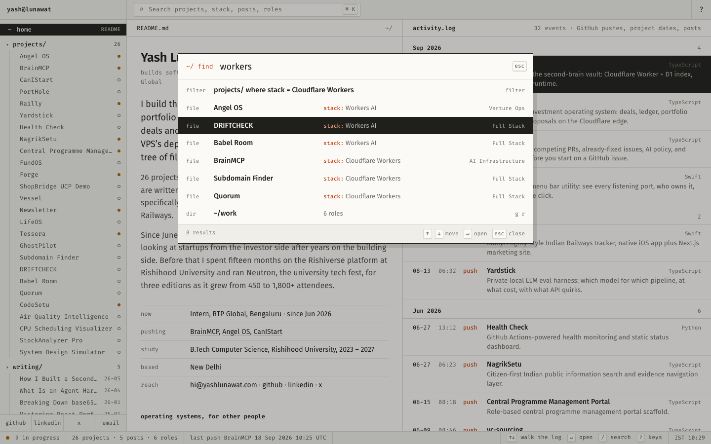
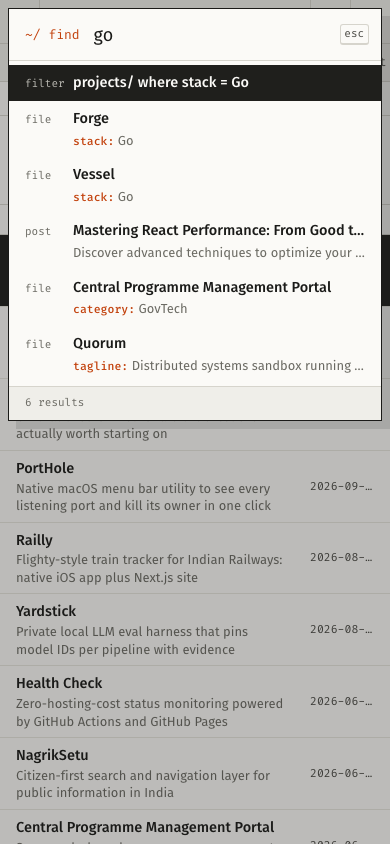
Type "workers" and the first result is `projects/ where stack = Cloudflare Workers · 6 files`. Every project, post and role is findable by what it is built with, and every file view says which other files share its stack.

Self-critique

  • **First impression:** it reads as an app, which is the point. But a recruiter who has never pressed ⌘K sees a wall of 12px mono in the tree before the name. The README pane competes with a 26-row sidebar and a 32-row log, and the eye has no single entry point.
  • **Originality:** the shell is borrowed wholesale from Finder, Linear and VS Code. The originality is in the data: cross-references, the stack index and the push log. The frame itself is familiar.
  • **Typography:** the Fira pairing is coherent. The mono is overused, though. Table cells, metadata, tree, status bar, section labels and the log are all 11–12.5px Fira Code, so the mono layer turns into one gray texture with little internal hierarchy.
  • **Hierarchy:** file titles are clearly primary, but the section labels in project bodies ("features", "hard parts") are 12px mono with a count, the same weight as the metadata labels. The long bodies read like a dump of the data file rather than an edited story, and I did not rewrite or cut any of it.
  • **Storytelling:** there is no narrative arc. The venture angle is one paragraph in the README, one on /about, and a cross-reference on the RTP file. An investor who does not click RTP Global gets almost nothing about how he thinks about venture, because the data has little to say there and I refused to invent it.
  • **Personality:** it says "careful, systematic builder" well. It hides the event-running, people-facing side (1,800-person fest, 112 organi

Worth stealing

  • **Stack cross-references computed from data**, with normali

Coordinator verdict

Not advanced. The README copy is the best opening statement of the set and the computed stack cross-references and activity log are real. But the frame is Finder or VS Code and monospace flattens everything. The cross-reference logic and the log feed the terminal hybrid.

21 screenshots
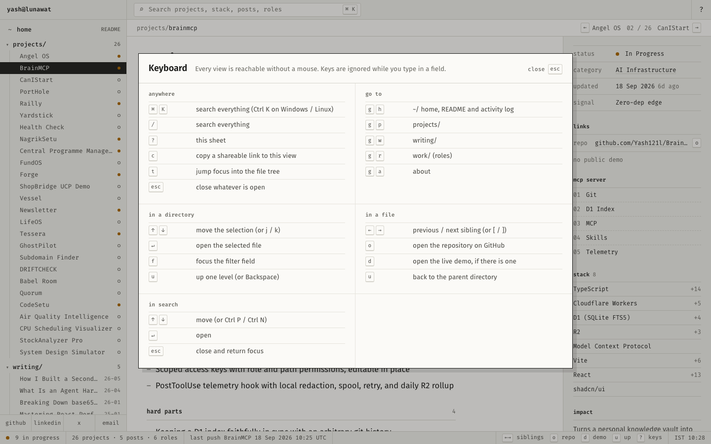
about-desktop.png
about-desktop.png
blog-detail-desktop.png
blog-list-desktop.png
experience-detail-desktop.png
help-overlay-desktop.png
home-desktop-full.png
home-desktop.png
home-desktop.png
home-mobile-full.png
home-mobile.png
home-mobile.png
palette-empty-desktop.png
palette-open-desktop.png
palette-open-mobile.png
project-detail-desktop-full.png
project-detail-desktop.png
project-detail-mobile-full.png
project-detail-mobile.png
projects-desktop.png
projects-filtered-desktop.png
projects-mobile.png
projects-mobile.png
tree-drawer-mobile.png
work-desktop.png
work-desktop.png

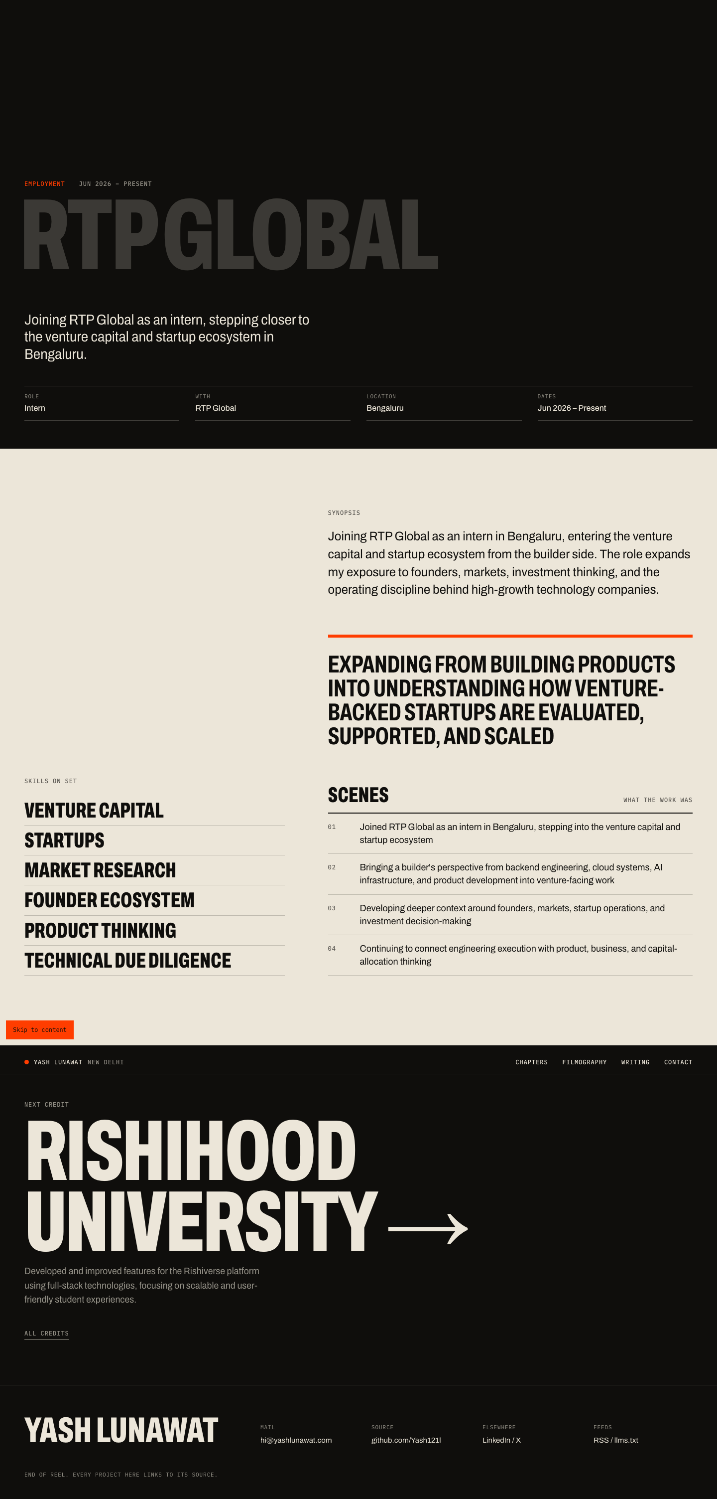
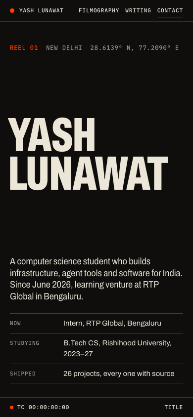
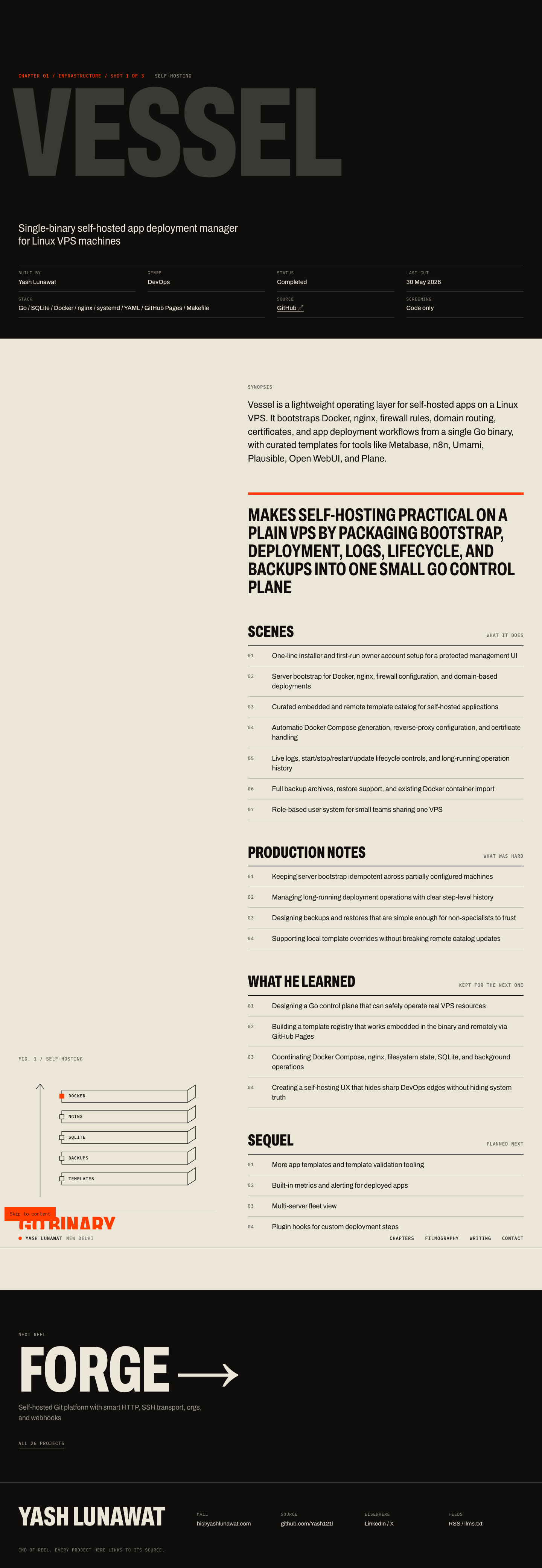
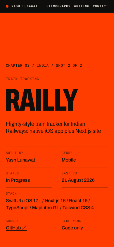
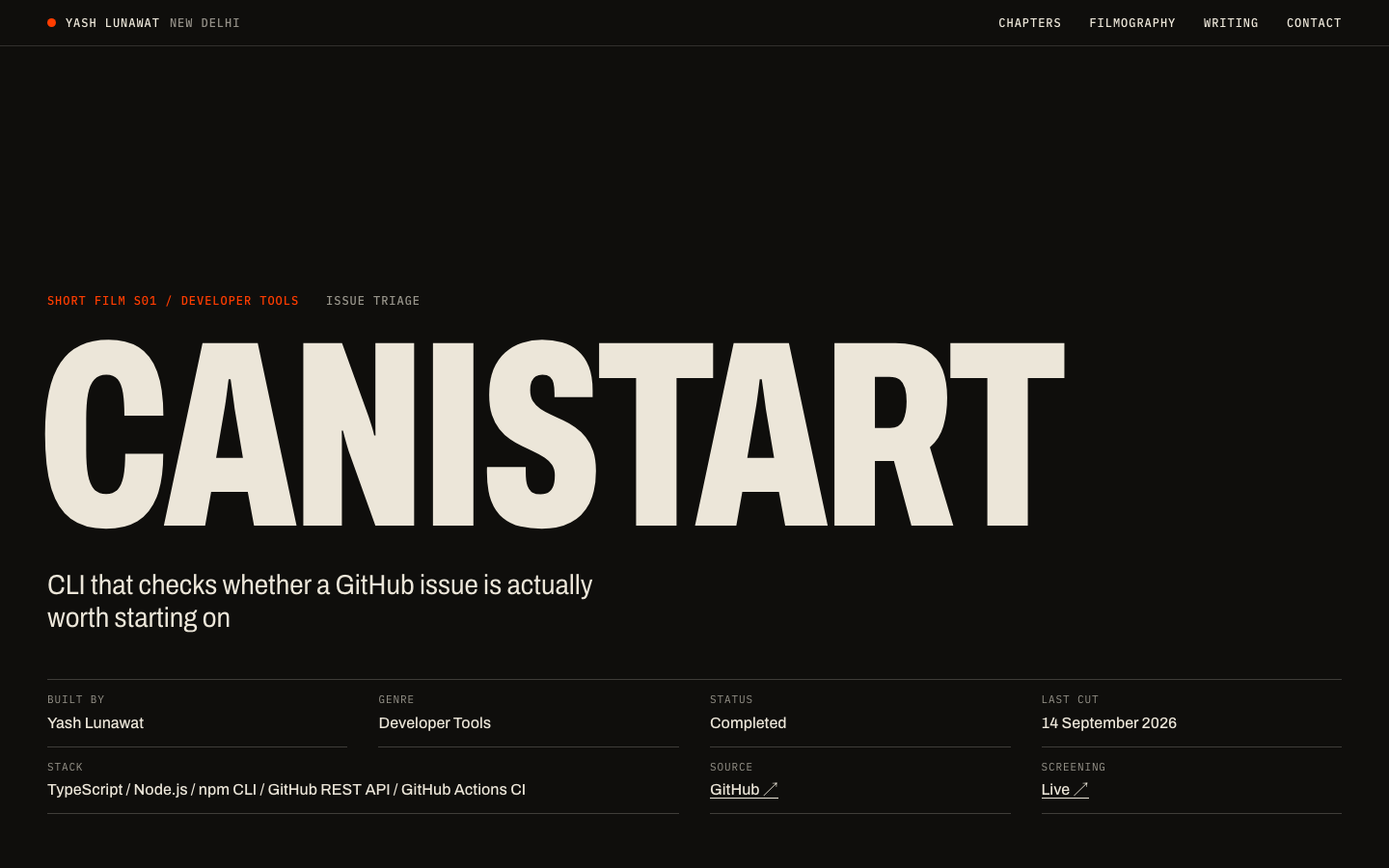
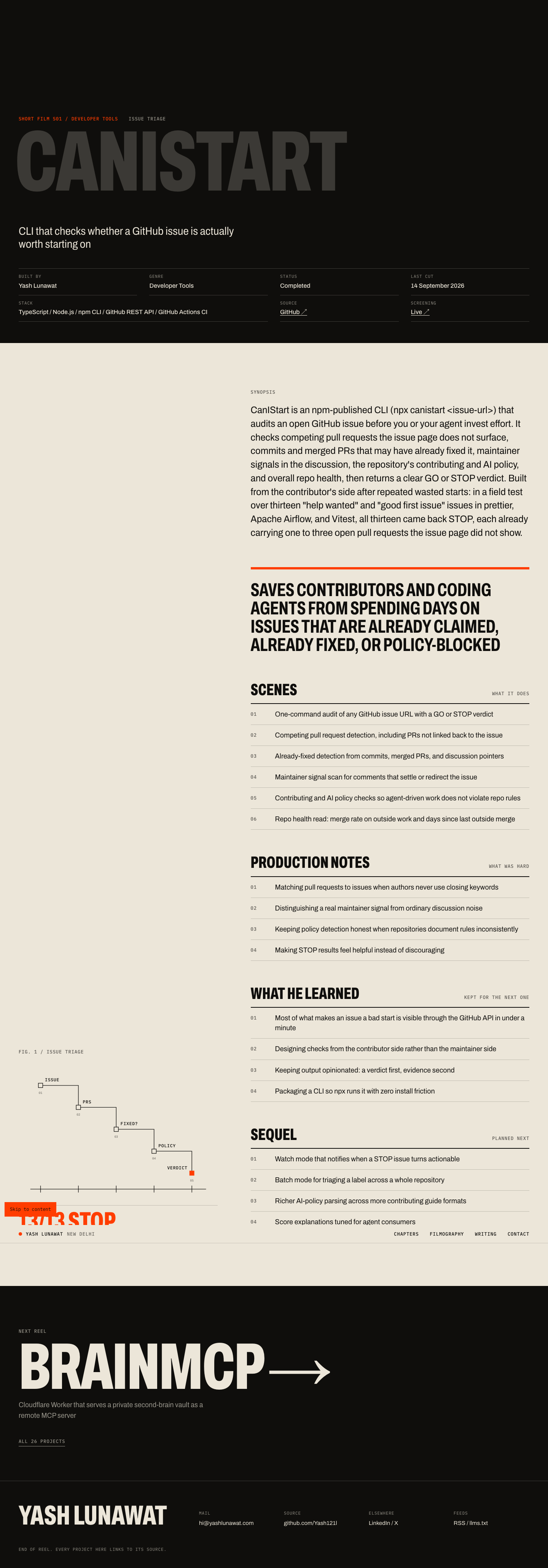
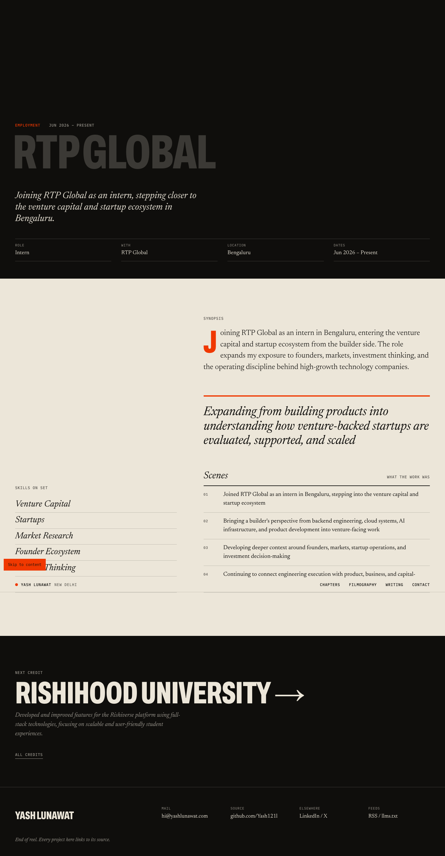
04 Cinematic scroll

https://v4.yashlunawat.com/ · worktree portfolio-04 · branch design/portfolio-04 · cd /Users/admin/.t3/worktrees/portfolio/portfolio-04 && npx vite --port 5204

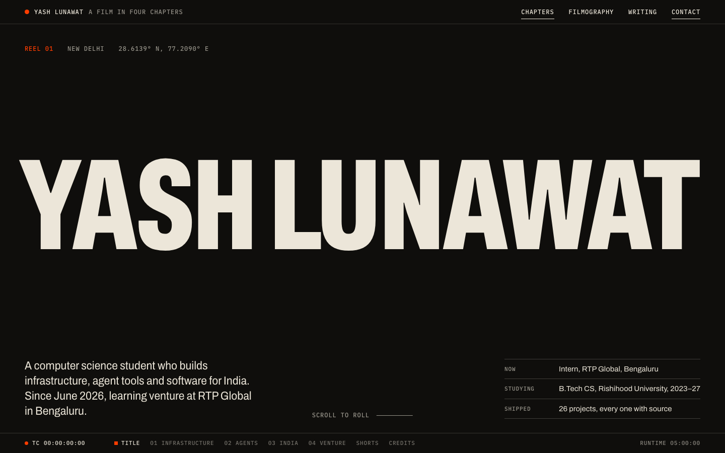
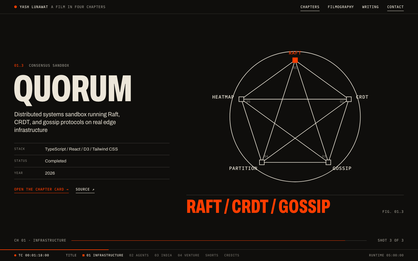
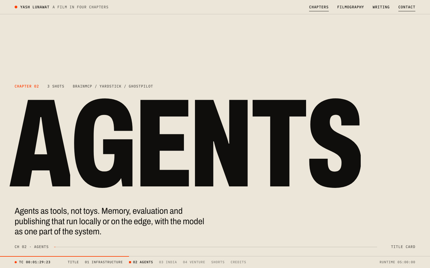
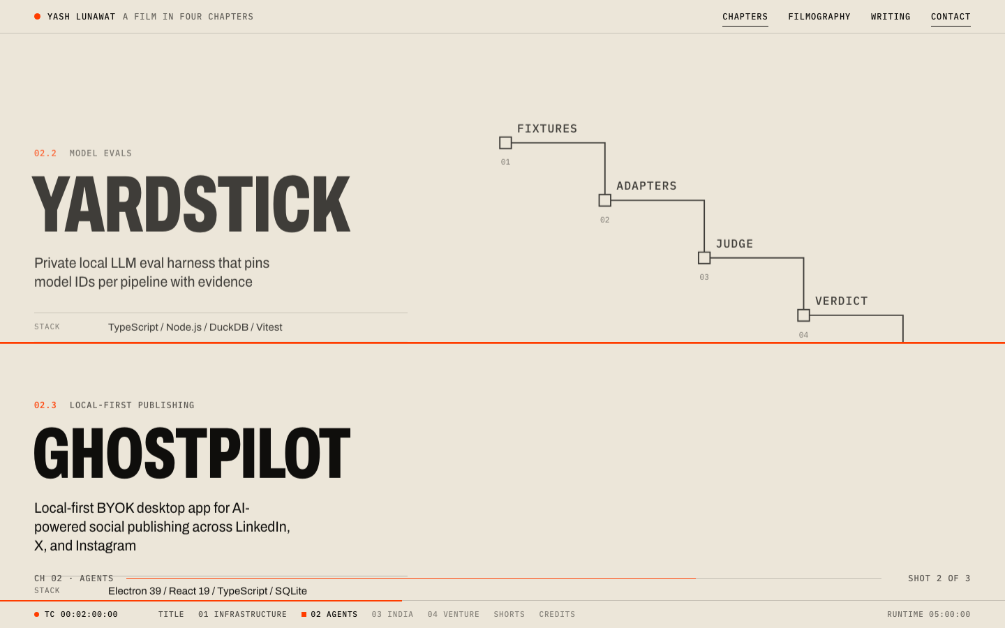
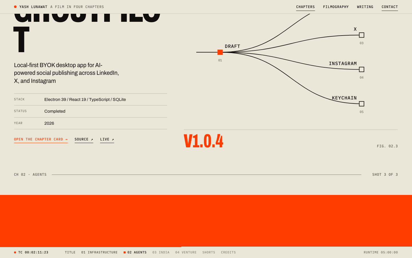
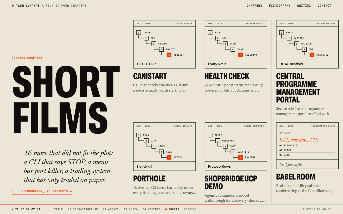
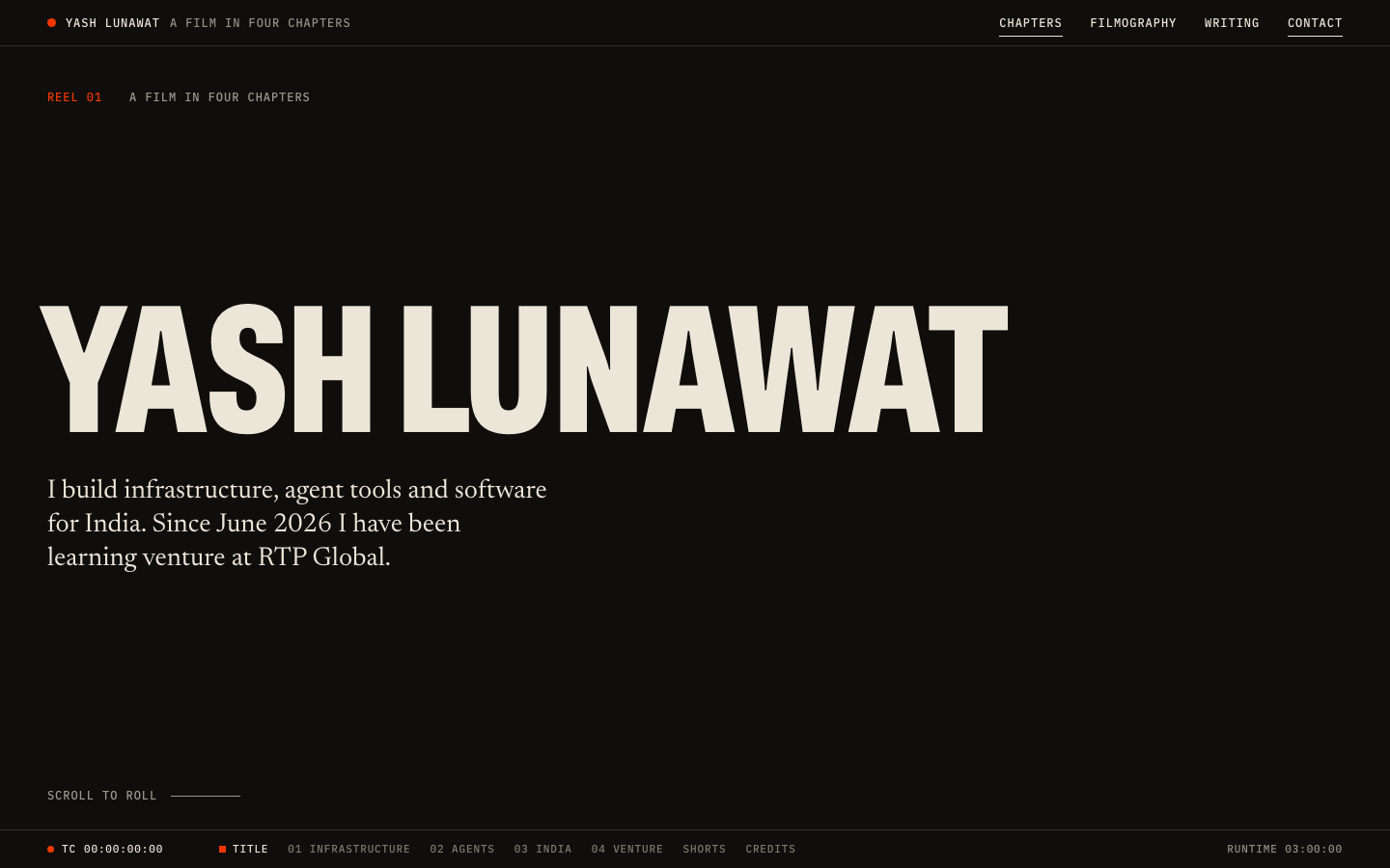
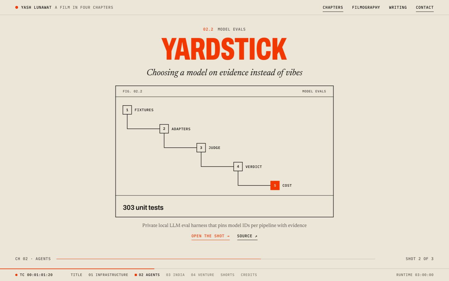
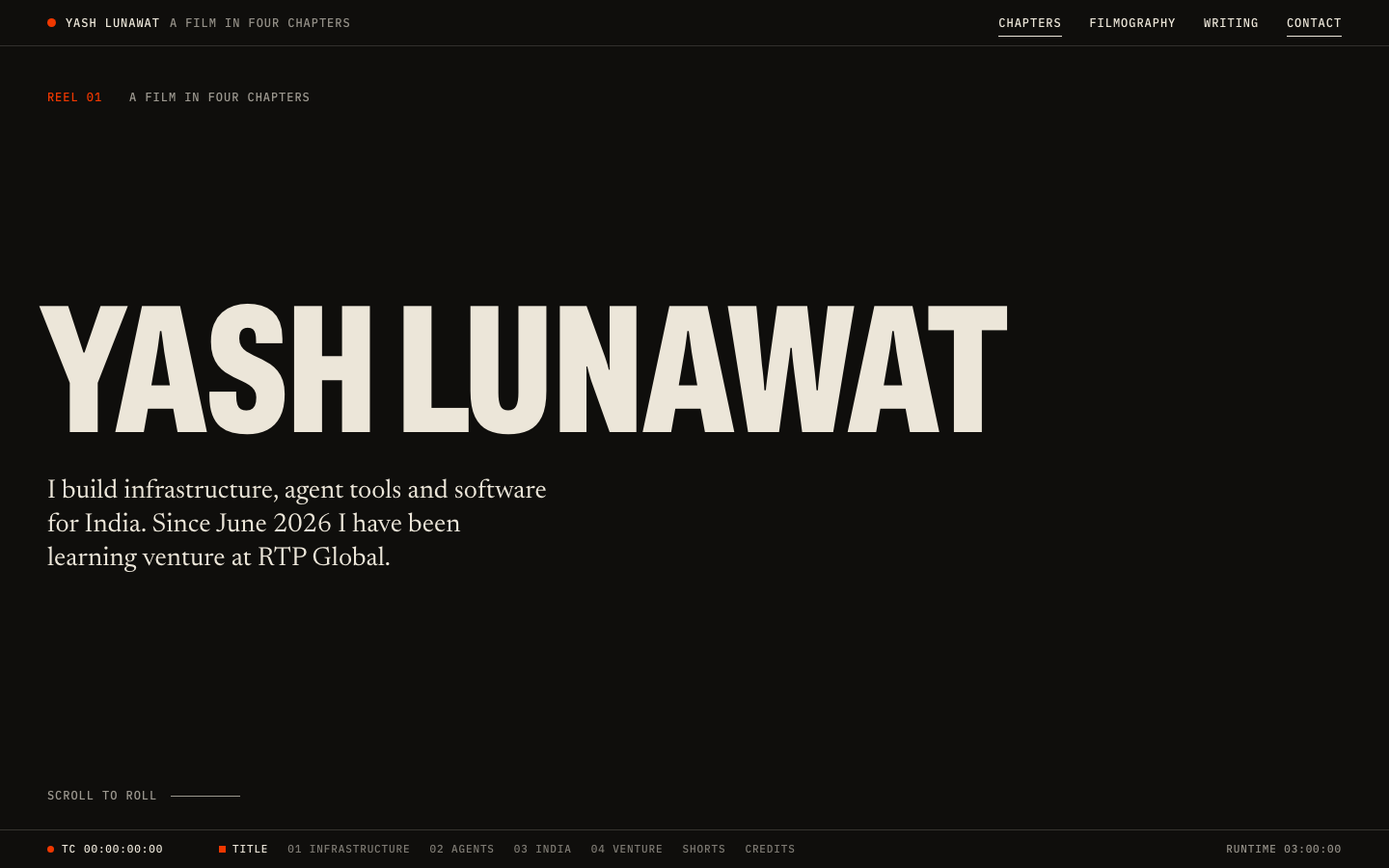
Cinematic scroll home

Thesis

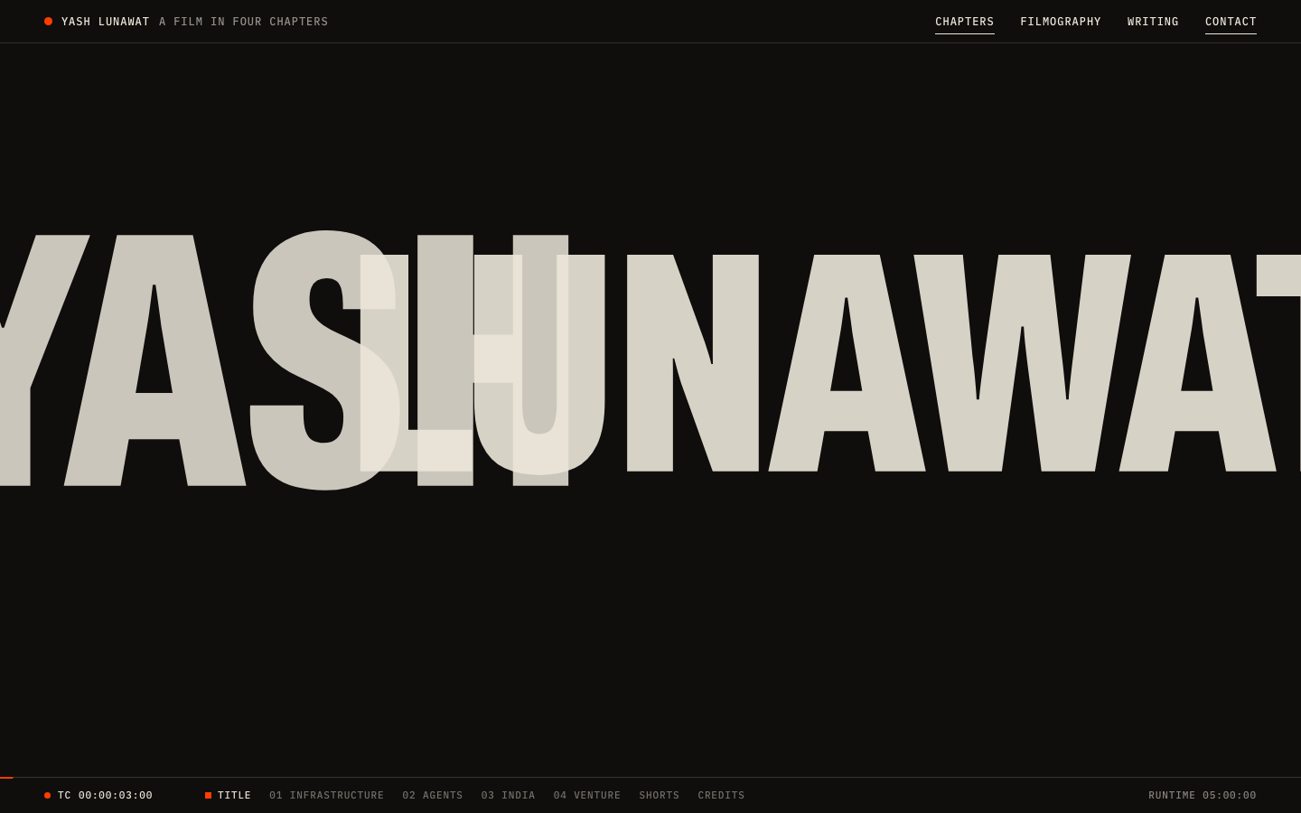
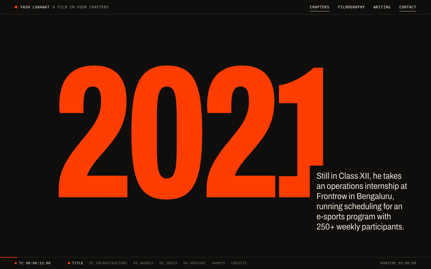
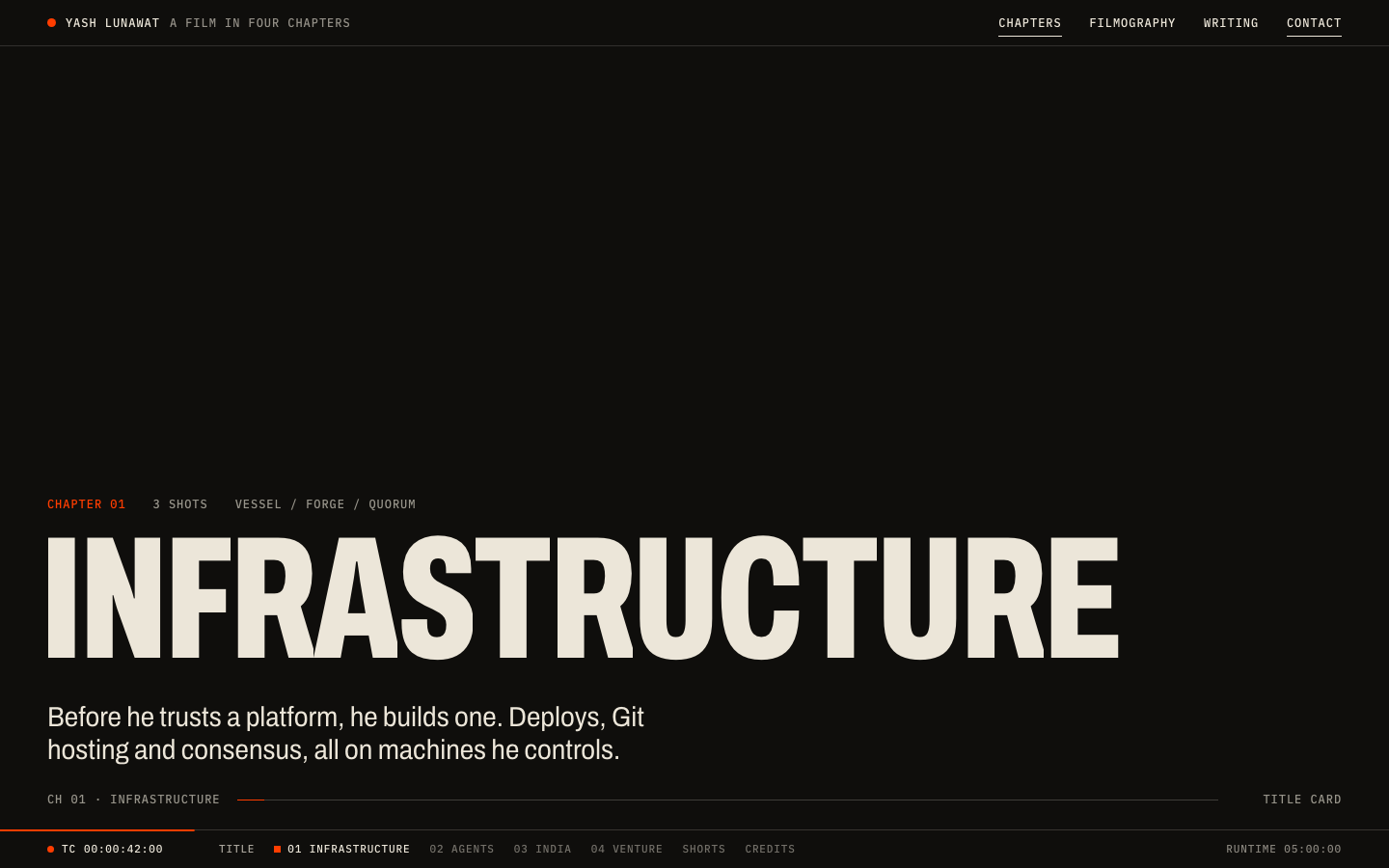
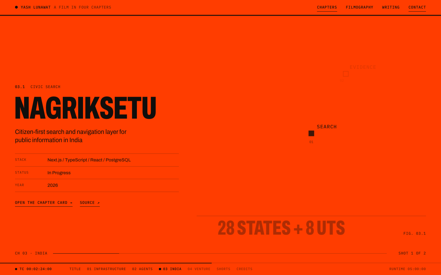
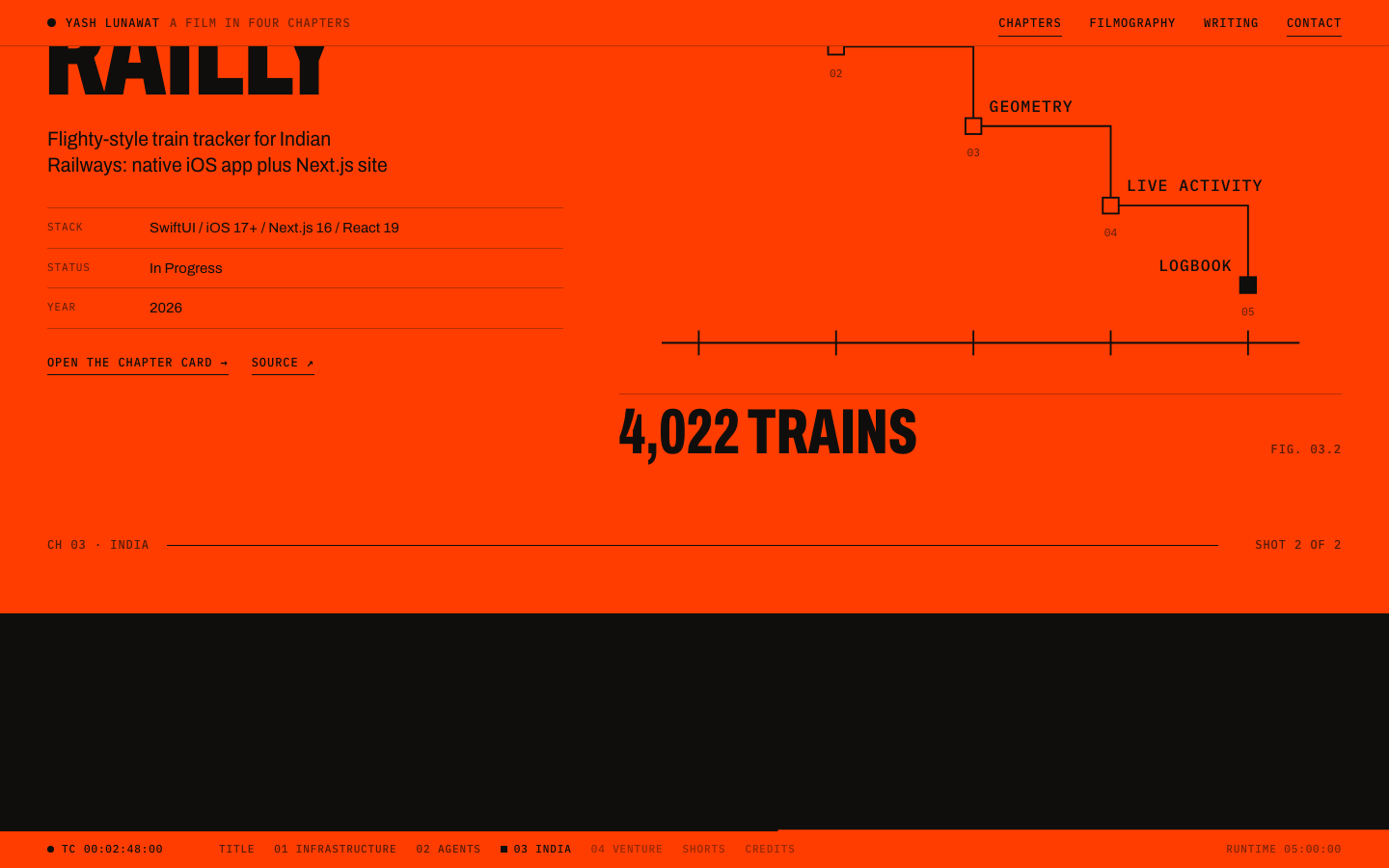
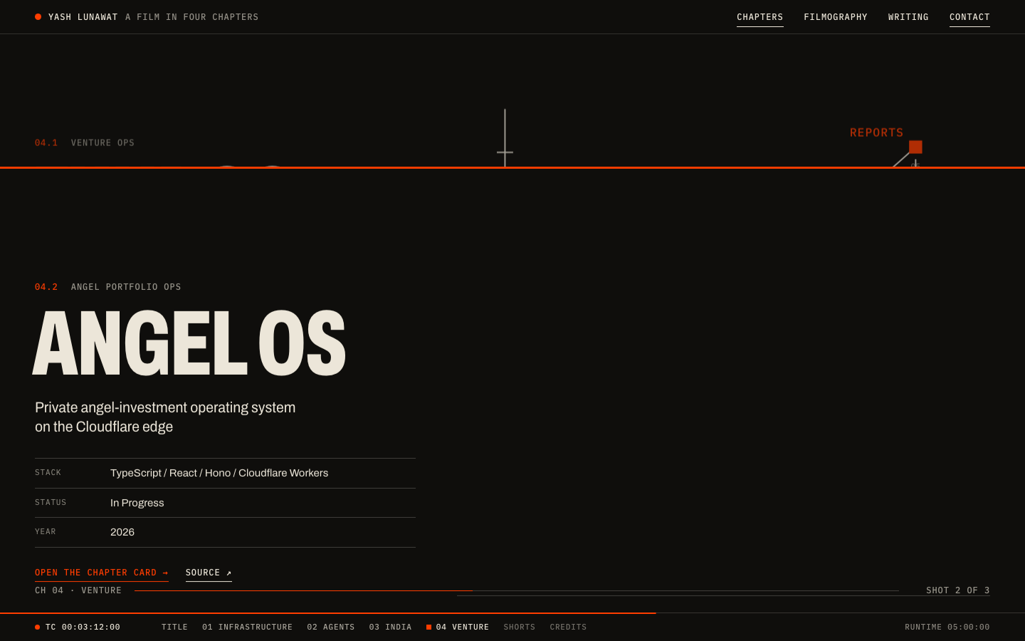
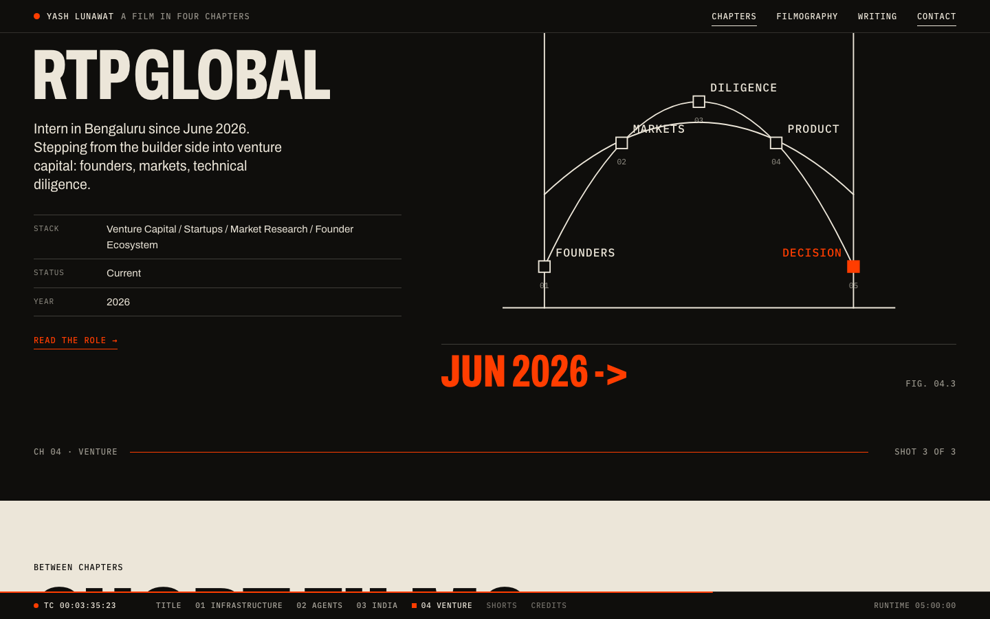
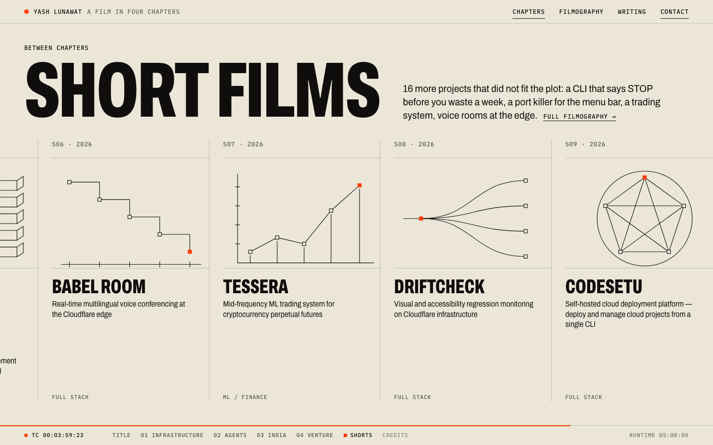
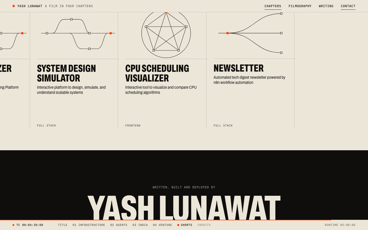
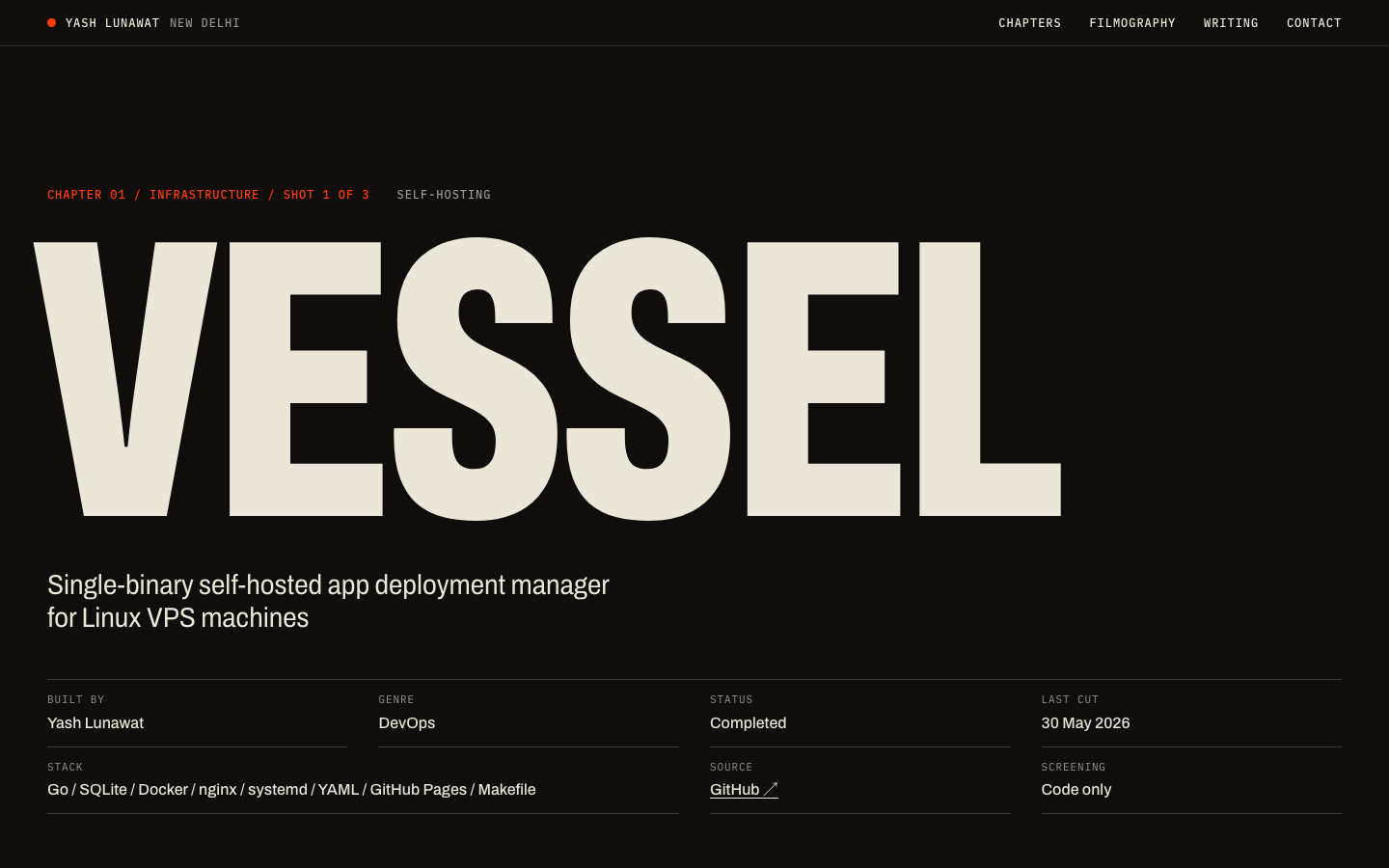
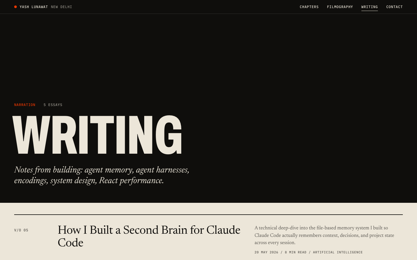
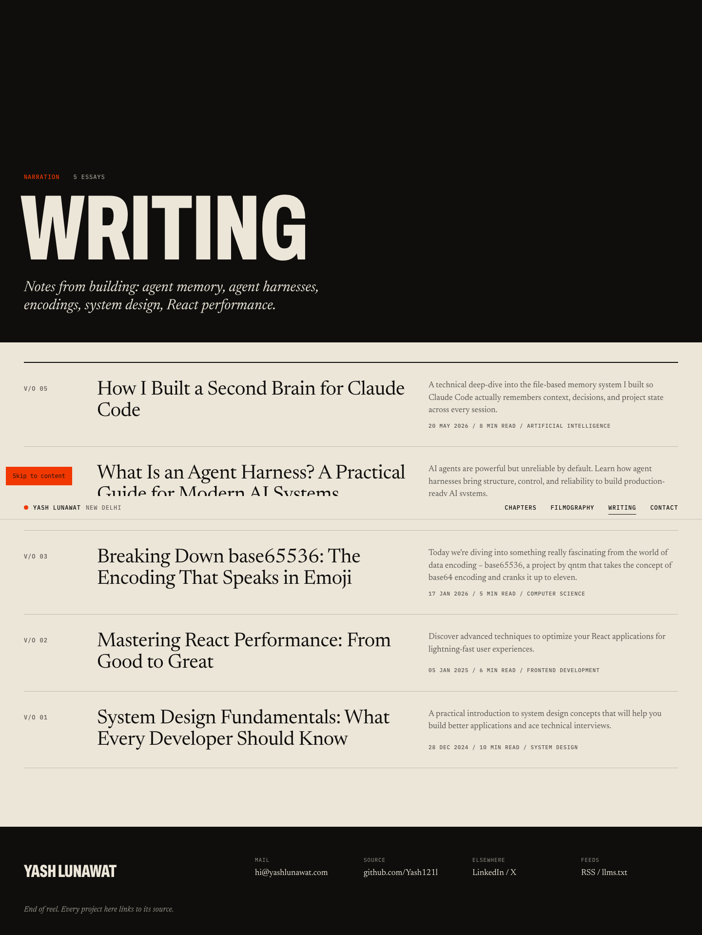
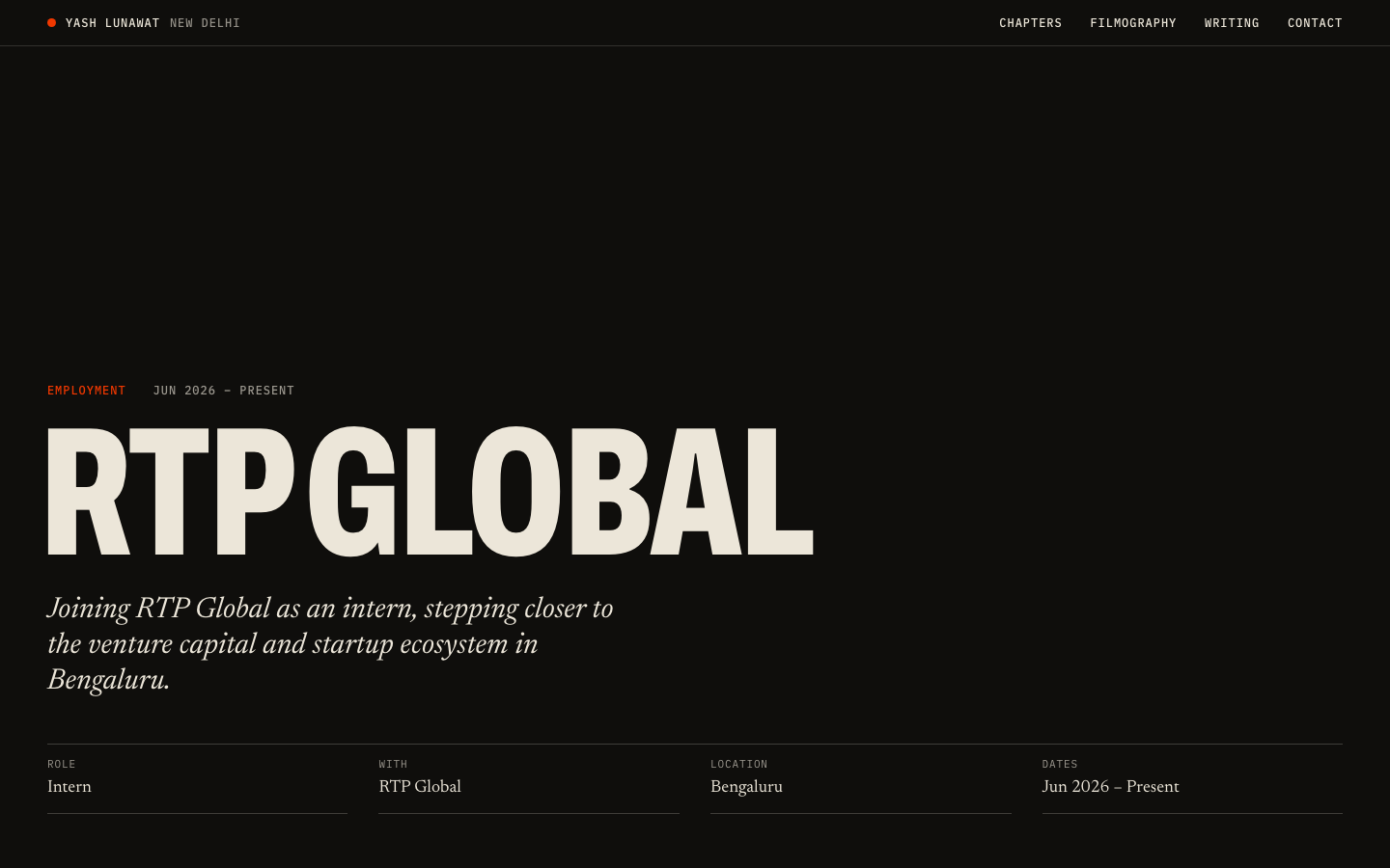
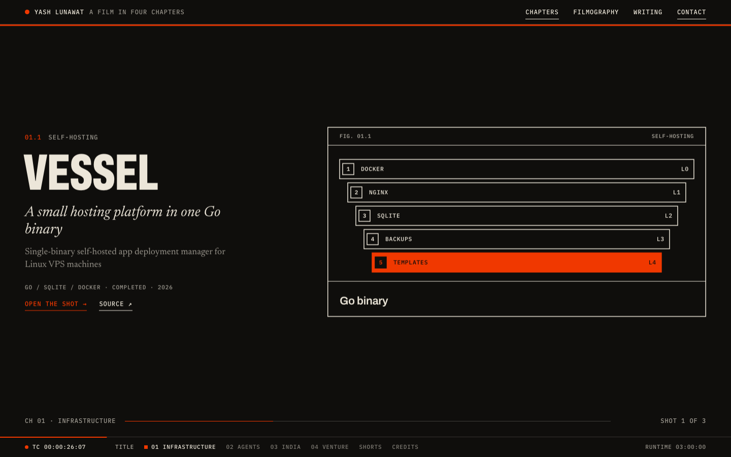
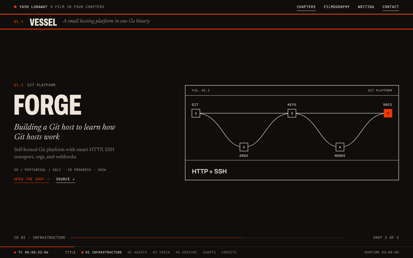
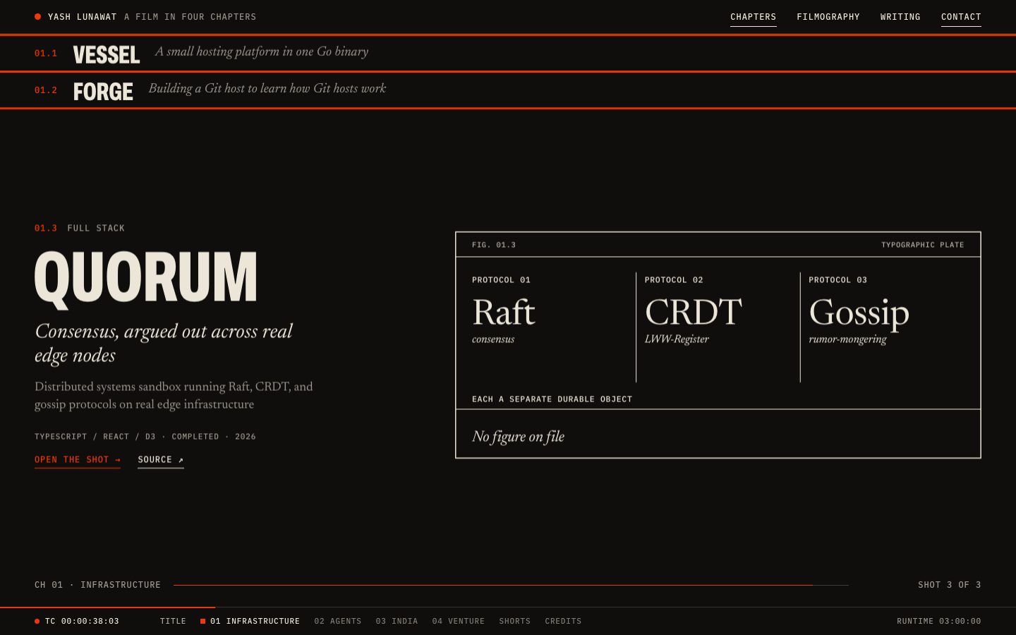
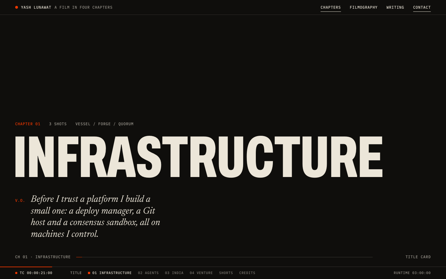
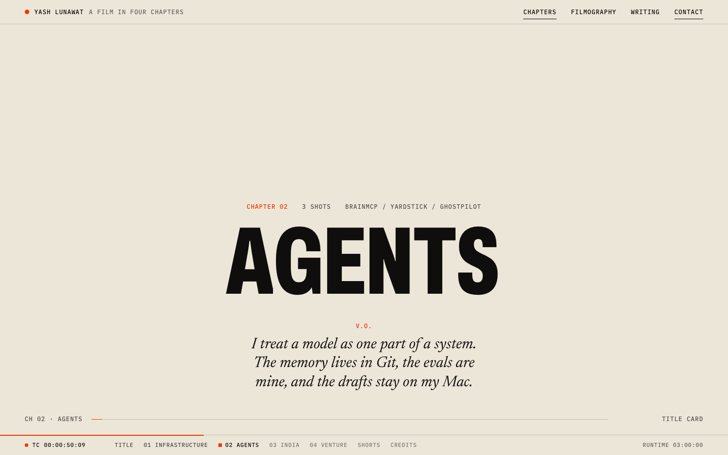
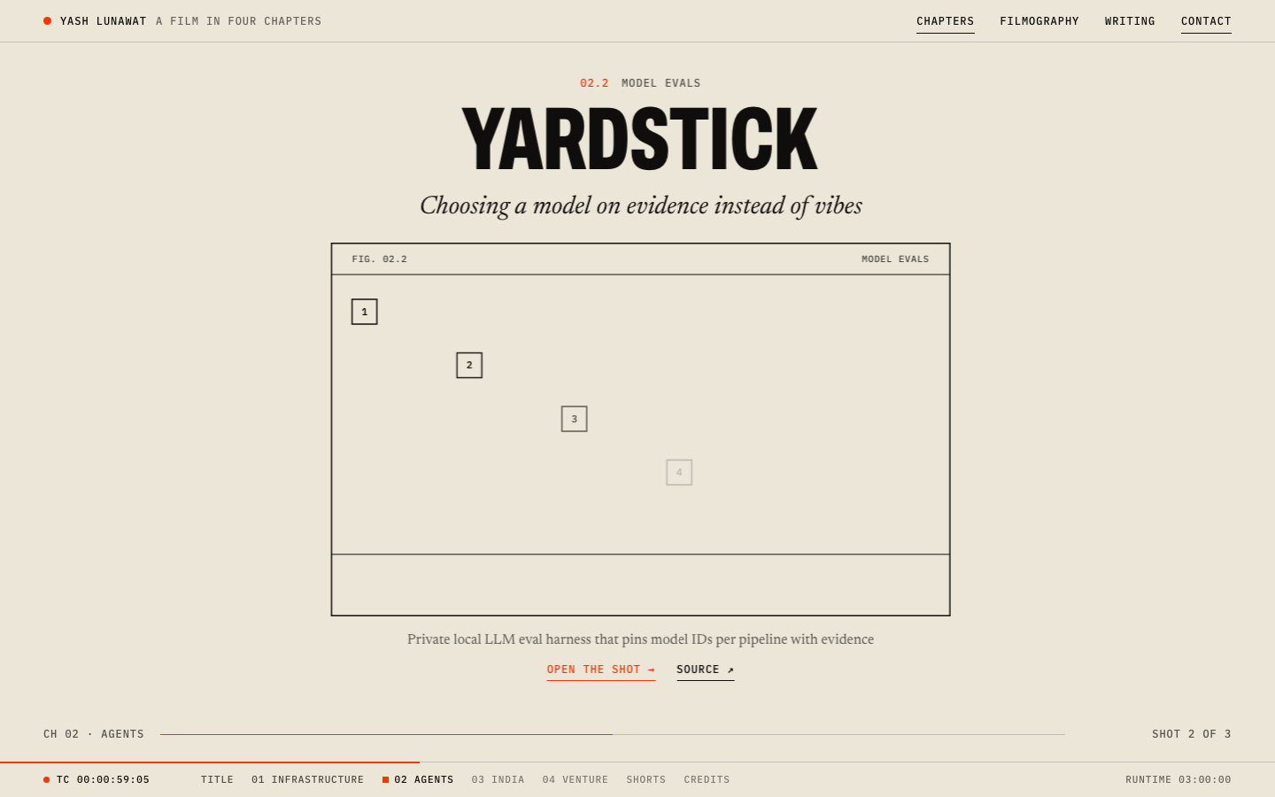
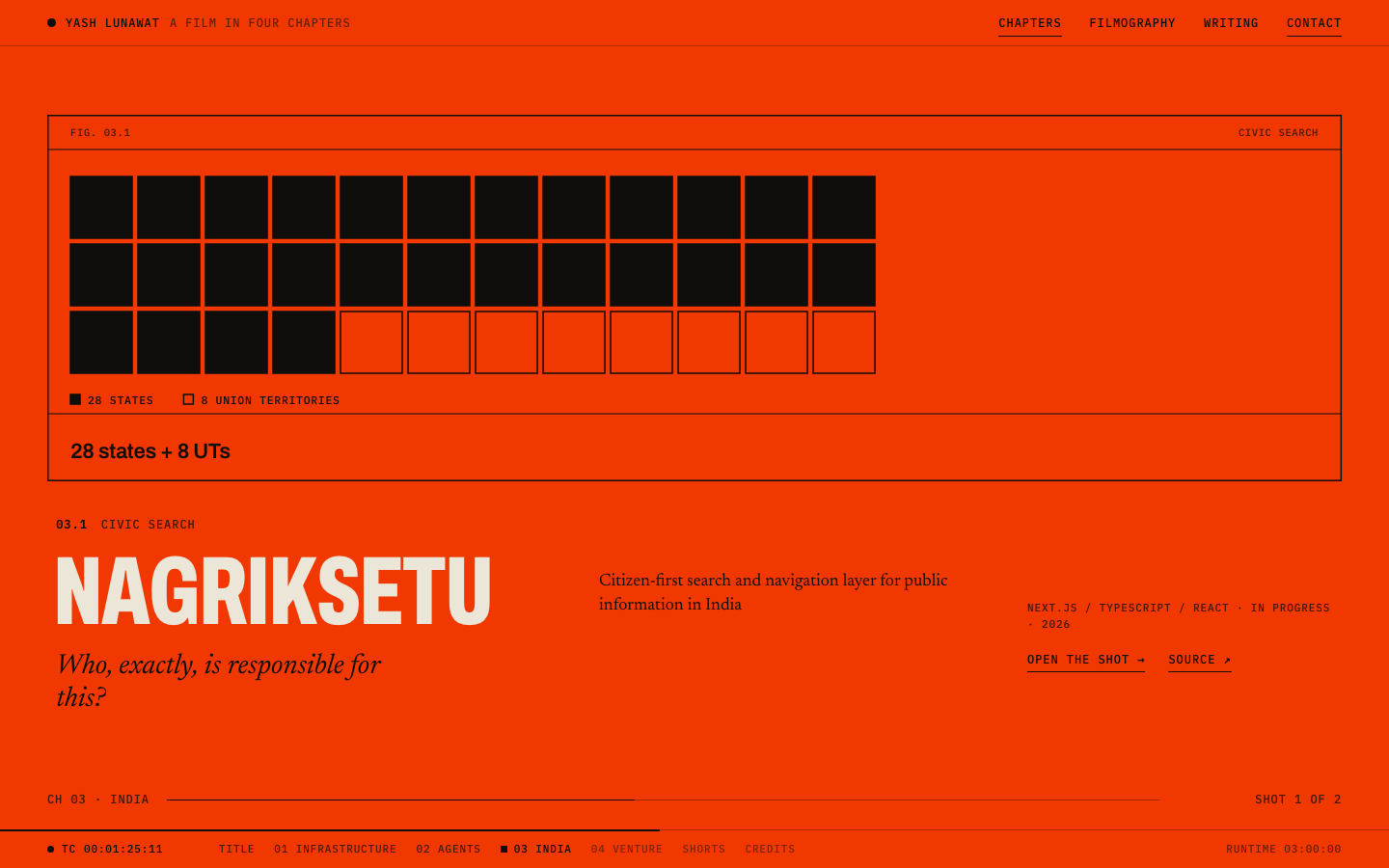
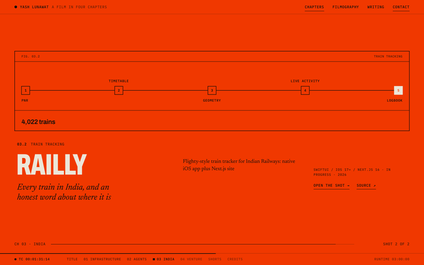
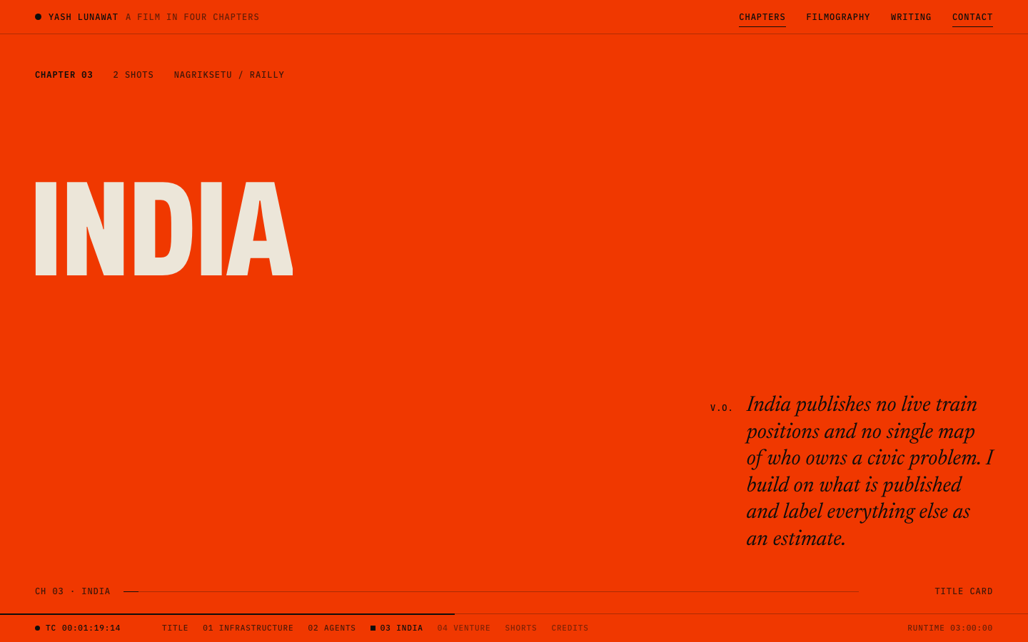
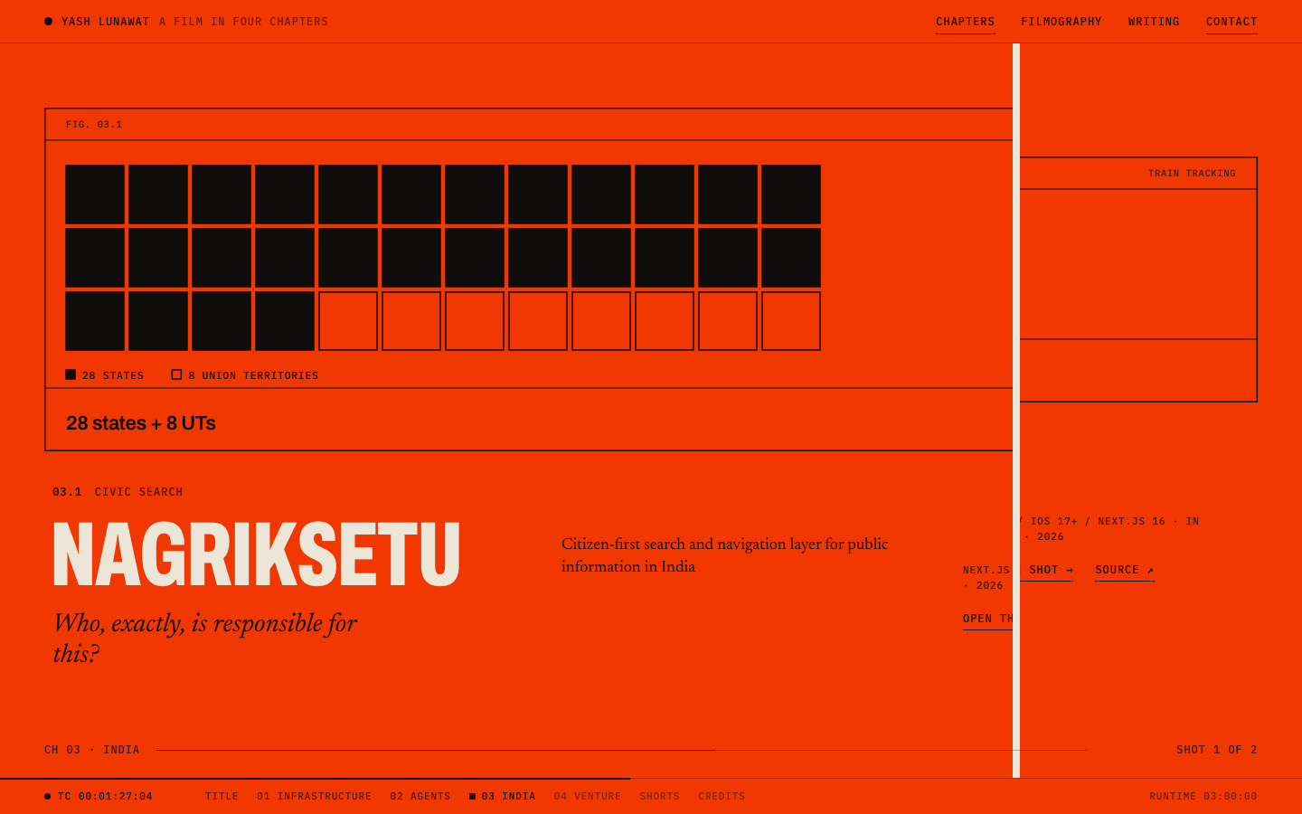
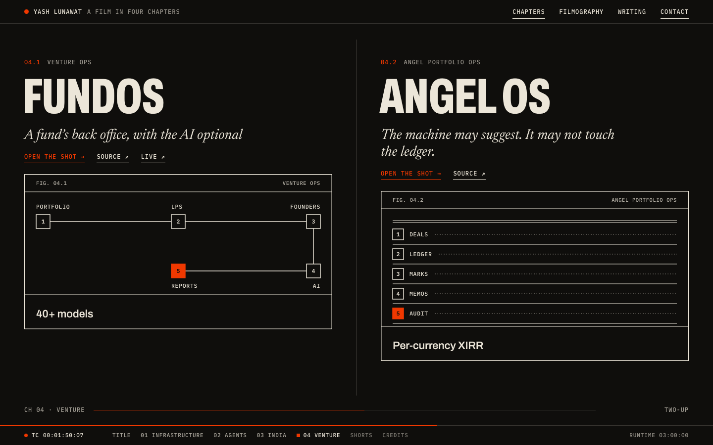
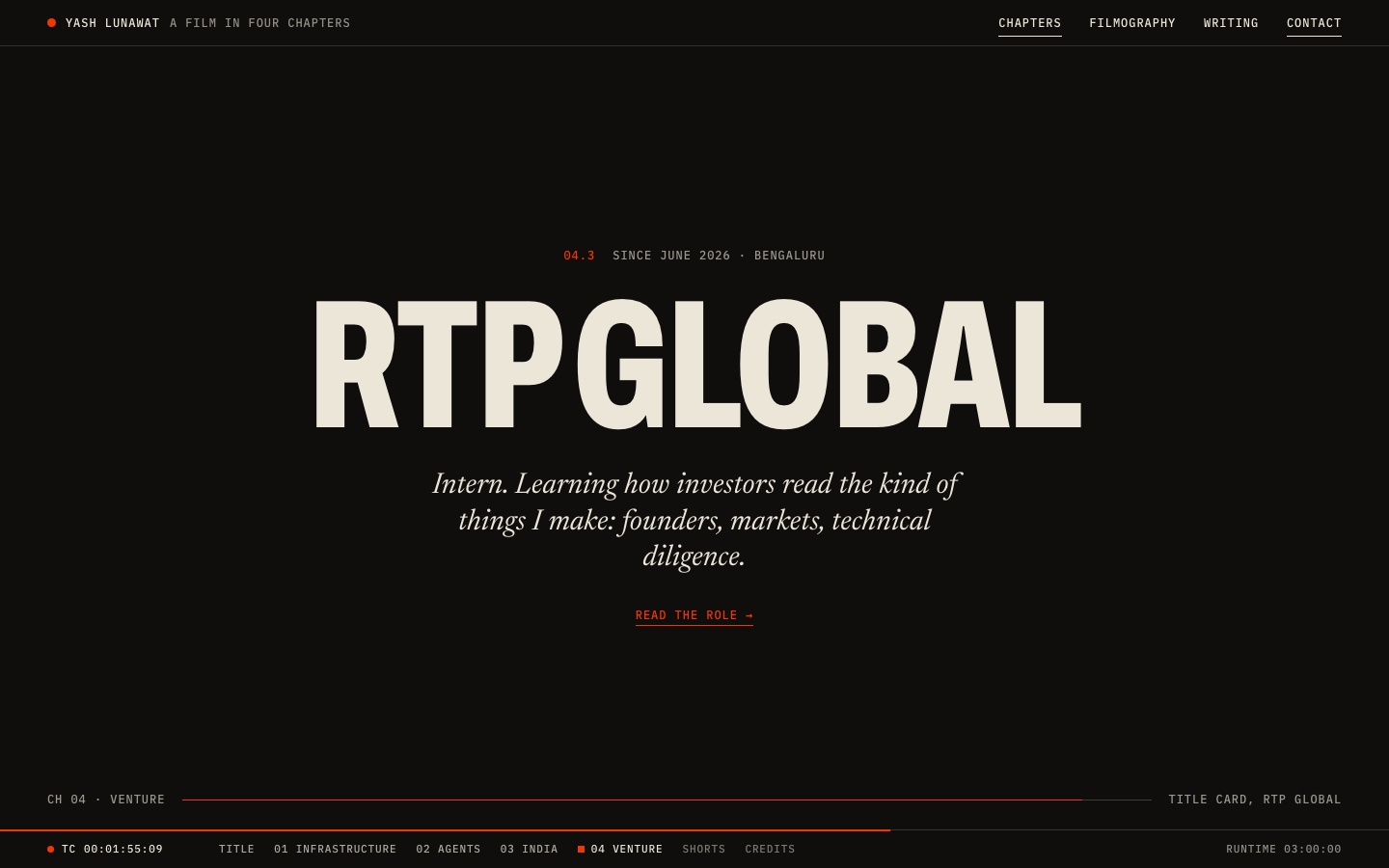
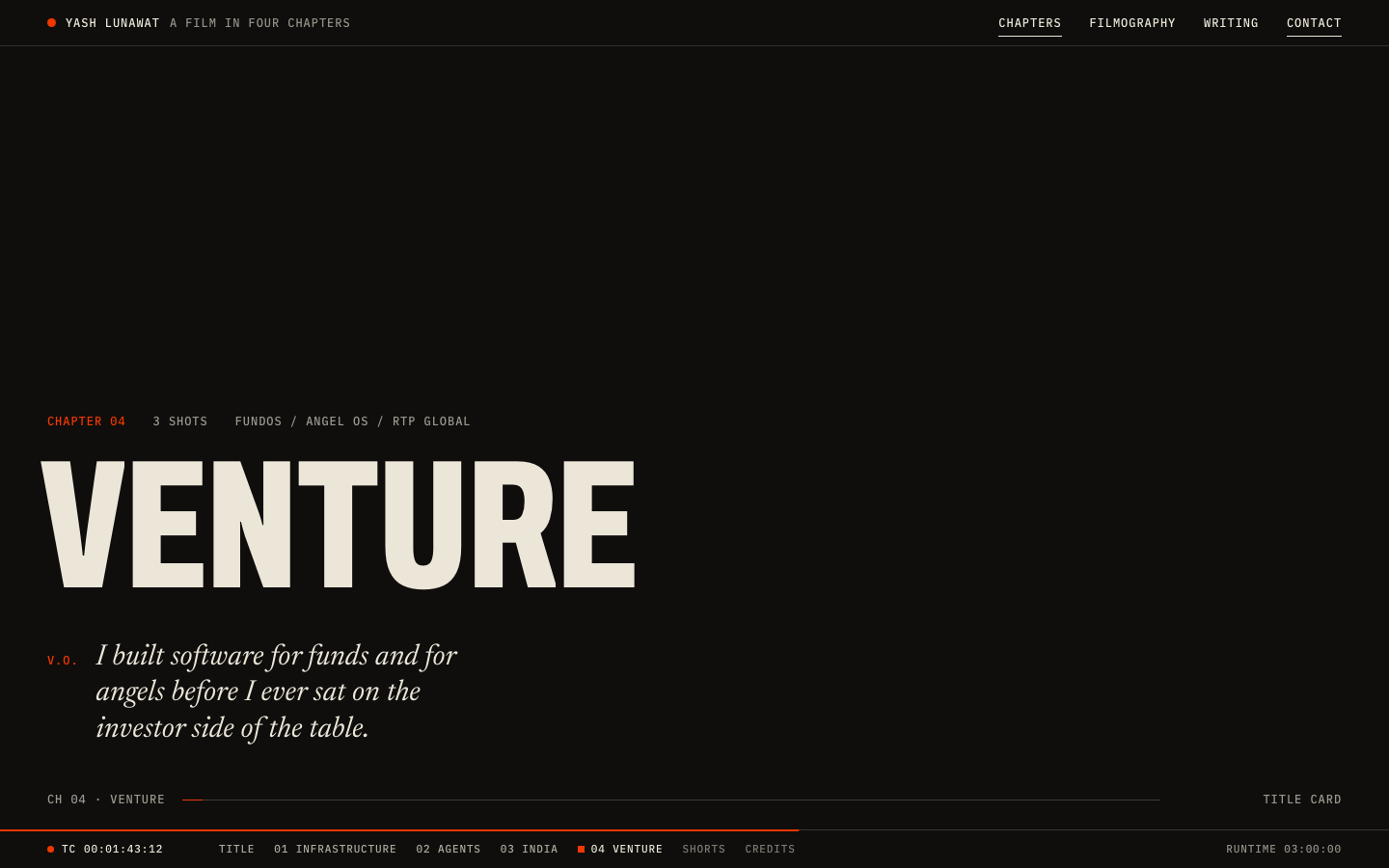
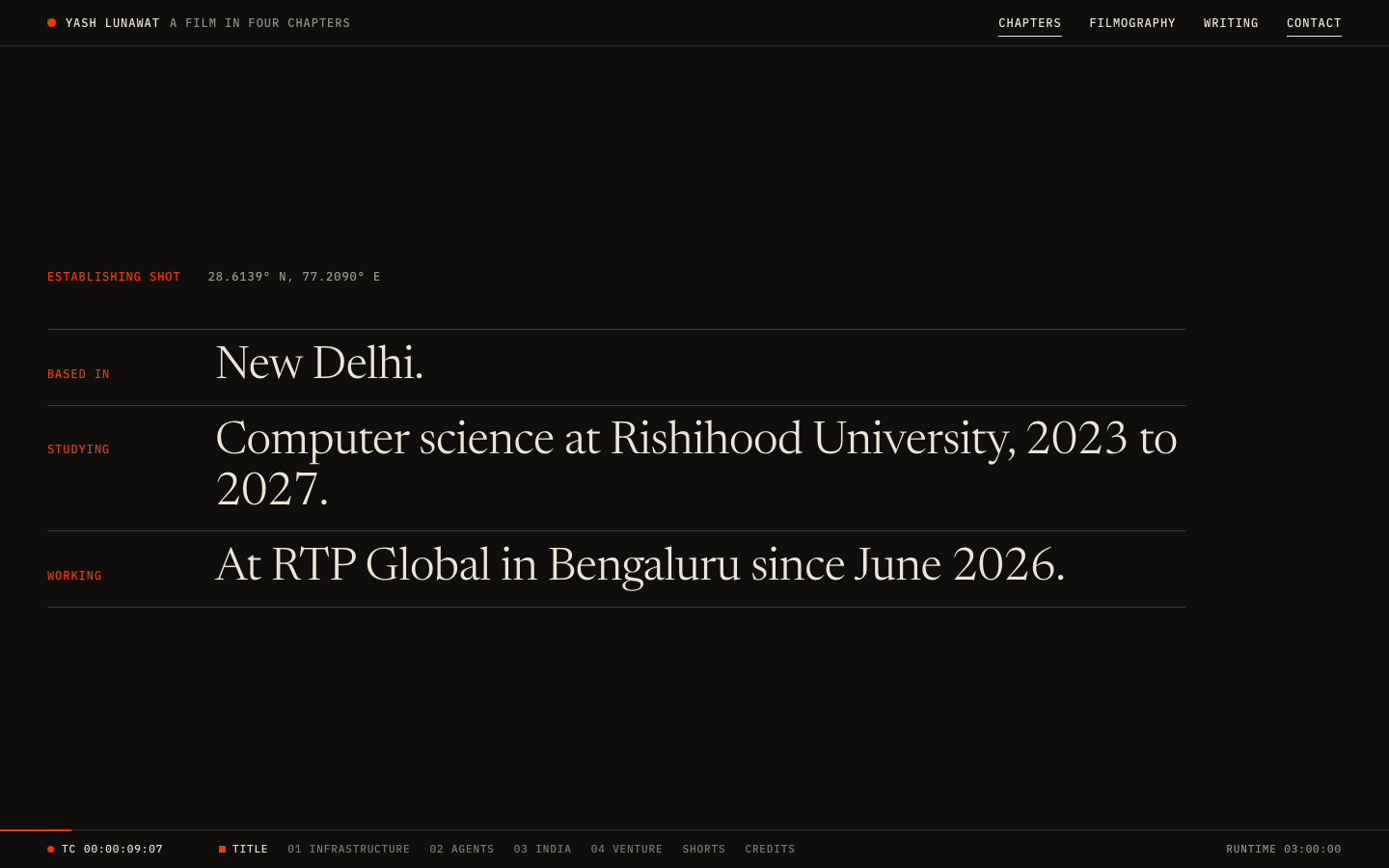
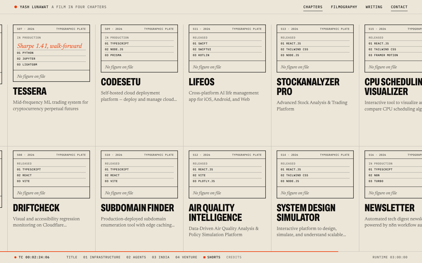
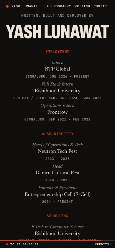
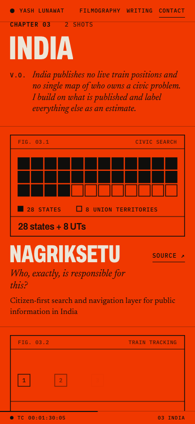
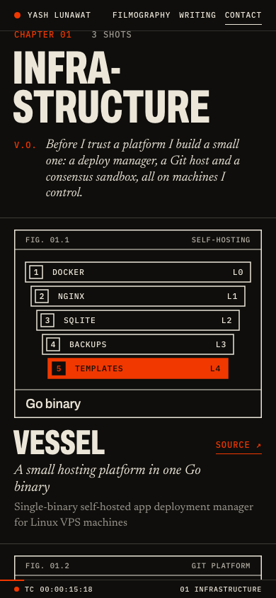
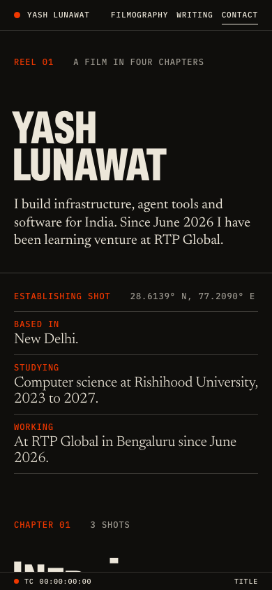
The home page is a title sequence, and the projects are the chapters of a short film: New Delhi, 2021, 2023, 2026, then Infrastructure, Agents, India, Venture, a strip of short films, and end credits. The scroll is mapped to a five-minute reel with a running timecode, so after 30 seconds you should feel "I just watched a five-minute film about this person in ninety seconds."

Memorable device

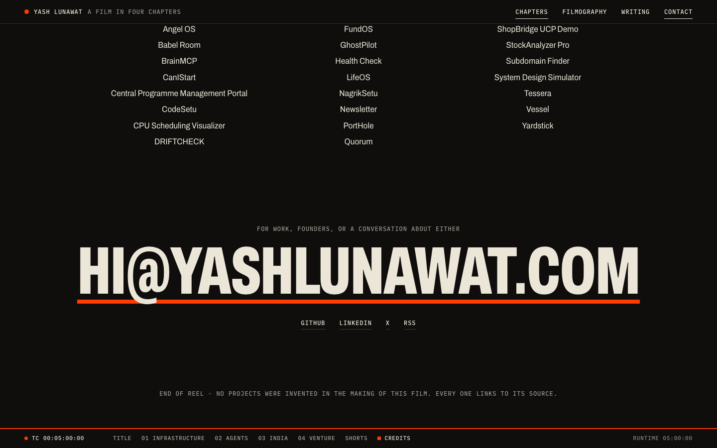
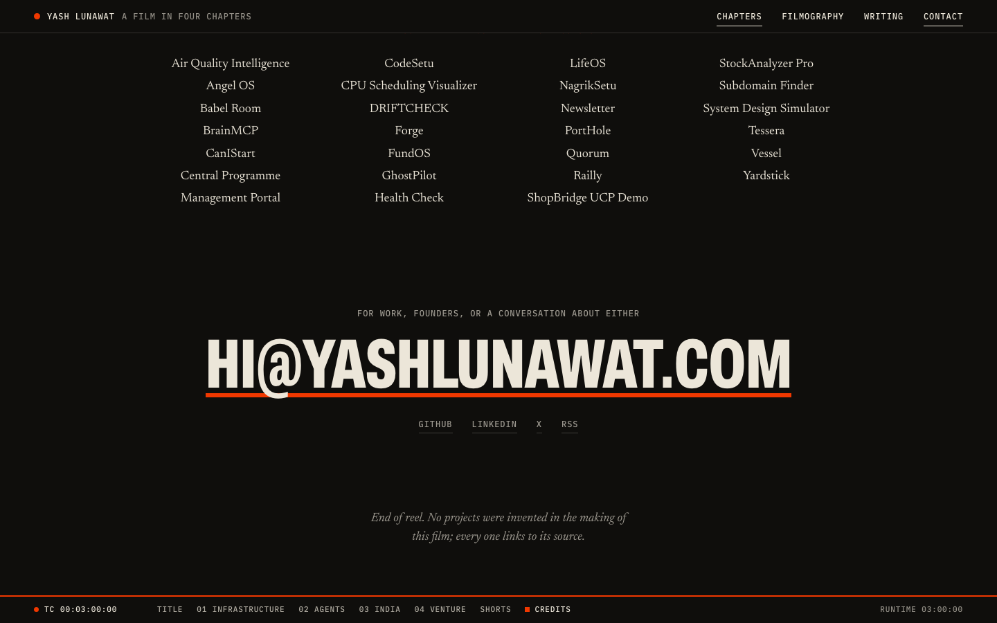
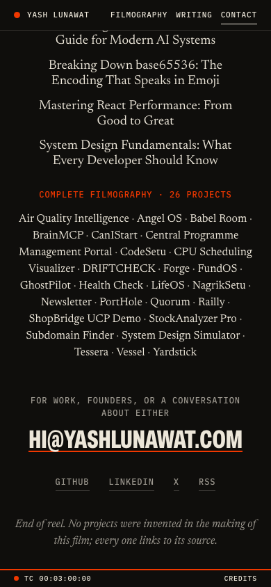
The timecode running in the bottom bar and reaching 00:05:00:00 at the email address, with the credits reading "No projects were invented in the making of this film."

Self-critique

  • **First impression:** the title card is a strong frame, but the band between the name and the footer is 40% empty ink, and a thumbnail reads as a generic "big name on black" until you scroll. The concept only proves itself in motion.
  • **Originality:** timecodes, slates and end credits are known film tropes. What stops it being a costume is that the tropes carry content: the scene index is the navigation, the credits are the CV. The year cards are the weakest part and are close to a keynote slide.
  • **Typography:** width-fitted condensed caps are powerful but monotonous. Every title on every page is the same 800-weight 62%-width uppercase, so after four chapters the eye stops registering scale. A contrasting voice (a serif italic for narration, say) is missing.
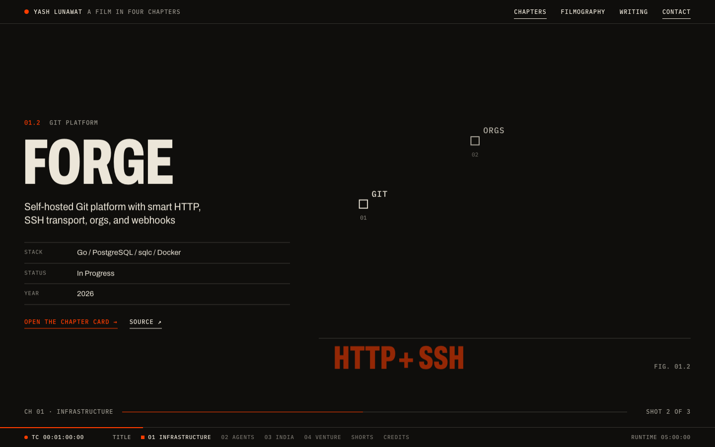
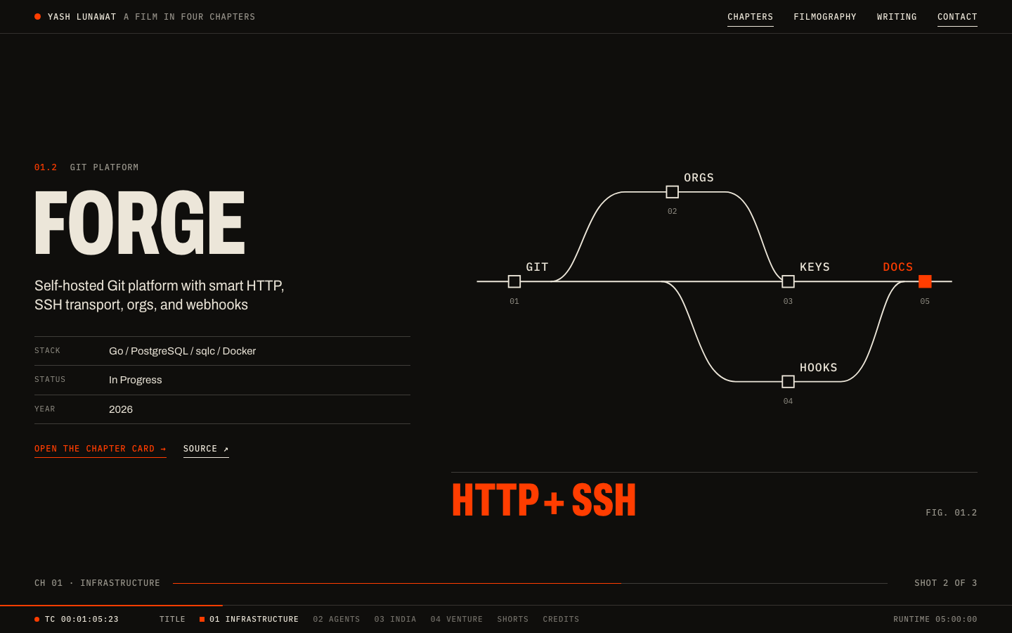
  • **Hierarchy:** inside a shot, the name, the metric and the diagram all compete. The metric ("GO BINARY", "HTTP + SSH") in hot orange is often louder than the project name, and it is the least informative element.
  • **Storytelling:** the four-chapter arc works, and putting RTP Global in the Venture chapter gives the venture angle a real place. But the prologue claims "started building early" using an ops internship, not a build, because the data has no early projects. The story leans on dates it cannot fully back.
  • **Personality:** the "No projects were invented" line and the plain chapter theses sound like a person. The shot credits (Stack / Status / Year) are dry and identical, and every project reads the same way.
  • **Usability:** pinned chapters mean about 30,000px of scroll on desktop. Someone who wants the project list has to find "Filmography" in the header or scrub the HUD. The HUD scene links help, but a recruiter in a hurry may bounce during the title push.
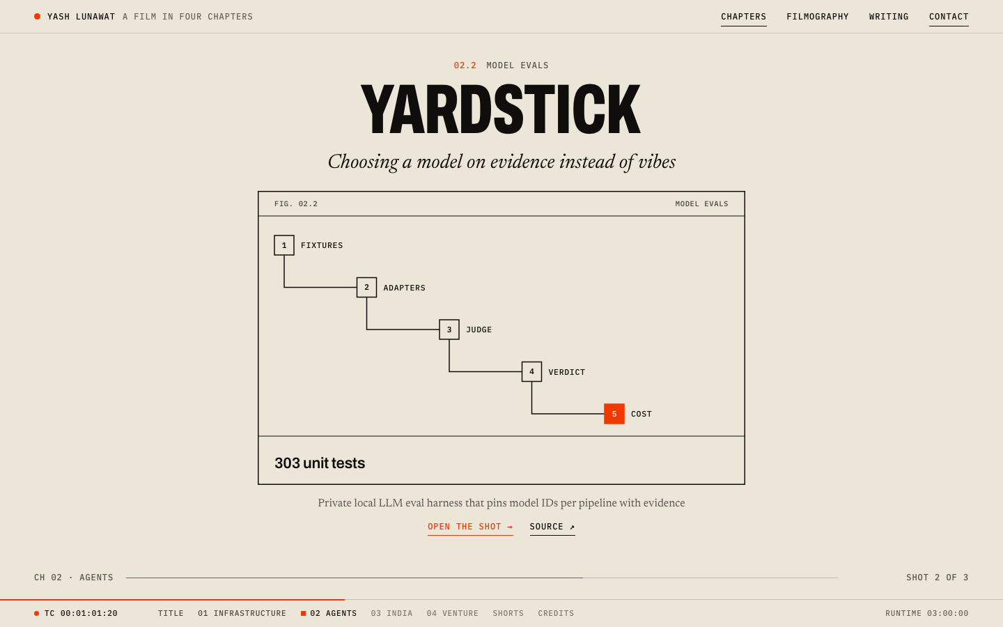
  • **Project presentation:** the diagrams are abstract by design, but several types look alike (four projects use the staircase), and the fallback visuals derived from stack names ("TypeScript" as a node) are weak.
  • **Coherence:** strong. Every page opens on a chapter card with a credits block, and the theme cuts are consistent.
  • **Responsive:** the mobile poster mode is honest and readable. Diagram labels had to be forced to 36px viewBox units to stay legible, and the mesh diagram's index numbers still collide with edges at 390px.
  • **Motion:** scrubbed, reversible, and it reads as editing. Early in a push the outgoing shot is still at full contrast, so the frame looks busy for about 150px of scroll.
  • **Craftsmanship:** the header bar ignores pointer events on its background, so clicks in the empty bar fall through to the content beneath. The diagram index numbers overlap lines in the radial types.
  • **Looks AI-generated / template:** not template-like. The orange India field and the timecode are distinctive. The detail-page body (sticky figure plus numbered lists) is the most generic part.
  • **Fit to Yash:** good for "ships a lot, runs things, now learning venture". It says less about the event-running side (Neutron, Damru), which only appears as credits lines.

Worth stealing

  • **The scroll as a timecode:** map document progress to a fixed runtime and show it in a persistent bar that doubles as a clickable scene index. It is progress, navigation and a signature in one element.
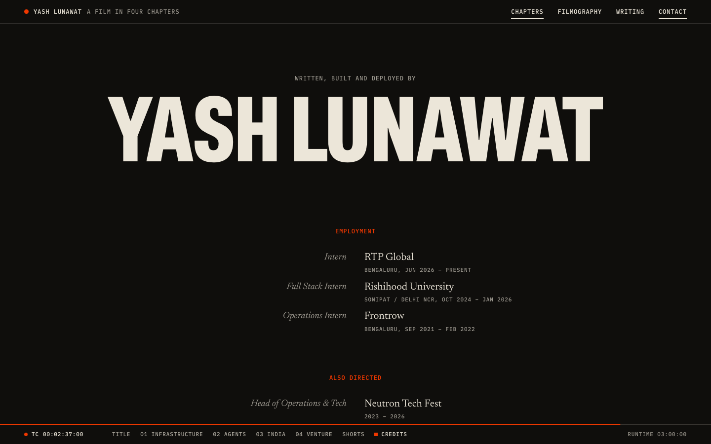
  • **End credits as the CV:** experience, leadership, education, writing and the full project list set as a two-column credits roll (role right-aligned, name left-aligned), ending on the email address. It makes the boring part of a portfolio the finale.
  • Also: width-fitted titles from character count (`calc(Nvw / var(--chars))`), and one chapter set as a full field of the accent colour.

Coordinator verdict

Not advanced. The orange India chapter and the end-credits CV are memorable, and scroll-as-timecode is a good signature. But one heavy condensed voice for every title on 30,000px of scroll goes monotonous, the metric shouts over the project name, and mobile loses the pinning that justified it.

37 screenshots
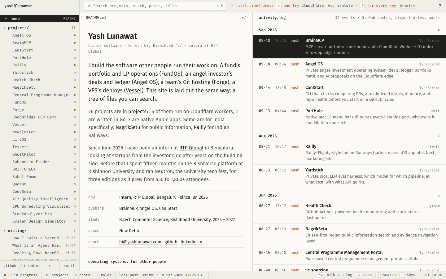
blog-detail-desktop-top.png
blog-detail-desktop.png
blogs-desktop-top.png
blogs-desktop.png
blogs-desktop.png
experience-desktop-top.png
experience-desktop.png
home-mobile-top.png
home-mobile-top.png
home-mobile.png
home-mobile.png
home-reduced-motion.png
home-scroll-000.png
home-scroll-000.png
home-scroll-001.png
home-scroll-001.png
home-scroll-004.png
home-scroll-004.png
home-scroll-014.png
home-scroll-014.png
home-scroll-020.png
home-scroll-020.png
home-scroll-022.png
home-scroll-022.png
home-scroll-026.png
home-scroll-026.png
home-scroll-030.png
home-scroll-030.png
home-scroll-040.png
home-scroll-040.png
home-scroll-044.png
home-scroll-044.png
home-scroll-048.png
home-scroll-048.png
home-scroll-056.png
home-scroll-056.png
home-scroll-064.png
home-scroll-064.png
home-scroll-072.png
home-scroll-072.png
home-scroll-080.png
home-scroll-080.png
home-scroll-090.png
home-scroll-090.png
home-scroll-100.png
home-scroll-100.png
project-detail-desktop-top.png
project-detail-desktop.png
project-detail-mobile-top.png
project-detail-mobile.png
project-detail-short-desktop-top.png
project-detail-short-desktop.png
projects-desktop-top.png
projects-desktop.png
projects-hover-interaction.png
projects-mobile-top.png
projects-mobile.png
projects-mobile.png

05 Brutalist document

https://v5.yashlunawat.com/ · worktree portfolio-05 · branch design/portfolio-05 · cd /Users/admin/.t3/worktrees/portfolio/portfolio-05 && npx vite --port 5205

Brutalist document home

Thesis

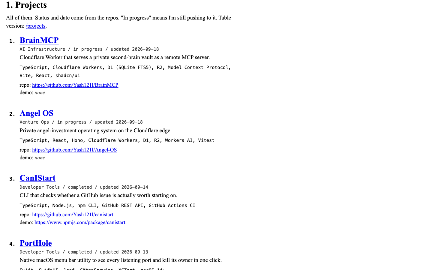
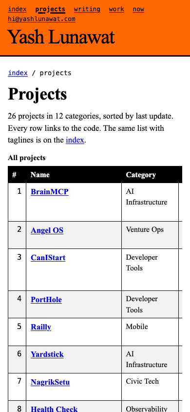
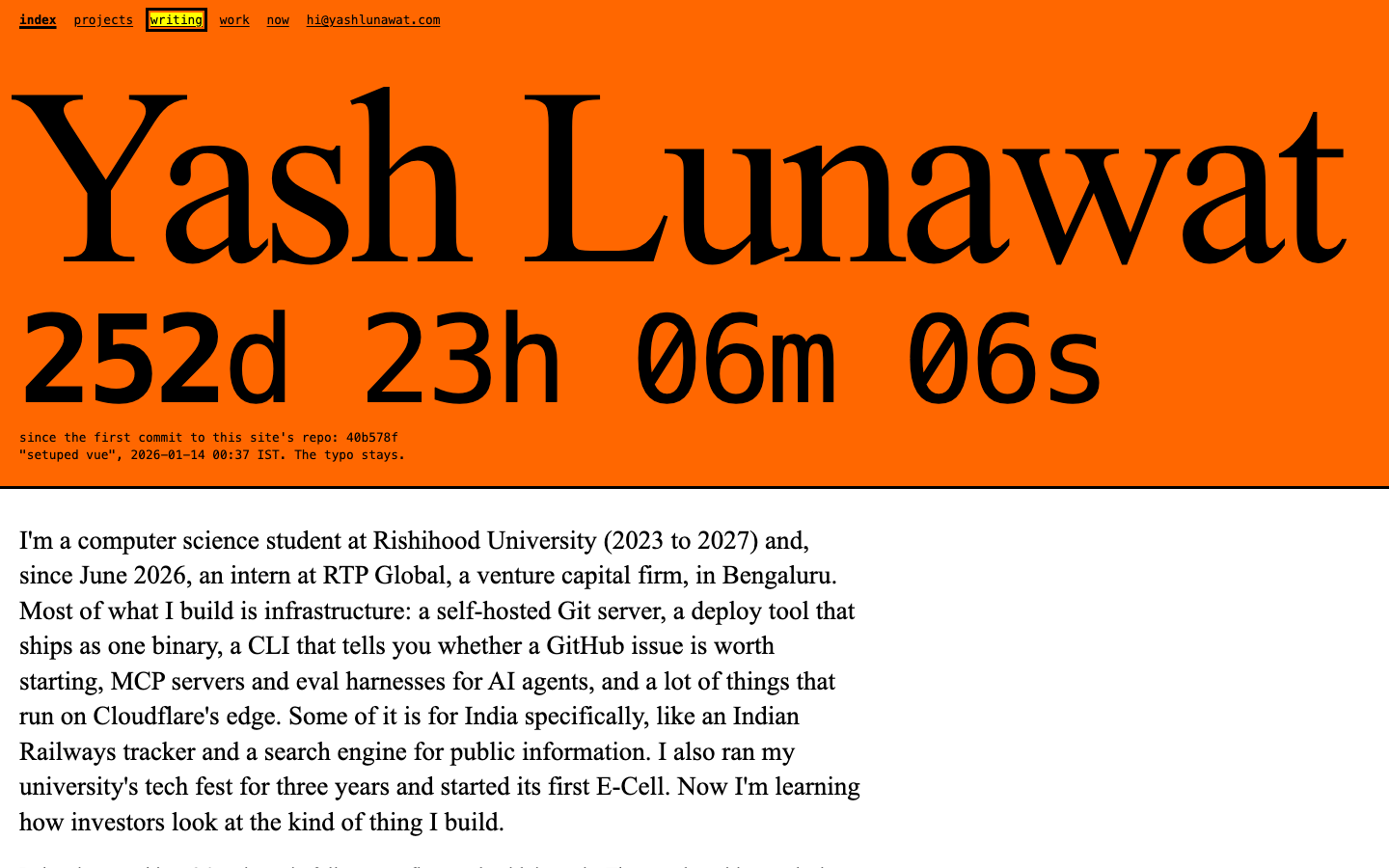
The fastest, most honest page on the internet about Yash: one long typed document with his name, a plain paragraph, all 26 projects in full with their code links, then work, writing, and now. After 30 seconds you should feel "this person has nothing to hide and is not trying to impress me," and be slightly impressed by that.

Memorable device

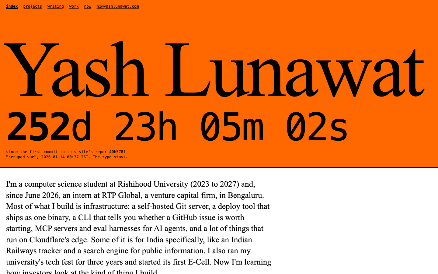
The counter: **`252d 23h 05m 02s`**, set in mono nearly as wide as the name, ticking every second. It is labelled as time since the first commit to the site's own repo: `40b578f "setuped vue", 2026-01-14 00:37 IST. The typo stays.` That is the one flourish (option c). It is a true fact taken from `git log --reverse`, and keeping the typo is the site's personality in one line. With `prefers-reduced-motion` it updates once a minute and drops the seconds.

Self-critique

  • **First impression:** the orange slab with a 260px Times name and a big ticking number lands in under a second and is unmistakable from a thumbnail. But the masthead is 500px tall at 1440, so the first thing you read that is *about him* sits at the fold. For a "fastest page" thesis, you spend a screen on a name and a clock.
  • **Originality:** the brutalist personal site is a known genre (motherfuckingwebsite, the 2019 brutalist-web wave). The orange plus default blue, and the commit counter with the typo, make it his own, but a design-literate viewer will name the genre immediately.
  • **Typography:** Times at 260px with tight tracking holds up. Times at 19px on non-Retina Windows is thin and old-fashioned, and I made no attempt to fix that. Mono meta lines next to serif body sometimes look like two documents pasted together, most visibly where `<time>` renders slightly bigger than the serif around it in tables.
  • **Hierarchy:** it collapses after the masthead, deliberately, but too far. Project names (1.45em blue bold) are the only landmarks in an 11,000px-tall mobile page. Section h2s ("2. Work") barely outrank project h3s, so on mobile you lose track of where Projects ends.
  • **Storytelling:** the lede paragraph does the work (builder, infra, India, fests, now venture) and the "Now" list is specific. The venture angle is still one sentence. Nothing on the page shows how he thinks about investing, because the data does not contain it and I would not invent it.
  • **Personality:** the typo line and the "demo: none" honesty carry it. "If you want one thing, read about CanIStart" is the only opinion on the page. Everything else is data dumped as fields, which fits the thesis but gives very little voice.
  • **Usability:** very good for scanning and Ctrl-F. Every URL is visible and copyable, and keyboard focus is loud. Bad for comparing projects on mobile, where the table scrolls sideways. There is no filter, deliberately.
  • **Project presentation:** the strongest part. 26 projects in full on the home page, with code links, is exactly what a recruiter wants. Weakness: the list has no grouping, so the Venture Ops pair (FundOS, Angel OS) and the India pair (Railly, NagrikSetu) are scattered by date and the themes from the brief never surface.
  • **Coherence:** high. Every page uses the same masthead, breadcrumbs, dl or table, and hr. The small masthead on subpages drops the counter, so the one flourish only exists on `/`.
  • **Responsive:** works at 390 and 1440 without overflow. The empty right half at 1440 is intentional but reads as unfinished to anyone who does not know the genre.
  • **Motion:** only the counter. It is honest, though a number ticking every second in 125px mono does pull the eye while you read the lede.
  • **Craftsmanship:** semantic landmarks, a real `<ol>`/`<dl>`/`<table>` with captions and `scope`, skip link, `role="timer"` with a label so screen readers do not hear every tick. Weakness: the whole app still client-renders through Vue. A truly raw page would be static HTML with the counter as a 20-line inline script.
  • **Memorability:** the counter and the typo are memorable. The body is not, by design.
  • **Looks AI-generated:** low. No gradients, cards, pills, or stat rows. The risk is that "brutalist template" is itself a recogni

Worth stealing

  • **"Since the first commit" counter with the real hash and commit message** (`40b578f "setuped vue"`). A true, self-updating, slightly funny fact about the site itself. It works in any concept as a footer line.
  • **All projects with raw visible URLs and an explicit "demo: none".** Showing the absence builds trust. Every concept should stop hiding projects behind "view more" and write out the repo link.
  • The detail-page field labels "Hard parts / What I learned / Not done yet" instead of "Challenges / Learnings / Enhancements". Same data, human voice.
  • One canonical project order (most recently updated first, `src/lib/order.js`), shared by the list, the table, and "Project 3 of 26".

Coordinator verdict

Not advanced. Honest and fast, and the days-since-first-commit counter with the real typo'd message is the funniest single detail in the tournament. But after the masthead it is a flat list and it undersells the person who runs events for 1,800 people. The counter, demo: none honesty, and human field labels are stolen.

16 screenshots

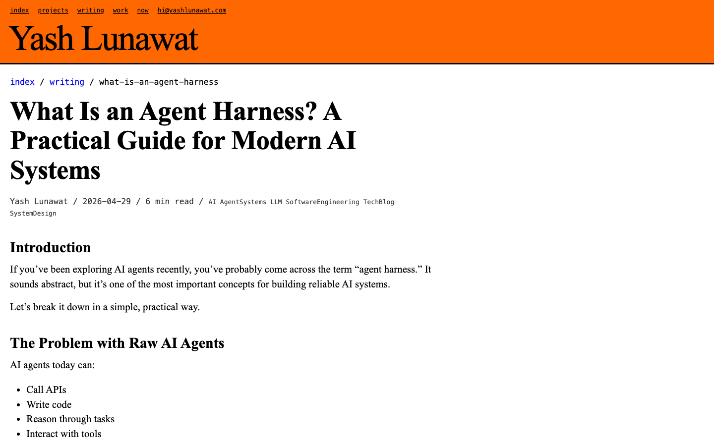
blog-detail-desktop.png
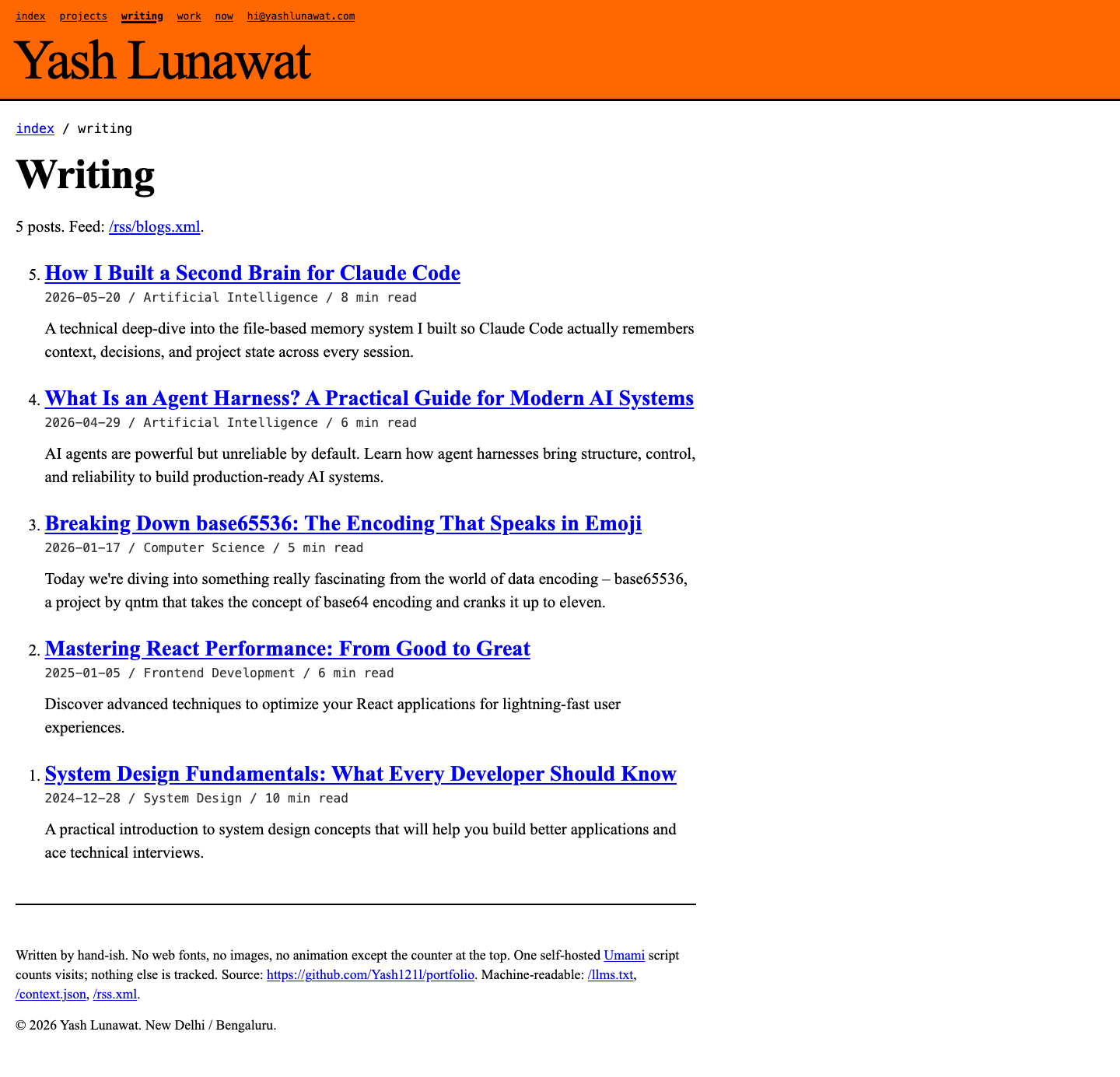
blogs-desktop.png
blogs-desktop.png
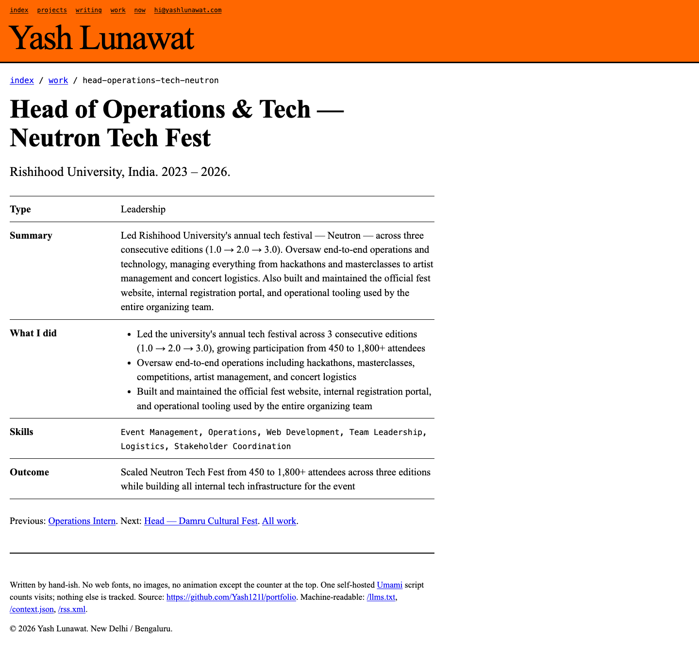
experience-desktop.png
home-desktop-fold.png
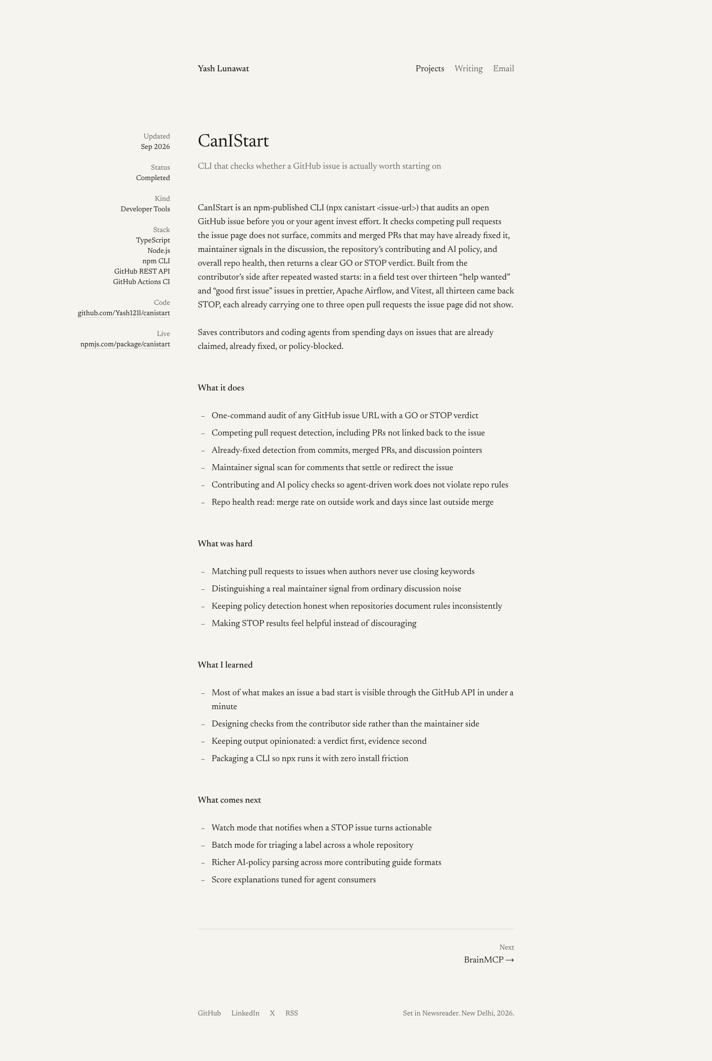
home-desktop-projects.png
home-desktop-work.png
home-desktop.png
home-desktop.png
home-mobile-fold.png
home-mobile.png
home-mobile.png
mobile-projects.png
mobile-projects.png
mobile-work.png
mobile-work.png
project-detail-desktop.png
project-detail-mobile.png
projects-desktop.png
projects-mobile.png
projects-mobile.png
state-keyboard-focus.png

06 Quiet minimal

https://v6.yashlunawat.com/ · worktree portfolio-06 · branch design/portfolio-06 · cd /Users/admin/.t3/worktrees/portfolio/portfolio-06 && npx vite --port 5206

Quiet minimal home

Thesis

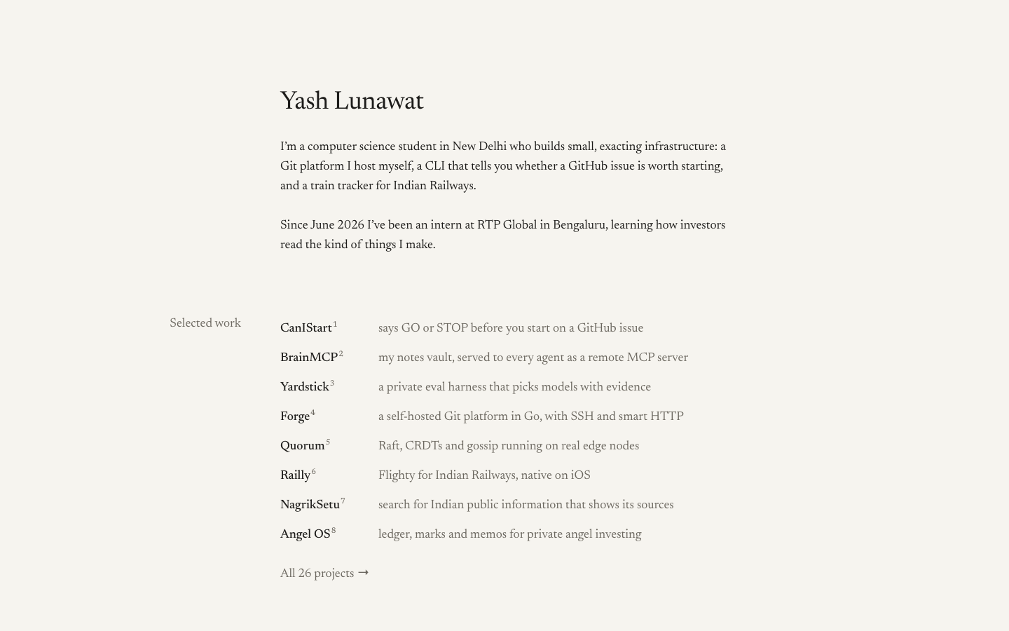
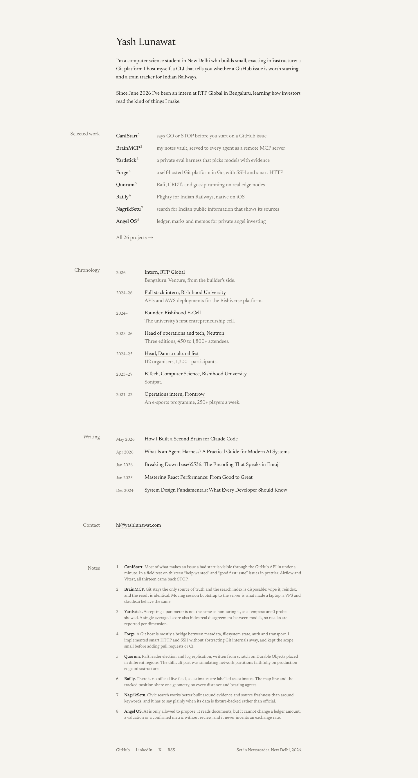
Almost nothing on the page, and every remaining thing is set with care: one serif, one narrow column, warm paper, and footnotes that hold what each project honestly taught him. After 30 seconds someone should feel "someone with taste and nothing to prove".

Memorable device

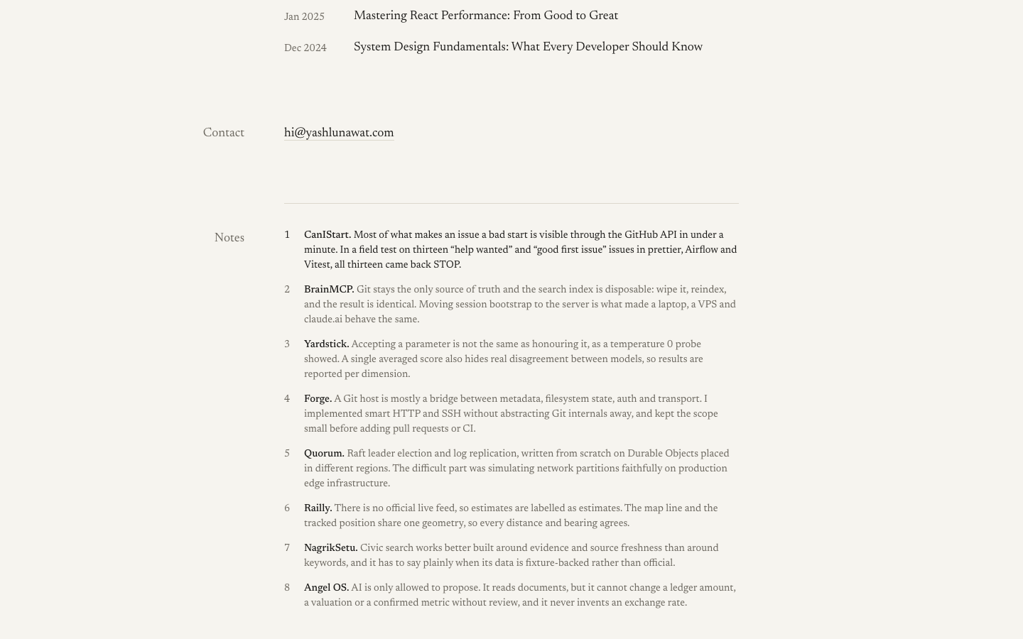
The footnotes. Every project line carries a small superscript number, and at the bottom of the page each one says in a sentence what building it taught him ("Accepting a parameter is not the same as honouring it, as a temperature 0 probe showed"). It reads like a well-set book, not a portfolio.

Self-critique

  • **First impression:** calm and expensive at 1440, but the fold is 60% empty paper and one heading. Someone skimming at speed sees "a text page" and may not stay long enough to find the footnotes, which are the best part and sit ~2,000px down.
  • **Originality:** the type is careful, but "serif column on cream" is a known genre (think gwern and every Tufte-CSS blog). What separates it is the footnotes and the hanging margin labels. Without them it would look like a tasteful Substack.
  • **Typography:** strongest area. Clauses align to a 126px tab stop, numerals switch between old-style and tabular by context, and the quotes are curly even where the data isn't. Weakness: blog titles arrive in Title Case from the data and clash with the sentence-case voice everywhere else. The 14px notes at muted colour are close to the legibility floor on low-quality screens.
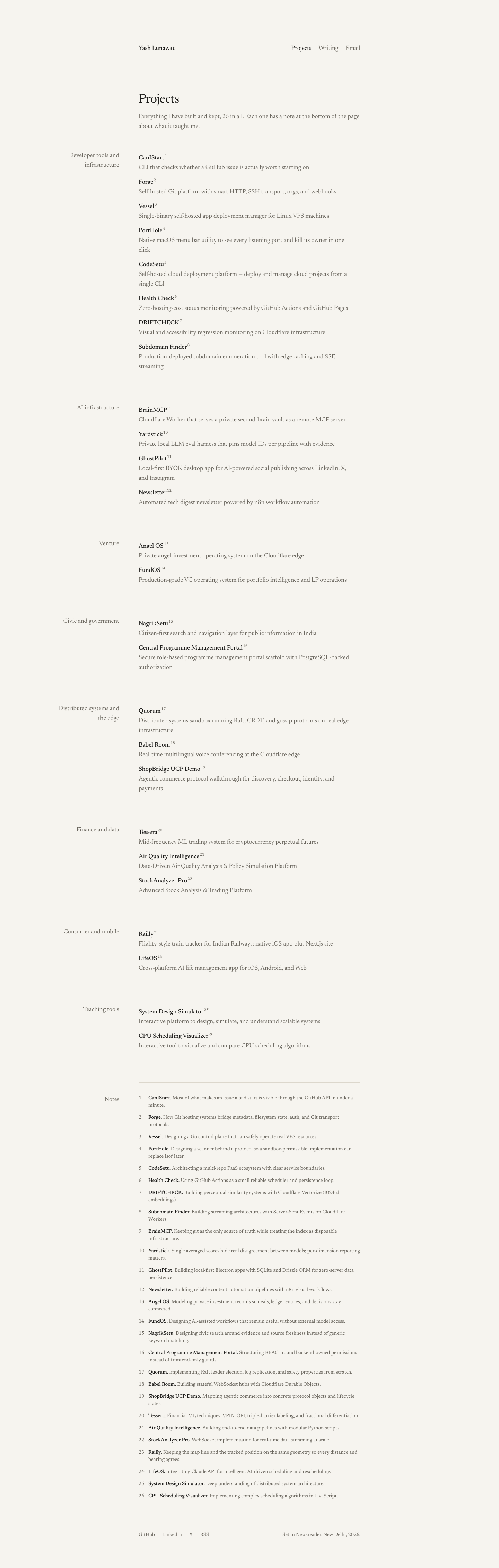
  • **Hierarchy:** it works on the home page because weight (500 names) does all the work. On `/projects` it flattens: 26 identical name/tagline pairs with only group labels to break them. Nothing tells you CanIStart matters more than the CPU scheduling visuali

Worth stealing

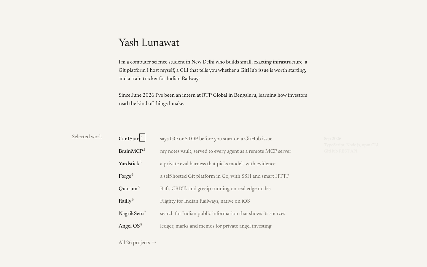
  • **Footnotes of "what I learned"**: a superscript on each project line linking to a one-sentence note at the bottom. Honest, skimmable, and it shows judgement rather than claiming it. Portable to any concept.
  • **Hanging margin metadata**: section labels, dates and project metadata hang in the left margin at desktop so the reading column carries only content. They fold back inline on mobile. This works in almost any layout that has a text column.
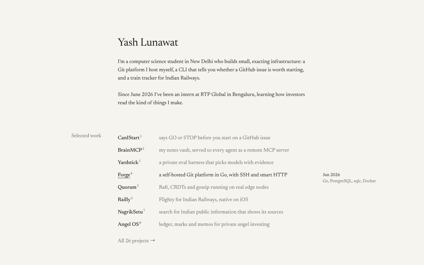
  • Hover reveals context in the empty right margin (date plus stack) instead of adding badges to the line.
  • A `smart()` quote filter at render time, so data-file text gets proper typography.

Coordinator verdict

Not advanced. Precise execution and the best first-person copy (learning how investors read the kind of things I make). But it is gwern or Tufte territory and the fold is a text page. The footnotes of what each project taught him are stolen for the finalists.

13 screenshots
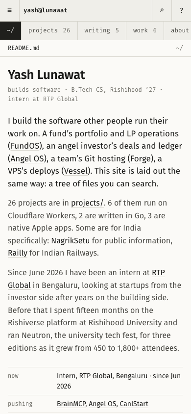
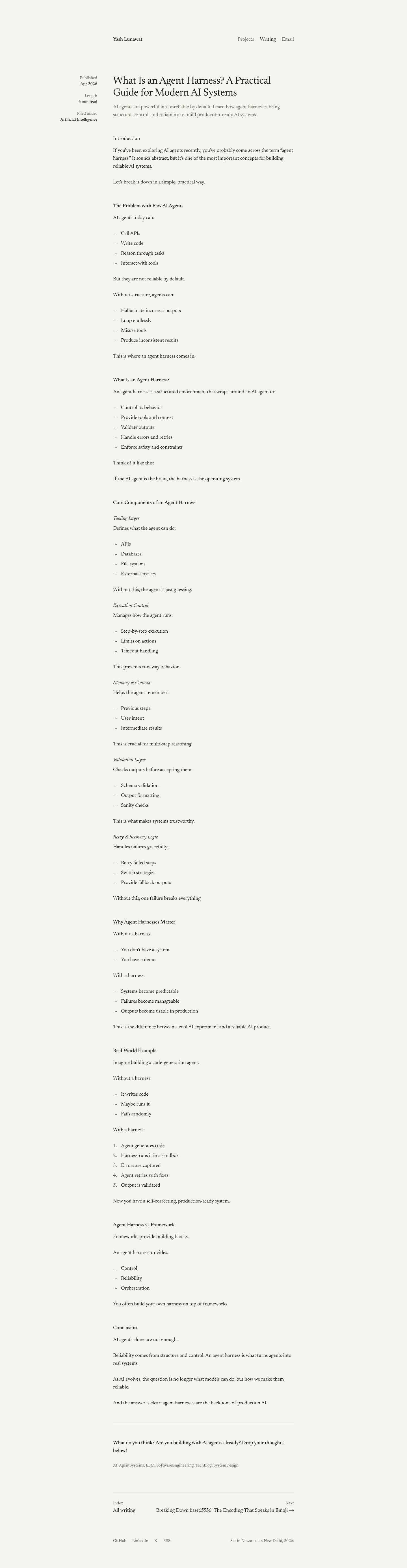
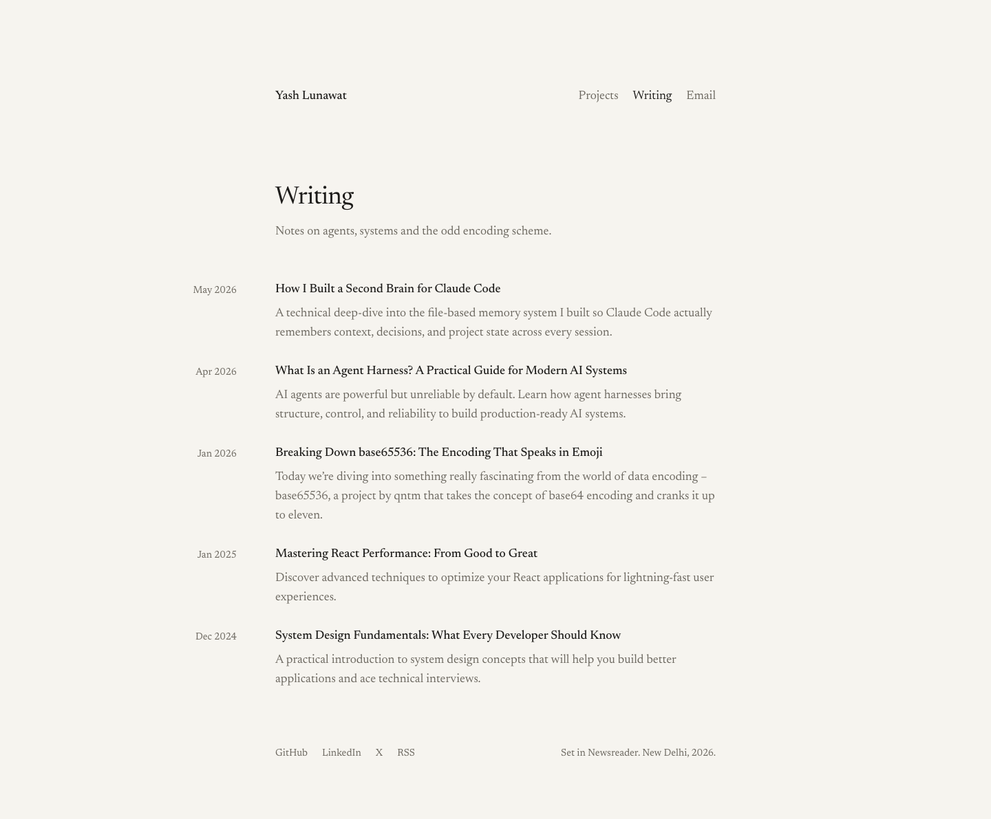
blog-detail-desktop.png
blog-list-desktop.png
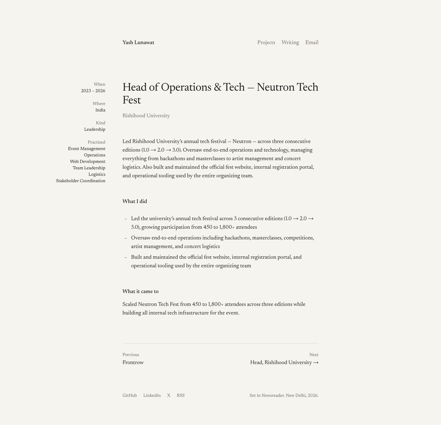
experience-desktop.png
footnote-target.png
footnote-target.png
home-desktop.png
home-desktop.png
home-fold-desktop.png
home-mobile.png
home-mobile.png
hover-project-line.png
keyboard-focus.png
keyboard-focus.png
project-detail-desktop.png
project-detail-mobile.png
projects-desktop.png
projects-mobile.png
projects-mobile.png

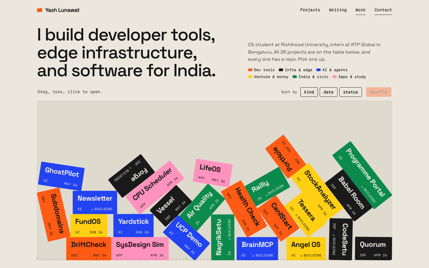
07 Workbench tiles

https://v7.yashlunawat.com/ · worktree portfolio-07 · branch design/portfolio-07 · cd /Users/admin/.t3/worktrees/portfolio/portfolio-07 && npx vite --port 5207

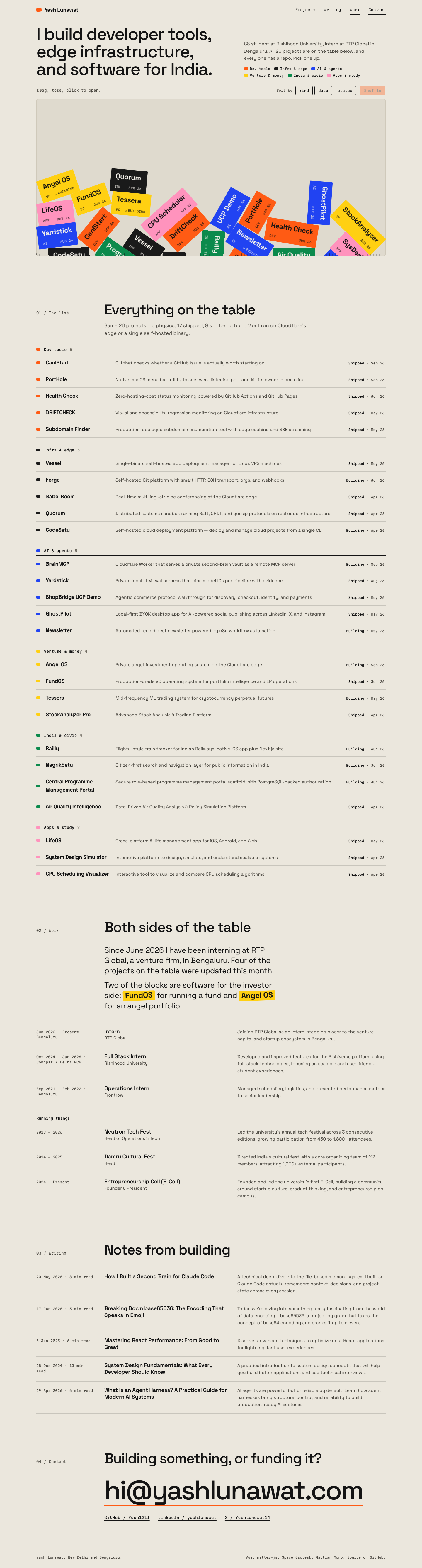
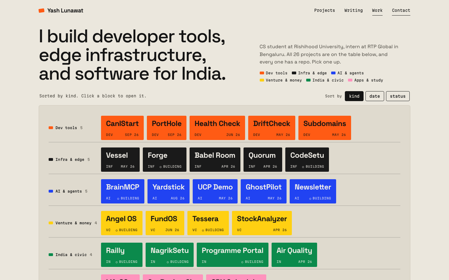
Workbench tiles home

Thesis

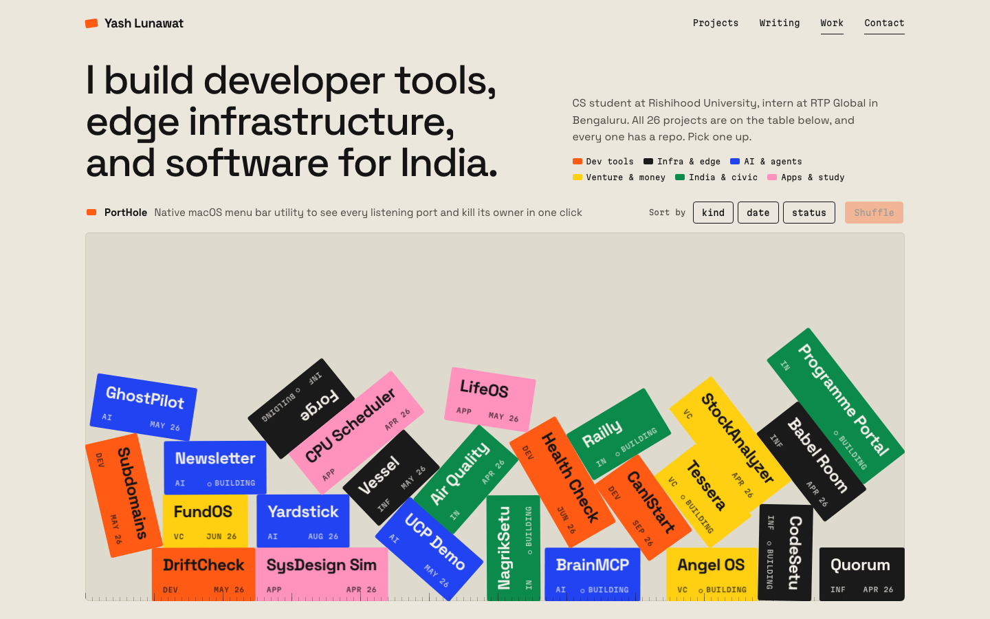
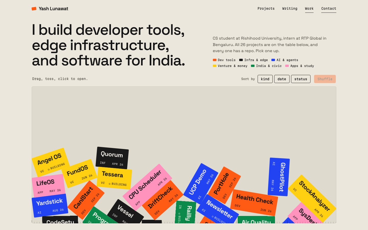
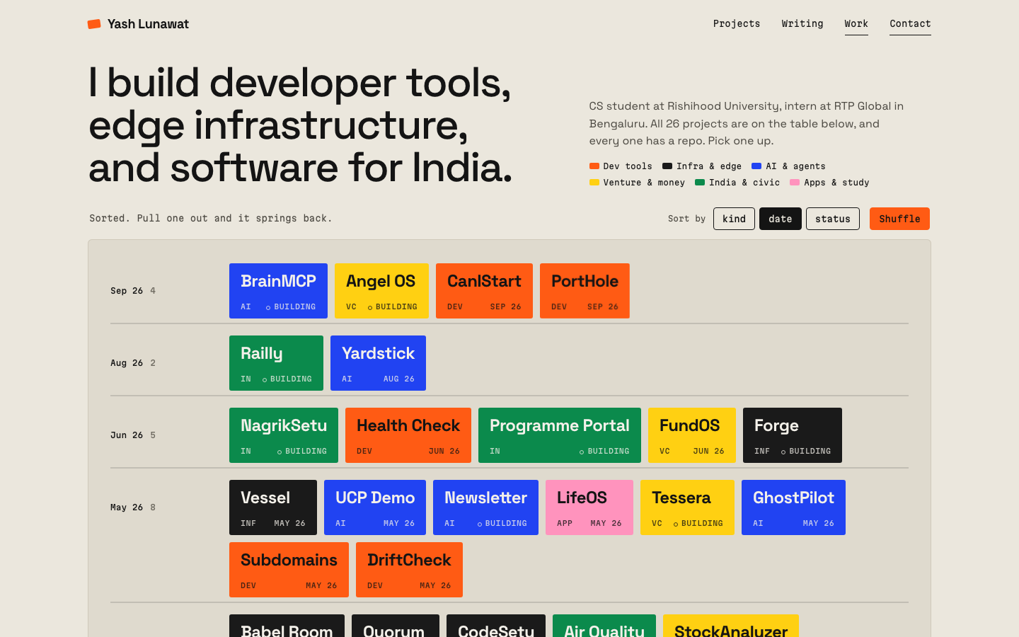
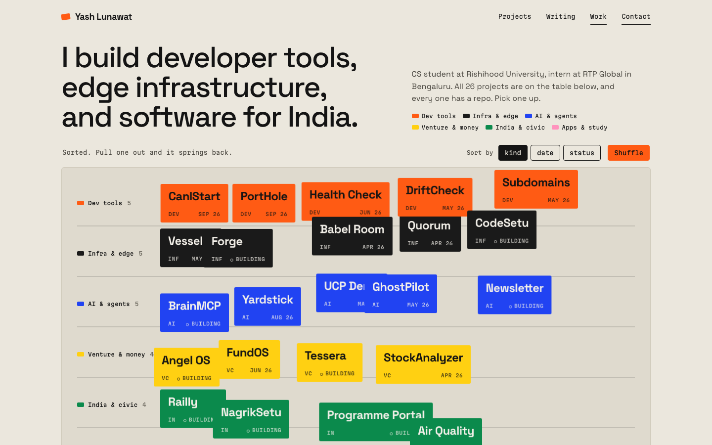
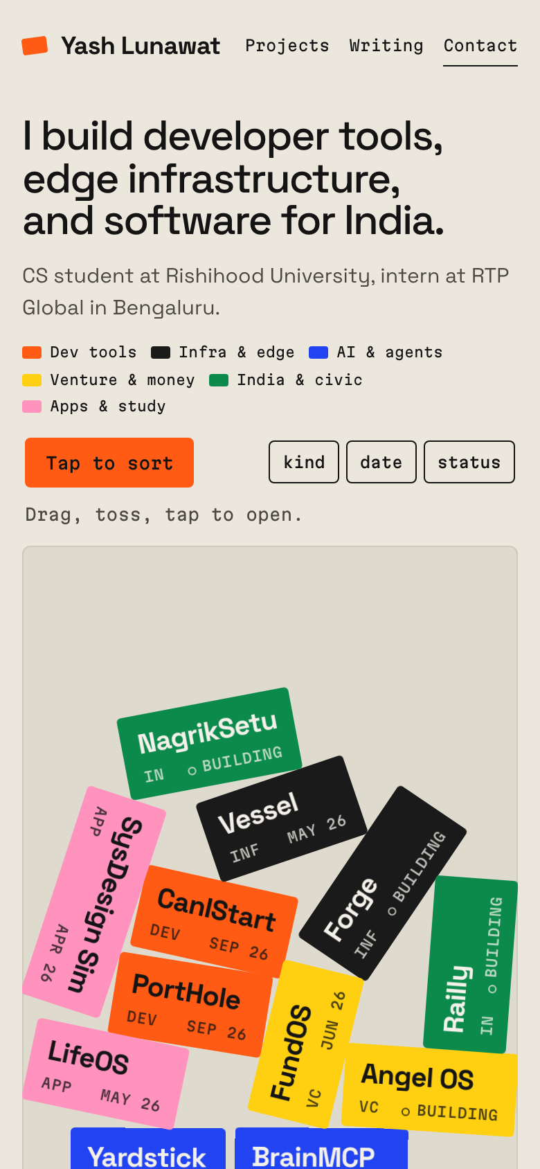
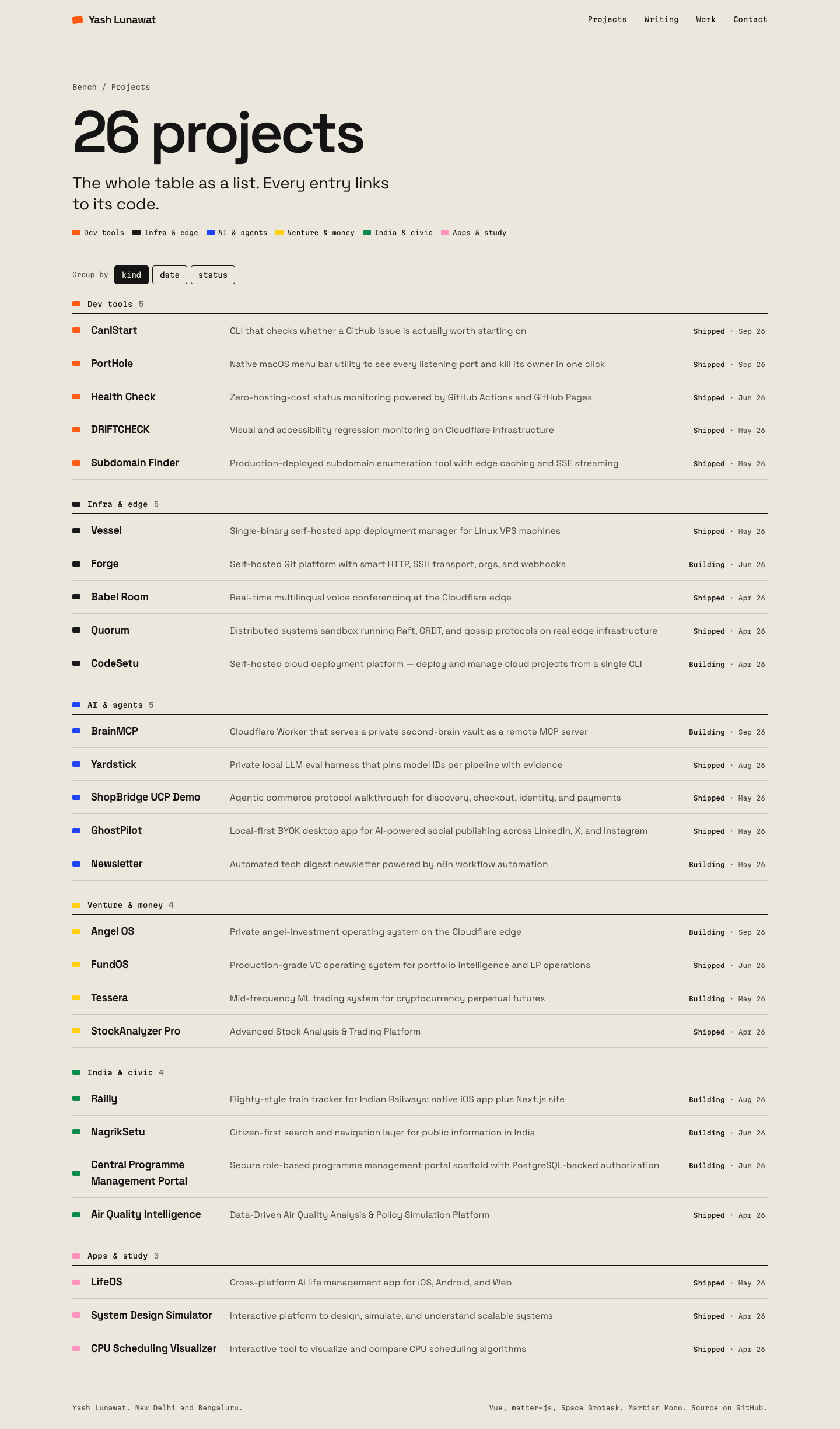
The site is a workbench, and Yash's 26 projects are flat, colored objects lying on it. You can pick them up, toss them, and sort them onto labelled shelves. Hovering over one or dragging it shows its tagline, so after 30 seconds of playing you should feel "I want to keep doing this" and find you have learned what he built.

Memorable device

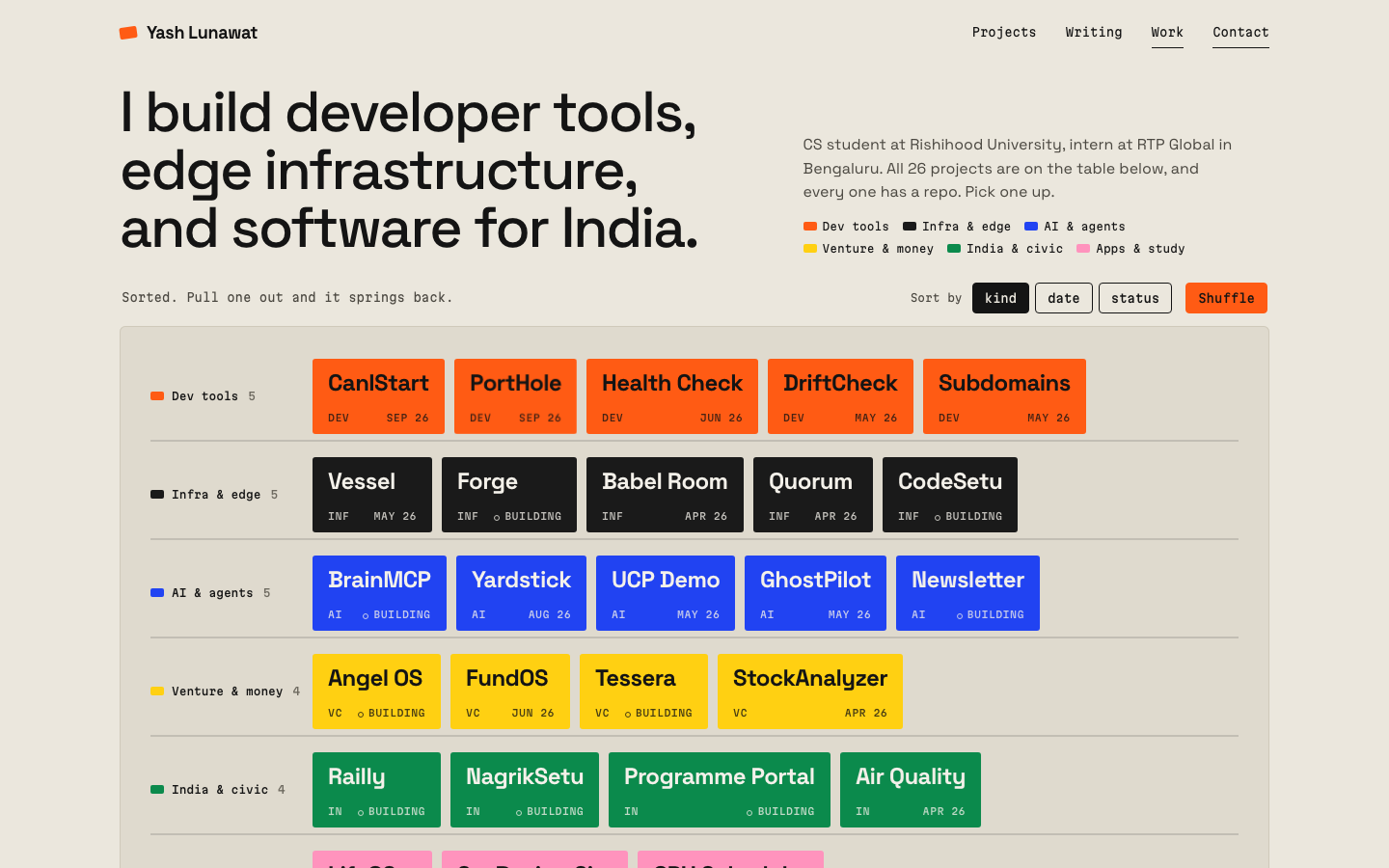
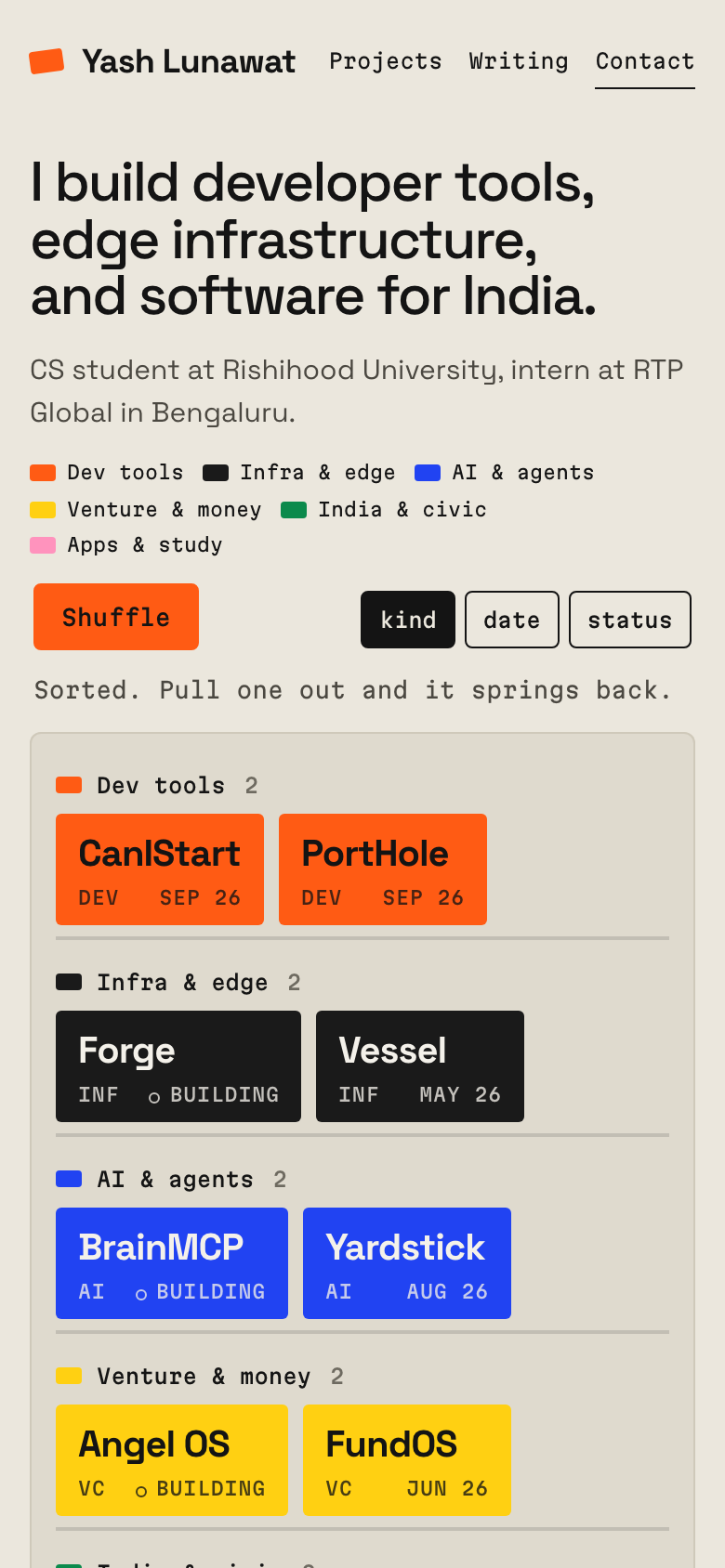
Grabbing the orange CanIStart tile by its corner, watching it swing, flinging it across the bench, then pressing "kind" and watching all 26 tiles file themselves onto labelled shelves.

Self-critique

  • **First impression:** the bench is strong from a thumbnail. The six flat colors on paper can't be mistaken for another concept. But the headline above it is a conventional two-column hero, which uses 290px of vertical space and pushes the bench's floor to the fold on a 900px screen. The pile sits in the bottom 60% of the bench, and the top 40% is empty until someone throws something.
  • **Originality:** physics-toy hero pages exist (the "falling tags" genre). What sets this one apart is the sorting and the readout, not the physics itself.
  • **Typography:** the Space Grotesk and Martian Mono pairing works, and tile names at 24/700 look stamped. Below the fold, though, everything is 15-19px regular text in thin rows. It is legible and correct, and also a bit anonymous. The section headings ("Everything on the table", "Both sides of the table") carry the metaphor, but the type doesn't.
  • **Hierarchy:** the list, work, and writing sections share the same row component and spacing, so after the hero the page becomes one long even ledger. Nothing tells you that CanIStart or Railly matters more than CPU Scheduler.
  • **Storytelling:** the venture angle gets two sentences, with FundOS and Angel OS shown as inline tiles. That is honest but thin. There's no point of view on how a builder thinks about venture, because the data doesn't contain one and I wouldn't invent it.
  • **Personality:** playful without being cartoonish. The weight and damping are the right call. The copy is plain and specific ("26 projects, every one has a repo") rather than "crafting experiences".
  • **Usability:** the tiles are deliberately invisible to keyboards and screen readers, and the list covers them. But a sighted keyboard user sees the toys and can only operate the sort buttons, not pick up a tile. On desktop, clicking a tile to open it competes with dragging (6px and 400ms thresholds). A shaky hand can open a page by accident, or fail to open one.
  • **Project presentation:** the grouping into six kinds is my editorial call. Railly is filed under "India & civic" rather than "Mobile", and Quorum and Babel Room under "Infra & edge". Tile names are shortened ("Programme Portal", "Subdomains"), so a tile does not always match its list entry exactly.
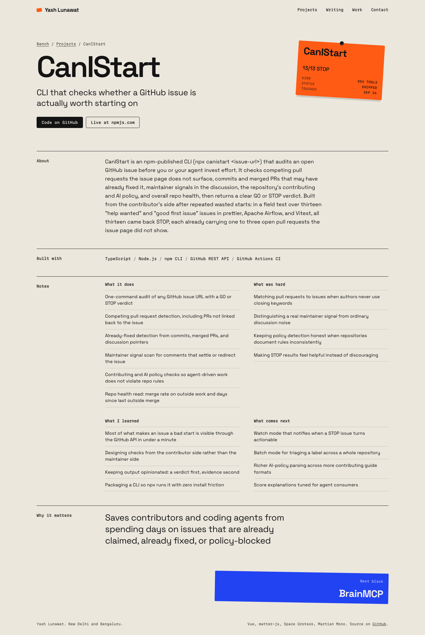
  • **Coherence:** the detail pages keep only a light touch of the metaphor (the pinned label and tile-style next links). The experience and blog pages are plain documents with no object at all, and they feel like a different, quieter site.
  • **Responsive:** mobile shows only 12 of the 26 tiles, which contradicts the "everything on the table" line. The mobile sorted bench grows to about 700px, so sorting pushes the list further down.
  • **Motion:** sorting and shuffling look good. Tiles often come to rest standing on their short edge, which is physically correct but looks slightly unstable and cuts some names vertically.
  • **Craftsmanship:** measurement depends on web fonts. I added a font-load wait plus a rebuild of any body whose tile changes si

Worth stealing

  • **The inspection readout.** Hovering over or holding any object shows its one-line tagline in a fixed status strip. It turns play or browsing into learning at no cost, and it works in any concept with a dense visual index.
  • **Categories as flat colors, used everywhere.** One color per kind of work, shown as swatches in the list, pinned labels, the legend, and even inline tiles in prose (FundOS and Angel OS in the venture paragraph). Any concept can teach the shape of his work this way without adding a chart.

Coordinator verdict

Close call, not advanced. Most memorable single image (a pile of flat colored tiles) and the best one-line headline (I build developer tools, edge infrastructure, and software for India). The sorted state is a clean taxonomy. But below the fold it becomes a generic minimalist list, physics tiles are a known creative-technologist pattern, and playfulness fits him less than the venture and infrastructure register. Color-per-kind is stolen.

18 screenshots
blog-detail-desktop.png
blog-list-desktop.png
experience-desktop.png
home-desktop-drag.png
home-desktop-full.png
home-desktop-reduced.png
home-desktop-rest.png
home-desktop-ship-egg.png
home-desktop-sorted-date.png
home-desktop-sorted-kind.png
home-desktop-sorting-mid.png
home-mobile-full.png
home-mobile-rest.png
home-mobile-sorted.png
project-detail-desktop.png
project-detail-mobile.png
projects-desktop.png
projects-mobile.png
projects-mobile.png

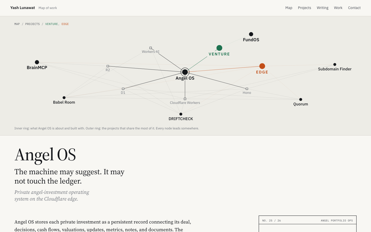
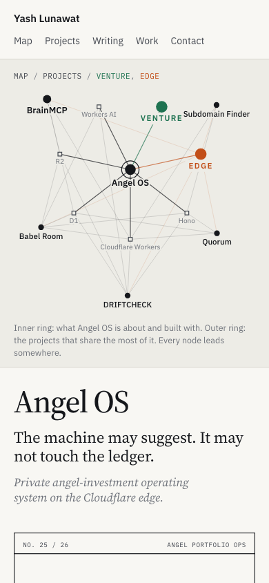
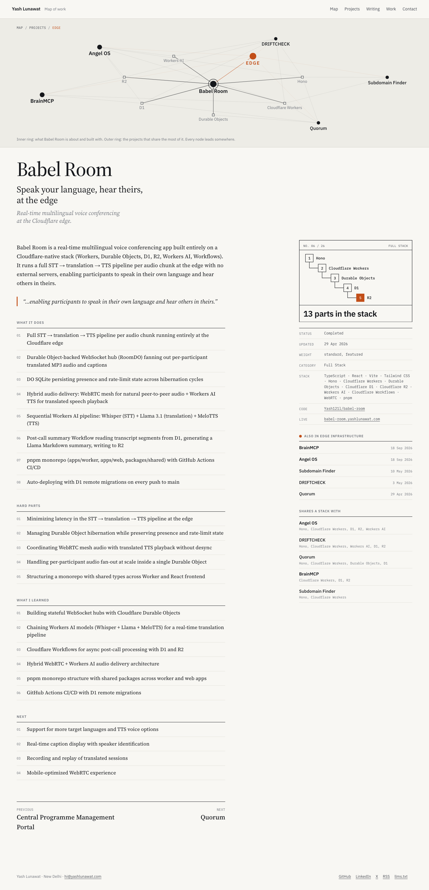
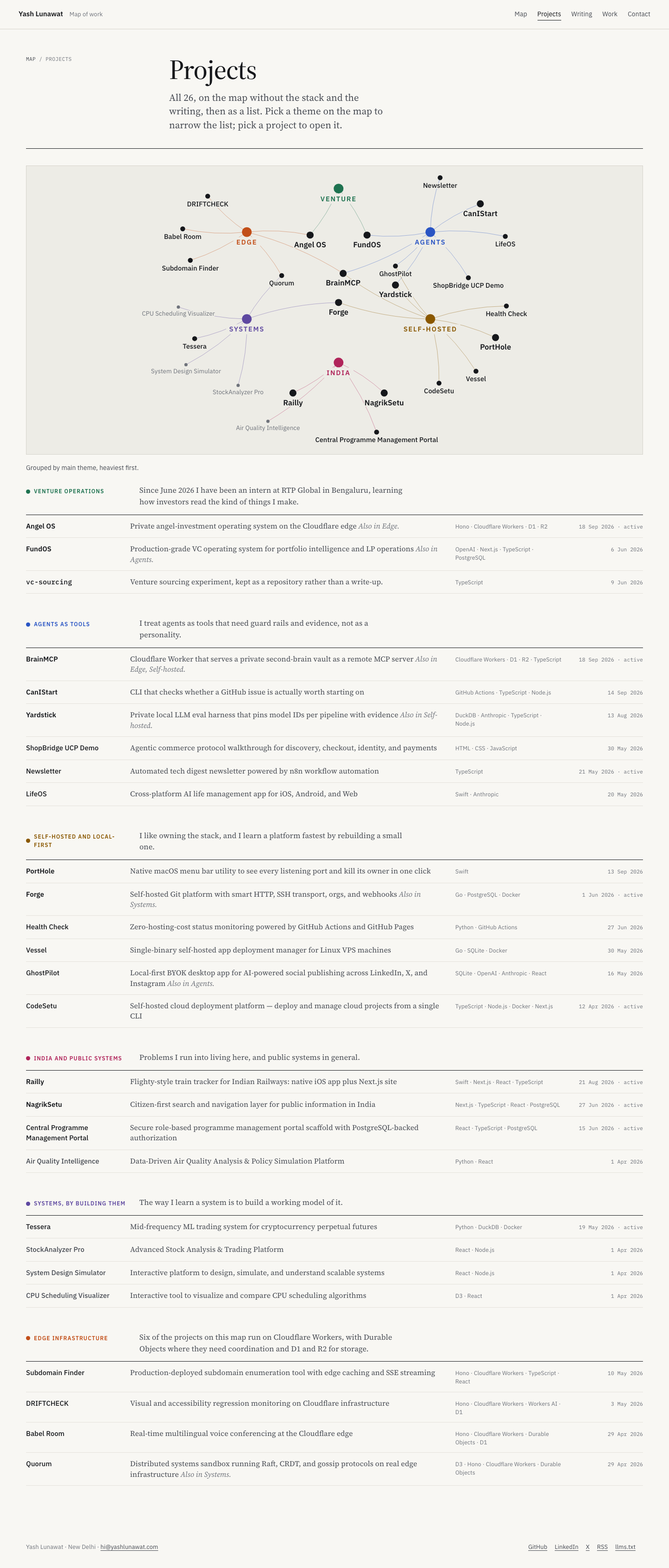
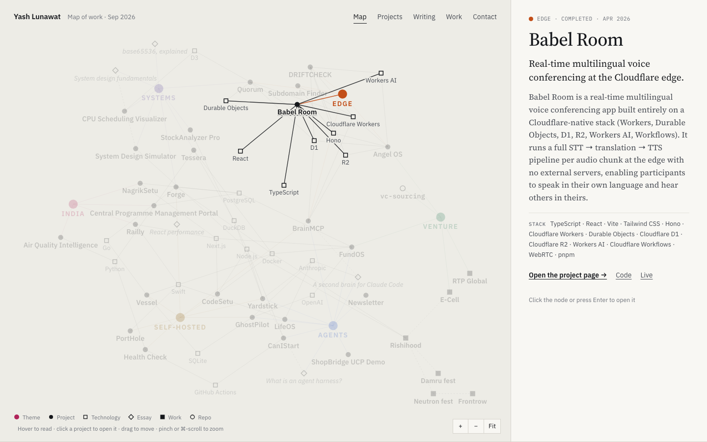
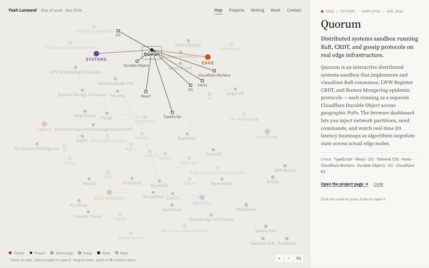
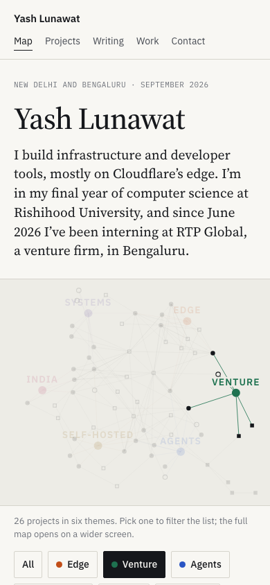
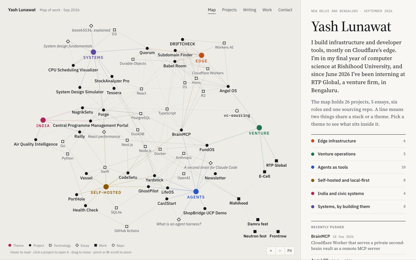
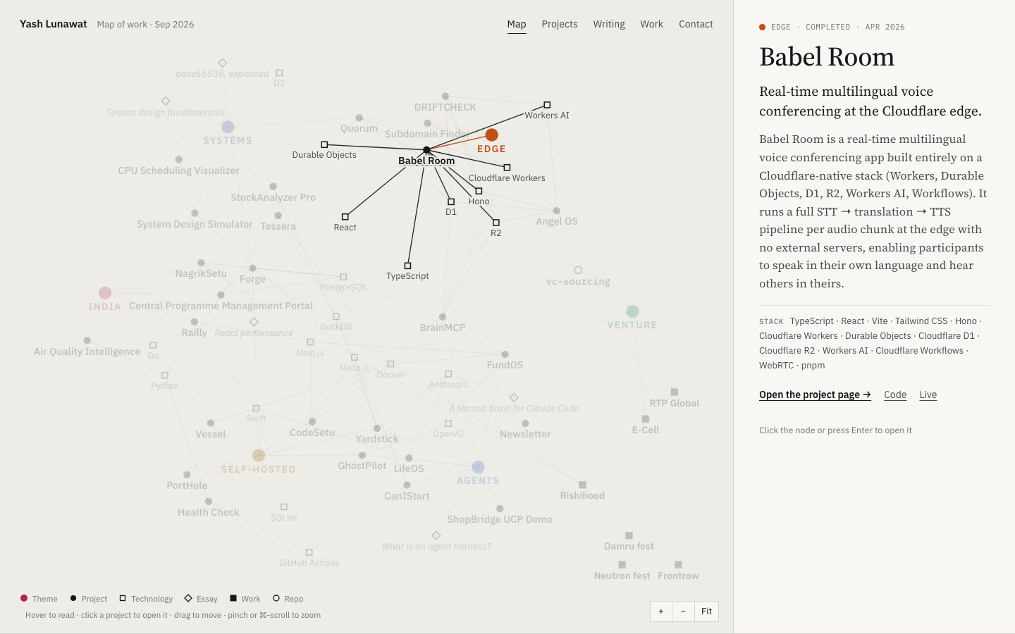
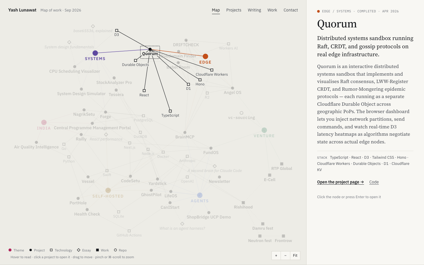
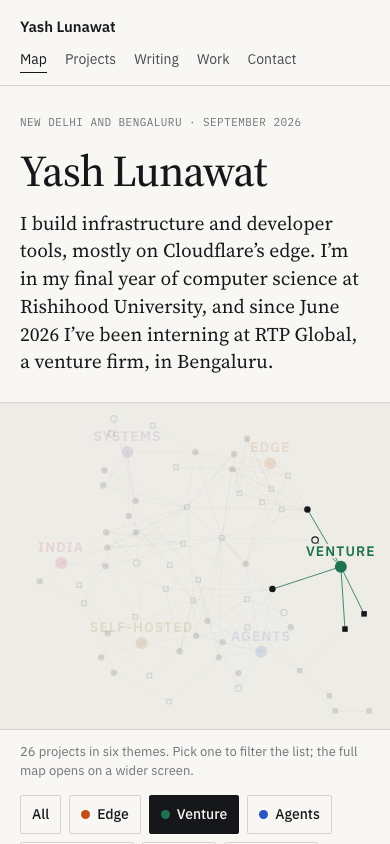
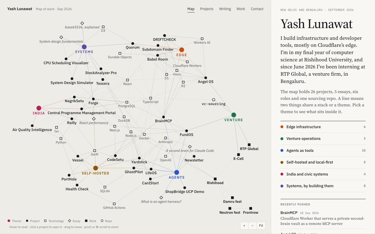
08 Network map

https://v8.yashlunawat.com/ · worktree portfolio-08 · branch design/portfolio-08 · cd /Users/admin/.t3/worktrees/portfolio/portfolio-08 && npx vite --port 5208

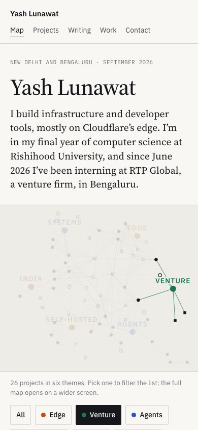
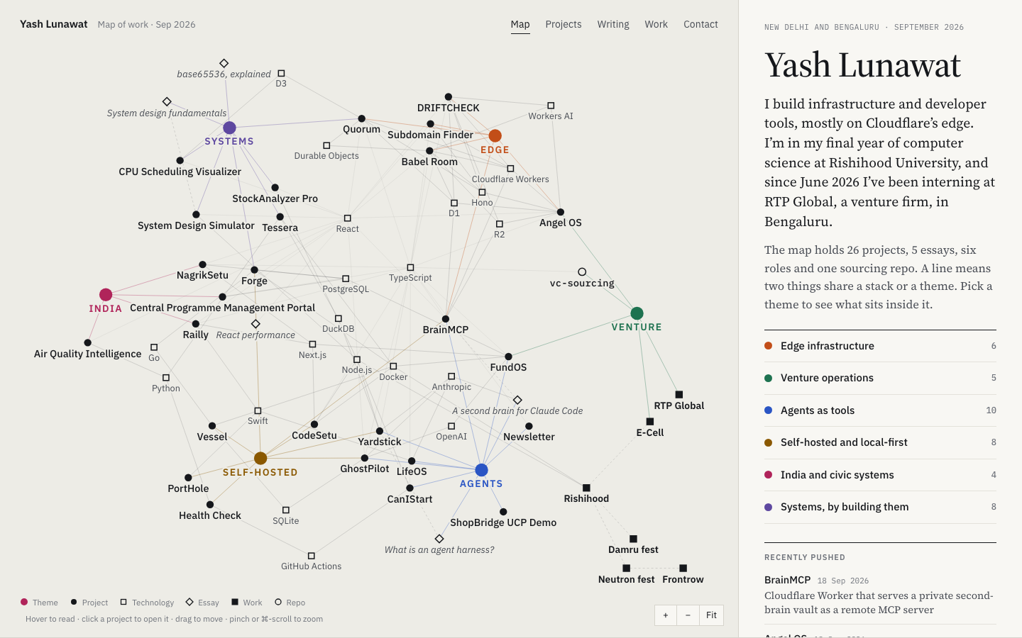
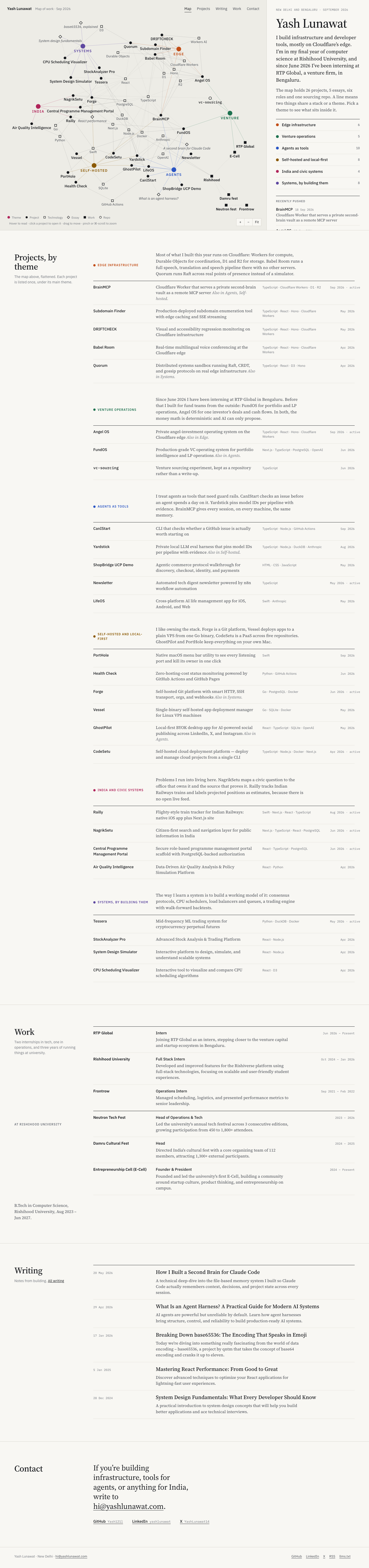
Network map home

Thesis

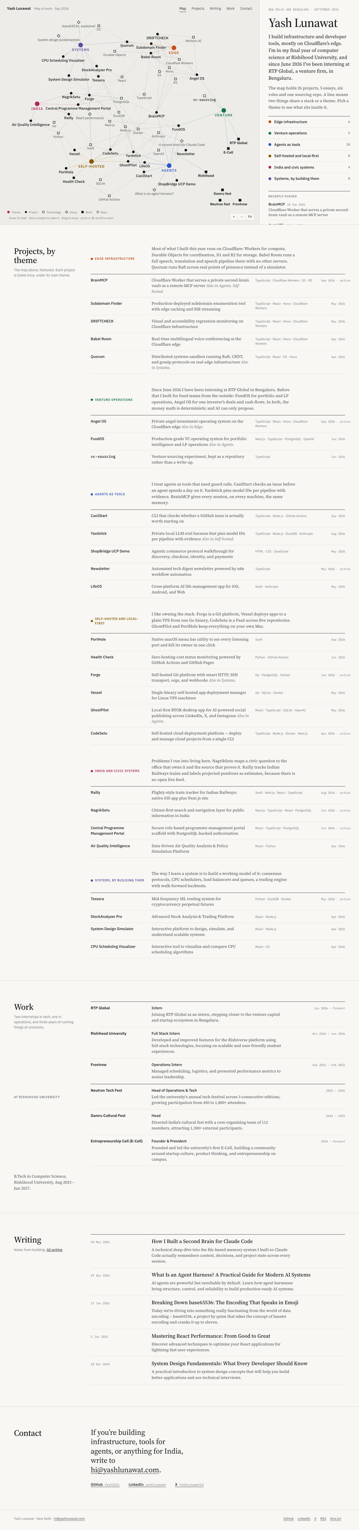
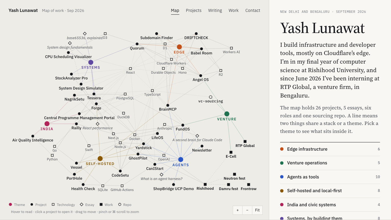
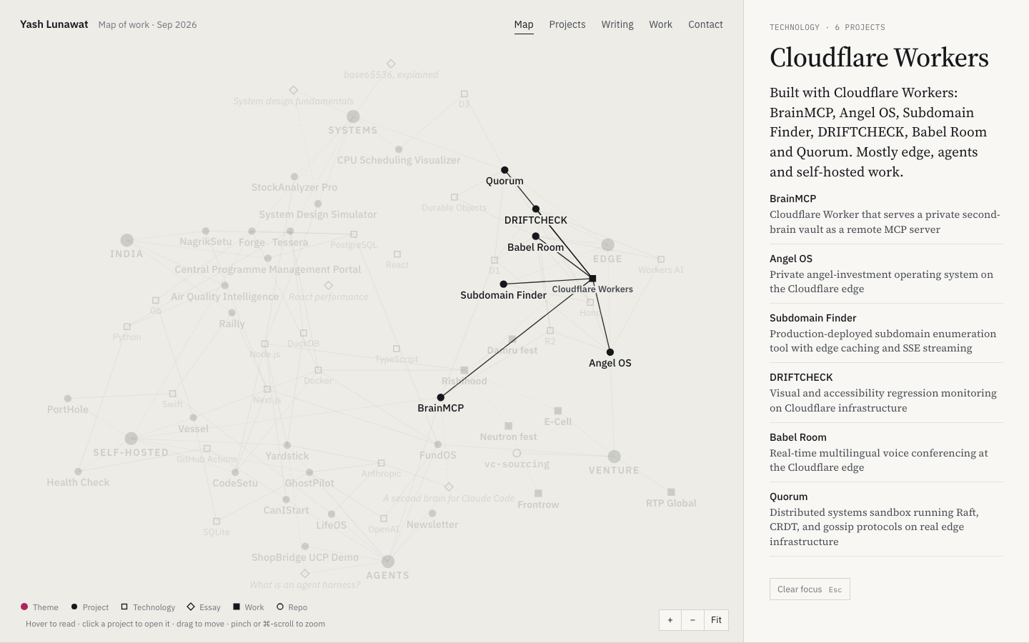
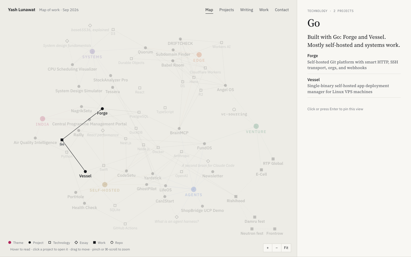
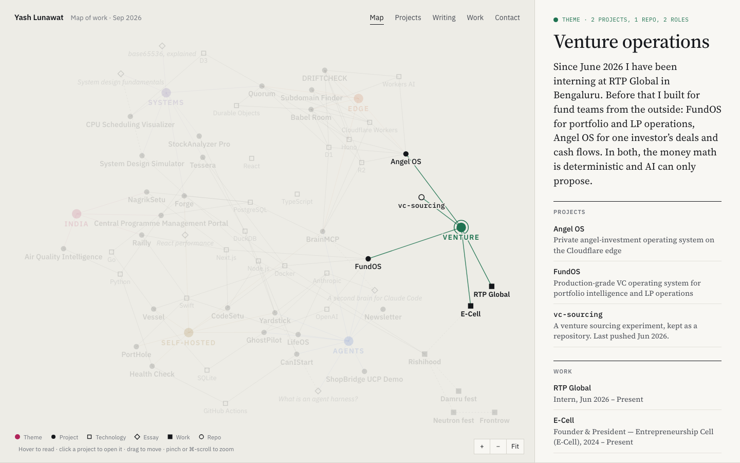
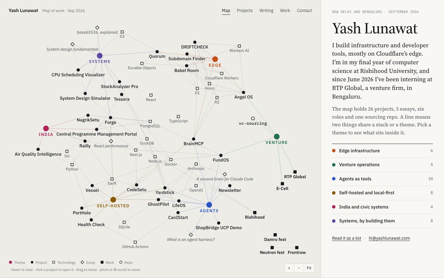
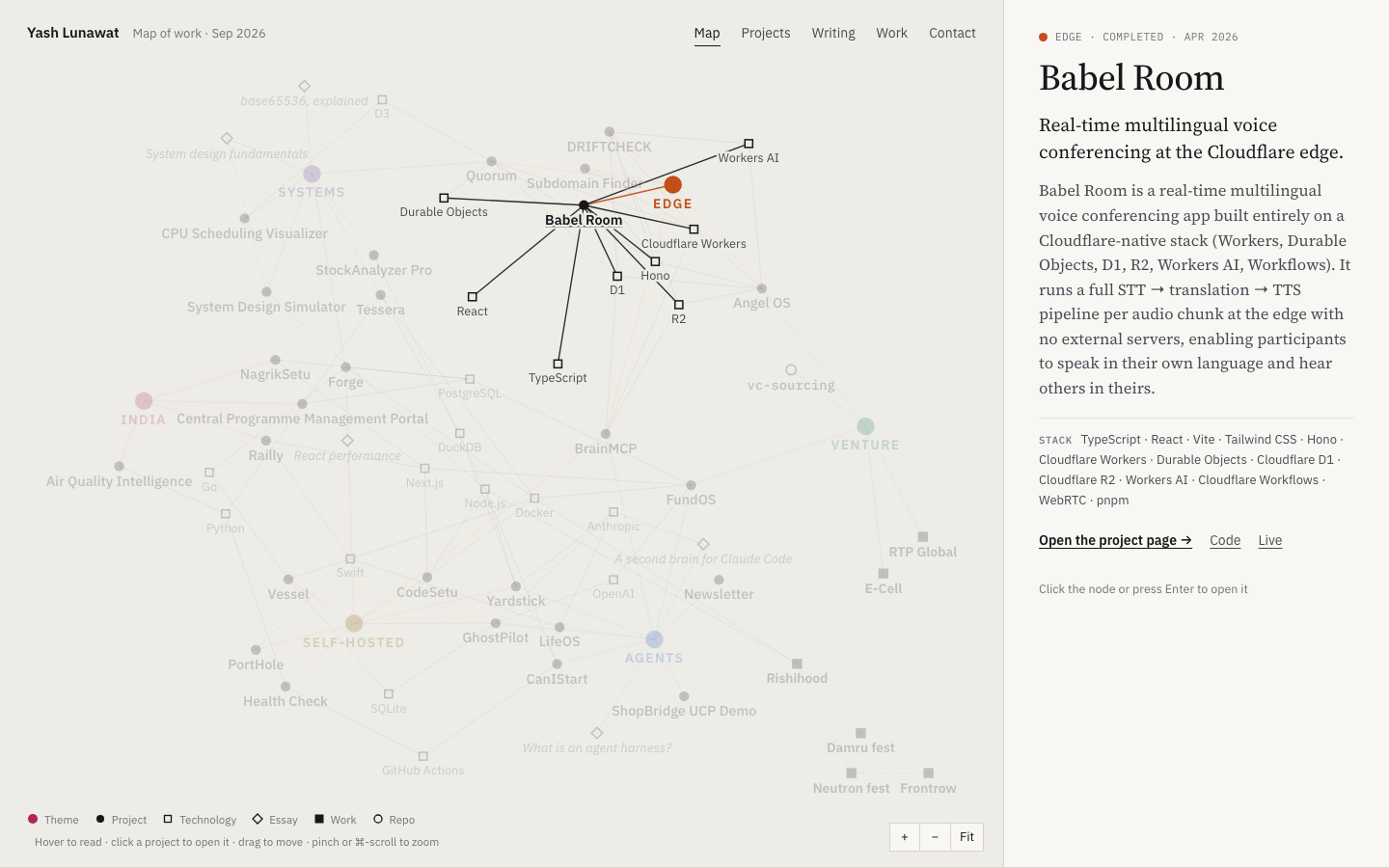
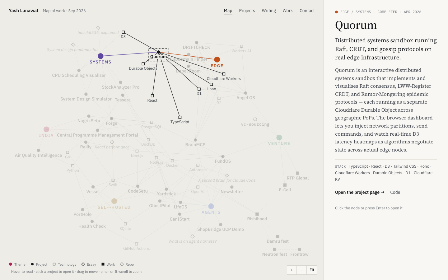
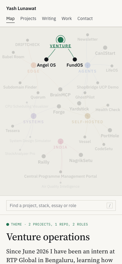
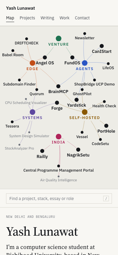
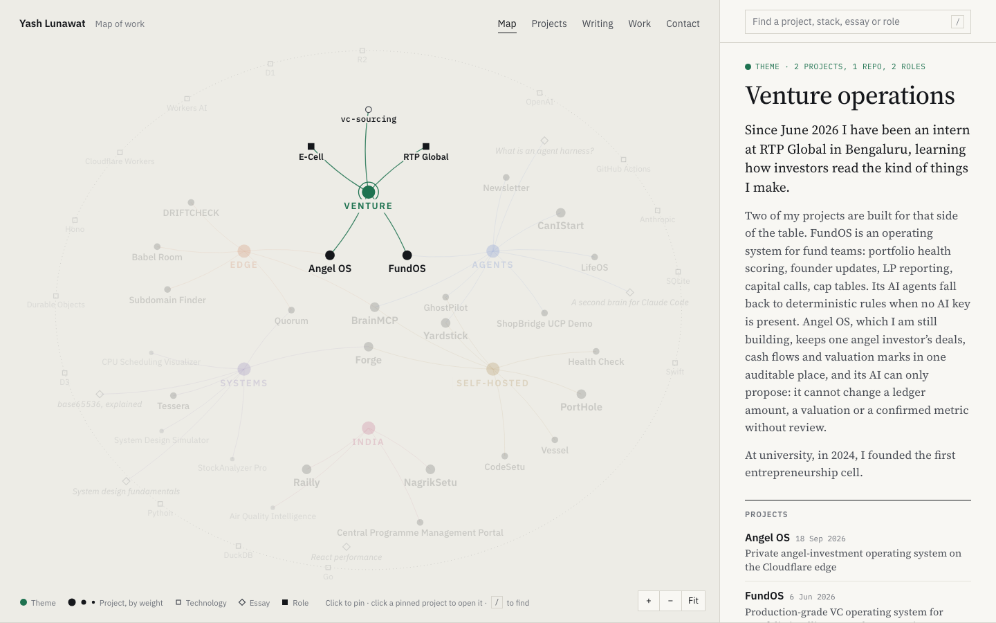
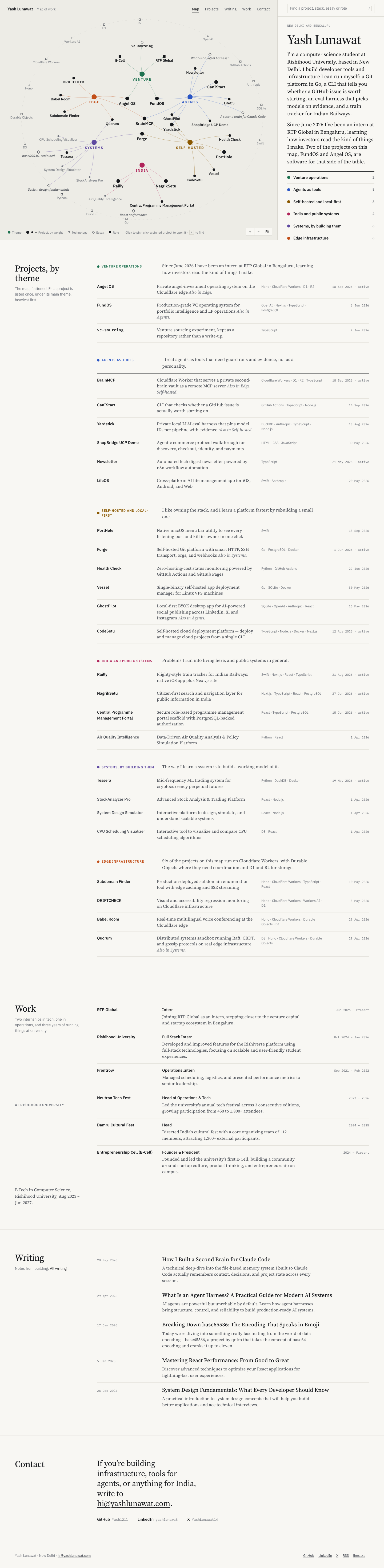
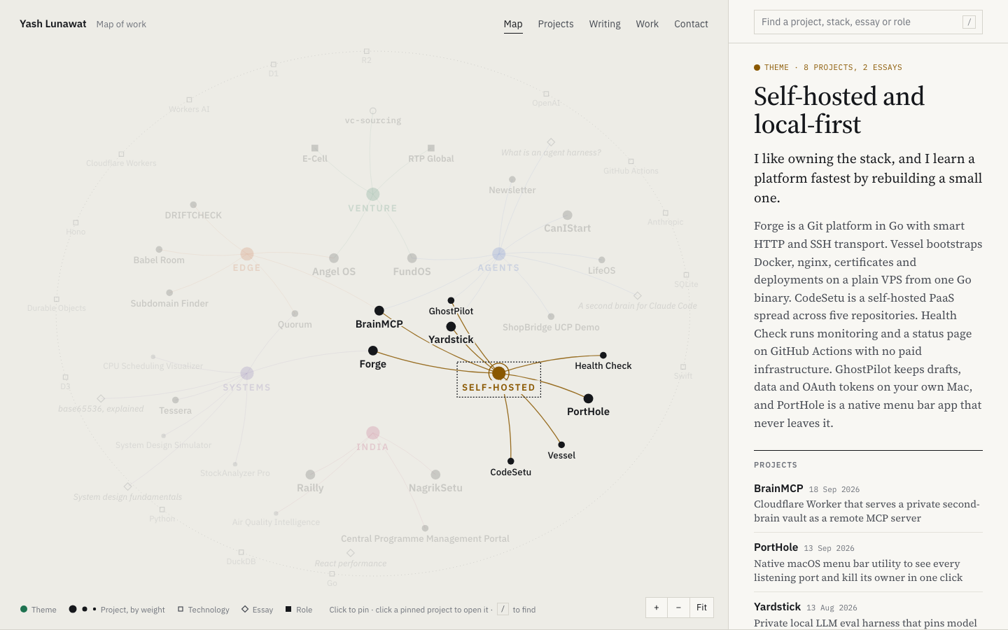
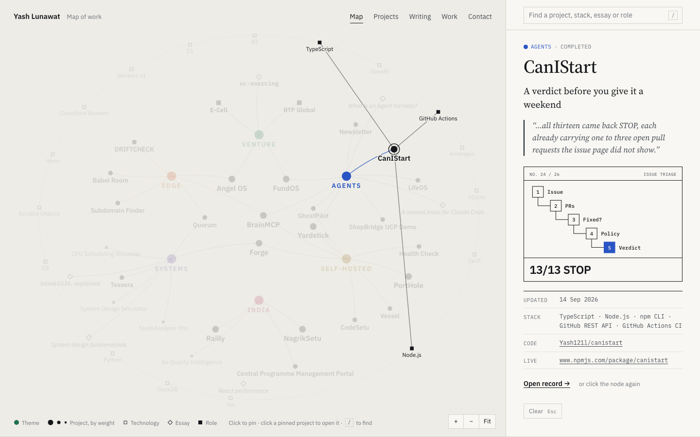
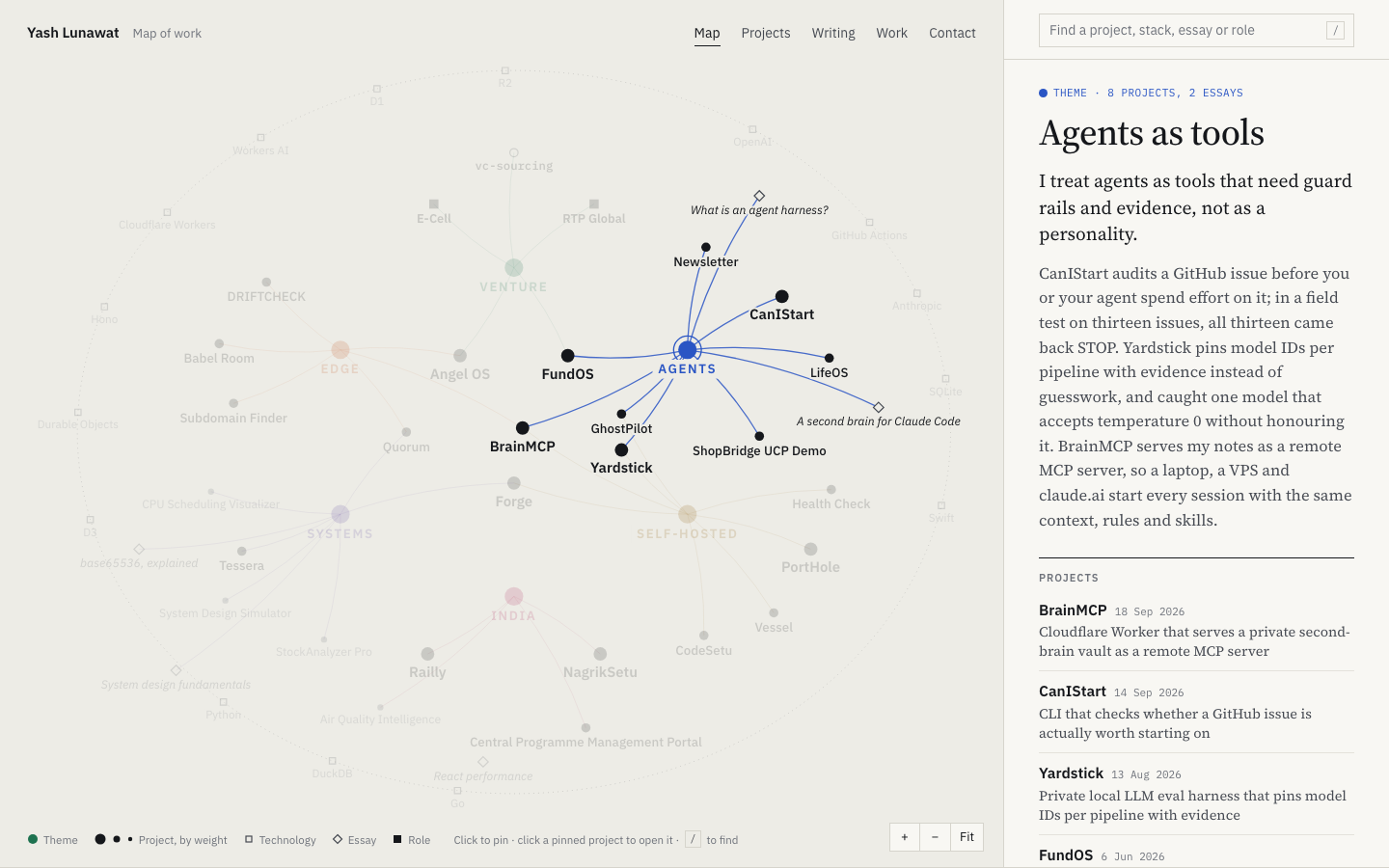
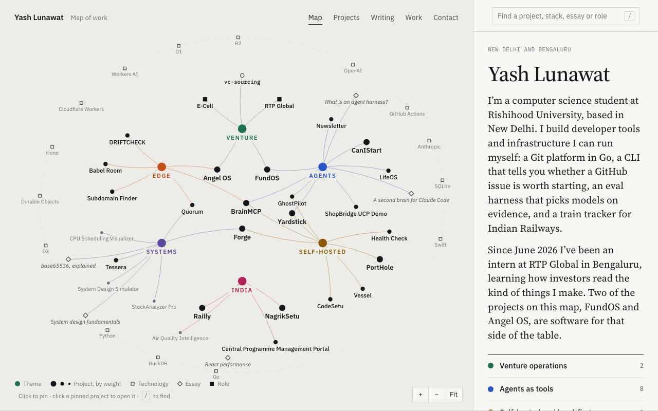
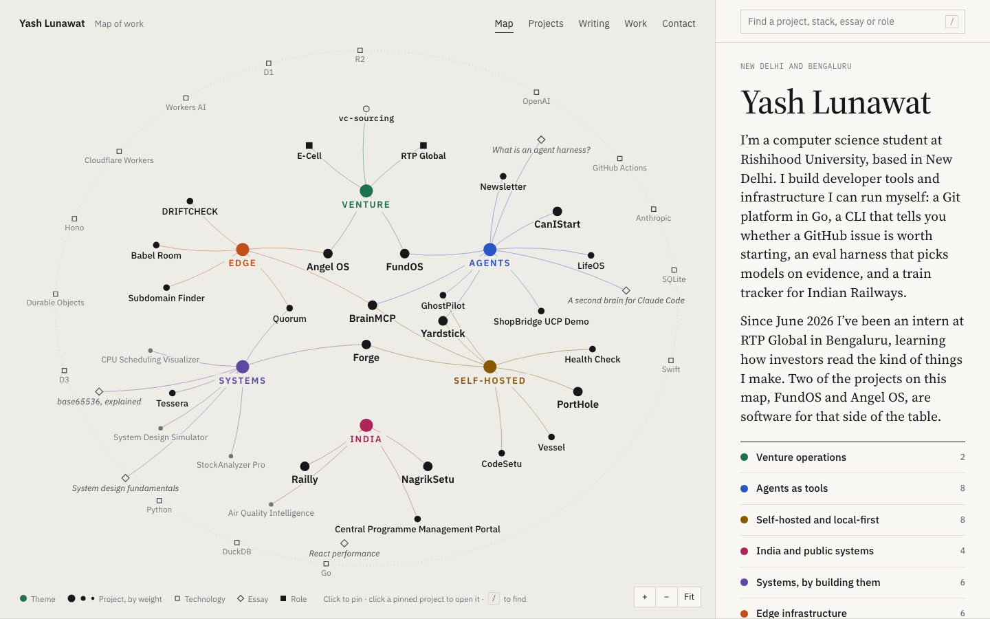
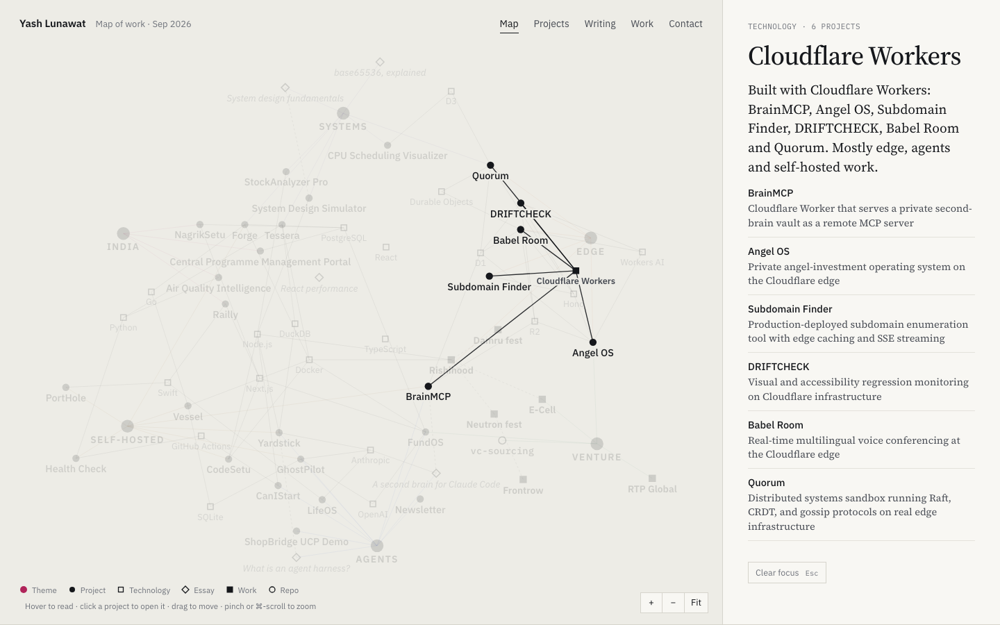
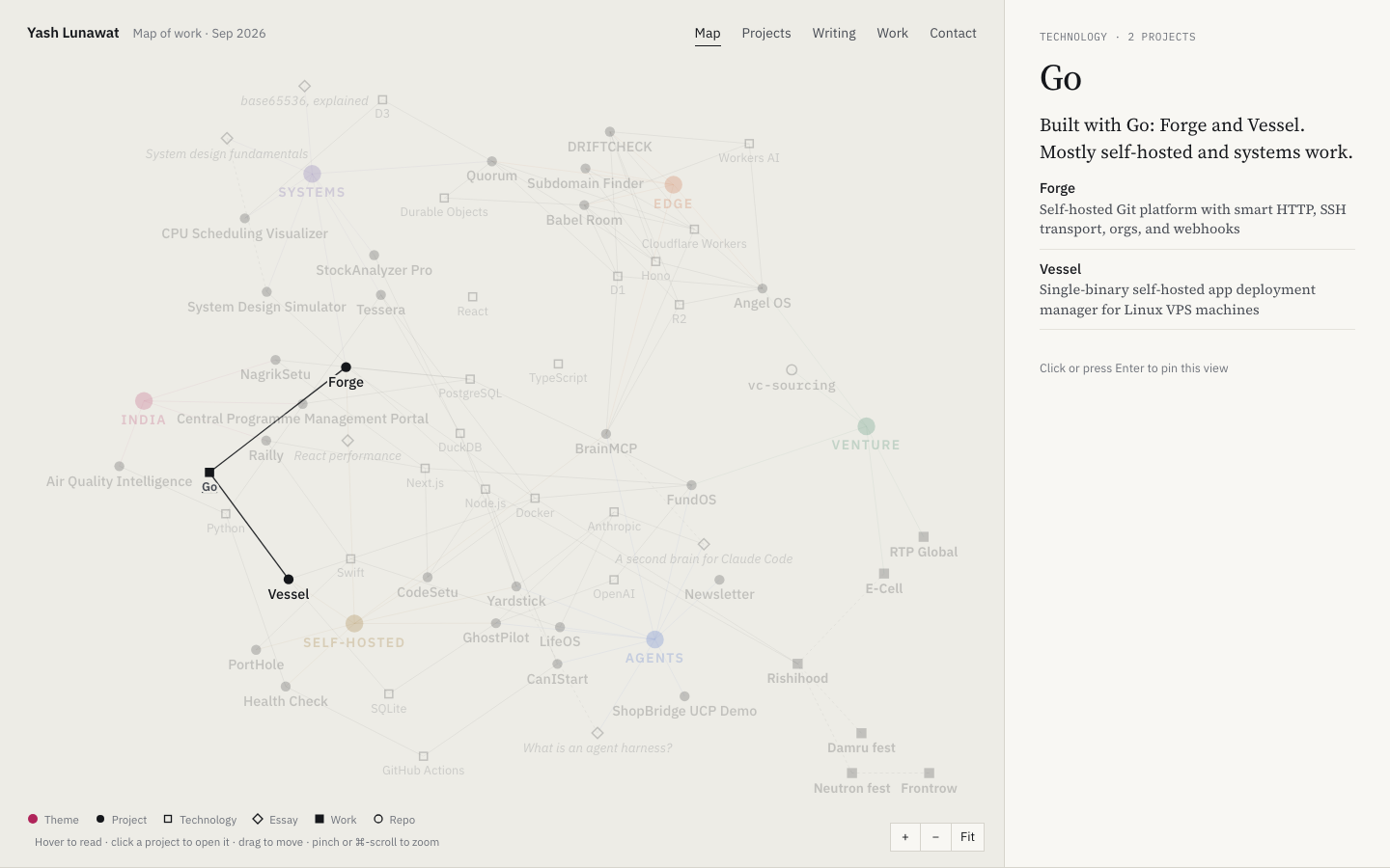
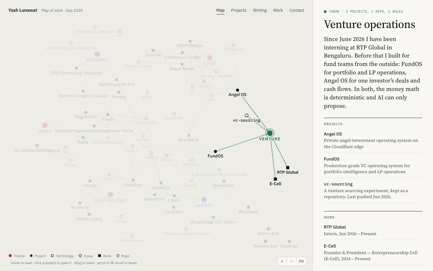
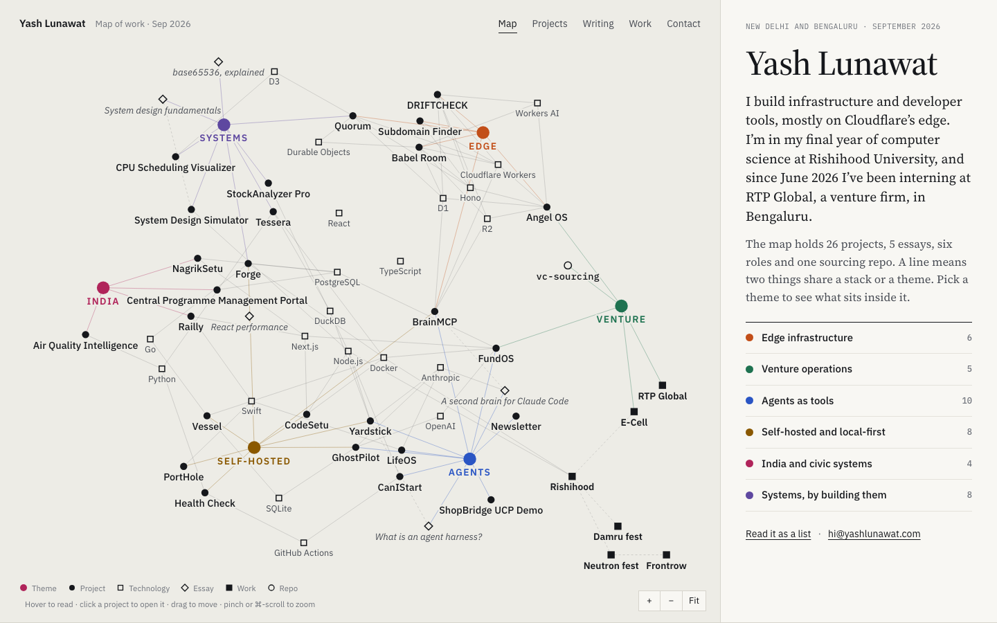
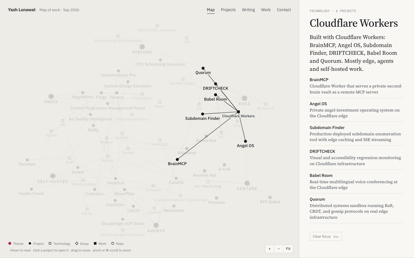
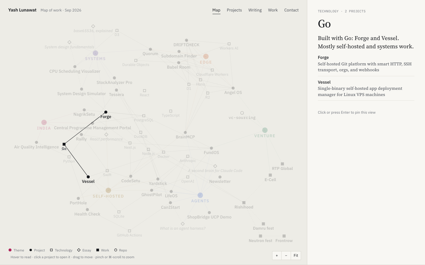
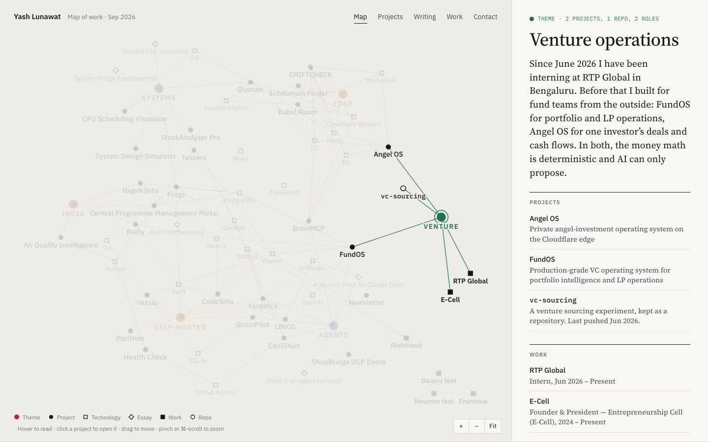
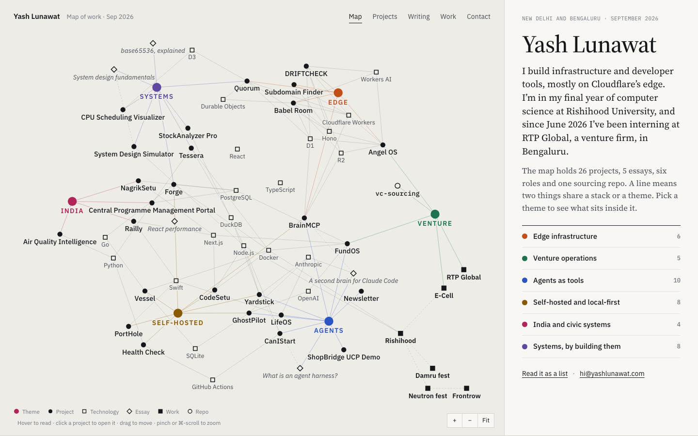
Yash's work is a graph, not a list: 26 projects, 21 shared technologies, six themes, six roles and five essays, joined by the stacks and themes they share. After 30 seconds someone should think: everything this person does connects, and I can see how.

Memorable device

Clicking "Venture" and watching FundOS, Angel OS, the vc-sourcing repo, RTP Global and E-Cell light up in green while the other 60 nodes fade to 20%.

Self-critique

  • **First impression:** the rest state is a correct hairball more than a beautiful one. Clusters read, but the middle third (TypeScript, React, PostgreSQL, DuckDB, Node.js, Docker) is a grey tangle of hollow squares with no story, and it sits exactly where the eye lands first.
  • **Originality:** force graphs are a known "second brain" look, and Obsidian users will recognise it immediately. What saves it is the light, calm ink treatment and the reading panel. Without those it is Obsidian's graph view.
  • **Typography:** Plex plus Source Serif is disciplined but safe. The serif name in the panel is the only typographic moment on the home page. The canvas has no scale contrast: project labels (12.5px, 500) and technology labels (11px, 400) are too close, so hierarchy inside the graph relies on shape alone.
  • **Hierarchy:** every project dot is the same si

Worth stealing

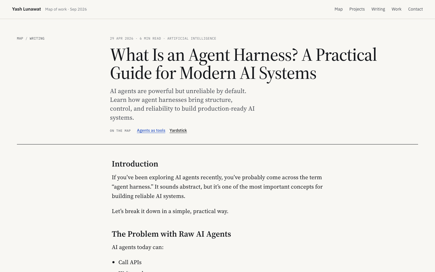
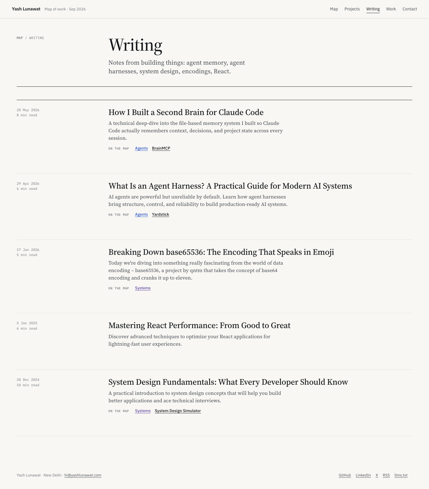
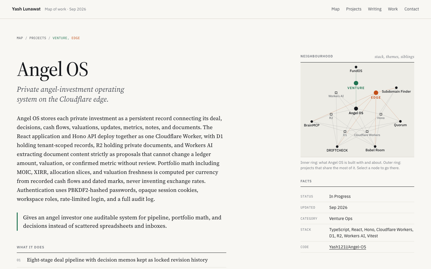
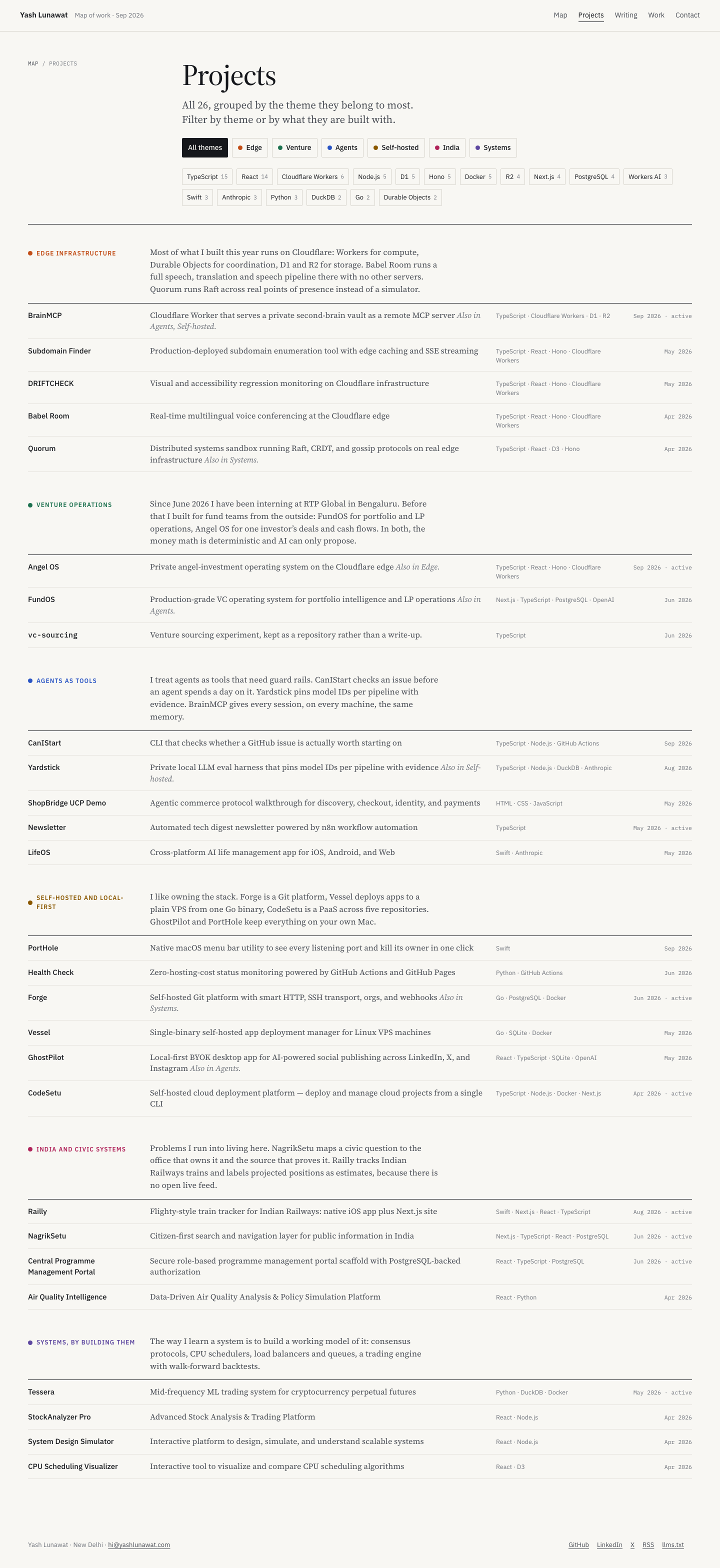
  • **`?focus=` deep links into a view of the work:** breadcrumbs, blog "on the map" rows and the project sidebar all link back to the home page focused on a theme or technology. Any concept with filters can make them shareable URLs.
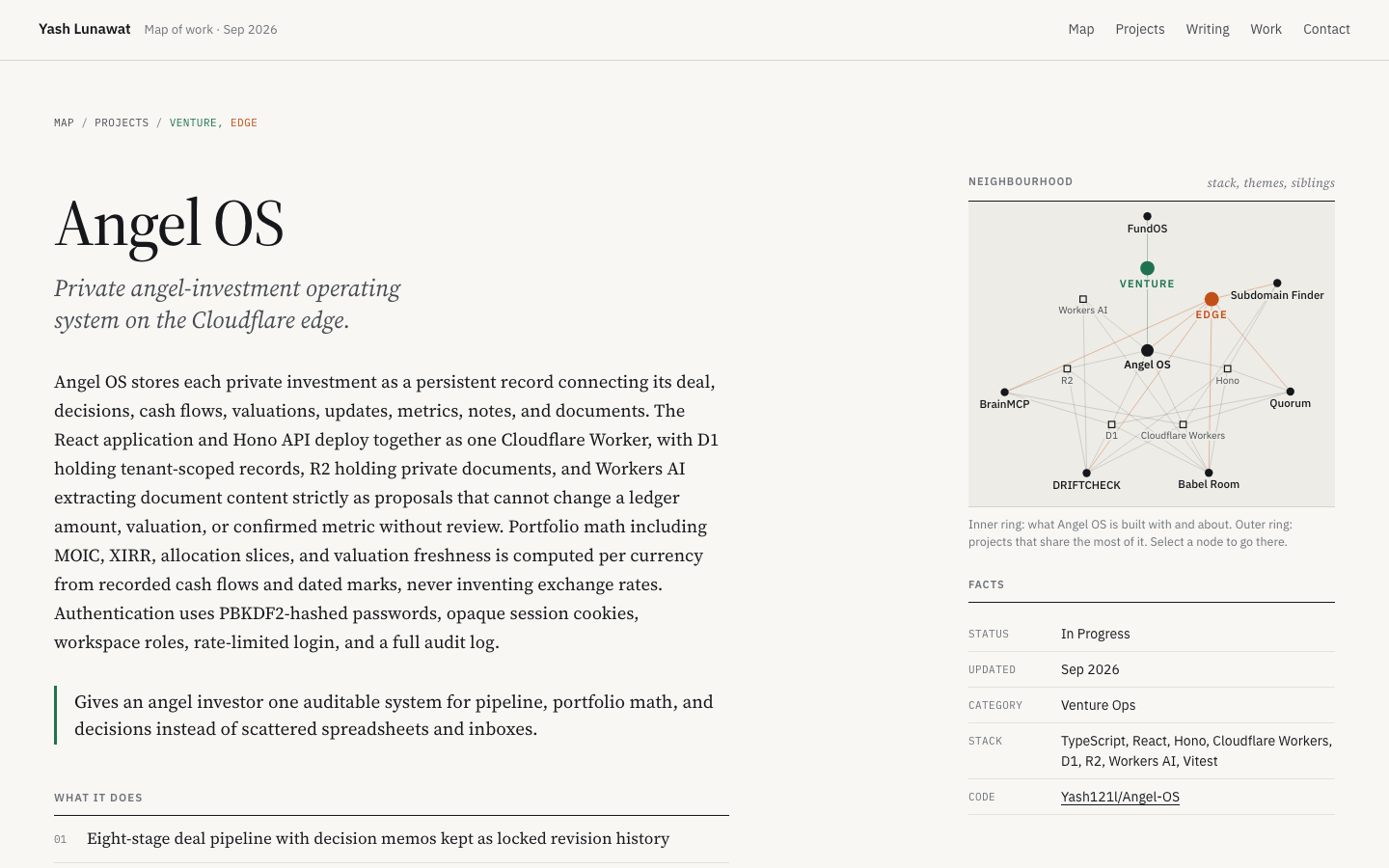
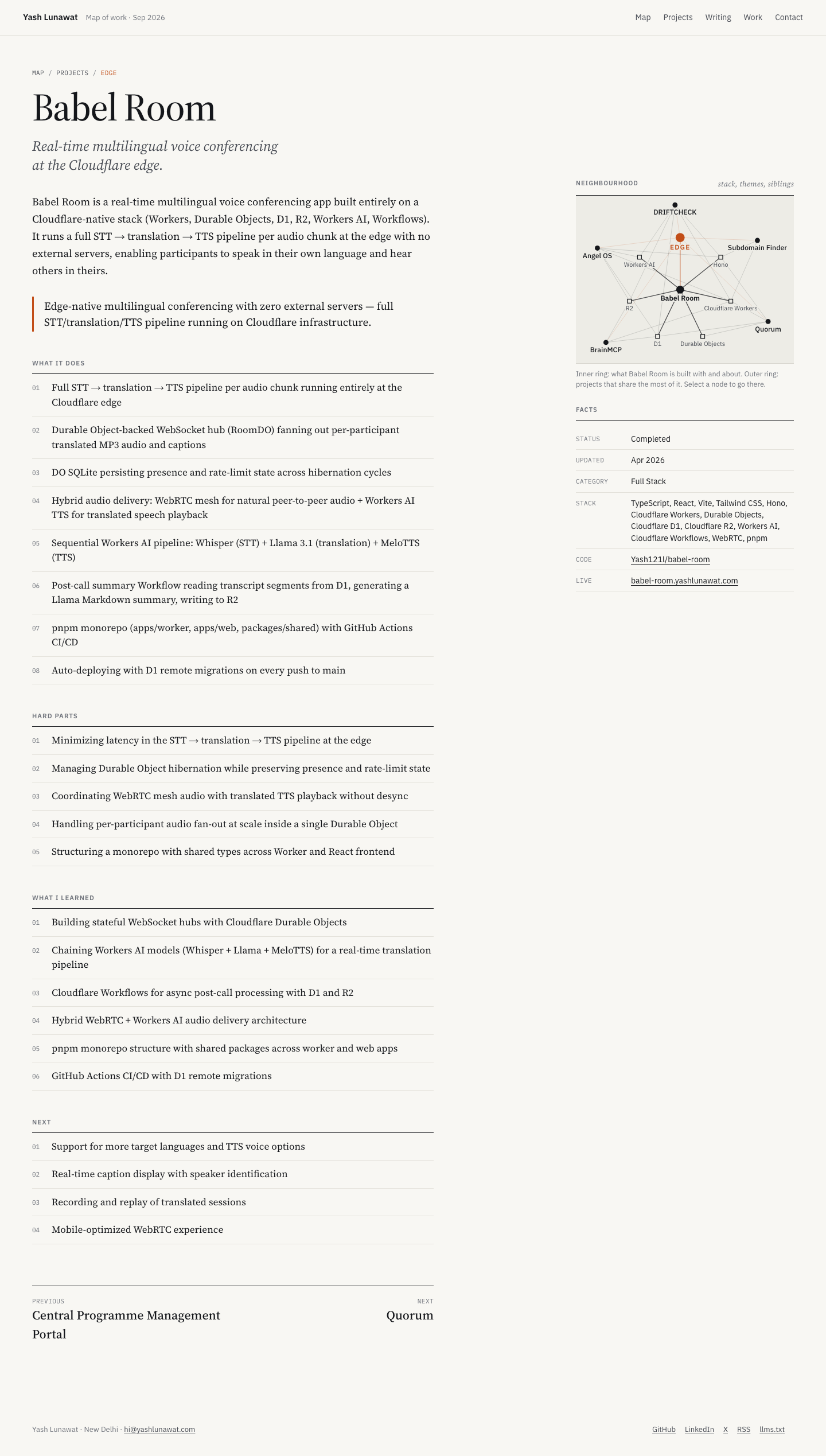
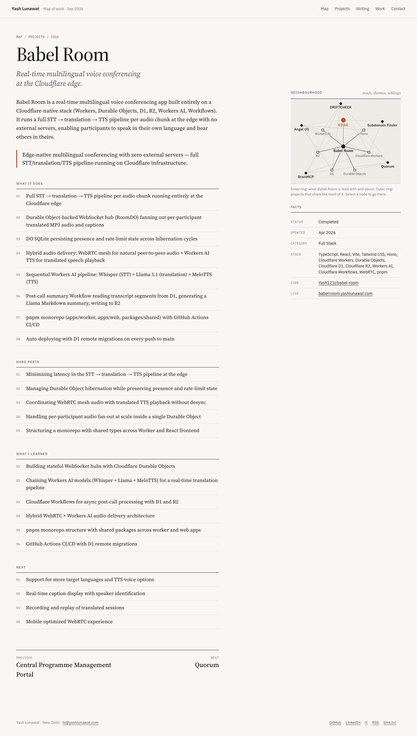
  • **A per-project "neighbourhood":** a small static diagram of the project's stack plus its three to six closest siblings, computed from the data. It replaces "related projects" cards and costs almost nothing.
  • Also: a knockout (paint-order stroke) on labels over line work instead of backgrounds, and the rule that one ink color carries everything while hue only marks categories.

Coordinator verdict

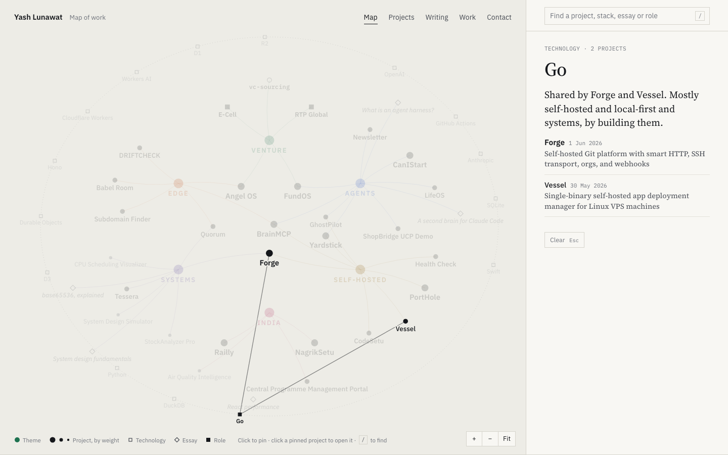
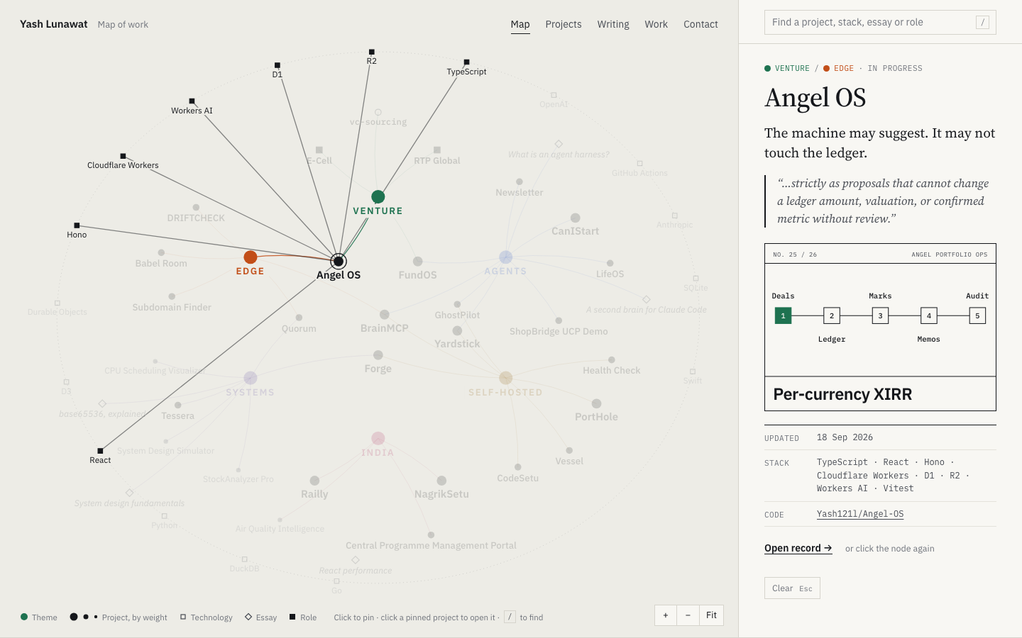
Not advanced. The theme-focus state with the serif reading panel is one of the best single screens. At rest the center is a tangle of TypeScript and Docker nodes, equal dot sizes give class projects the weight of Forge, and mobile gives up. The per-project neighbourhood graph and shareable focus links are stolen.

18 screenshots
blog-detail-desktop.png
blog-list-desktop.png
experience-desktop.png
home-1280.png
home-1280.png
home-desktop.png
home-desktop.png
home-focus-tech-cloudflare.png
home-focus-tech-go.png
home-focus-theme-venture.png
home-graph-rest.png
home-graph-rest.png
home-hover-project.png
home-keyboard.png
home-keyboard.png
home-mobile-chip.png
home-mobile.png
home-mobile.png
home-reduced-motion.png
project-detail-angel-desktop.png
project-detail-desktop.png
project-detail-mobile.png
projects-desktop.png

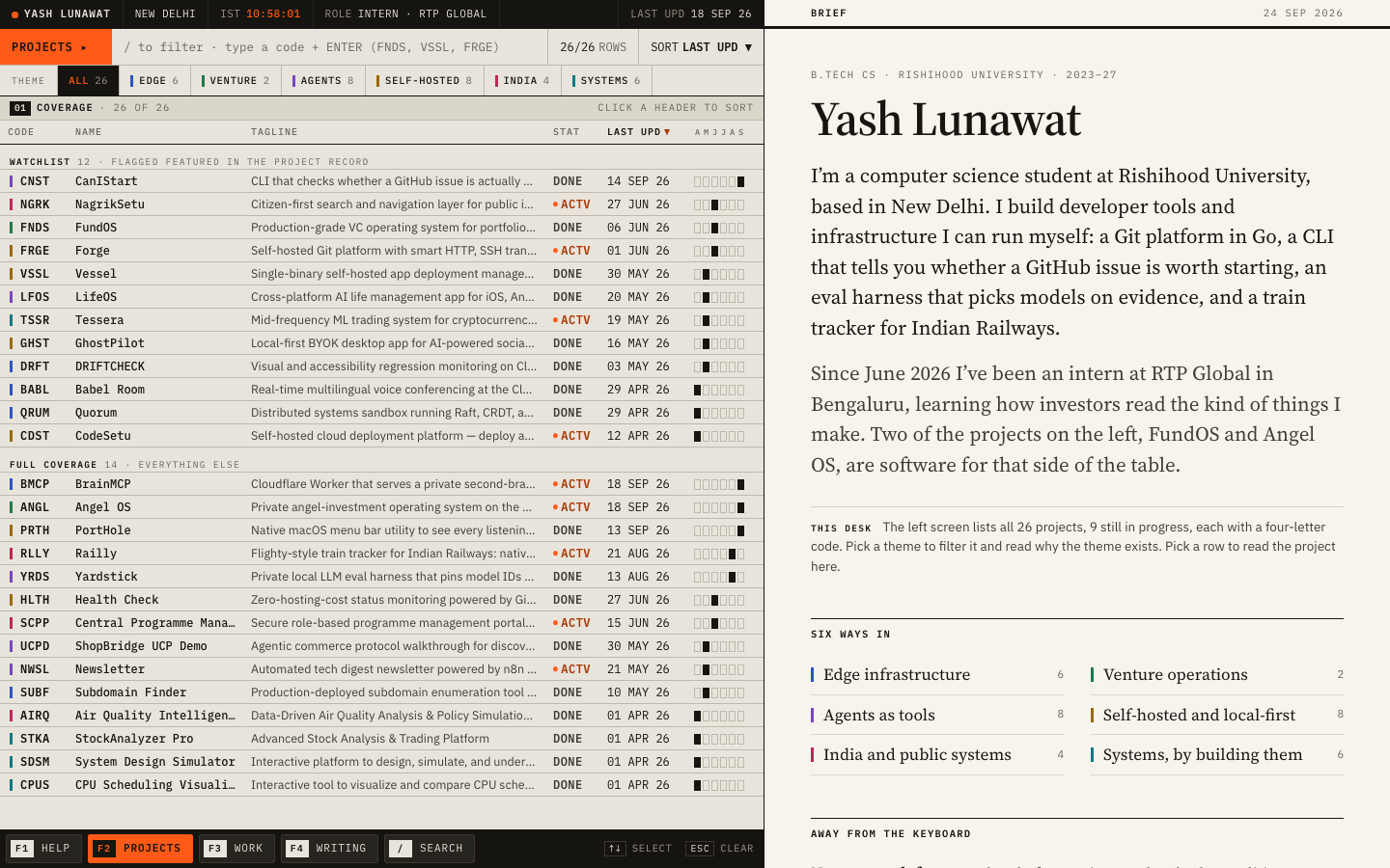
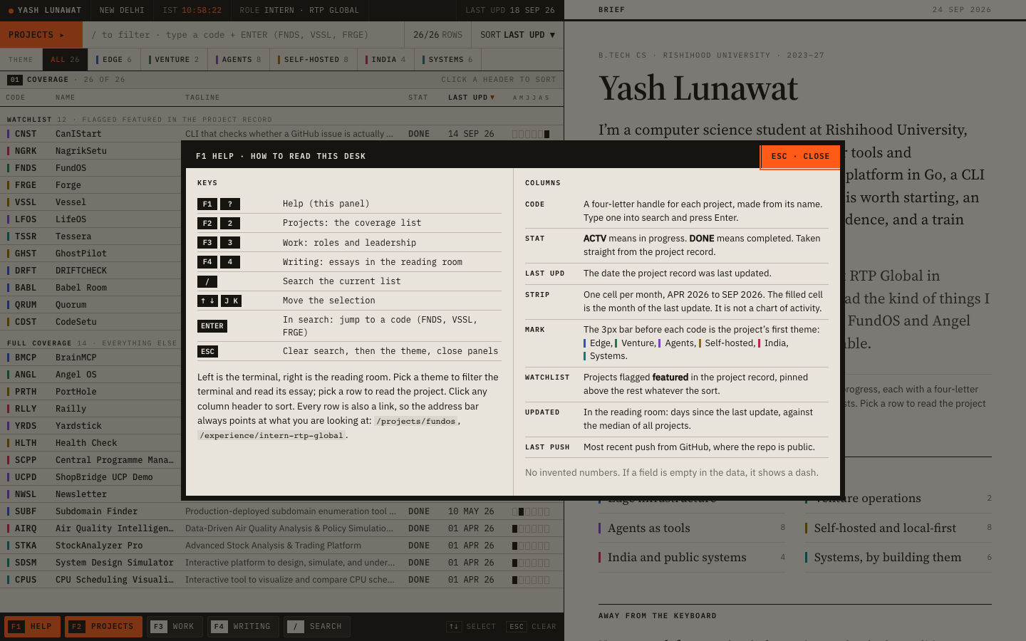
09 Research terminal

https://v9.yashlunawat.com/ · worktree portfolio-09 · branch design/portfolio-09 · cd /Users/admin/.t3/worktrees/portfolio/portfolio-09 && npx vite --port 5209

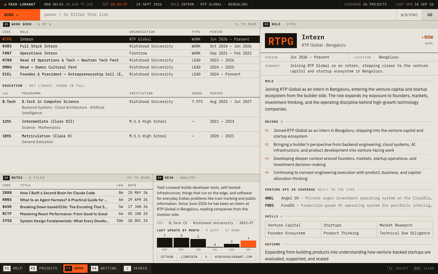
Research terminal home

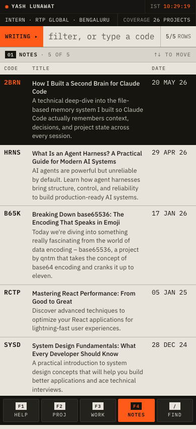
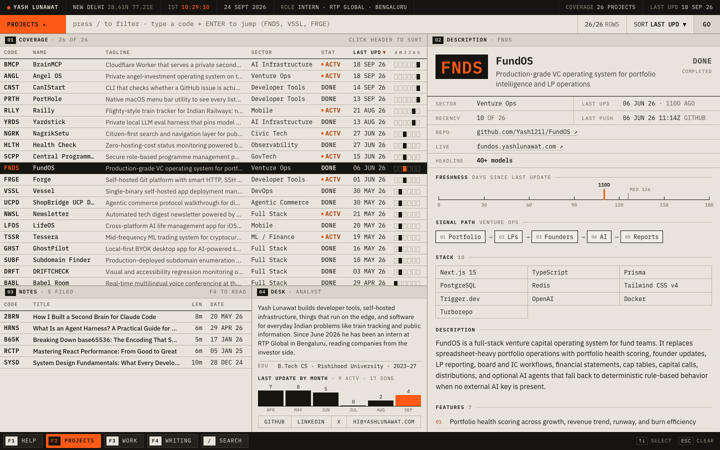
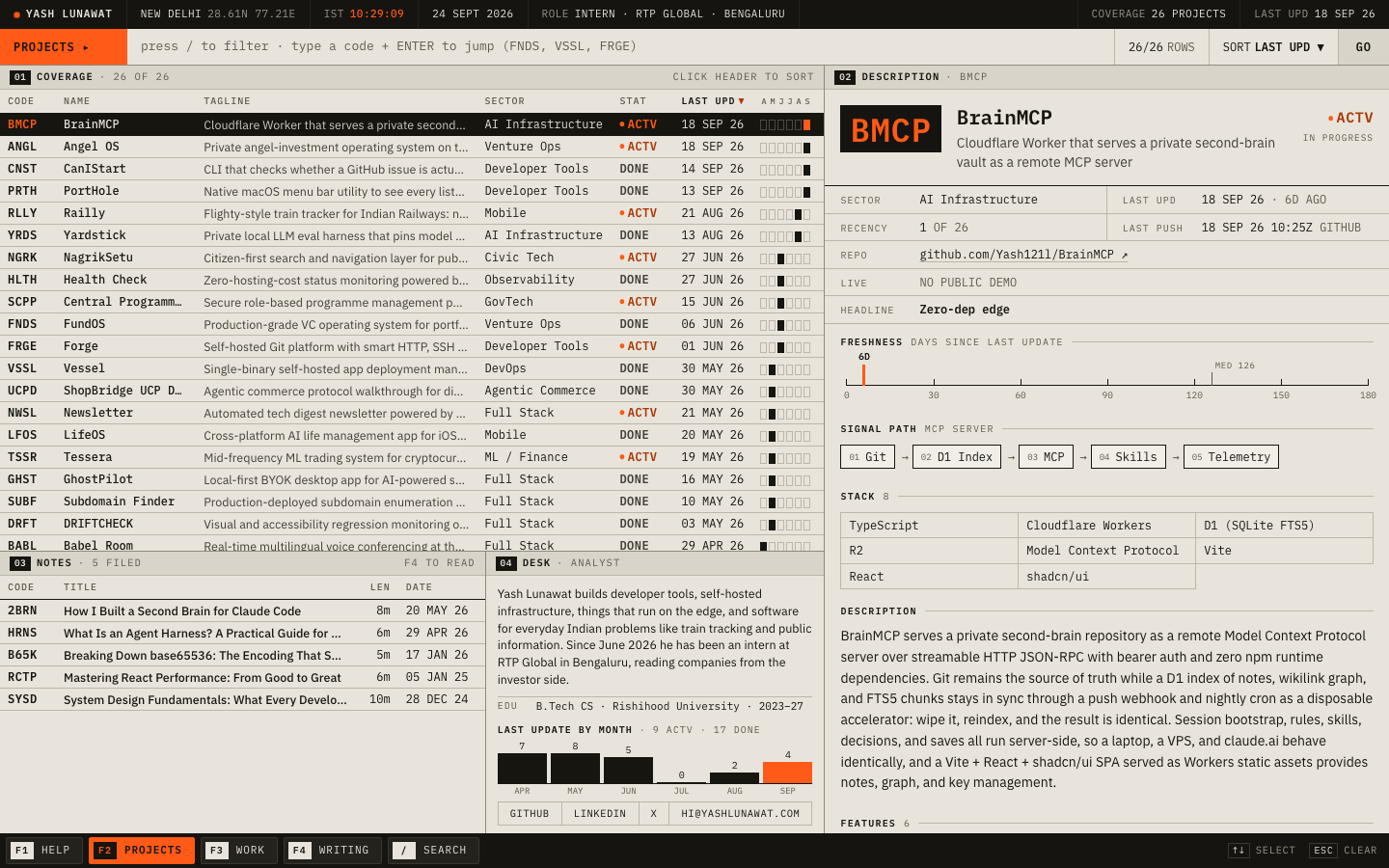
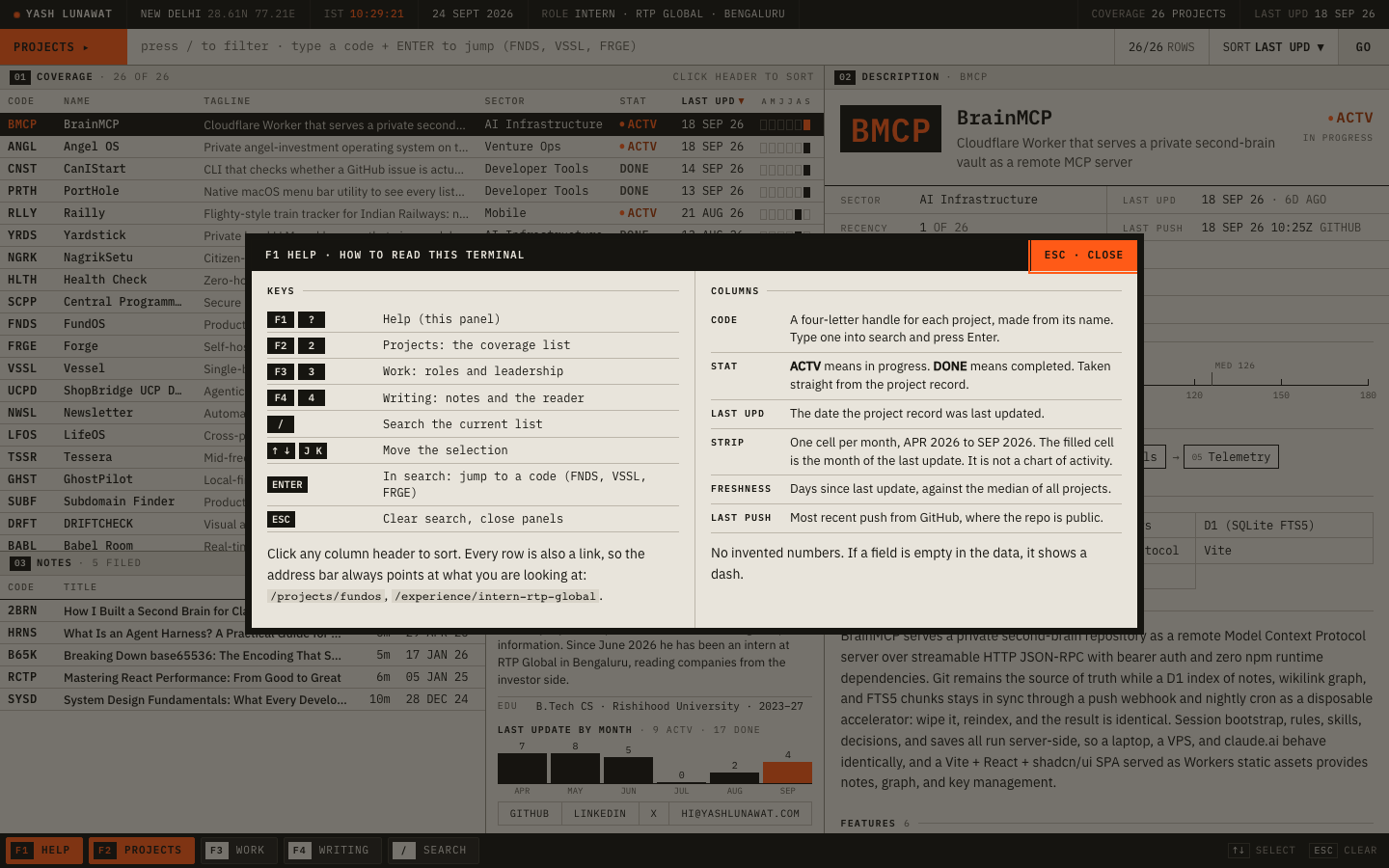
Thesis

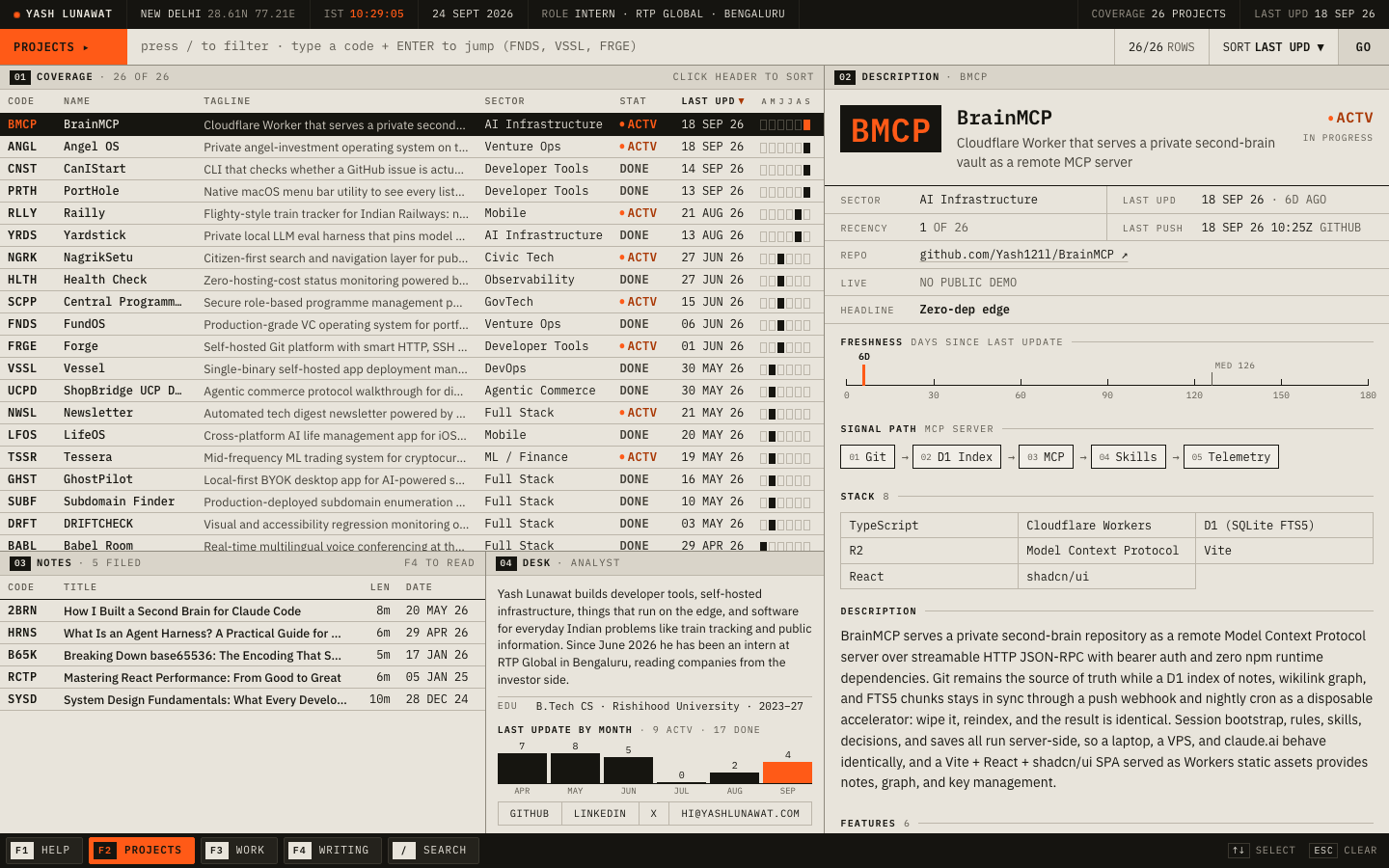
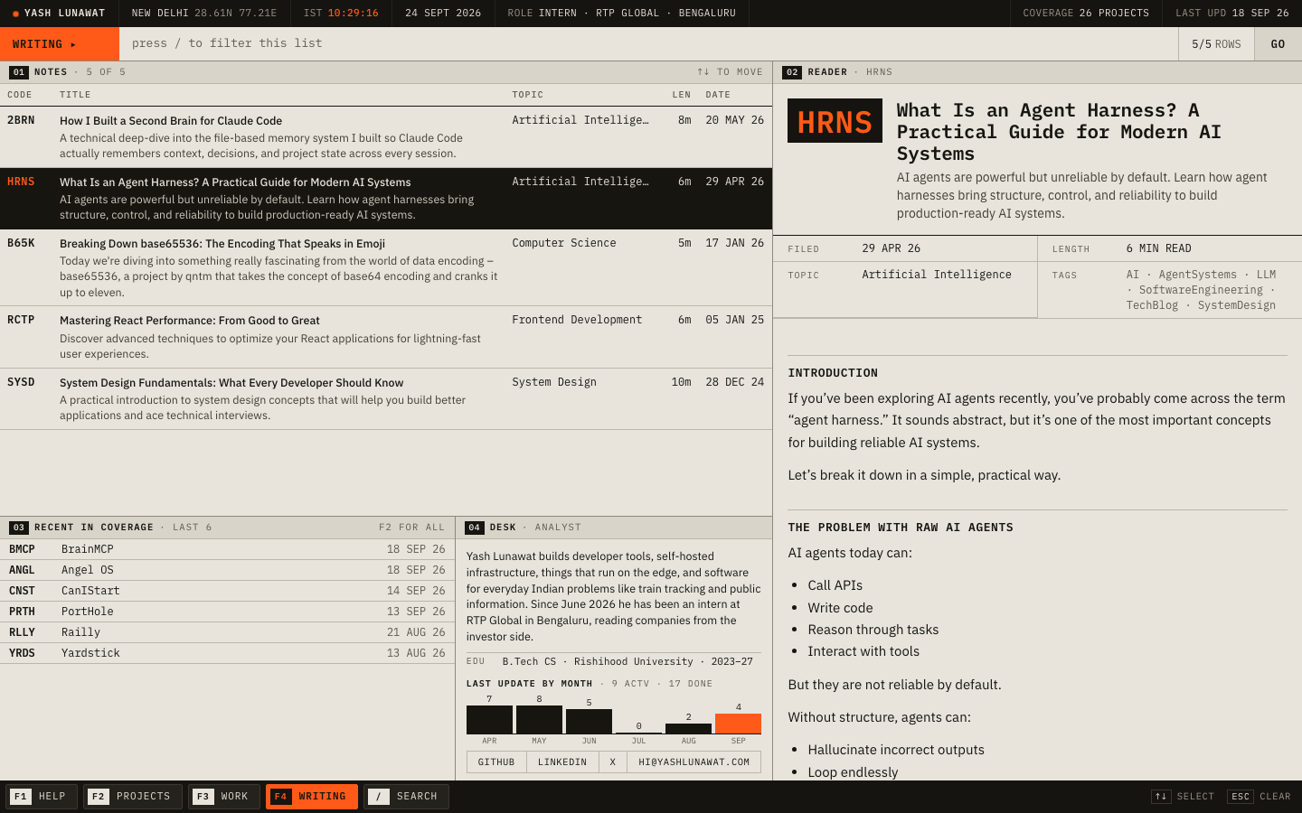
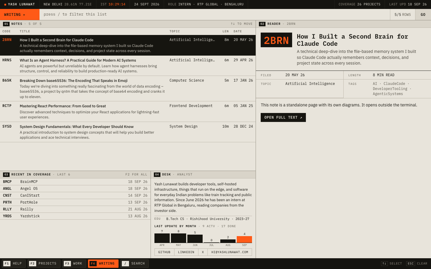
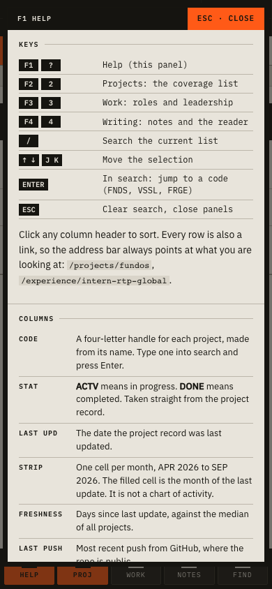
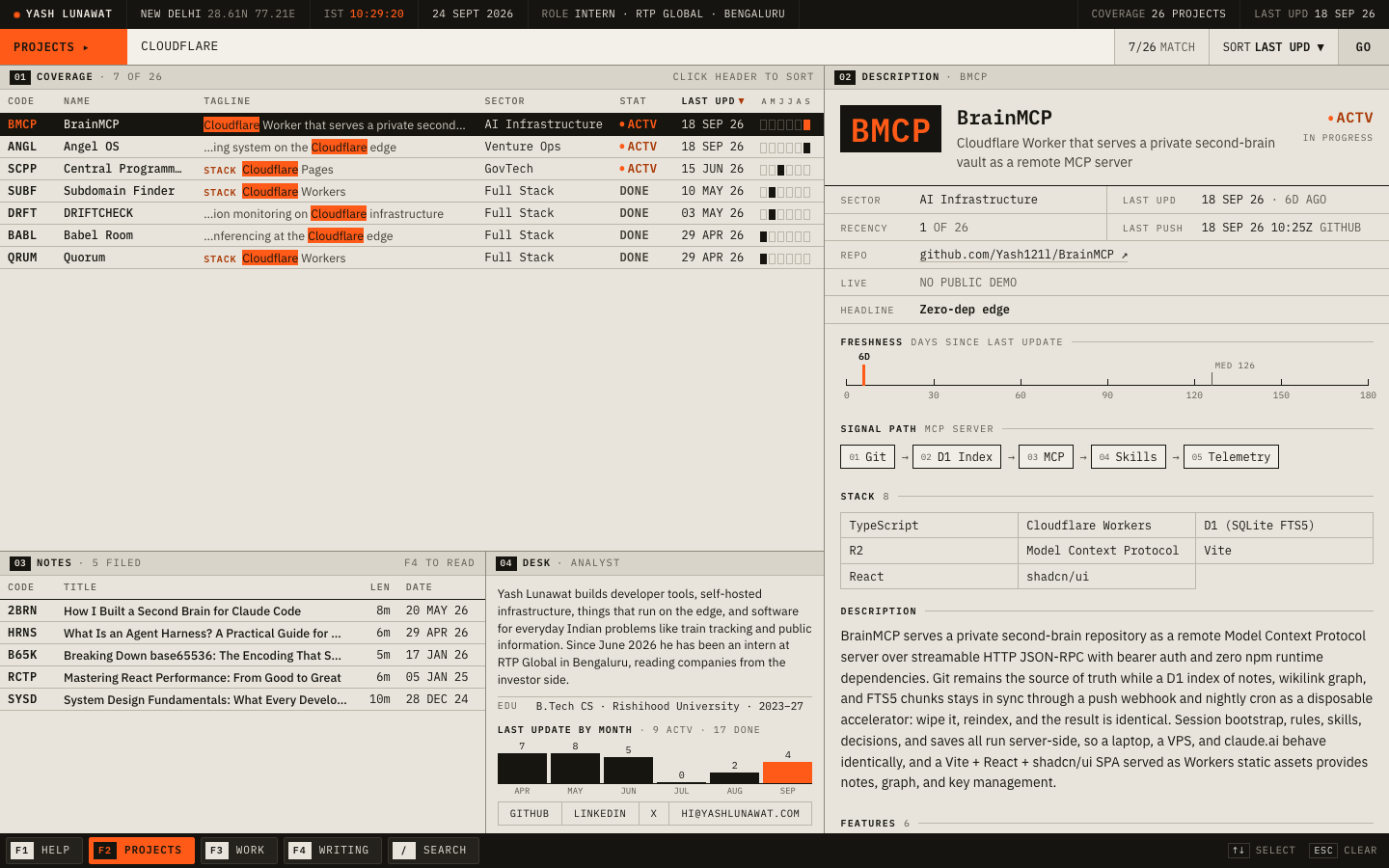
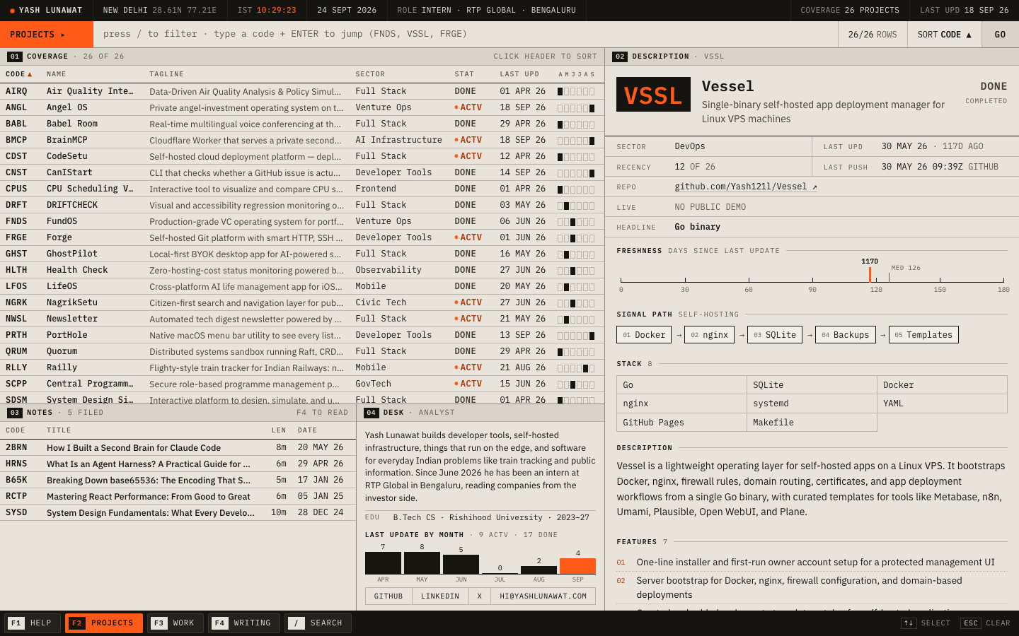
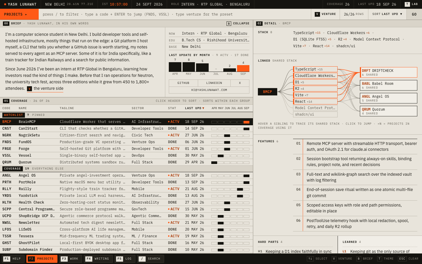
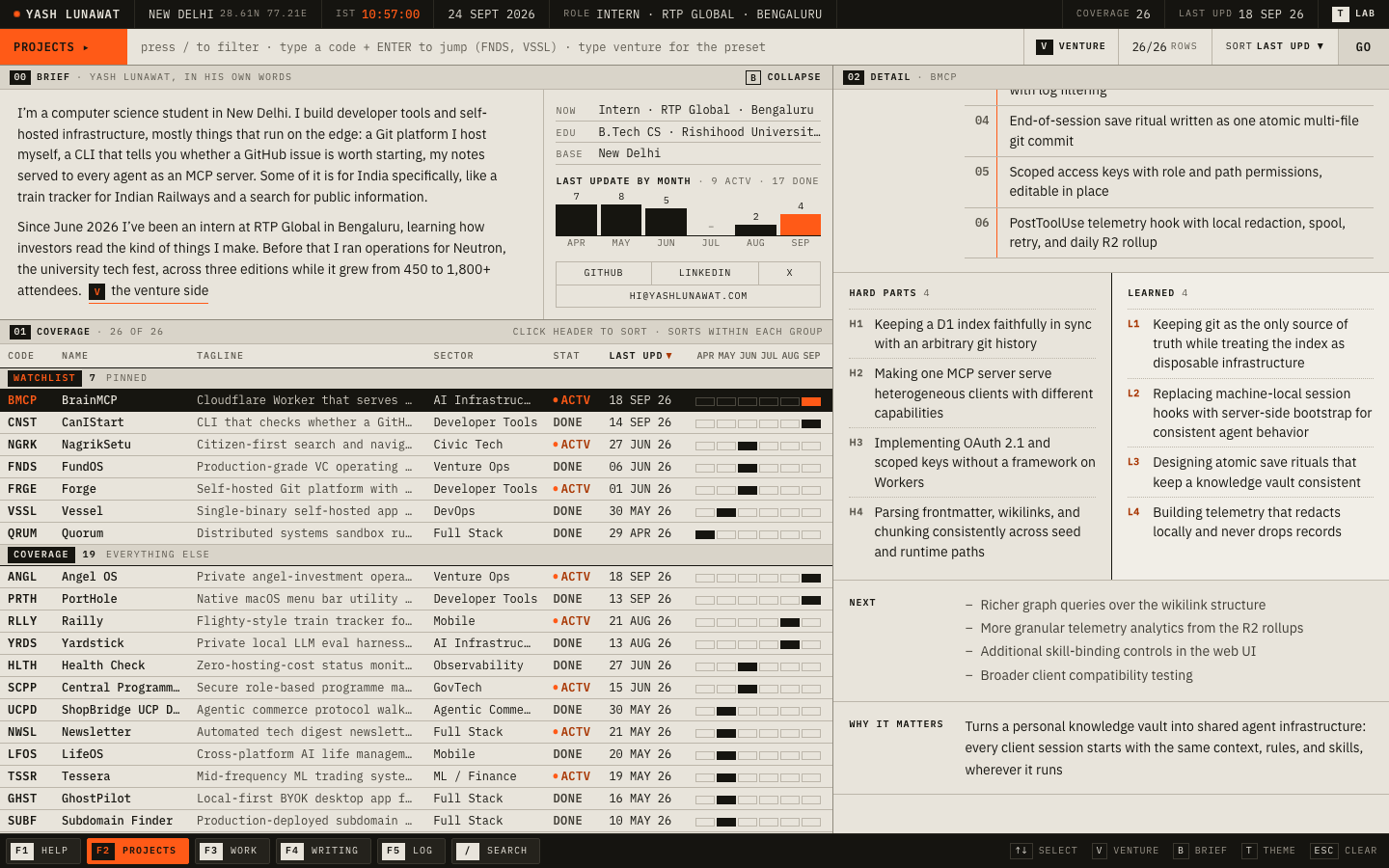
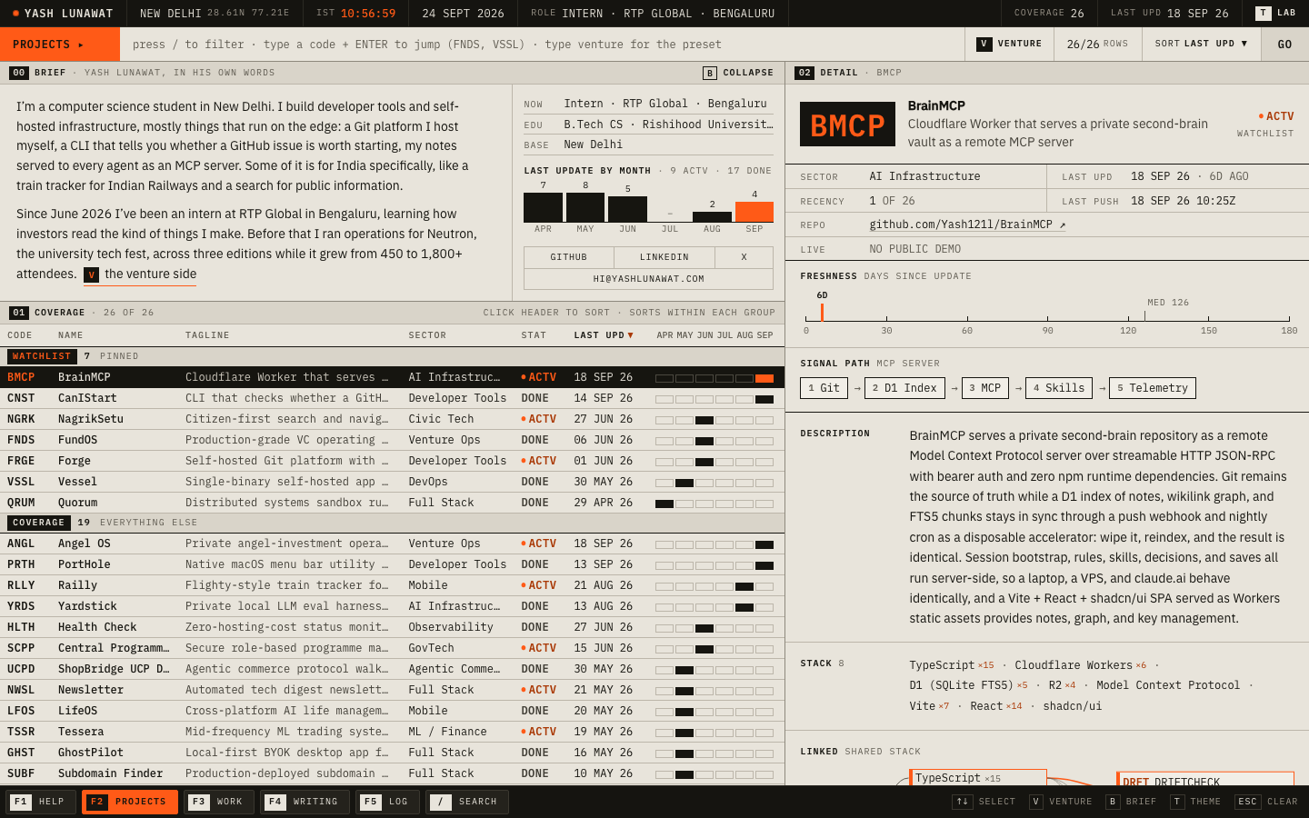
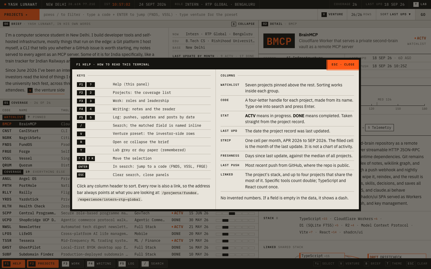
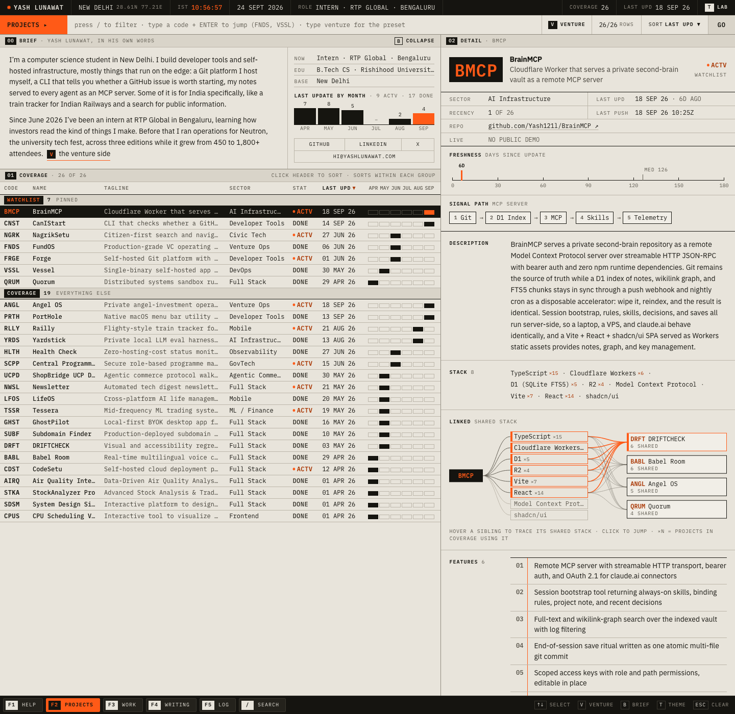
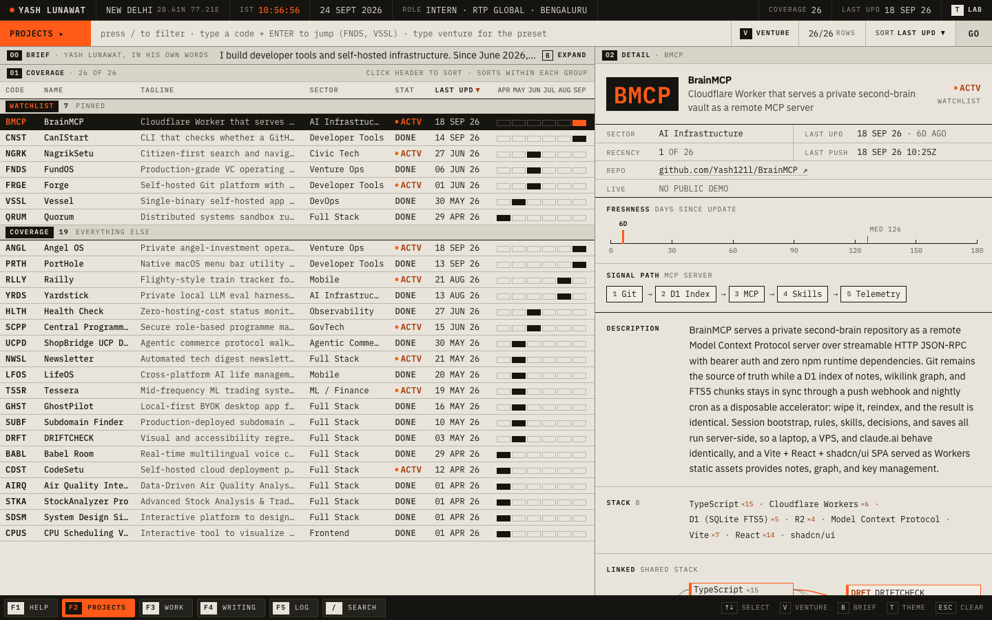
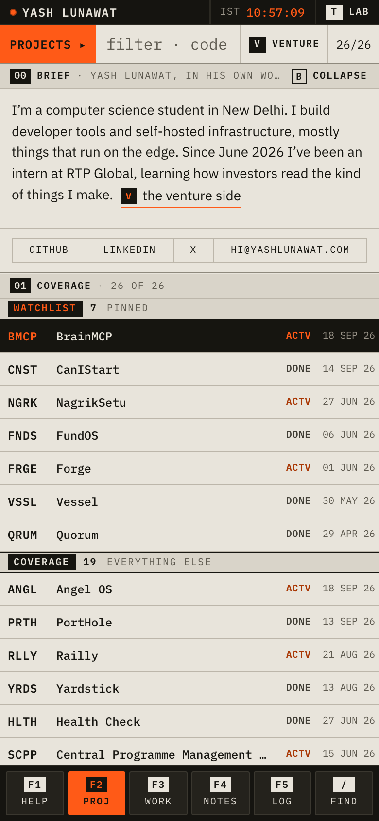
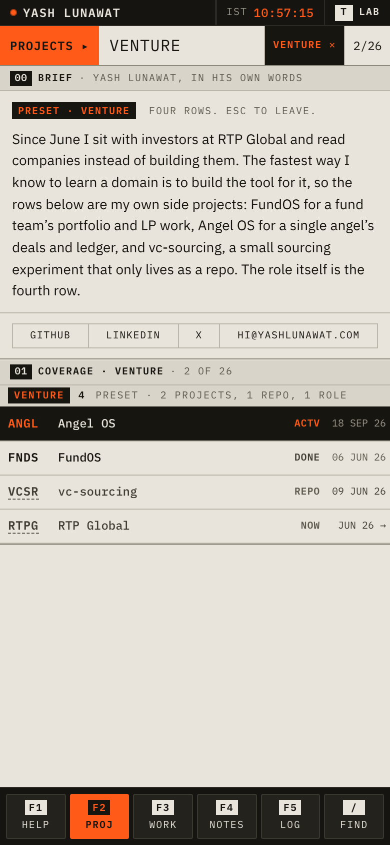
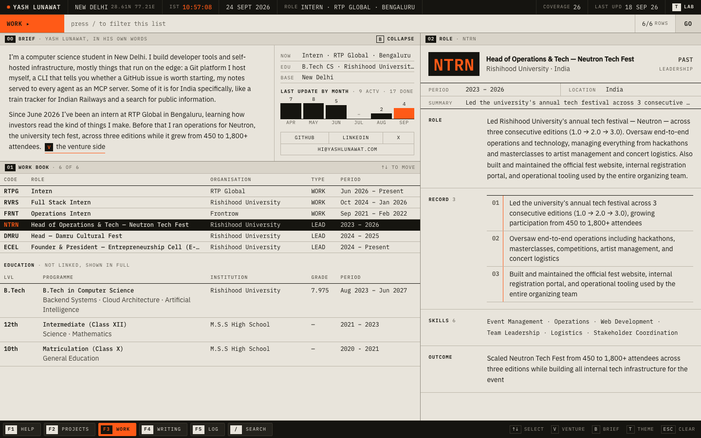
A professional data terminal whose coverage universe is Yash's own work: 26 projects with four-letter codes, sortable columns, a dense detail sheet, and function keys, laid out like Bloomberg and built like a 1980s lab instrument. After 30 seconds you should think: "this is the instrument panel of someone who keeps track of what he builds."

Memorable device

The big orange four-letter code in a black readout box, plus the jump: type `VSSL`, press Enter, and you are on Vessel.

Self-critique

  • **First impression:** it reads as a tool right away, which is the point, but there is no single sentence telling you who Yash is until your eye finds the DESK pane in the bottom middle. A recruiter scanning at arm's length sees a spreadsheet first and a person second.
  • **Originality:** the Braun grey plus orange avoids the green-on-black hacker cliché. Still, "Bloomberg for my portfolio" is a known move, and the pane-header numbering (01/02/03/04) is a familiar dashboard tic.
  • **Typography:** Plex Mono at 12px is crisp, but there are about five label si

Worth stealing

  • **Four-letter codes with jump-to.** Short handles for projects make the work feel like a coverage universe, and "type code, press Enter" is a fast, memorable way to navigate that any concept could add to its search.
  • **Honest date-derived marks.** The month strip (month of last update), the freshness gauge against the coverage median, and the last-push field from githubActivity give liveliness without inventing a single metric.
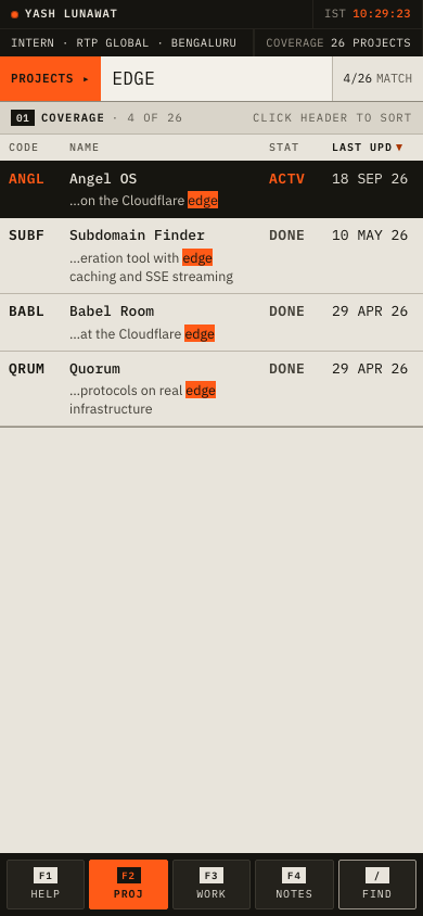
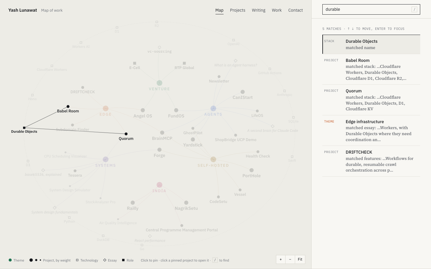
  • Also: during search, show the field that matched ("STACK Cloudflare Workers") instead of just filtering rows.

Coordinator verdict

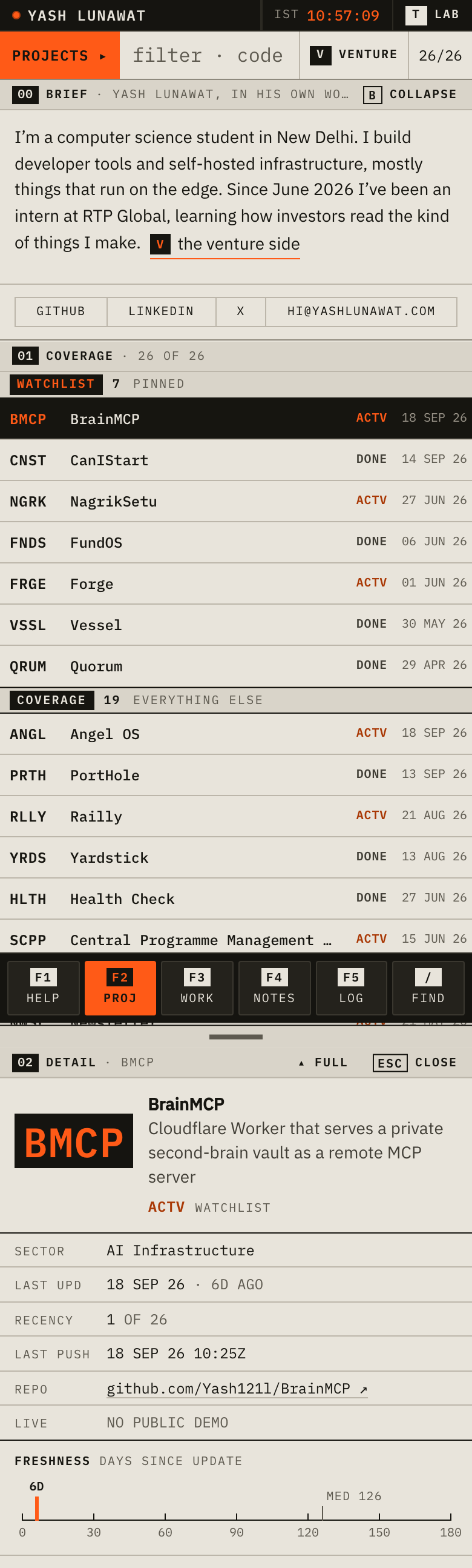
Finalist. The most completely realized concept: four-letter codes, sortable coverage table, freshness gauge and month strips from real dates only, working function keys, every route a terminal state. Weak: the person appears last in a small pane, five near-identical mono sizes, and mobile loses the density that made it a terminal.

14 screenshots
blog-detail-desktop.png
blog-list-desktop.png
blog-list-mobile.png
home-desktop.png
home-desktop.png
home-mobile.png
home-mobile.png
project-detail-desktop.png
project-detail-mobile.png
projects-desktop.png
state-help-desktop.png
state-help-mobile.png
state-search-desktop.png
state-search-mobile.png
state-sorted-jump-desktop.png
work-desktop.png
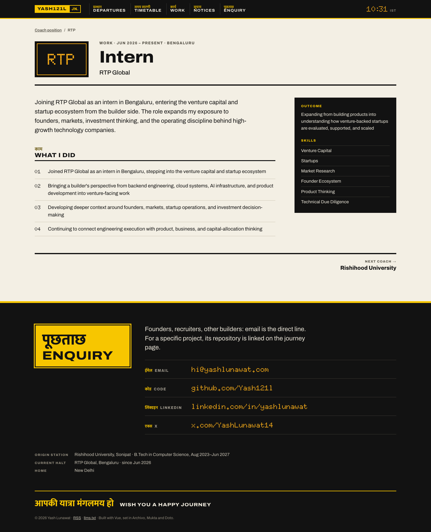
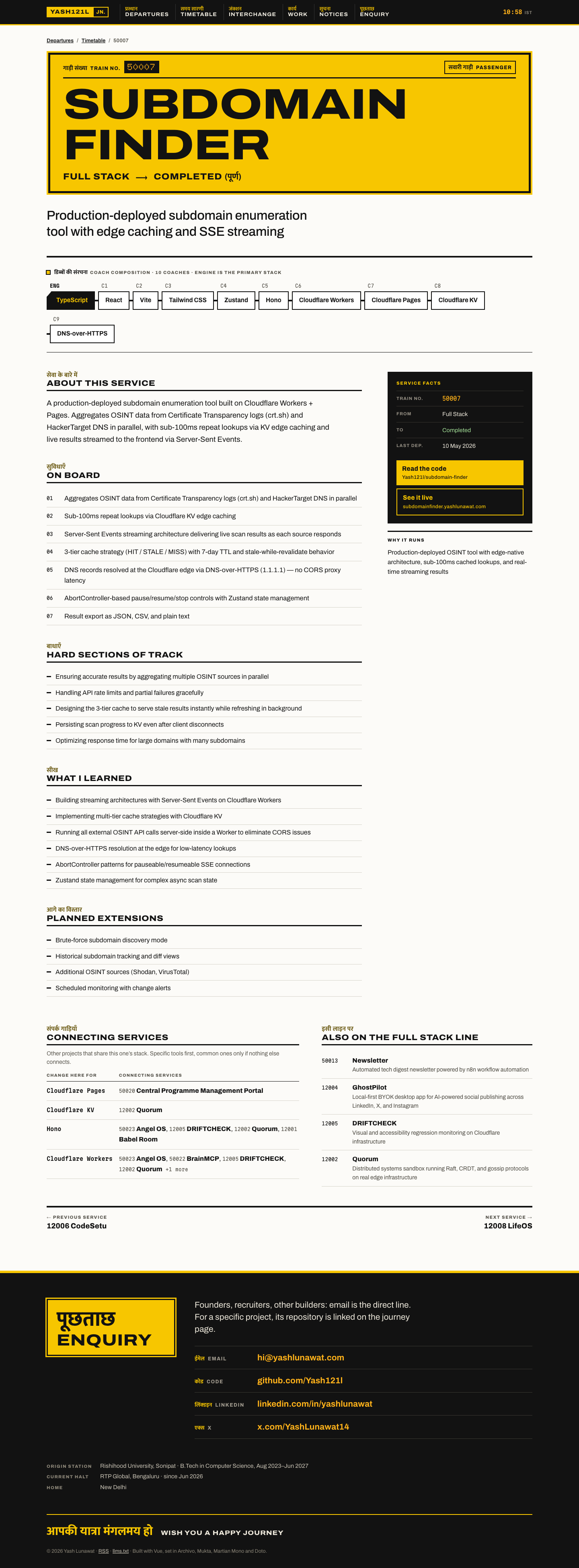
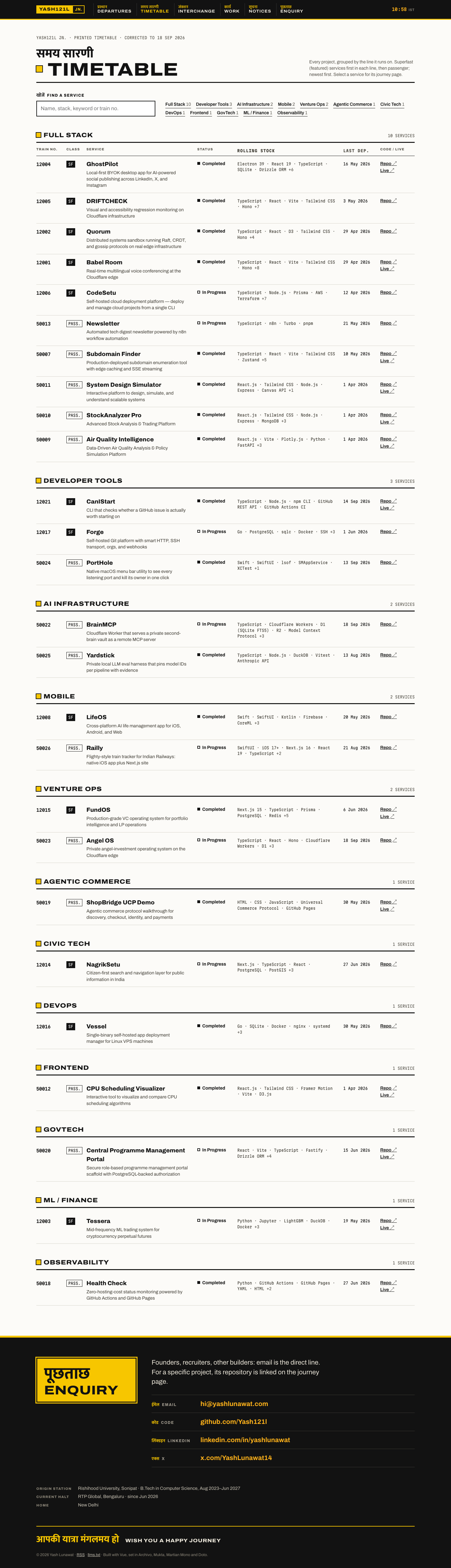
work-desktop.png

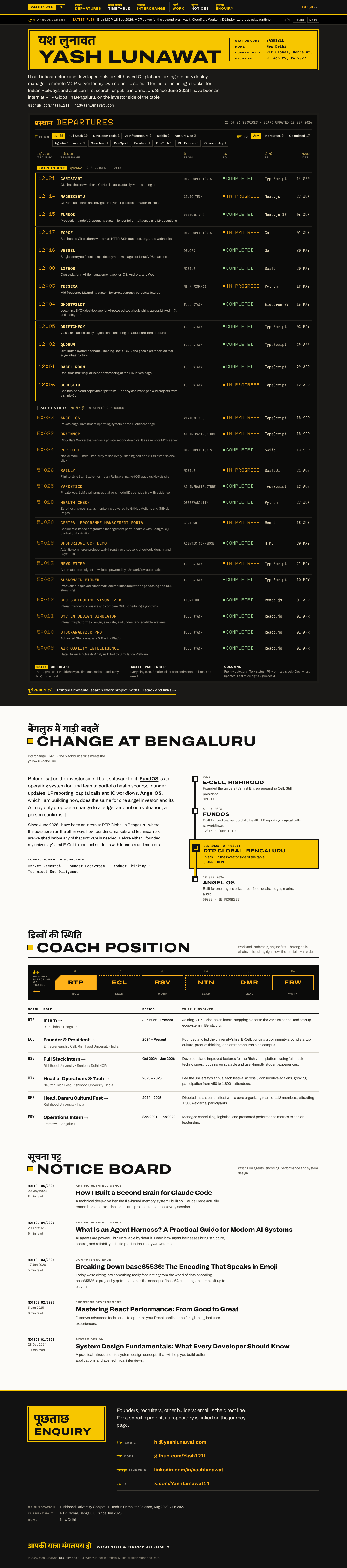
10 Departures board

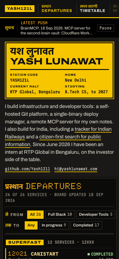
https://v10.yashlunawat.com/ · worktree portfolio-10 · branch design/portfolio-10 · cd /Users/admin/.t3/worktrees/portfolio/portfolio-10 && npx vite --port 5210

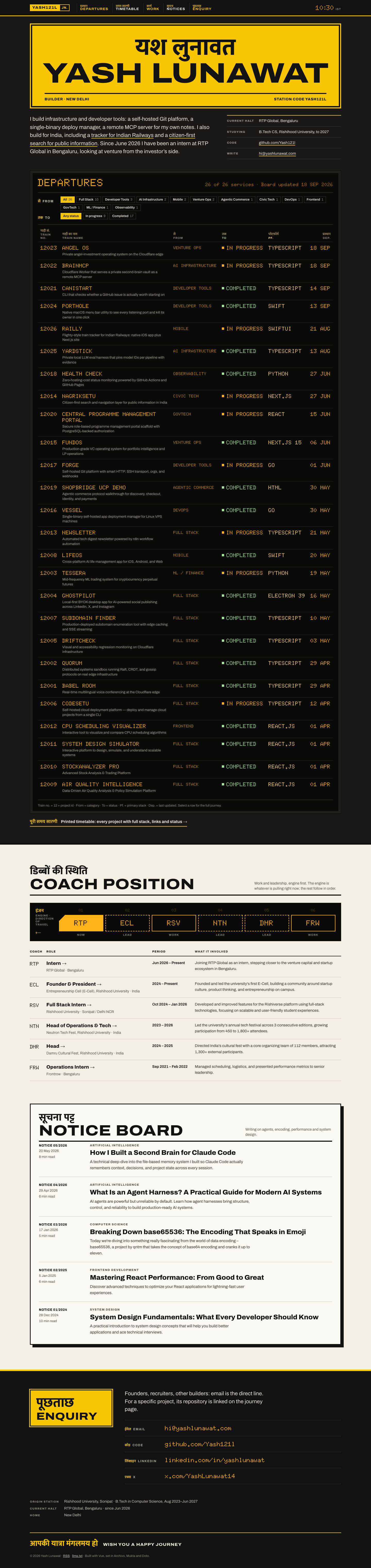
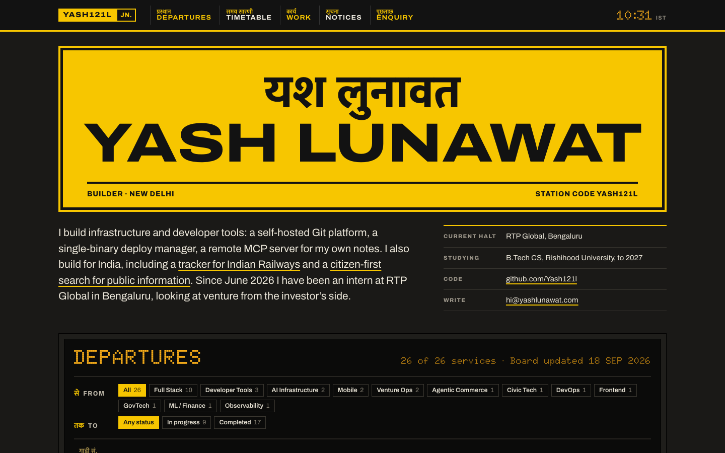
Departures board home

Thesis

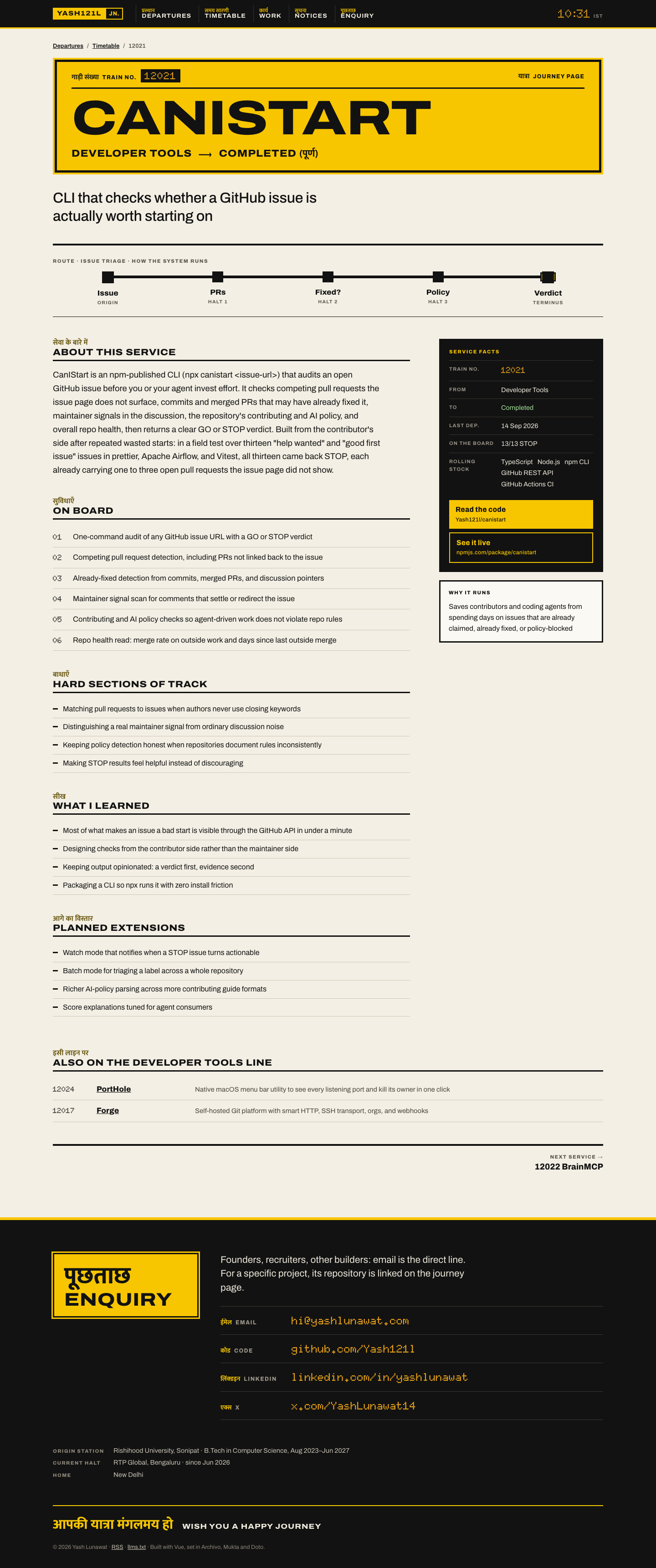
Yash builds for India (Railly, NagrikSetu) and ships so often that his work is best read as a live service board. So the site is a bilingual Indian Railways station information system: the projects are trains, and you read them the way you would at New Delhi station. After 30 seconds a visitor should think "this is obviously him", having already scanned all 26 projects, their status and their stack without clicking anything.

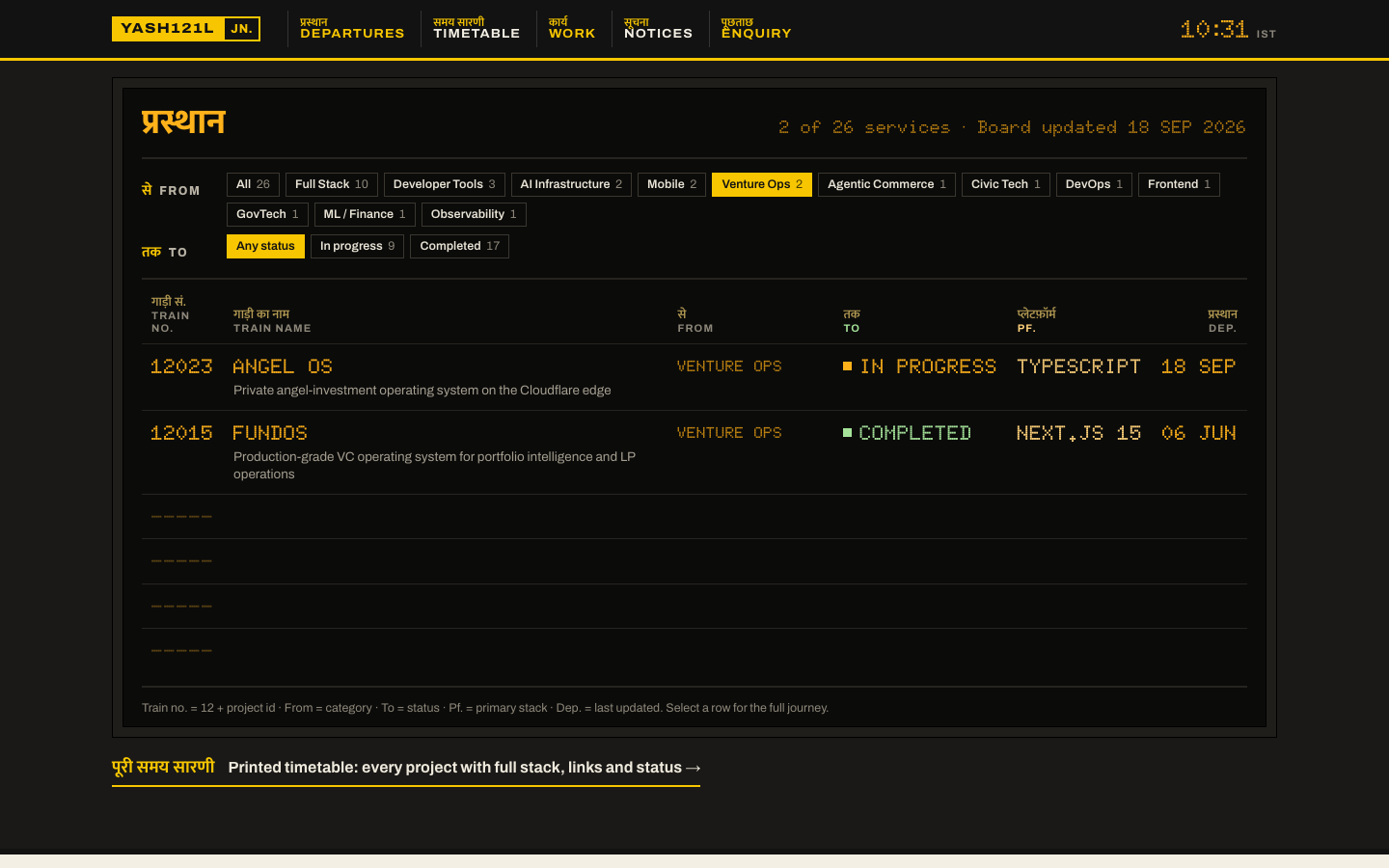
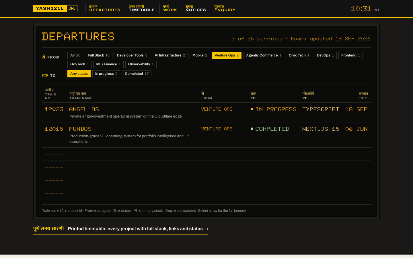
Memorable device

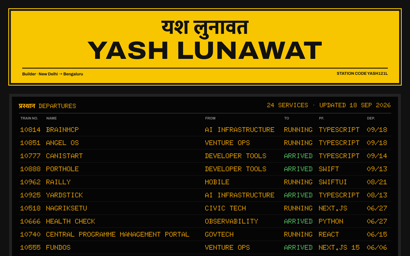
A yellow Indian Railways station nameboard reading "यश लुनावत / YASH LUNAWAT", over an amber LED departures board where every project is a train and the header flips between प्रस्थान and DEPARTURES.

Self-critique

  • **First impression:** strong and legible from a thumbnail. But the sign plus intro still push the first board row below the 900px fold. You see the DEPARTURES title, not a train, and that is the thing that should hit first.
  • **Originality:** high. No other portfolio I know of speaks Indian Railways. The risk is that it reads as a themed gimmick to someone who does not know the boards.
  • **Typography:** Archivo expanded caps and Mukta pair well on the signs. Doto at 21px is readable but spiky; categories set in Doto at 16px (From column) are the weakest text on the site. Doto's "." glyph renders as a raised dot in NEXT.JS and REACT.JS, which looks like a bug.
  • **Hierarchy:** the board is dense by design. With 26 rows at equal weight, nothing tells a founder which five projects matter most (CanIStart, NagrikSetu, FundOS, Vessel, Forge). A "featured" signal, such as a Rajdhani/superfast marker, is missing.
  • **Storytelling:** the intro paragraph does the narrative work, and the venture angle rests on one sentence plus two board rows. An investor gets little of "how a builder thinks about venture".
  • **Personality:** it fits the facts (Delhi, railways, civic, ships a lot). The Hindi labels are simple and correct, but the whole site depends on them being right, and they have not been checked by a native reader.
  • **Usability:** better than the old site. Everything is visible without scroll-reveal, filters are one tap, rows are fully clickable, and search works. The empty dashed slots after filtering are authentic but waste about 300px.
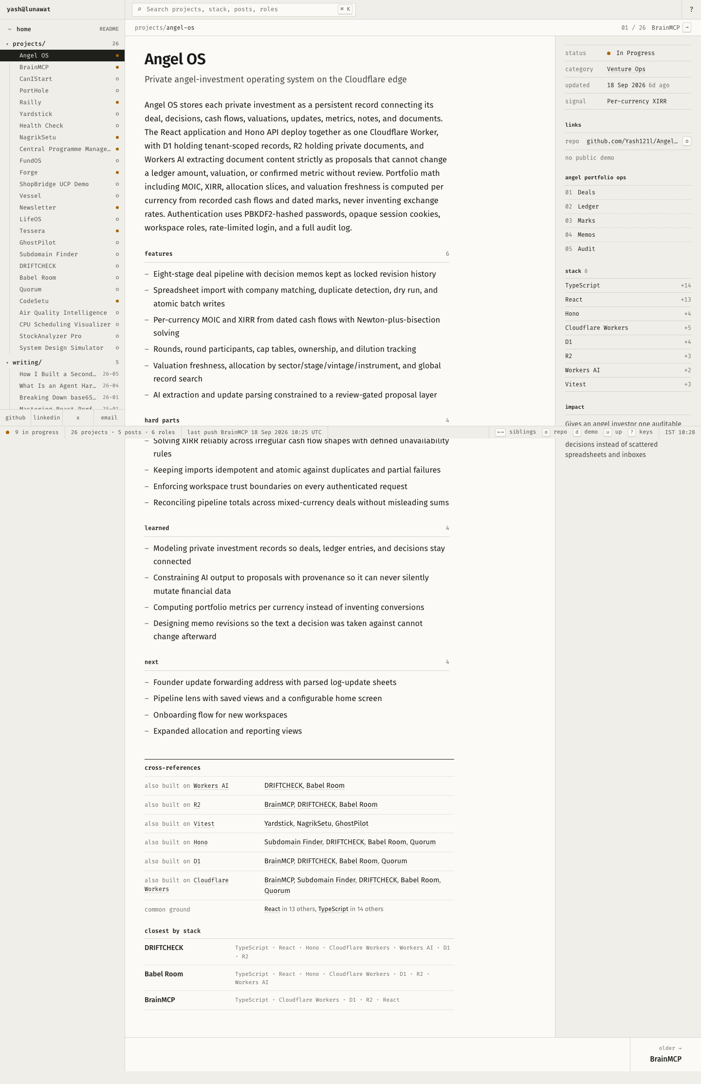
  • **Project presentation:** strong on facts,

Worth stealing

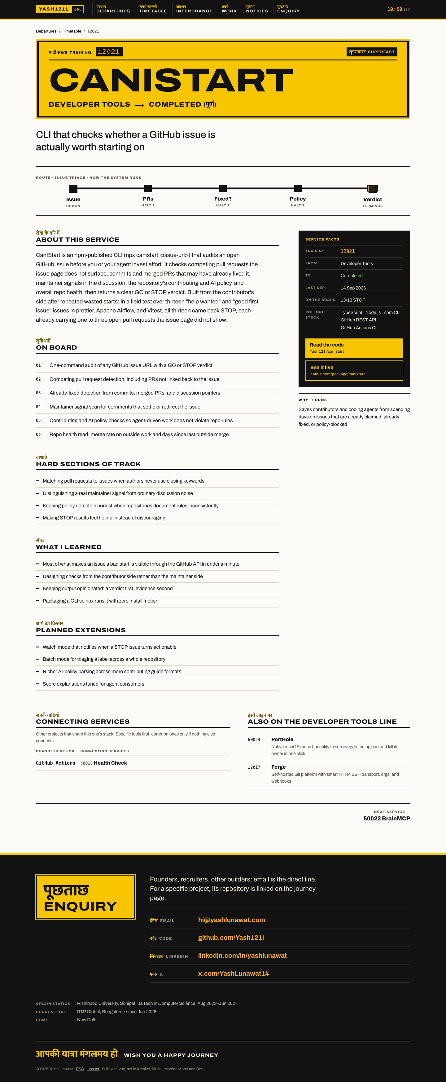
  • **Encode real metadata as a familiar public information system.** Status becomes To, stack becomes Platform, lastUpdated becomes Departed. The metaphor adds scannability instead of hiding information; any concept can map its project fields onto a known wayfinding grammar.
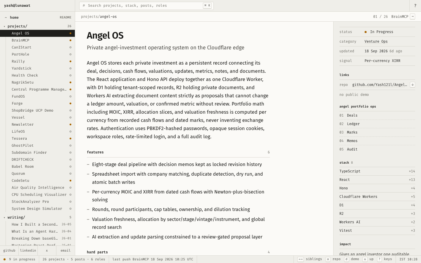

  • **Bilingual labels and live data as identity.** A Hindi label beside each English heading, plus "board updated" computed from the newest `lastUpdated` and a live IST clock. It costs little and makes the site unmistakably located and current.
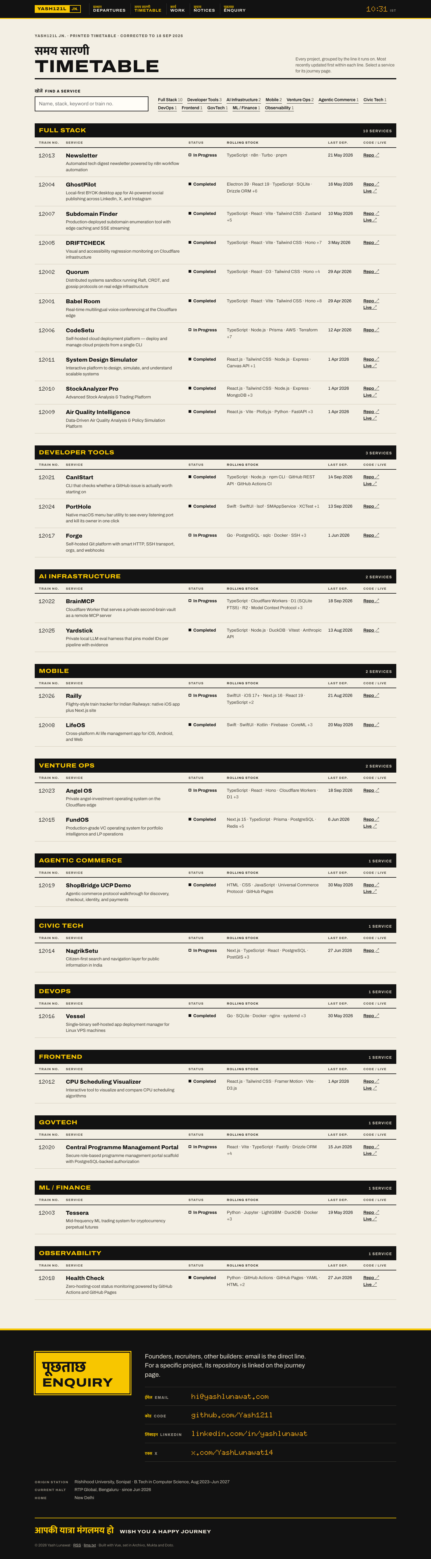
  • Also: a route strip built from `visual.nodes` on project detail pages, and printed-timetable grouping with search synced to `?query=`.

Coordinator verdict

Finalist. The most distinctly his: a bilingual Indian Railways nameboard and a board where status is the destination and last update is departure time. It grows from Railly and NagrikSetu instead of from a trend. Weak: the first train row falls below the fold, all 26 rows weigh the same, the dot-matrix face is spiky at small sizes, and it risks kitsch if pushed wrong.

13 screenshots
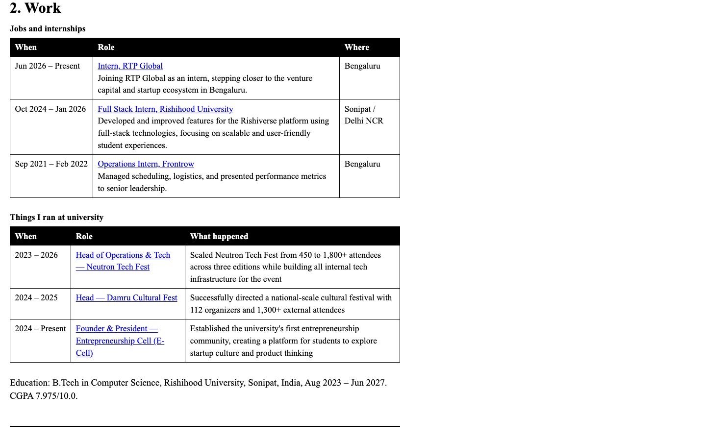
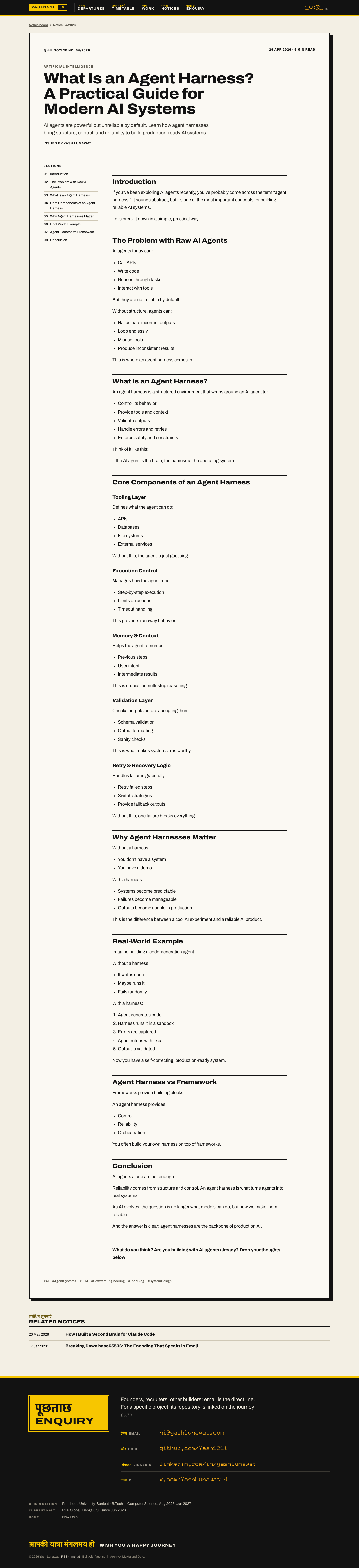
blog-detail-desktop.png
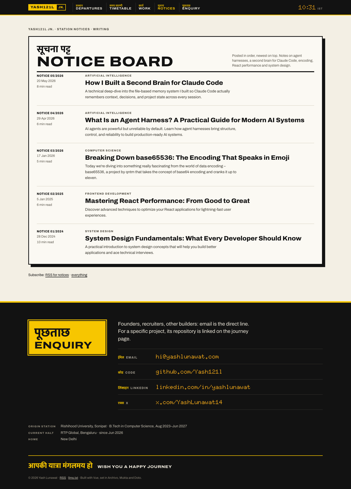
blogs-desktop.png
blogs-desktop.png
experience-desktop.png
home-desktop.png
home-desktop.png
home-fold.png
home-fold.png
home-mobile.png
home-mobile.png
interaction-board-filtered.png
interaction-board-flipping.png
project-detail-desktop.png
project-detail-mobile.png
projects-desktop.png
projects-mobile.png
projects-mobile.png
sketch-a-departures.png

11 Editorial magazine, second edition

https://v11.yashlunawat.com/ · worktree portfolio-11 · branch design/portfolio-11 · cd /Users/admin/.t3/worktrees/portfolio/portfolio-11 && npx vite --port 5211

Editorial magazine, second edition home

Thesis

The site is one issue of a small independent maga

Memorable device

Still the cover: the name as a masthead and an oxblood 13/13 underneath. Second place: the little superscripts in the back of the book that take you to what each project taught him.

Self-critique

Worth stealing

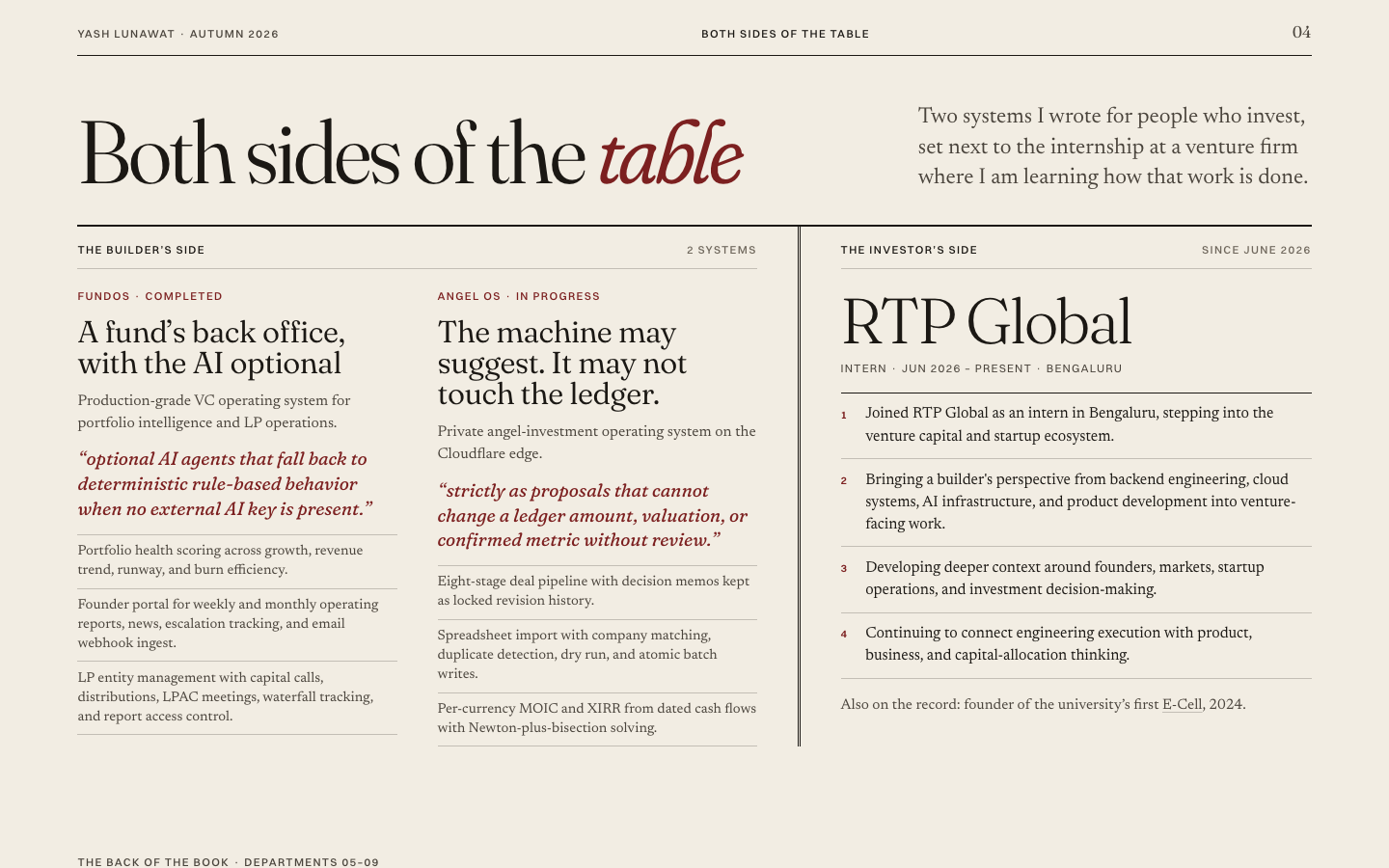
  • Department cross-references ("Also in this department: CanIStart (02)") so a home page can feature projects without listing them twice.
  • Footnotes whose text comes from a `learnings` index, so they are verbatim by construction and checked by script.
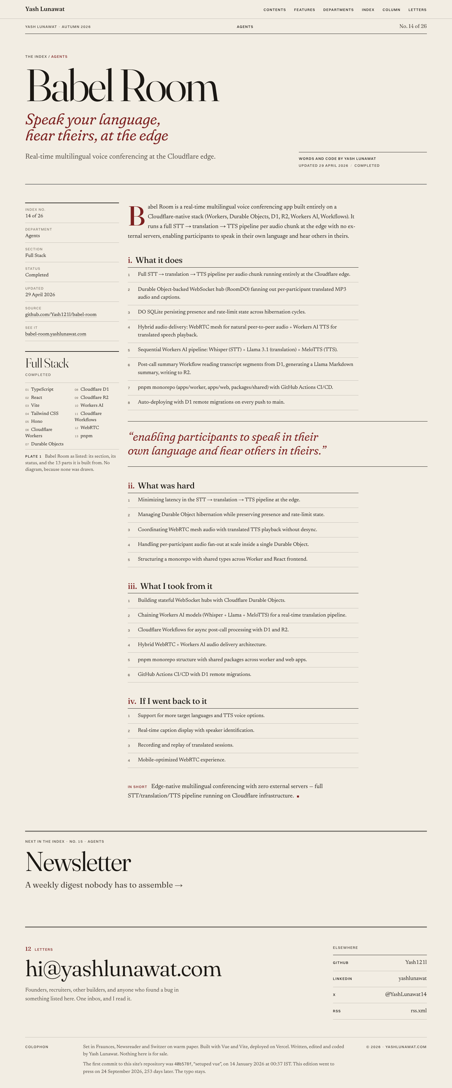
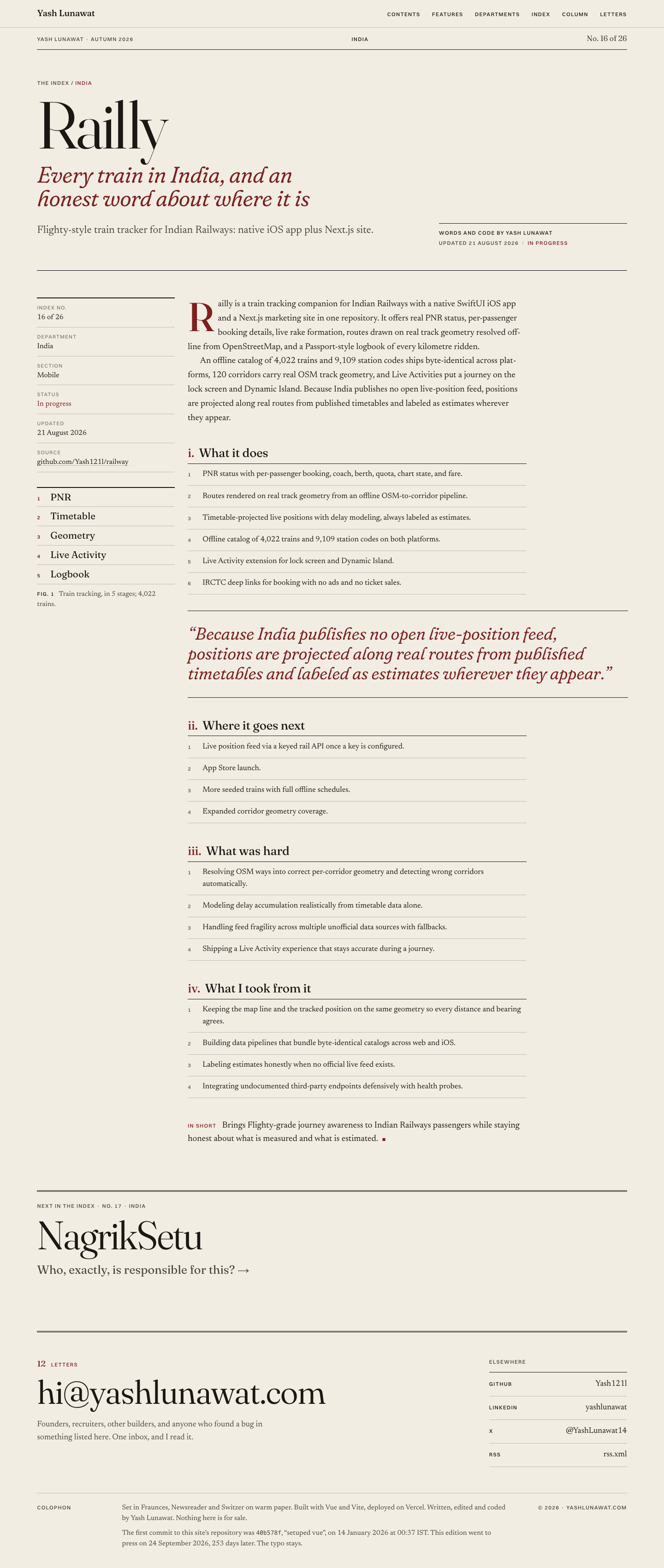
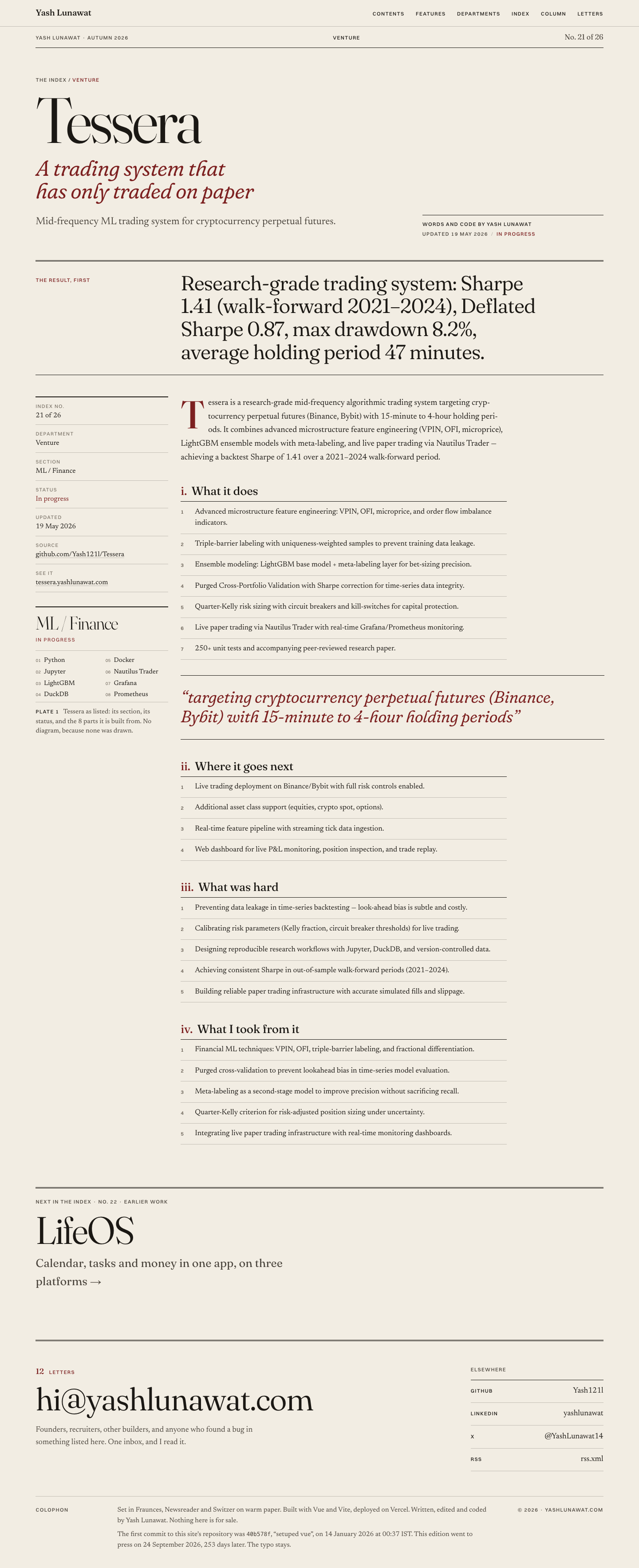
  • "Plate n": a typographic figure for projects without diagrams that says so in its caption.
  • Real section numbers shared by the contents, the running heads and the index.
  • The build-time colophon sentence.

Coordinator verdict

Generation 2 of 01. Departments replace the flat index, all 26 projects have a headline and a verified verbatim quote, and the Both sides of the table spread is the best treatment of the venture angle in the tournament. Still conservative past the cover, oxblood does too many jobs, and the typographic Plate repeats on 17 projects. Superseded by hybrid A, which shares its typography but has a stronger structure.

17 screenshots

blog-list-desktop.png
both-sides-desktop.png
detail-babel-desktop.png
detail-railly-desktop.png
detail-railly-mobile.png
detail-tessera-desktop.png
detail-tessera-mobile.png
experience-desktop.png
footnote-target-desktop.png
footnote-target-mobile.png
home-desktop.png
home-desktop.png
home-fold-desktop.png
home-mobile.png
home-mobile.png
letter-desktop.png
letter-desktop.png
projects-desktop.png
projects-mobile.png
projects-mobile.png
projects-tab-agents.png

12 Departures board, second edition

https://v12.yashlunawat.com/ · worktree portfolio-12 · branch design/portfolio-12 · cd /Users/admin/.t3/worktrees/portfolio/portfolio-12 && npx vite --port 5212

Departures board, second edition home

Thesis

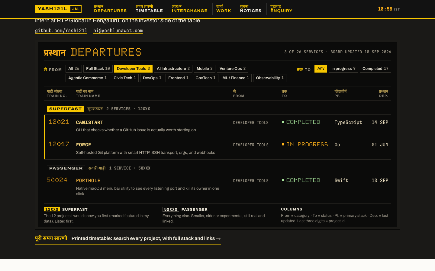
Yash builds for India and ships constantly, so his work reads as a live departures board at a bilingual station: every project is a train, featured work runs superfast and comes first, and the venture side is the junction where he changed lines. After 30 seconds a visitor should have seen the first three trains, know which twelve projects matter most, and know he now sits on the investor side, all without clicking.

Memorable device

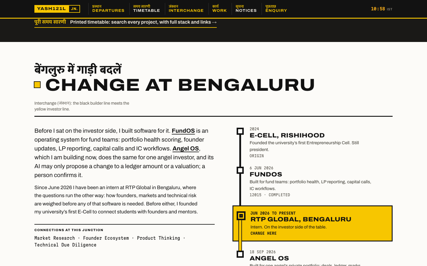
A black departures board whose first rows, visible before scrolling, are yellow-edged SUPERFAST trains with dot-matrix numbers, and below it a yellow "Change here" box where his builder line turns into the investor line at Bengaluru.

Self-critique

Worth stealing

  • A class system taken from the data's own `featured` flag, with the numbering scheme carrying the class so it survives even in plain text (12xxx vs 5xxxx).
  • An announcement strip built only from computed data (latest push, counts, latest post, current role), pausable and static under reduced motion.
  • For projects without a diagram, show the stack as a coupled composition instead of inventing a flow.
  • "Change here for <stack>" connection tables with alias normalisation (from concept 03).

Coordinator verdict

Generation 2 of 10. First train above the fold, superfast and passenger classes, dot-matrix face confined to three columns, a Change at Bengaluru interchange for the venture side. The most unmistakably his, and the honest data mapping holds. Loses on the journey pages (long styled lists), on the kitsch risk once the yellow spreads, and because 12 of 26 projects are flagged featured so the top tier is flat. Kept as the strongest alternative direction.

14 screenshots
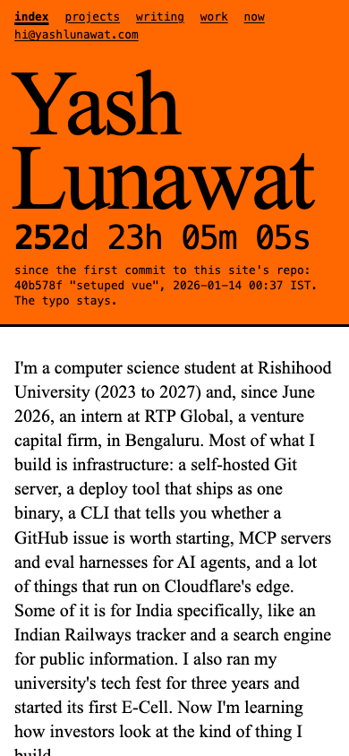
blog-detail-desktop.png
blogs-desktop.png
blogs-desktop.png
experience-desktop.png
home-desktop.png
home-desktop.png
home-fold.png
home-fold.png
home-mobile-fold.png
home-mobile.png
home-mobile.png
interaction-filter-settled.png
interchange-desktop.png
journey-featured-desktop.png
journey-mobile.png
journey-mobile.png
journey-nonodes-desktop.png
projects-desktop.png
projects-mobile.png
projects-mobile.png

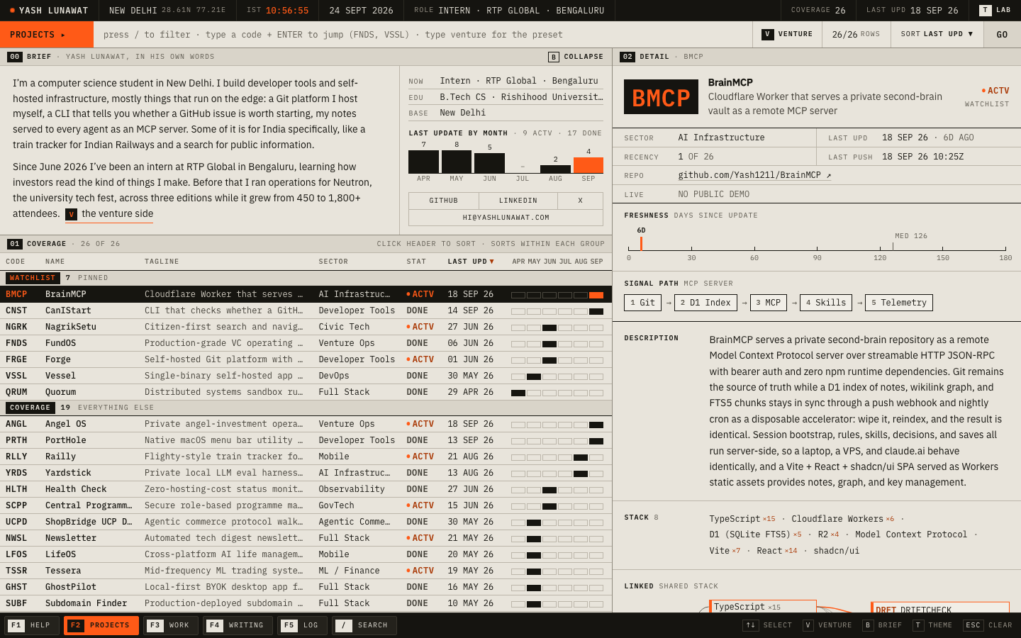
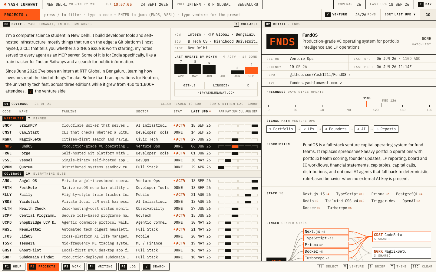
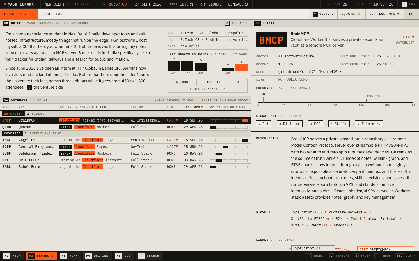
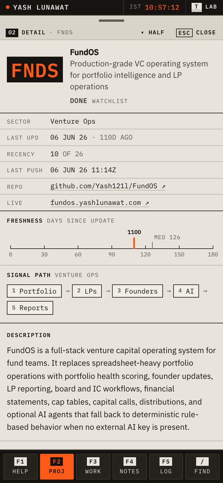
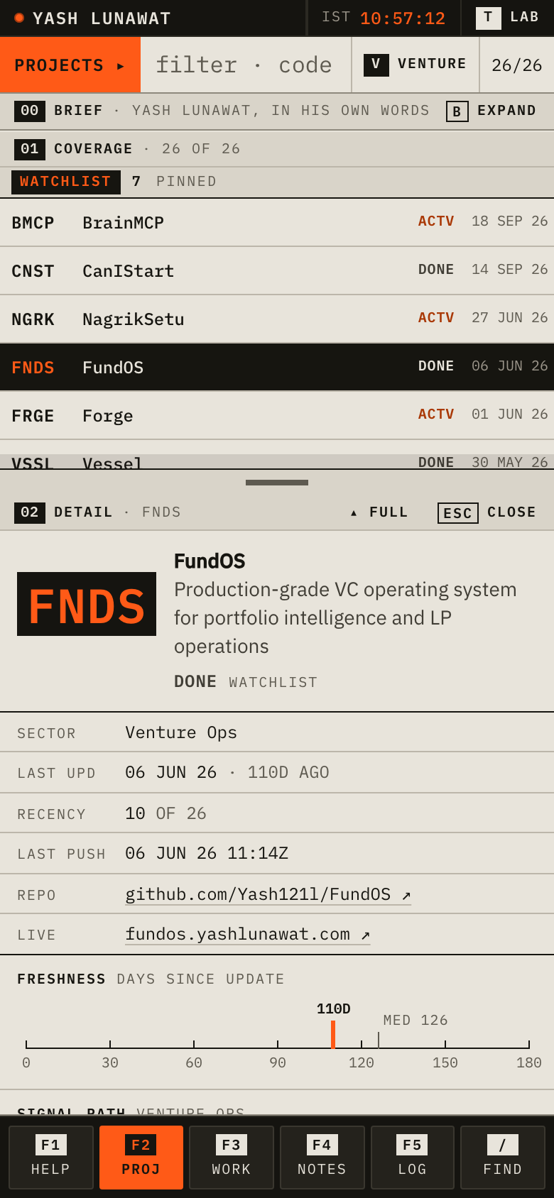
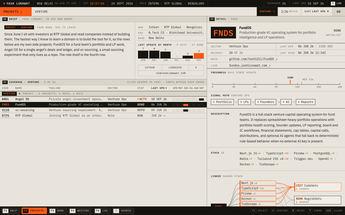
13 Research terminal, second edition

https://v13.yashlunawat.com/ · worktree portfolio-13 · branch design/portfolio-13 · cd /Users/admin/.t3/worktrees/portfolio/portfolio-13 && npx vite --port 5213

Research terminal, second edition home

Thesis

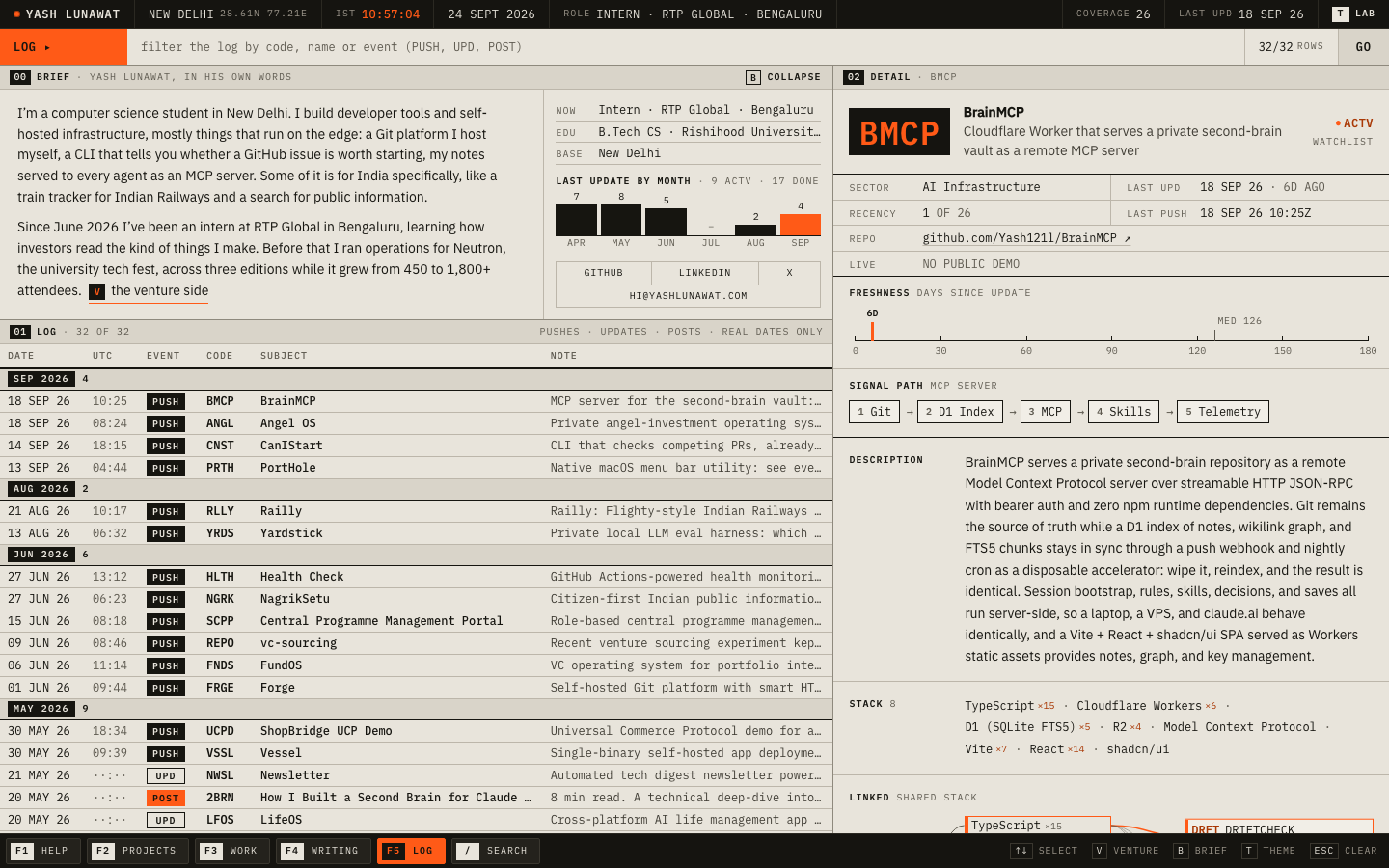
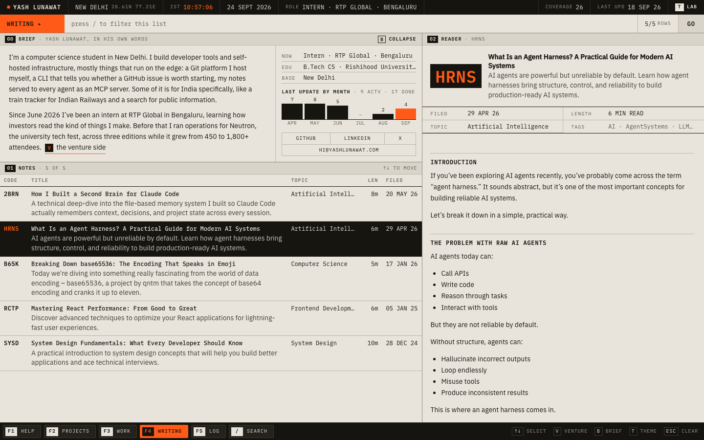
It's still a research terminal whose coverage universe is Yash's own work, but now the first pane you read is Yash talking about himself in the first person. The instrument comes after that. After 30 seconds you should think: "a builder who tracks what he ships like a portfolio, and who is now learning how the people on the other side of the table read it."

Memorable device

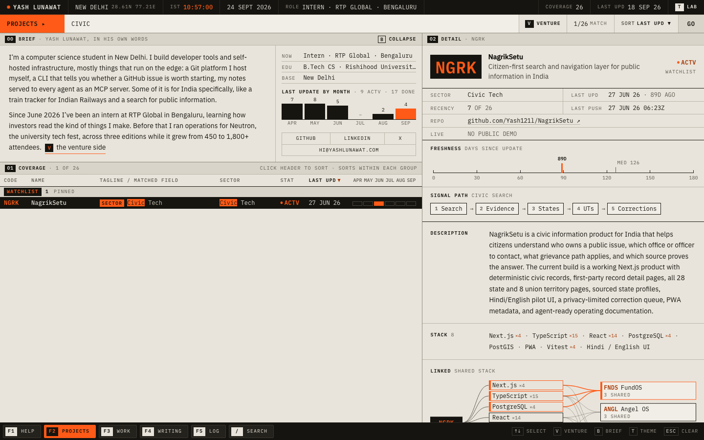
You type `venture`, the terminal narrows to four rows, and the pane above it switches to his own voice explaining why those rows exist. Close second: the LINKED graph lighting up the shared stack between BrainMCP and its siblings.

Self-critique

  • **First impression:** the person now comes first, and the fold reads status bar, brief, table. But the brief is 240px of grey prose next to a histogram, and from arm's length the page is still 70% table. A recruiter sees "a person who made a spreadsheet of himself" before seeing any one project that impresses.
  • **Originality:** the Bloomberg-for-yourself idea was already taken by 09. What I added (watchlist, preset, log) deepens the metaphor but doesn't change the thumbnail. At thumbnail si

Worth stealing

  • **Preset filters with a voice.** A named preset (`venture`) that narrows the data and swaps in a first-person paragraph explaining the subset. Any concept with a list can do this.
  • **Search that names the matched field** as an inverse tag plus a trimmed snippet (`STACK Cloudflare Workers`).
  • **A collapsible brief that remembers you.** Full prose on the first visit, one line after that.

Coordinator verdict

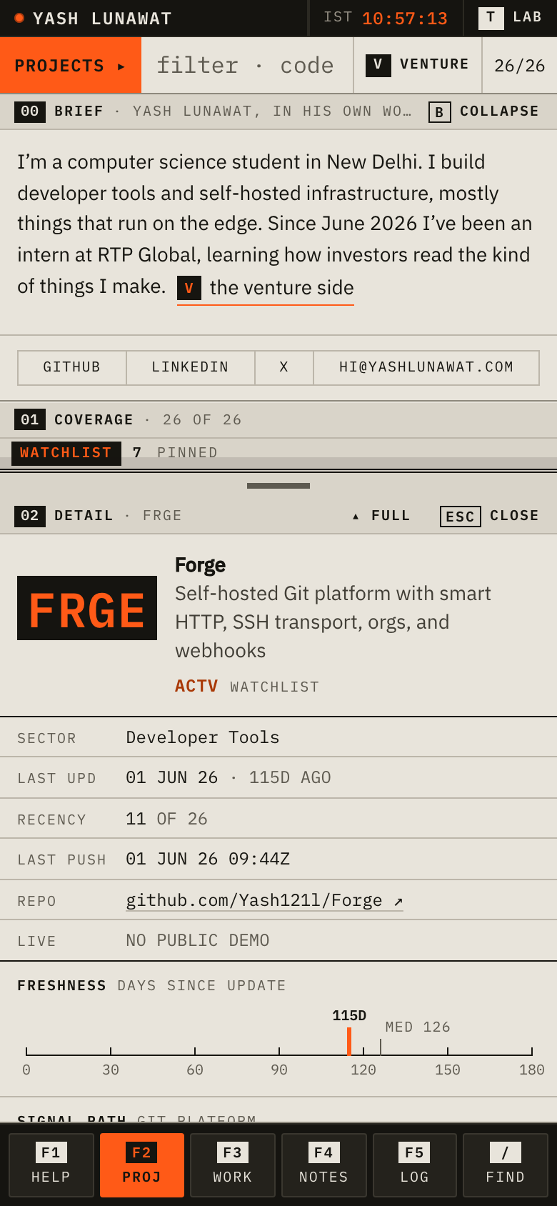
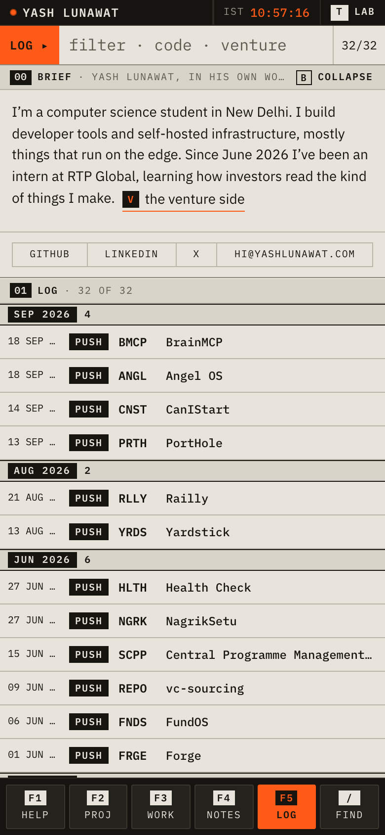
Generation 2 of 09. Brief pane first, watchlist, LINKED neighbour graph, activity log, day theme, and a mobile bottom sheet that keeps the density. The most complete build in the tournament. Loses because from a thumbnail it is still 70 percent table and it is a sharper 09 rather than a new idea. Its mobile sheet and search match tags are the best of their kind.

21 screenshots

day-desktop.png
day-desktop.png
detail-desktop-scrolled.png
detail-desktop-scrolled2.png
detail-desktop.png
detail-desktop.png
detail-mobile-direct.png
help-desktop.png
help-desktop.png
home-desktop-first.png
home-desktop-full.png
home-desktop-returning.png
home-mobile-full.png
home-mobile.png
home-mobile.png
log-desktop.png
log-desktop.png
log-mobile.png
log-mobile.png
search-civic-desktop.png
search-desktop.png
search-desktop.png
sheet-mobile-full.png
sheet-mobile.png
sheet-mobile.png
venture-desktop.png
venture-desktop.png
venture-mobile.png
venture-mobile.png
work-desktop.png
work-desktop.png
writing-desktop.png
writing-desktop.png

14 Hybrid A: exhibition catalogue

https://v14.yashlunawat.com/ · worktree portfolio-14 · branch design/portfolio-14 · cd /Users/admin/.t3/worktrees/portfolio/portfolio-14 && npx vite --port 5214

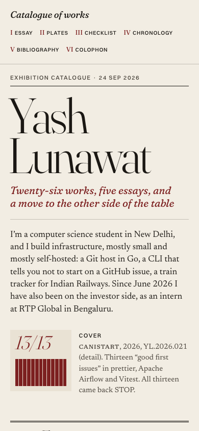
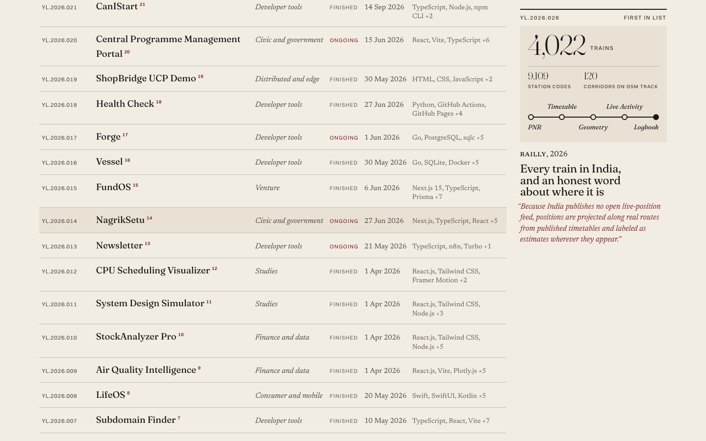
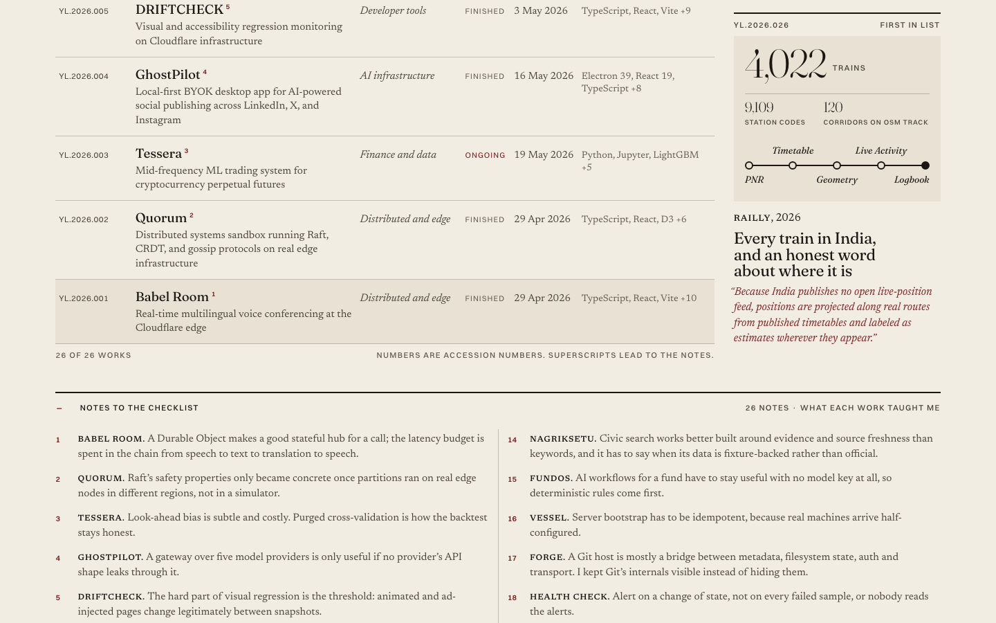
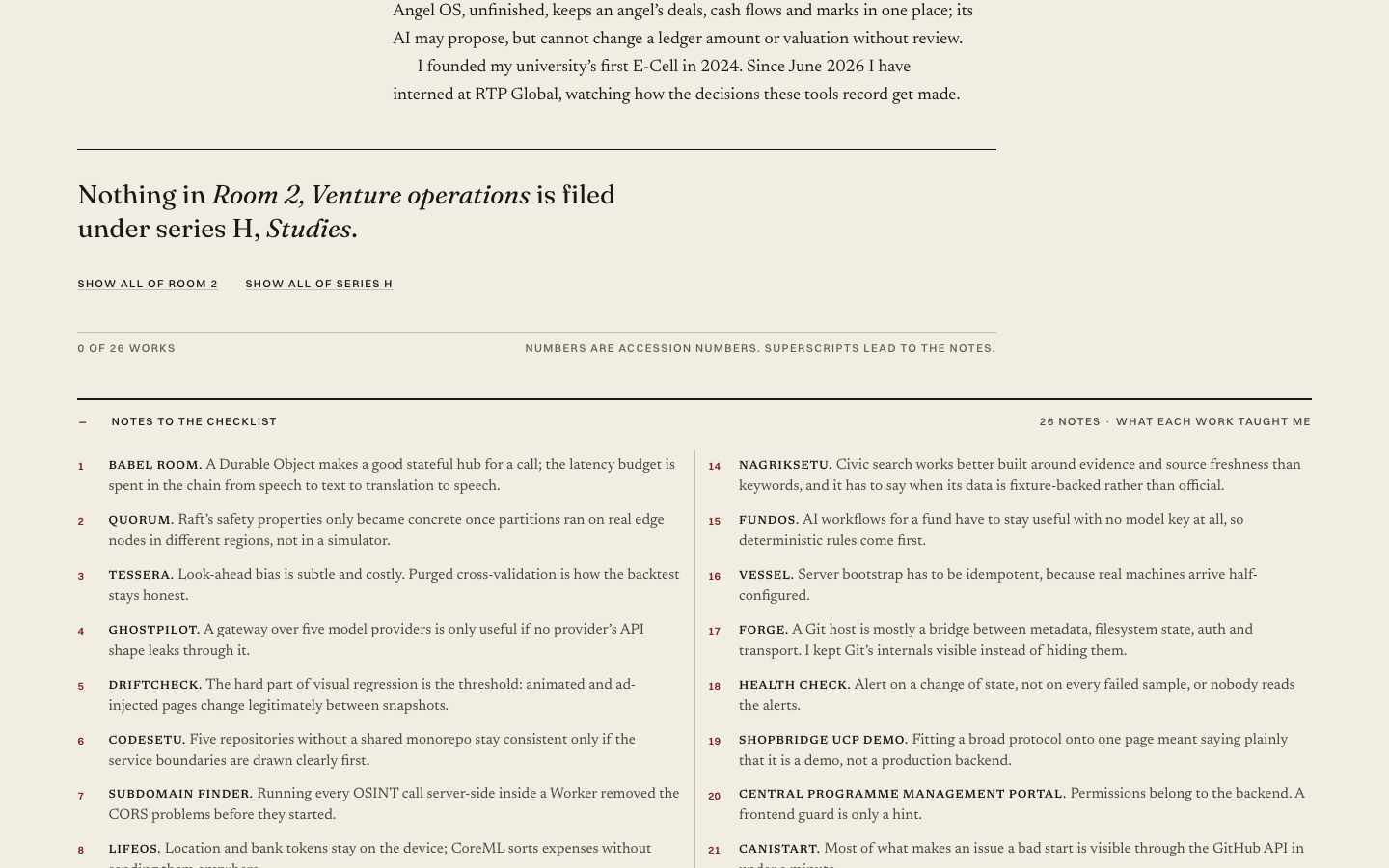
Hybrid A: exhibition catalogue home

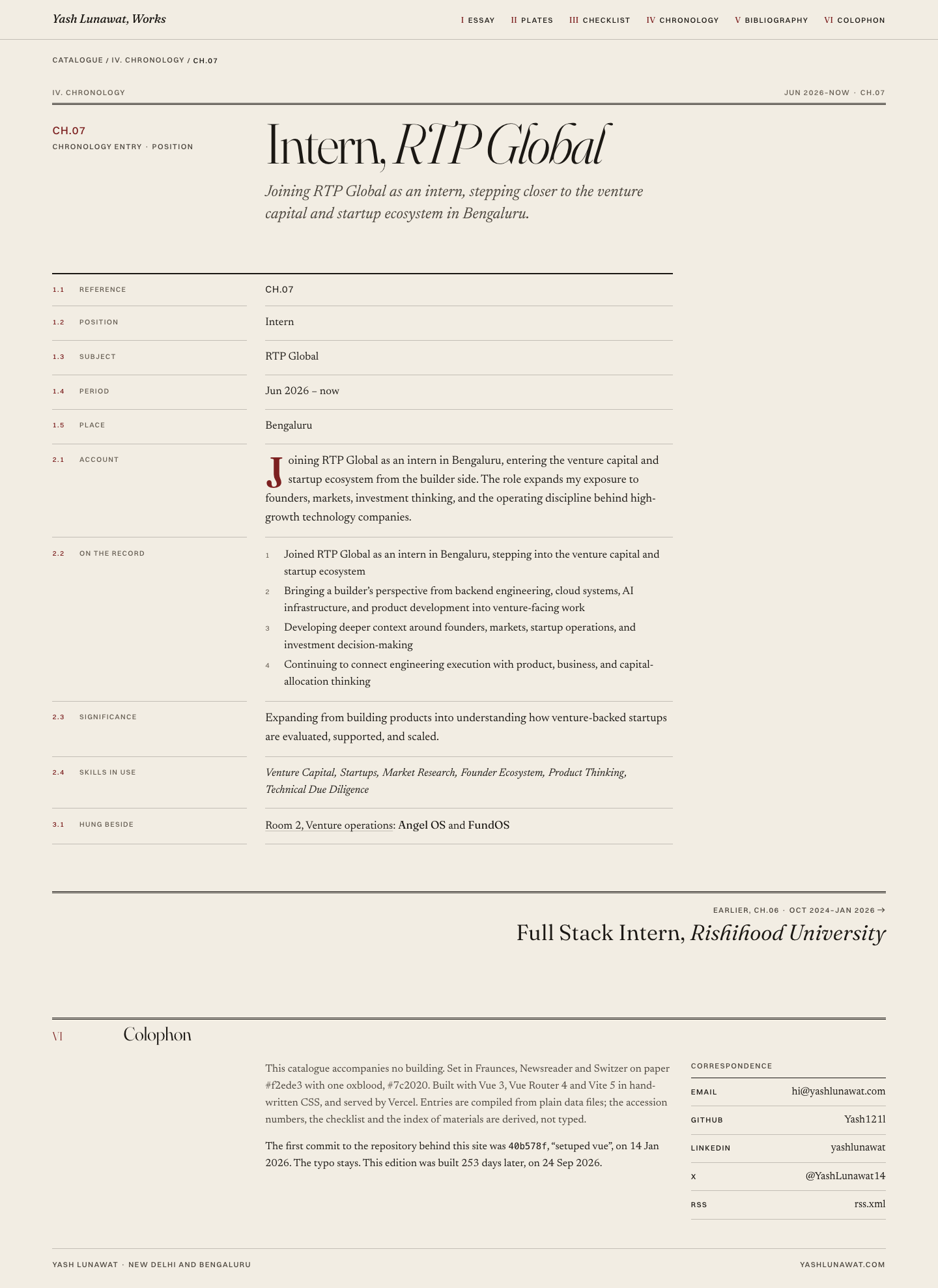
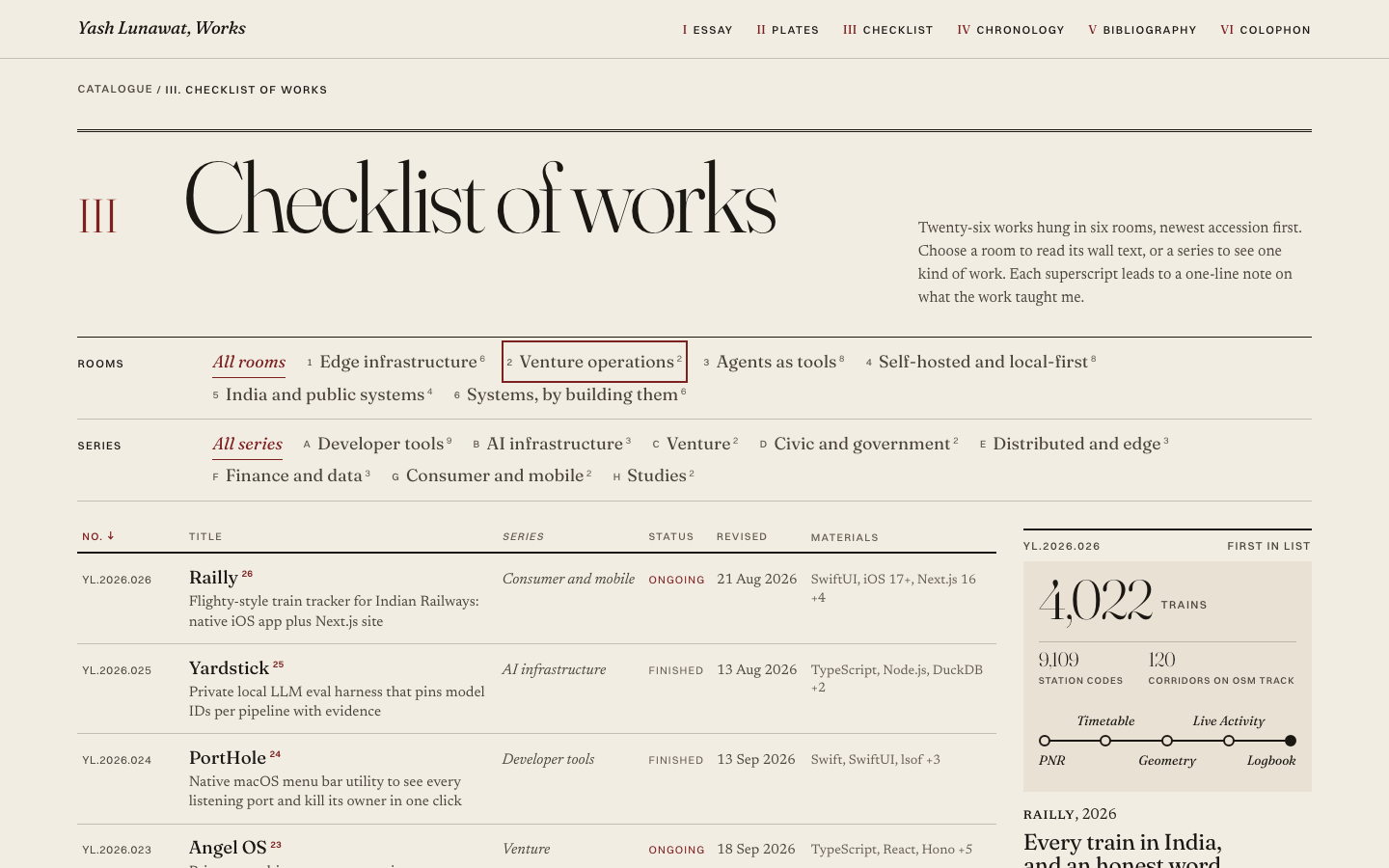
Thesis

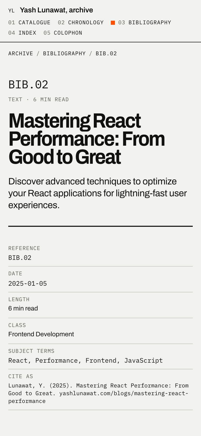
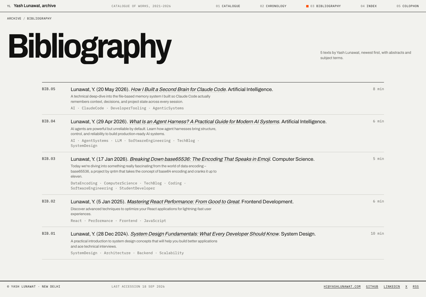
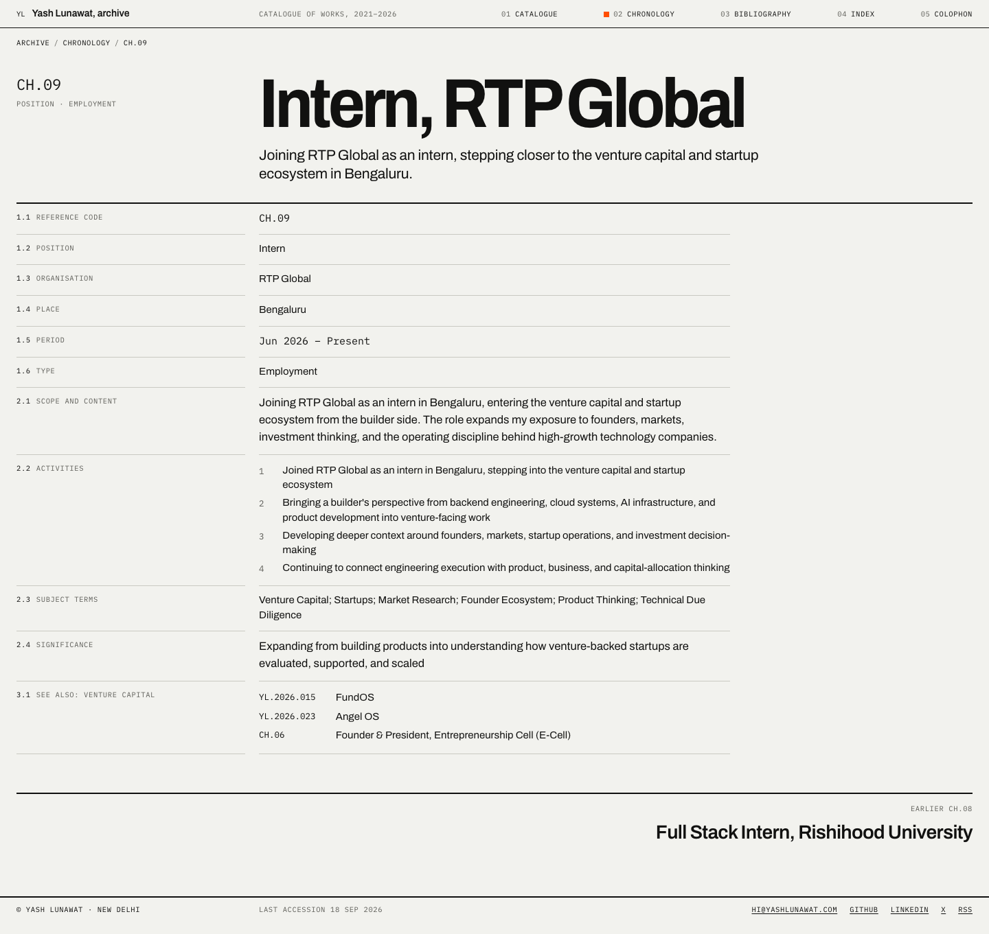
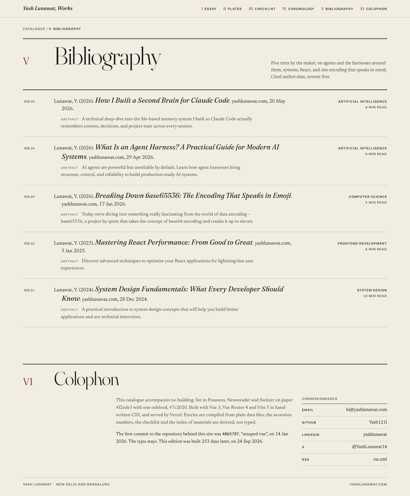
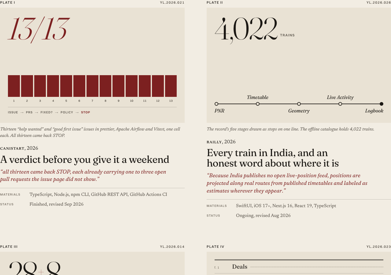
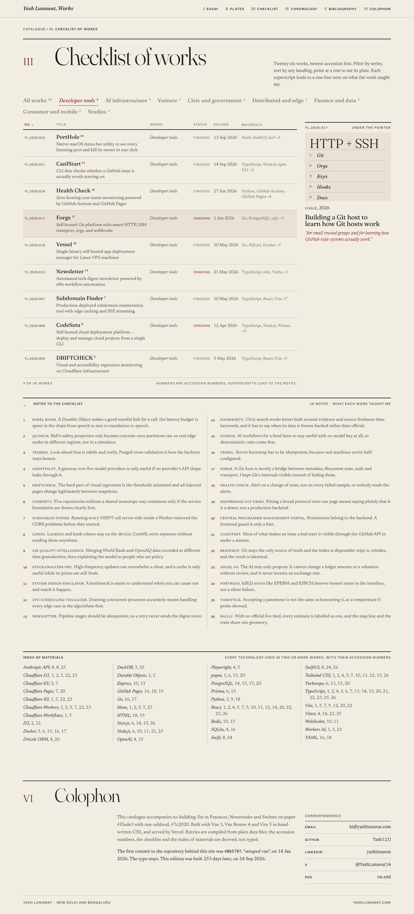
The site is the printed catalogue for a small exhibition of one builder's work: a cover with one reproduced work, an essay by the maker at the front, six plates in the middle, a numbered checklist of all 26 works at the back, then chronology, bibliography and colophon. After 30 seconds a visitor should think "this is a body of work, catalogued by someone who measures things honestly", and should already know he builds infrastructure, cares about India, builds for agents, and now sits at a venture firm.

Memorable device

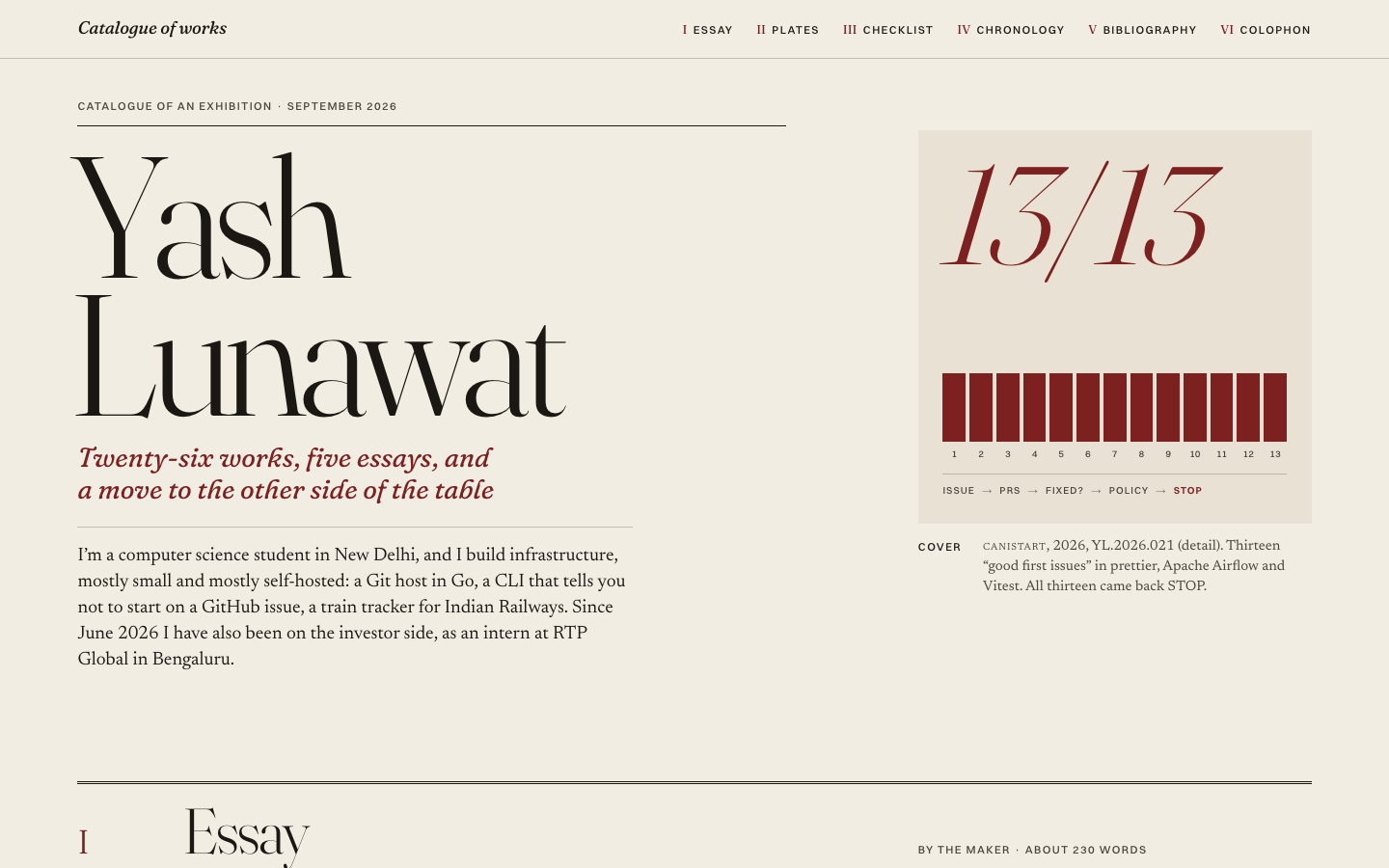
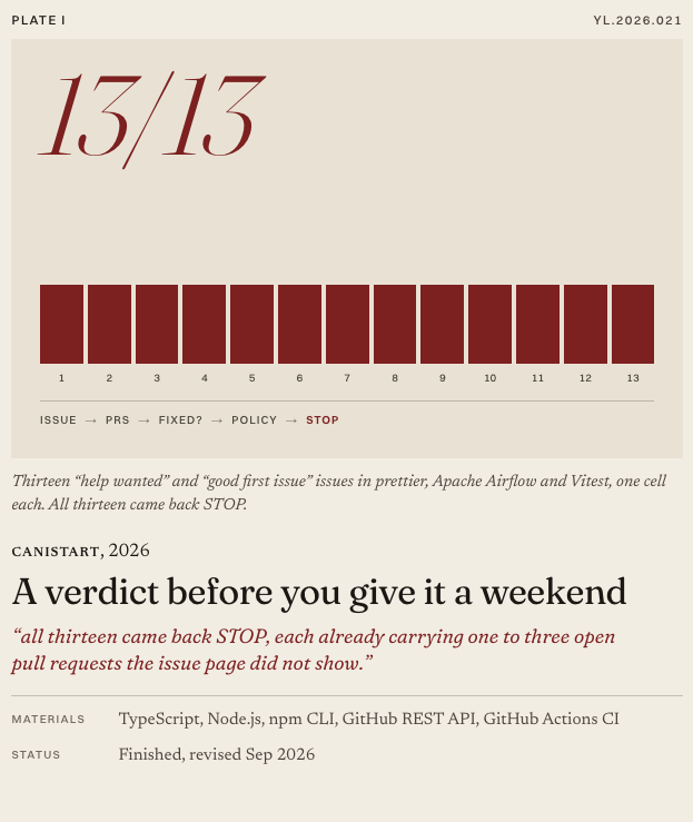
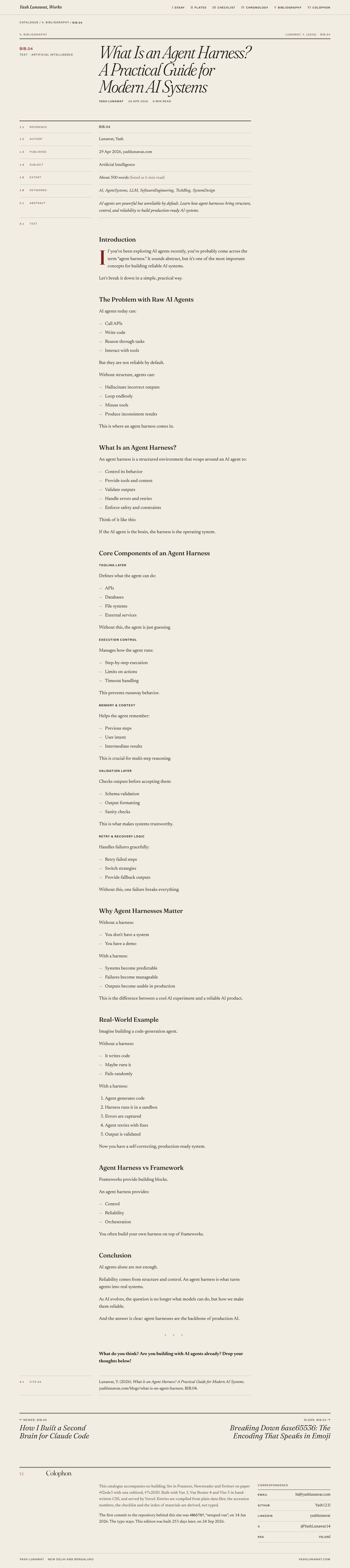
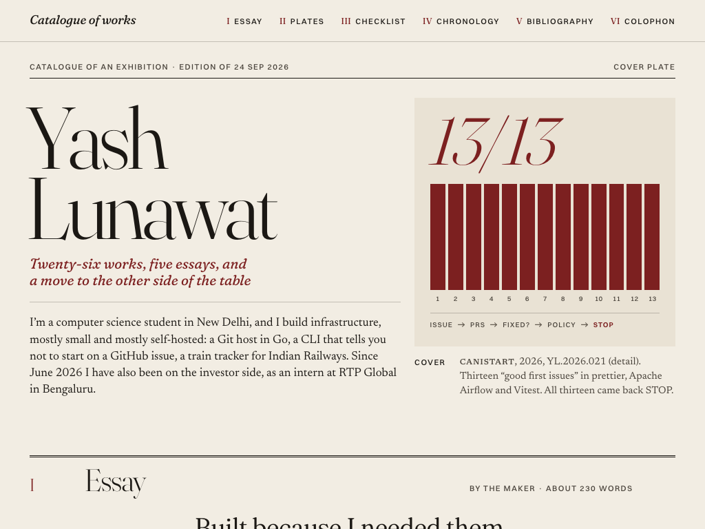
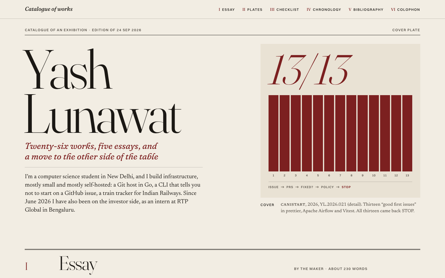
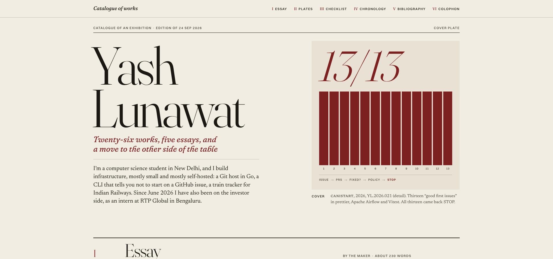
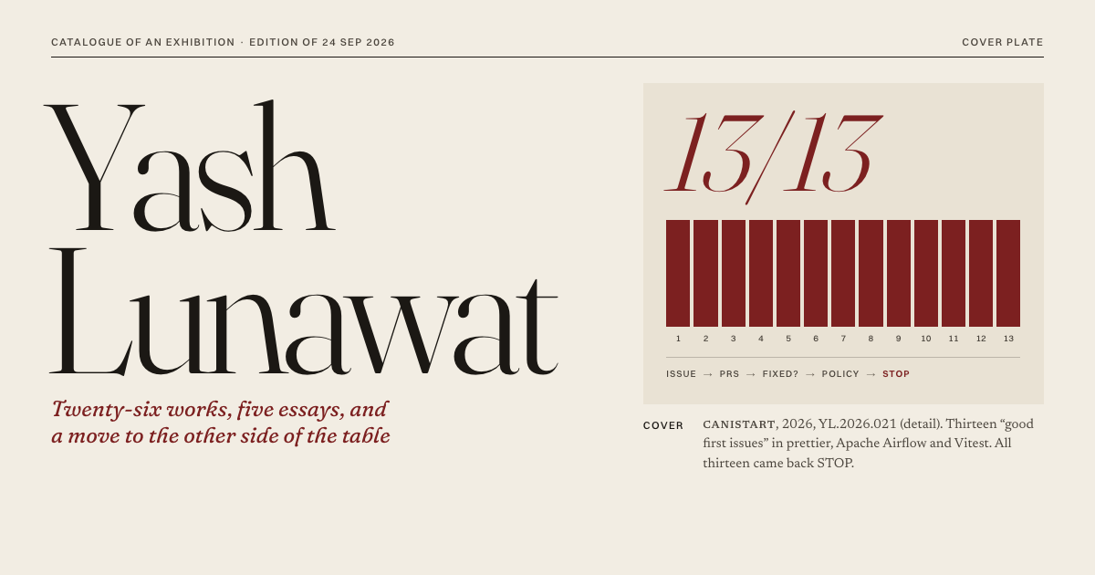
A cover that reproduces a tiny CLI's field test as if it were a painting: "13/13" over thirteen oxblood STOP bars, captioned like a catalogue plate. Then, at the back, a real checklist where each of the 26 works has a footnote saying what it taught him.

Self-critique

Worth stealing

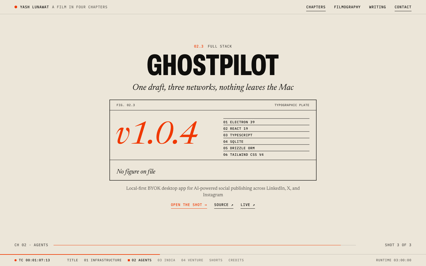
  • **Plates drawn only from stated numbers**, with a typographic plate captioned "No figure on file" when there are none. This is the honest fix for 02's invented bars.
  • **Footnote numbers equal to catalogue numbers**, so a note keeps its number however the table is sorted.
  • **Mobile sort value shown under the title only when sorted**, so a phone checklist stays two columns until the reader asks for more.
  • **A static "N days since first commit" colophon line** fixed at build time (`__BUILD_DATE__` in vite.config.js), with no ticking counter.

Coordinator verdict

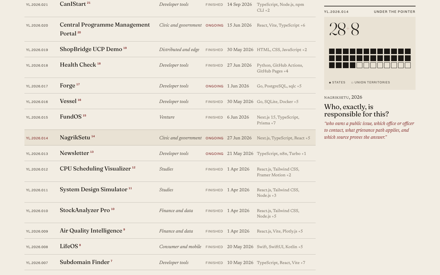
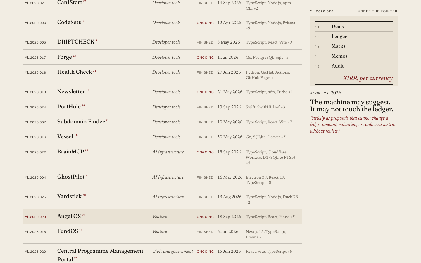
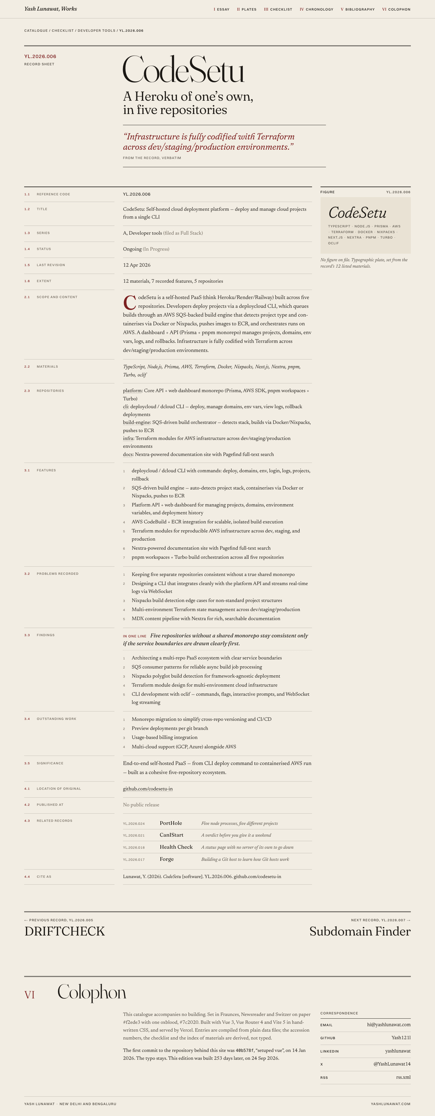
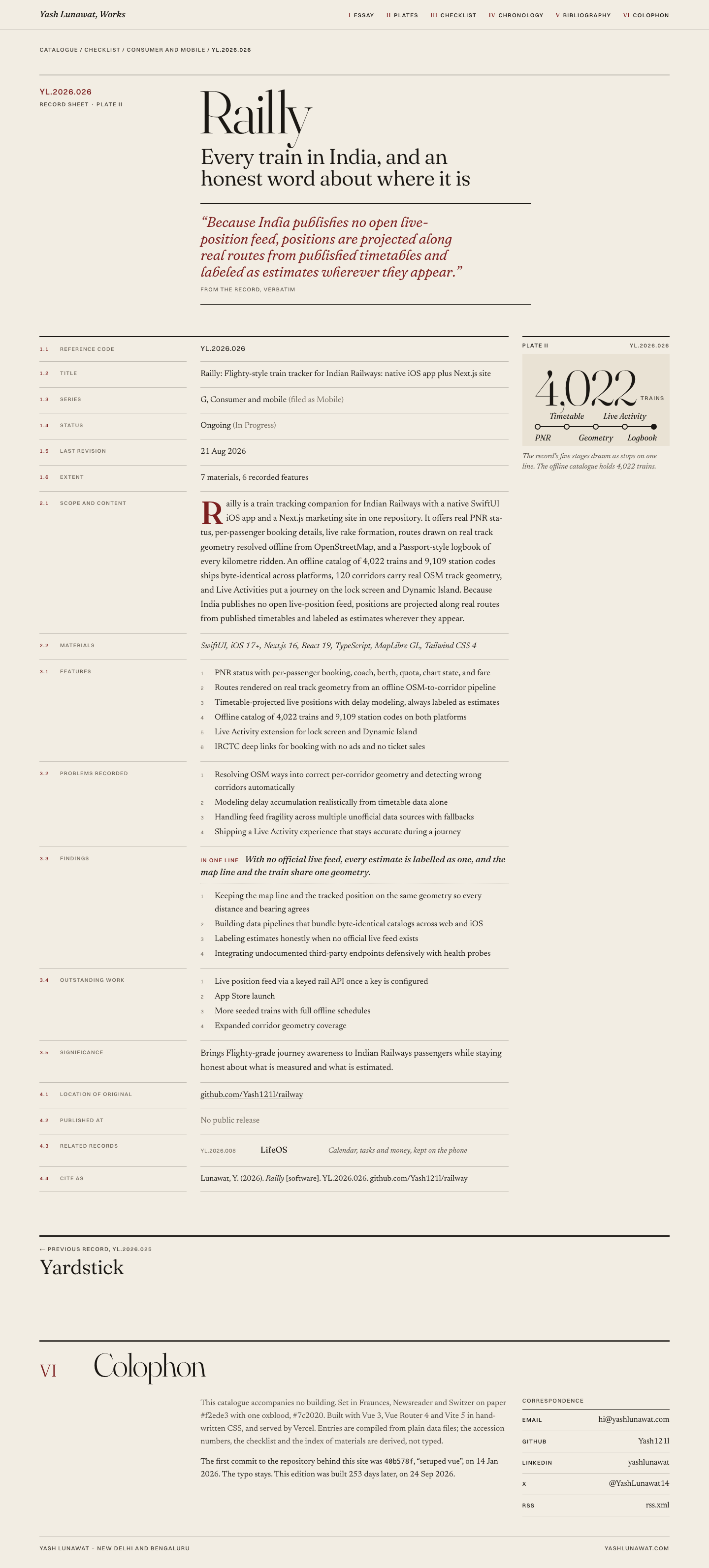
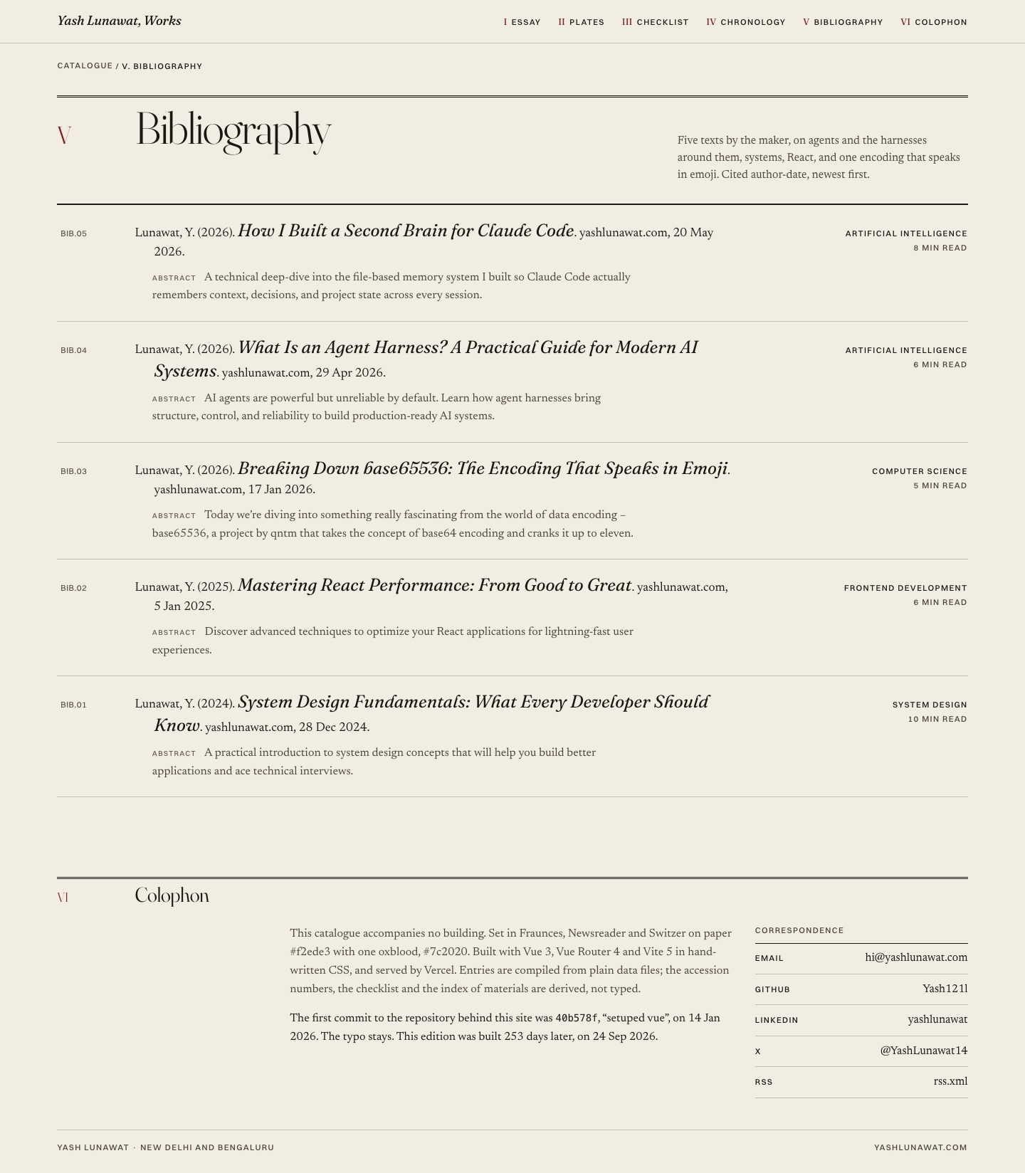
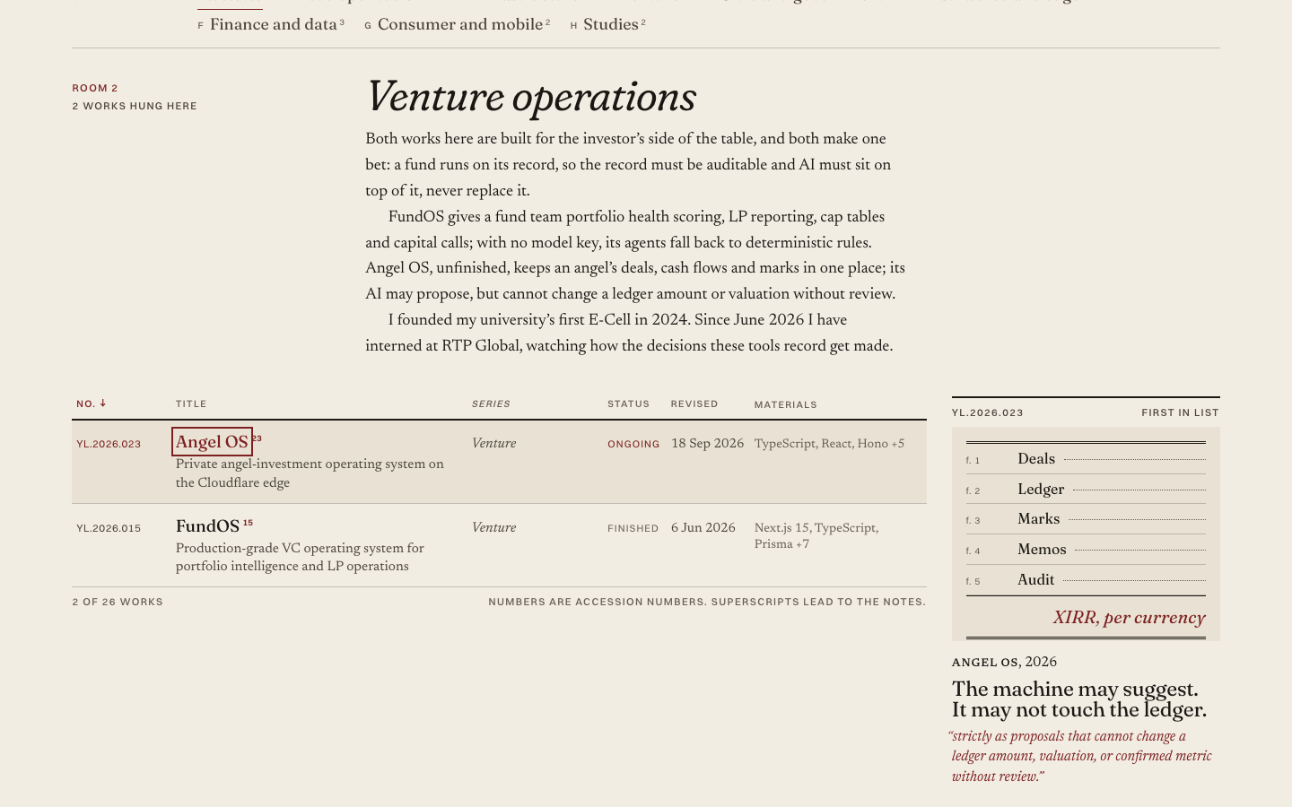
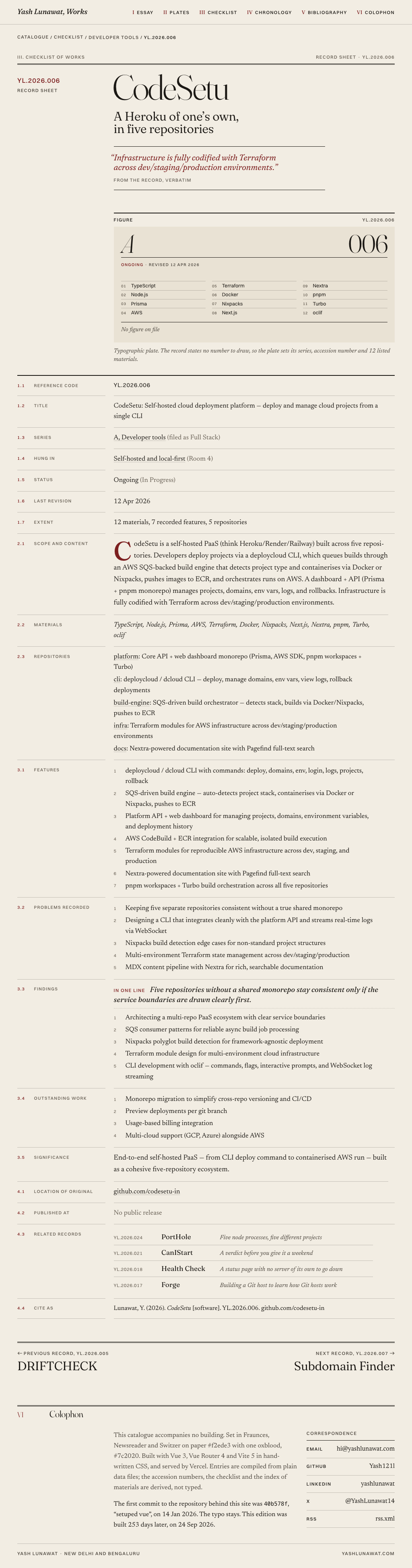
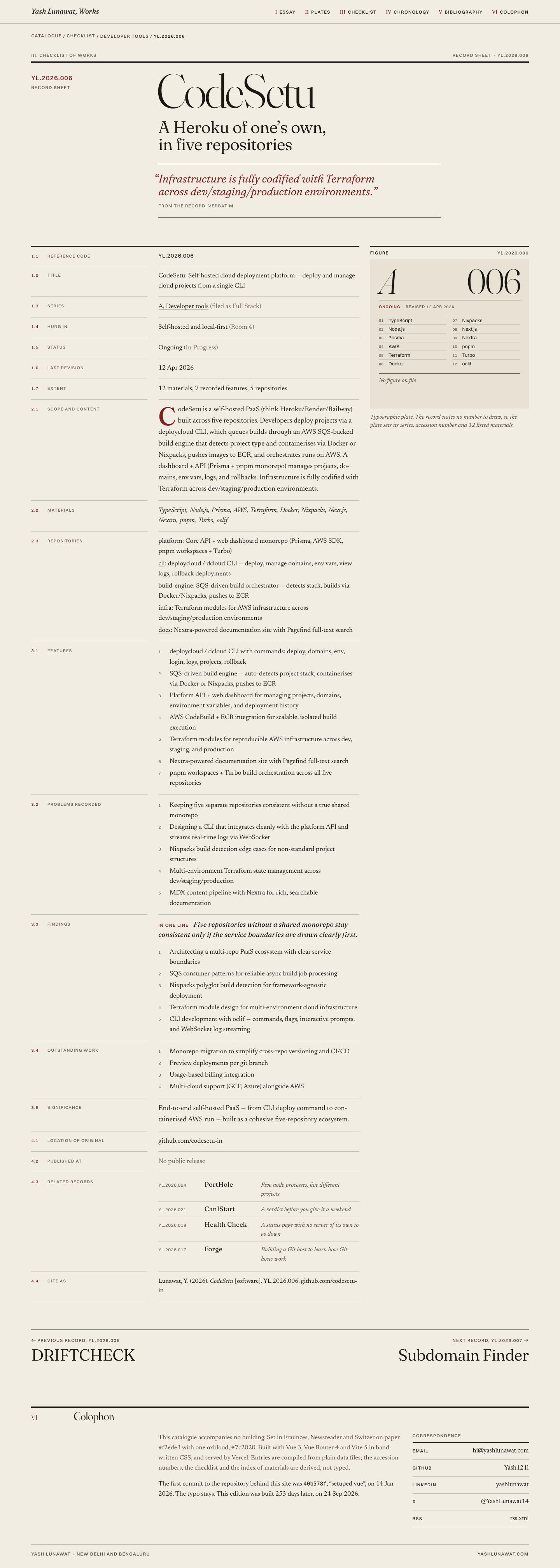
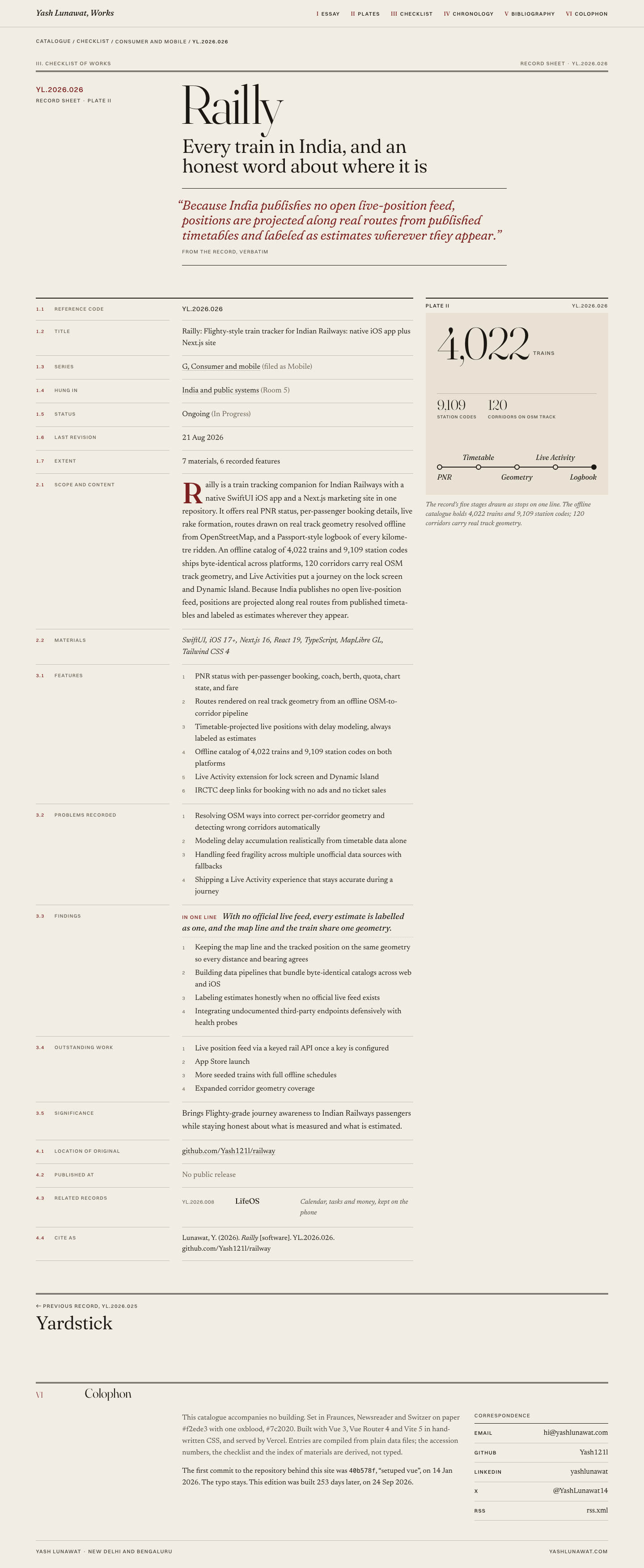
WINNER. Essay, plates, checklist, chronology, bibliography, colophon: one idea, not three glued together. Plates drawn only from stated numbers (13 STOP bars, 4,022 trains, 28 states plus 8 UTs, five ledger books with no amounts). The checklist with hover plate, footnotes keyed to catalogue numbers, and an index of materials is the best project presentation in the set. Record sheets open with the editorial headline and close with Cite as. Weak points, all fixable in the final pass: empty ground in the cover plate, uniform section headings, 12 plain typographic plates, accession numbers hidden on the mobile checklist, and the venture angle still one paragraph.

18 screenshots
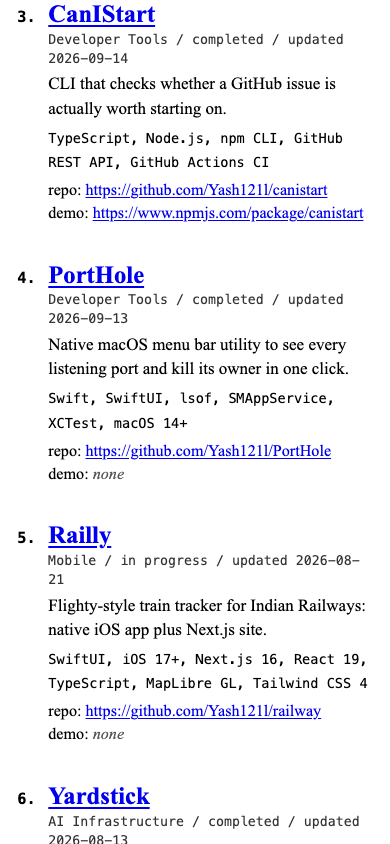
bibliography-desktop.png
blog-detail-desktop.png
checklist-hover-panel.png
checklist-sorted-series.png
cover-fold-desktop.png
experience-desktop.png
footnote-target.png
footnote-target.png
home-desktop.png
home-desktop.png
home-mobile-fold.png
home-mobile.png
home-mobile.png
keyboard-focus.png
keyboard-focus.png
plate-i-closeup.png
plate-i-closeup.png
plates-closeup.png
plates-closeup.png
projects-filter-active.png
projects-mobile.png
projects-mobile.png
record-angel-os-mobile.png
record-codesetu-desktop.png
record-railly-desktop.png

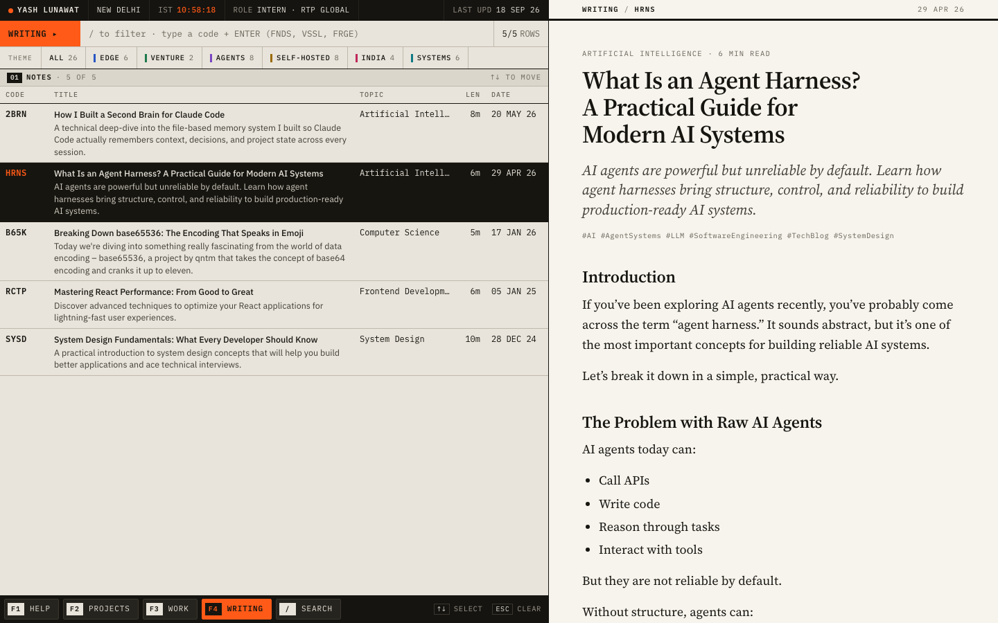
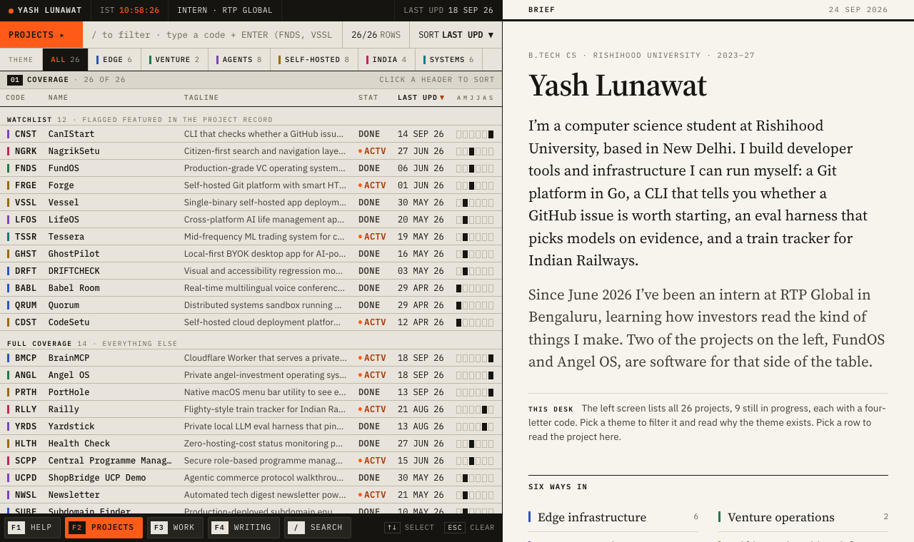
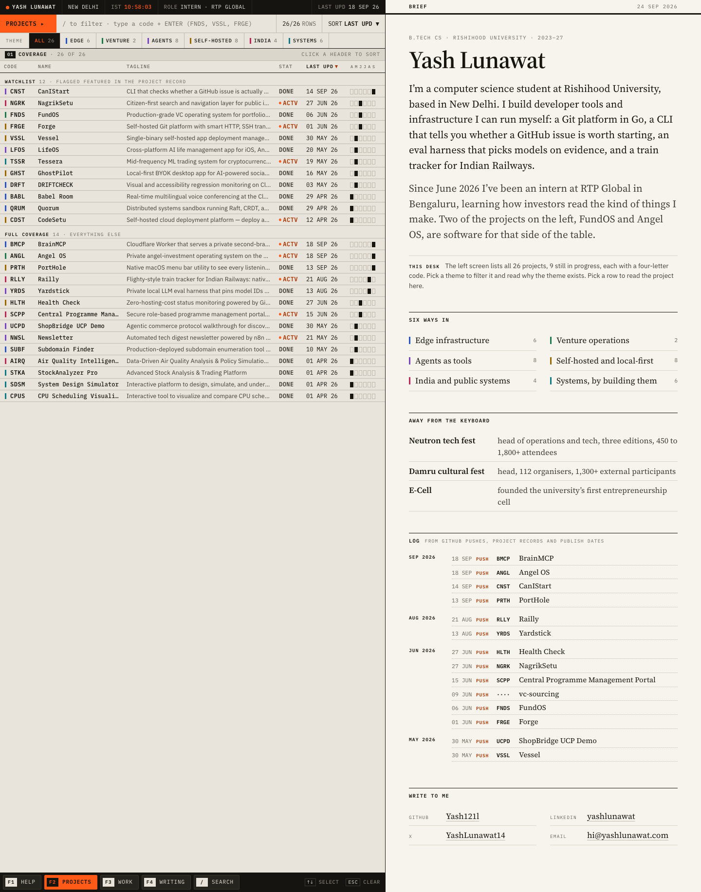
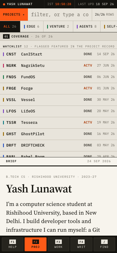
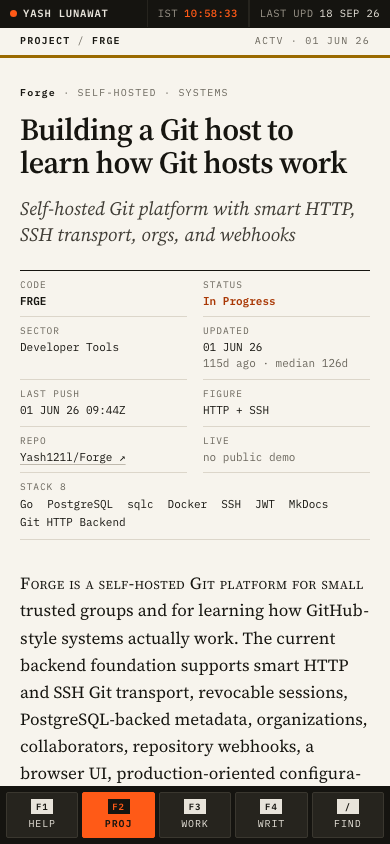
15 Hybrid B: analyst's desk

https://v15.yashlunawat.com/ · worktree portfolio-15 · branch design/portfolio-15 · cd /Users/admin/.t3/worktrees/portfolio/portfolio-15 && npx vite --port 5215

Hybrid B: analyst's desk home

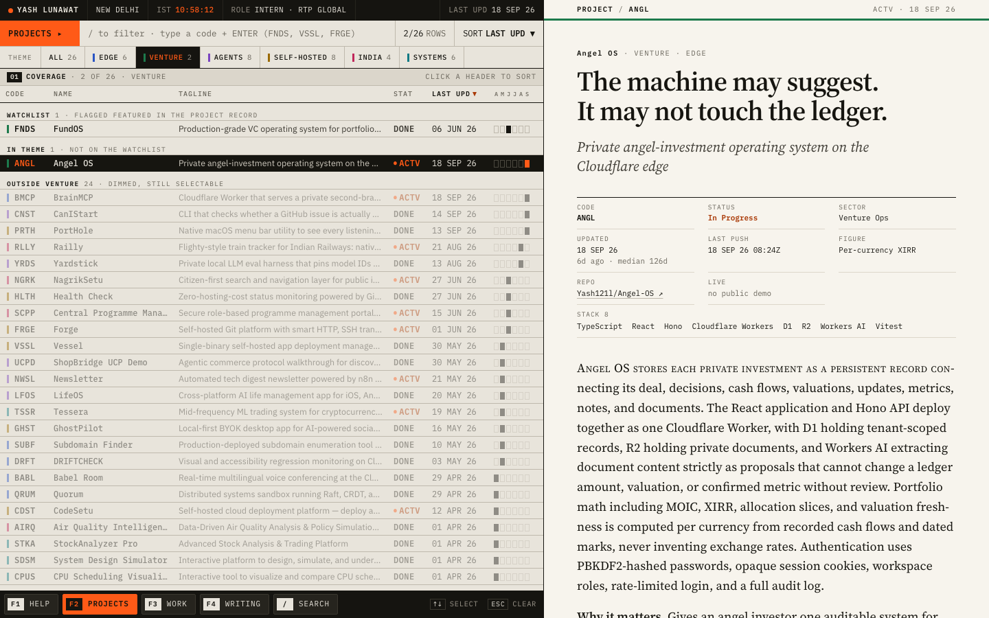
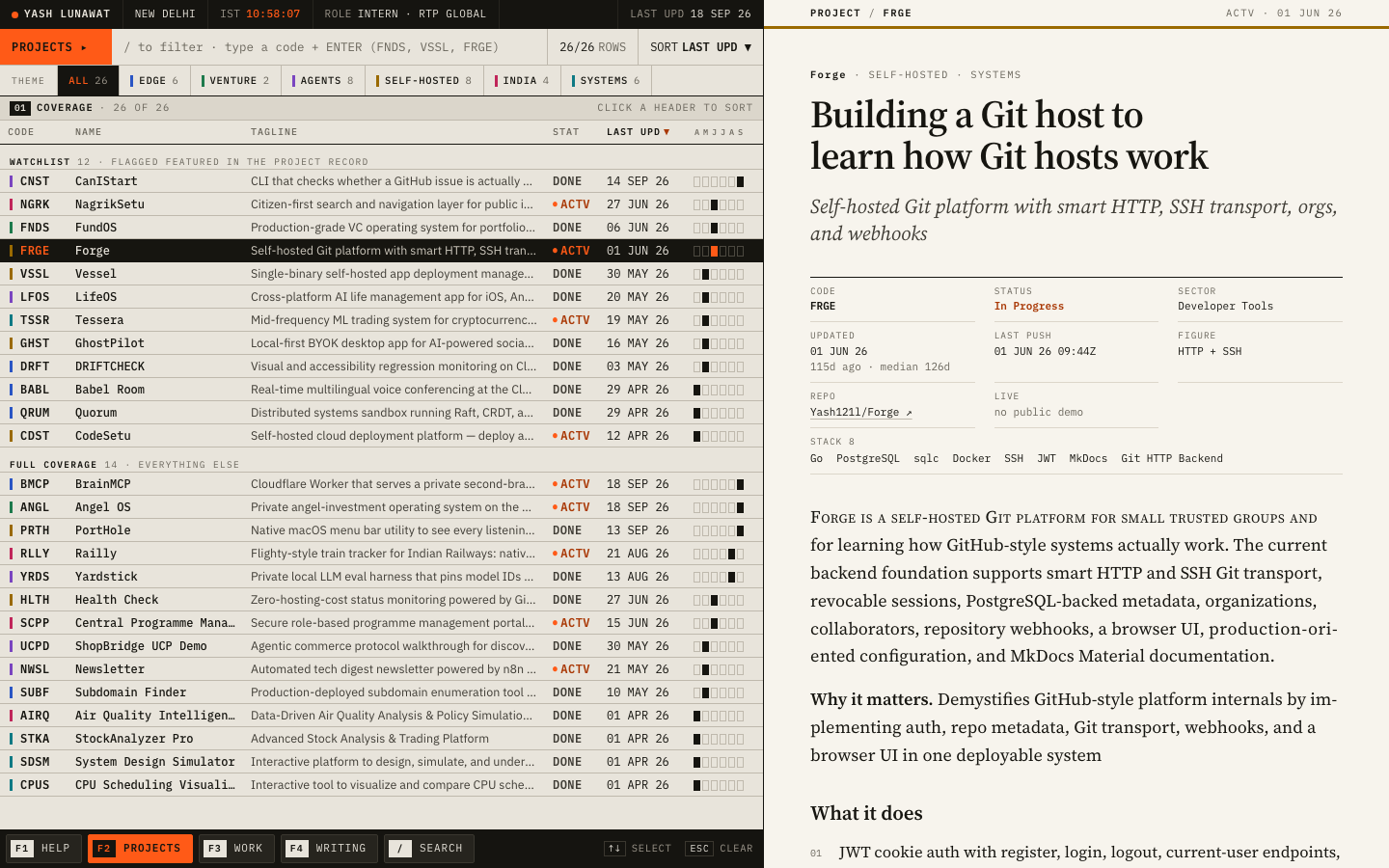
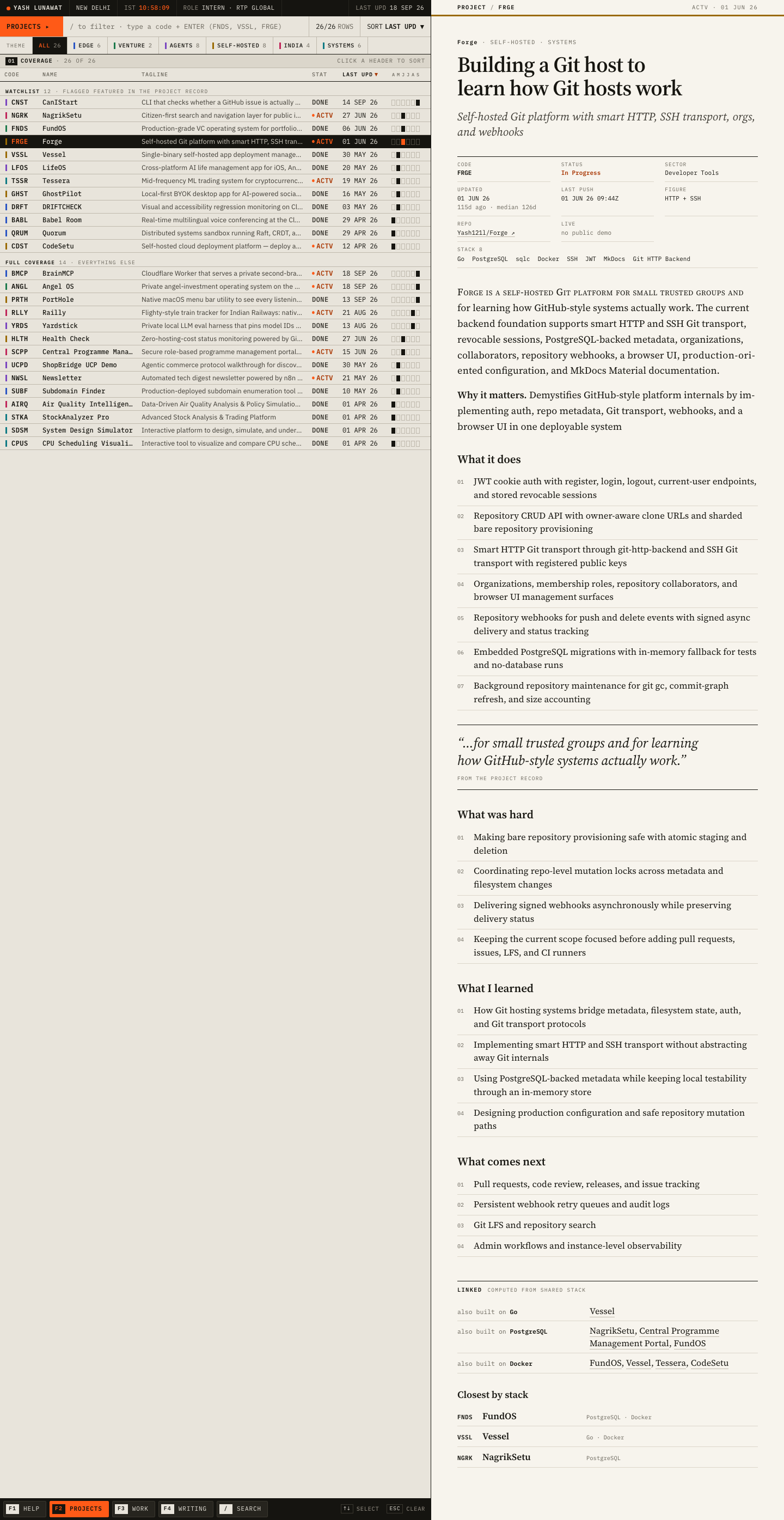
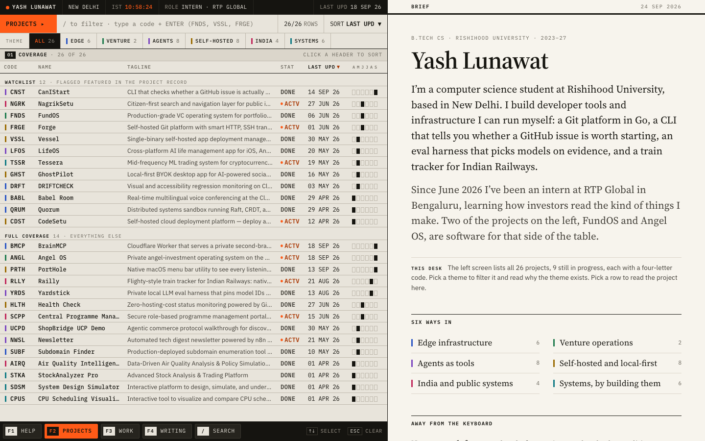
Thesis

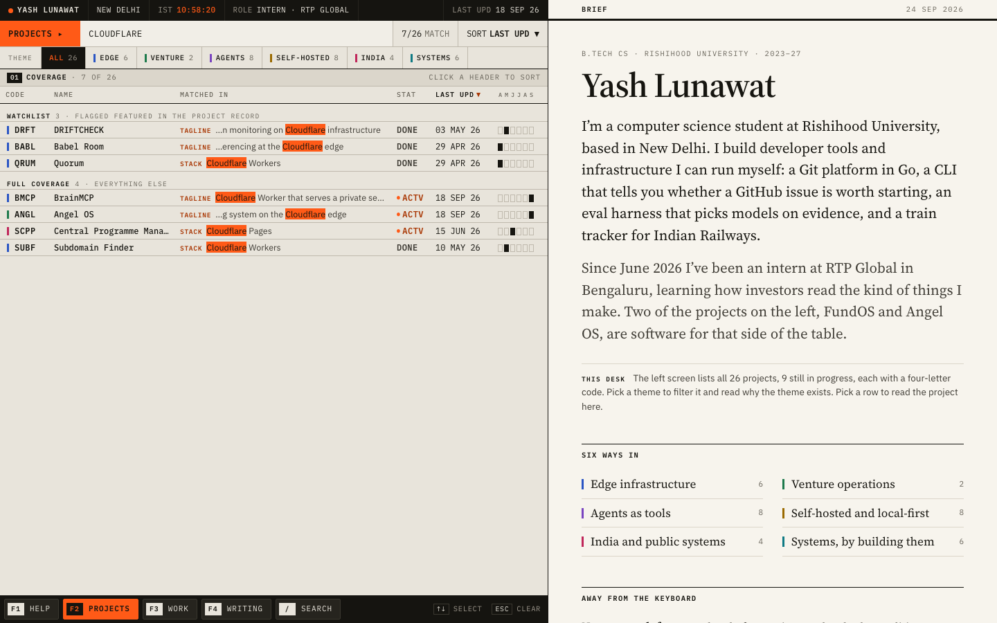
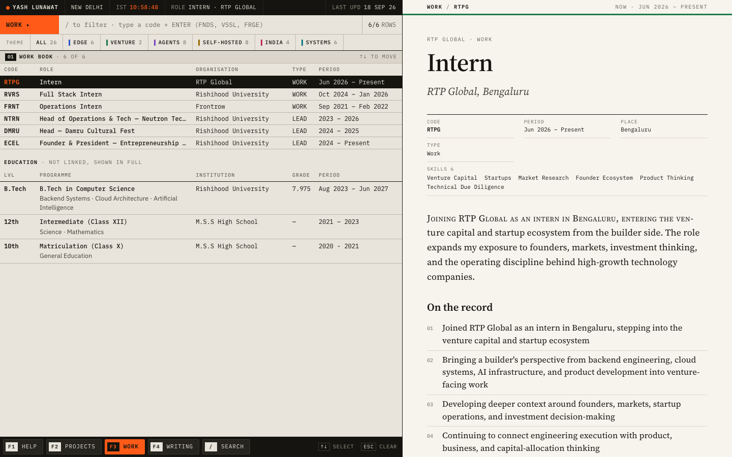
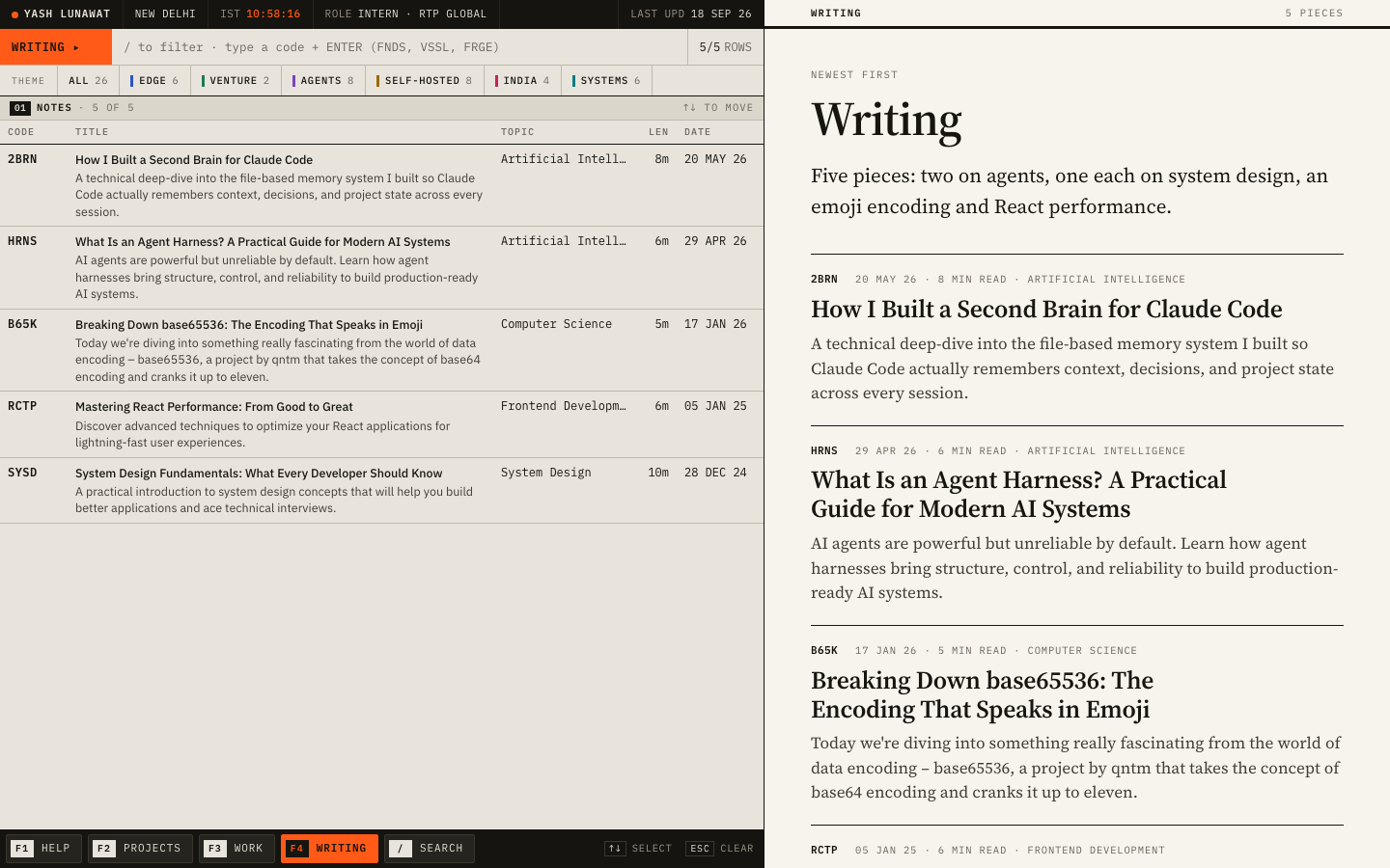
One desk, two instruments. The left screen is a data terminal listing every project (Bloomberg). The right screen is a reading room where the same person writes about the work in the first person (the FT). Yash builds instruments (FundOS, Angel OS, Yardstick, Health Check) and now reads companies at a venture firm, so the site gives him both screens. After 30 seconds you should think: "he keeps track of everything he builds, and he can also explain why it matters."

Memorable device

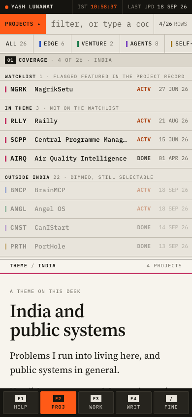
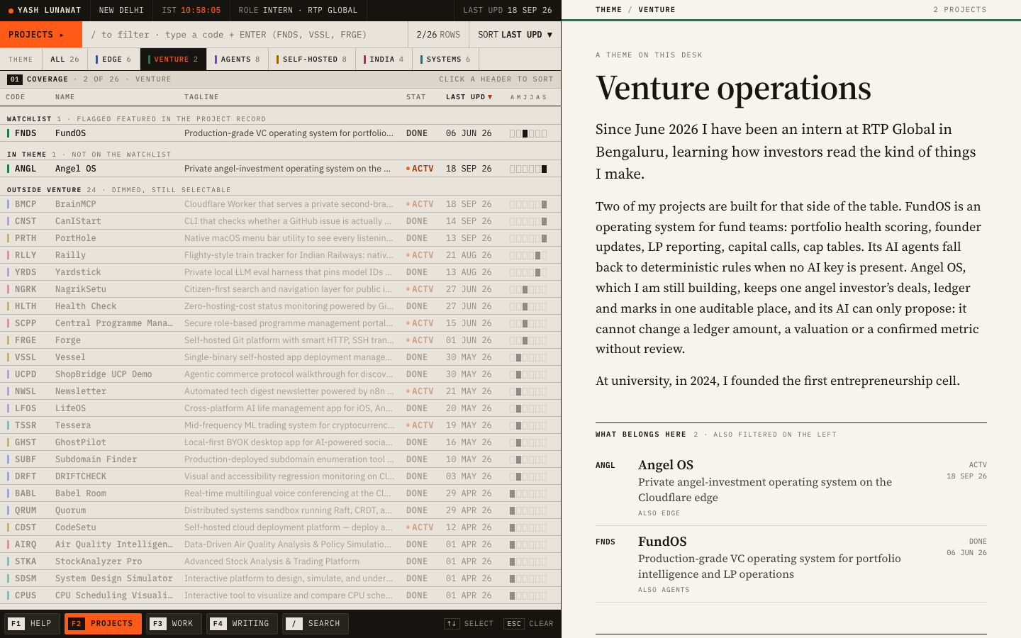
Clicking VENTURE: the terminal pulls FundOS and Angel OS to the top and dims the other 24, the rule over the reading room turns green, and on the right he explains in plain first person what those two projects are and why they sit next to his internship.

Self-critique

Worth stealing

  • **Filter as emphasis, not removal.** Pull matching rows to the top and dim the rest under a labelled group. The screen stays full and the filter is legible.
  • **A running-head rule that carries the category colour.** One 3px line tells you which theme you are reading, with no other chrome.
  • **Keep the filter in the URL while reading** (`/projects/angel-os?theme=venture`), so a detail page remembers the context you came from.

Coordinator verdict

Runner-up. Terminal on the left, serif reading room on the right, six themes as the bridge. The only concept that shows the builder and the investor side at once, and the theme essays were checked sentence by sentence against the data. Loses narrowly because the left half reads as a spreadsheet at arm's length, the two heading systems on project pages feel stitched, and mobile turns the terminal into a small list. Its theme axis with wall text is carried into the final as rooms.

18 screenshots
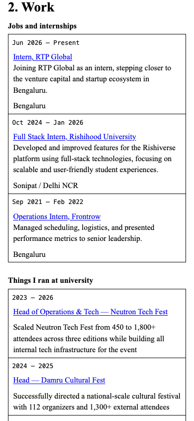
blog-detail-desktop.png
help-desktop.png
help-desktop.png
home-1280.png
home-1280.png
home-fold-desktop.png
home-full-desktop.png
home-mobile-full.png
home-mobile.png
home-mobile.png
mobile-project-full.png
mobile-project-selected.png
mobile-theme-india.png
project-angel-venture-desktop.png
project-forge-desktop.png
project-forge-full-desktop.png
projects-list-desktop.png
search-cloudflare-desktop.png
theme-venture-desktop.png
work-rtp-desktop.png
writing-desktop.png
writing-desktop.png

FINAL The exhibition catalogue, final

https://catalogue.yashlunawat.com/ · worktree portfolio-final · branch design/portfolio-final · cd /Users/admin/.t3/worktrees/portfolio/portfolio-final && npx vite --port 5216

The exhibition catalogue, final home

Thesis

Self-critique

Worth stealing

Coordinator verdict

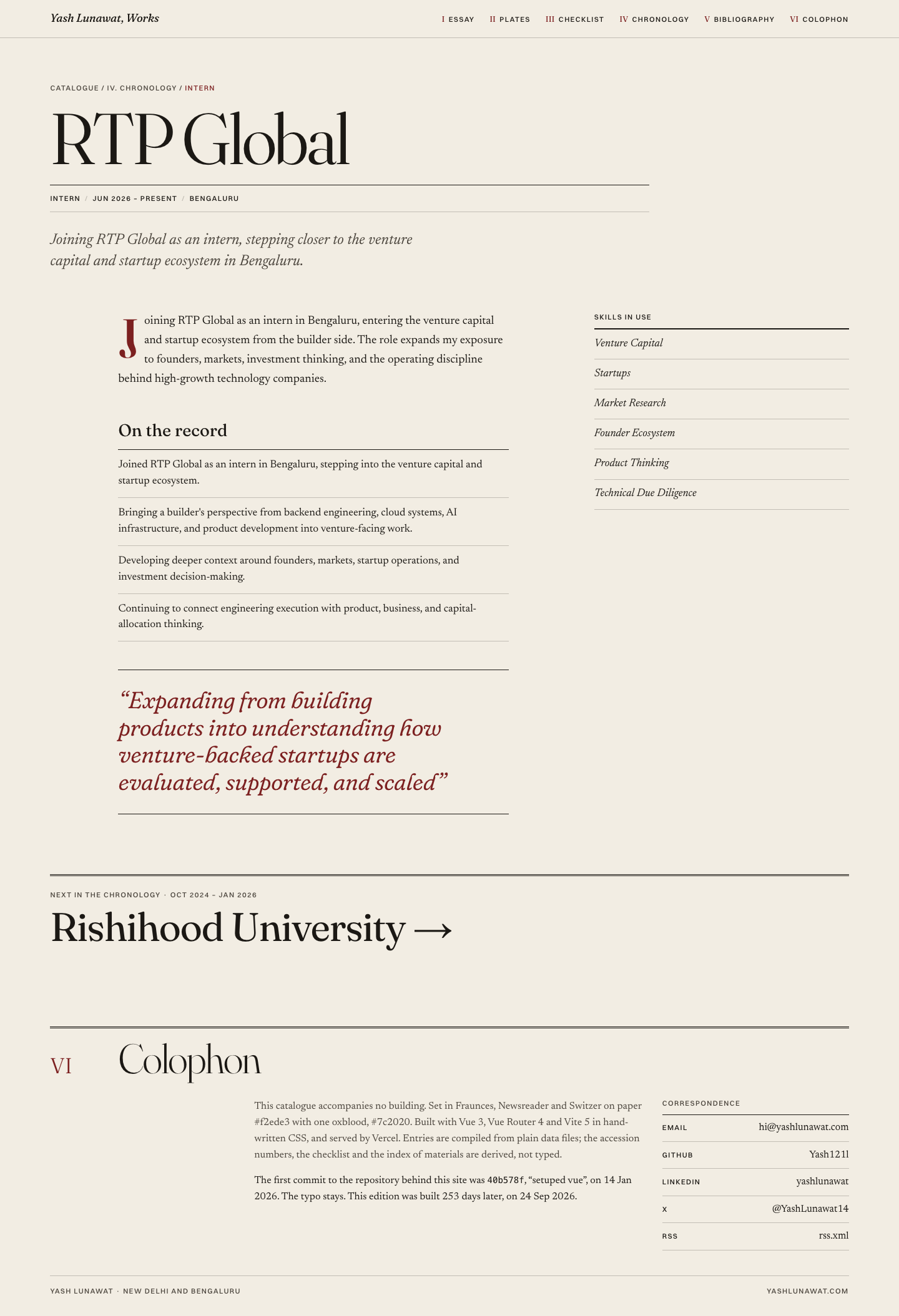
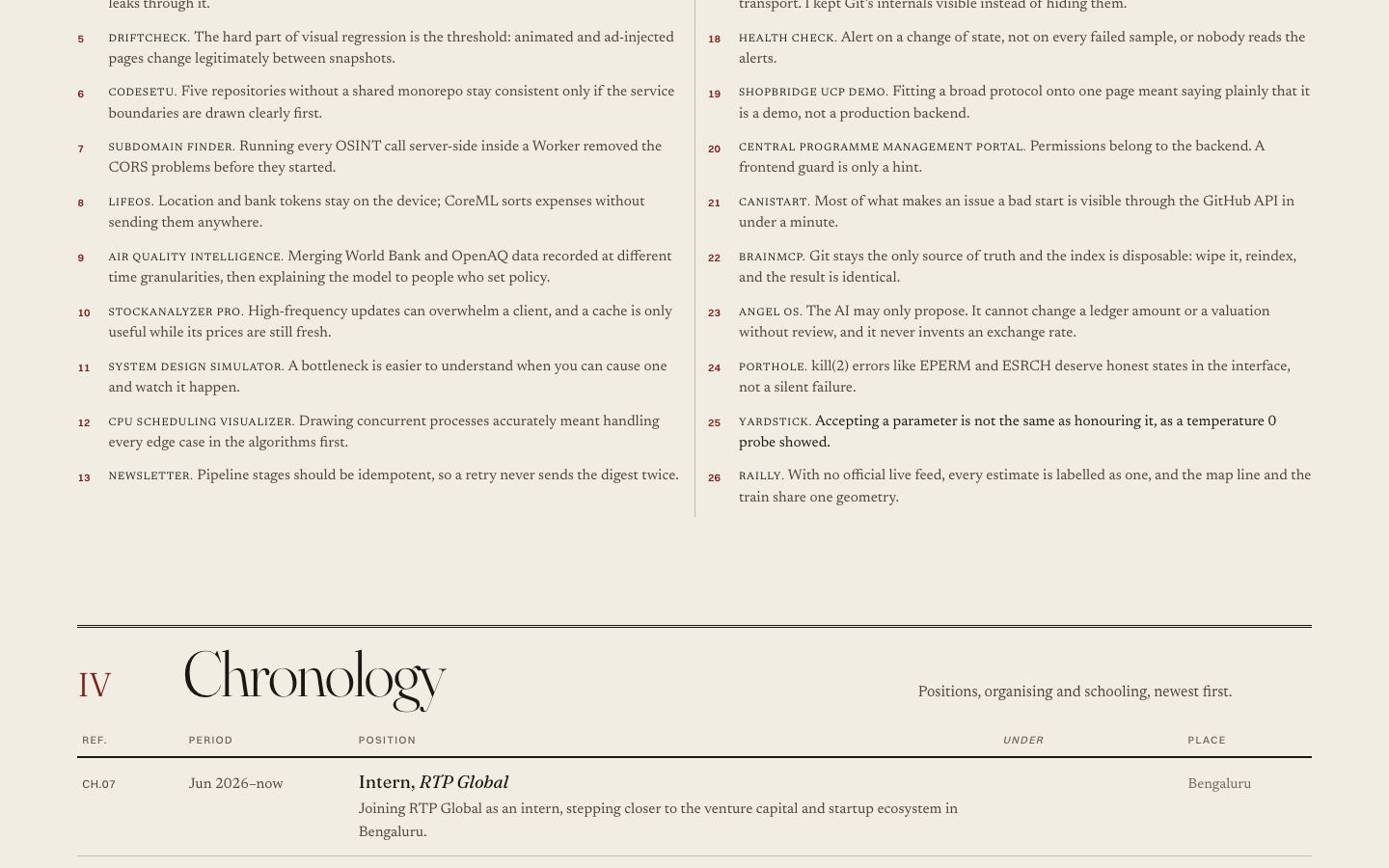
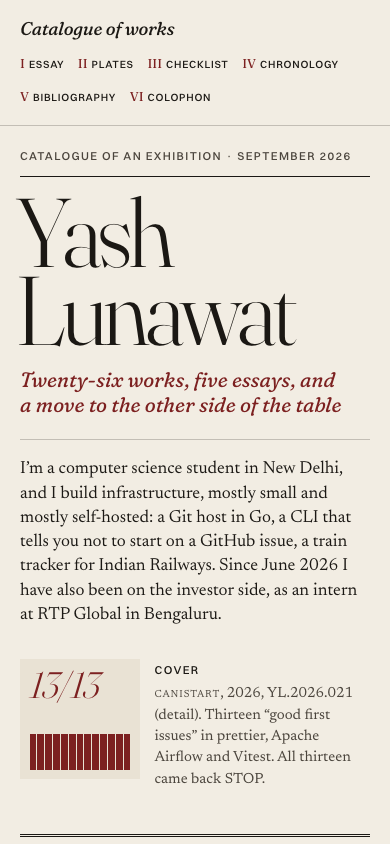
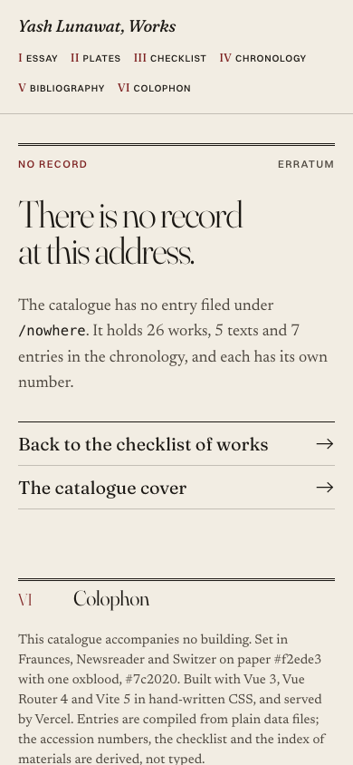
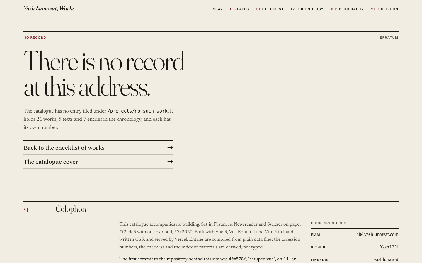
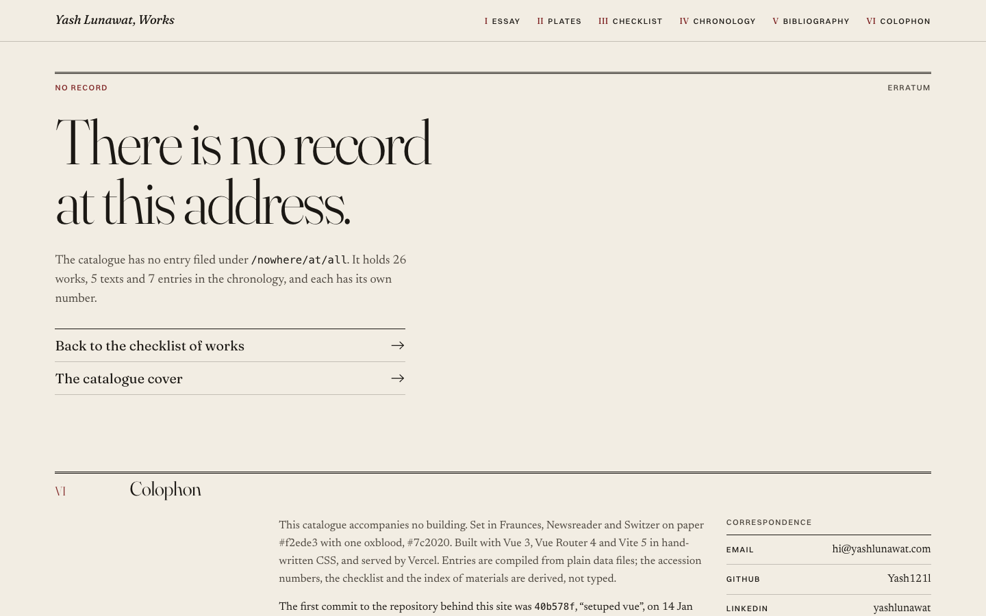
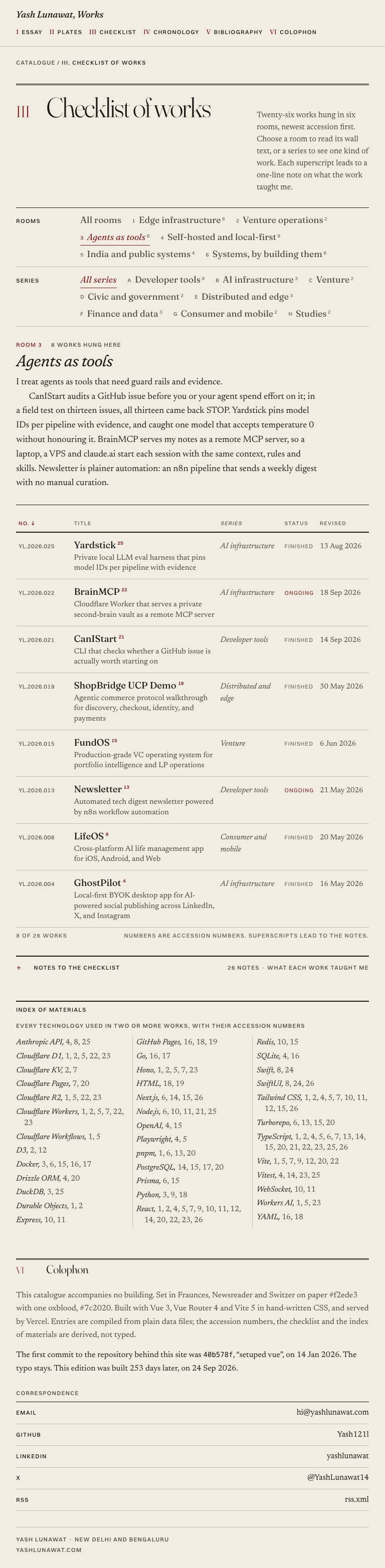
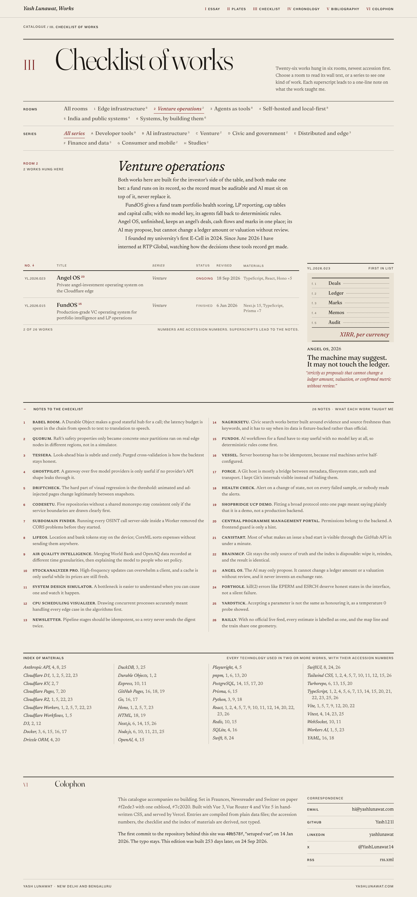
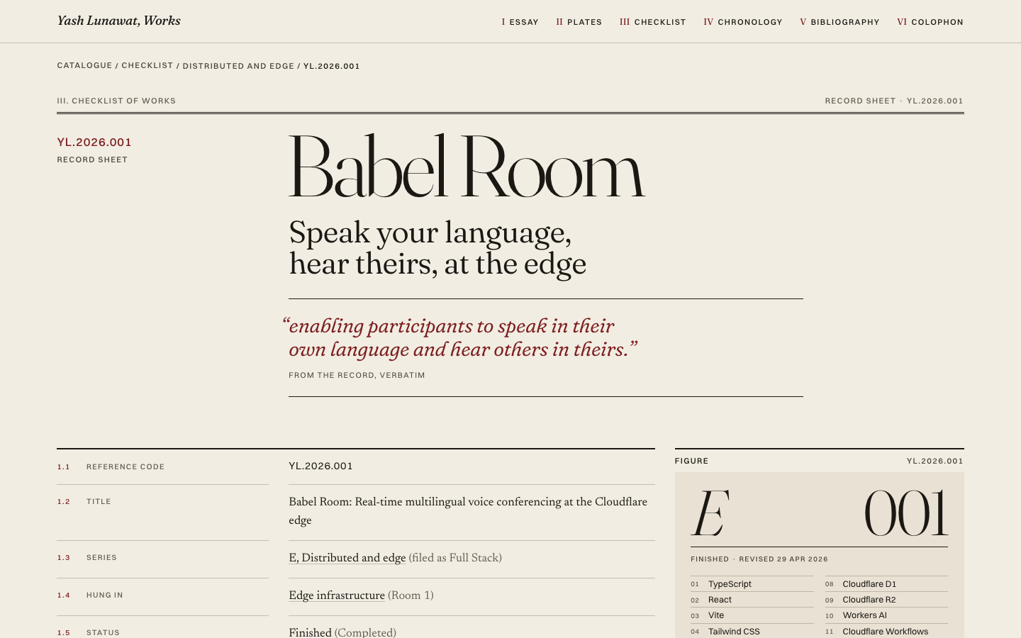
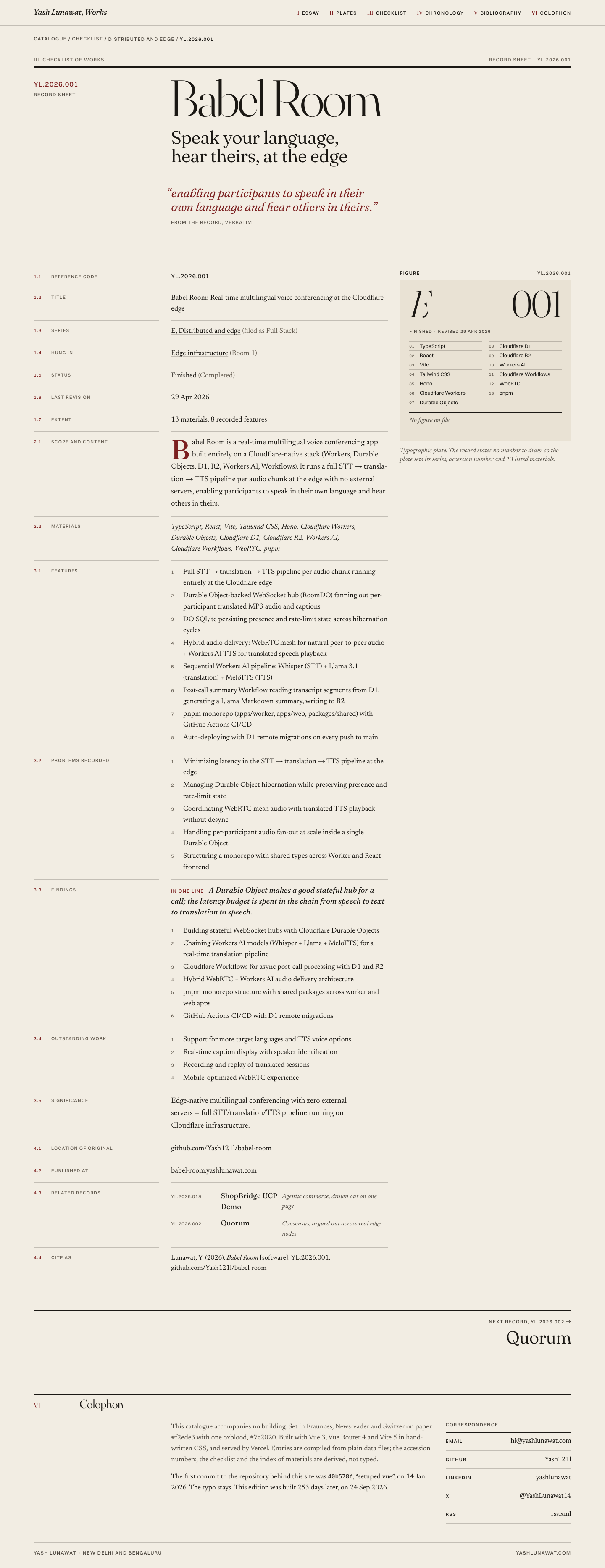
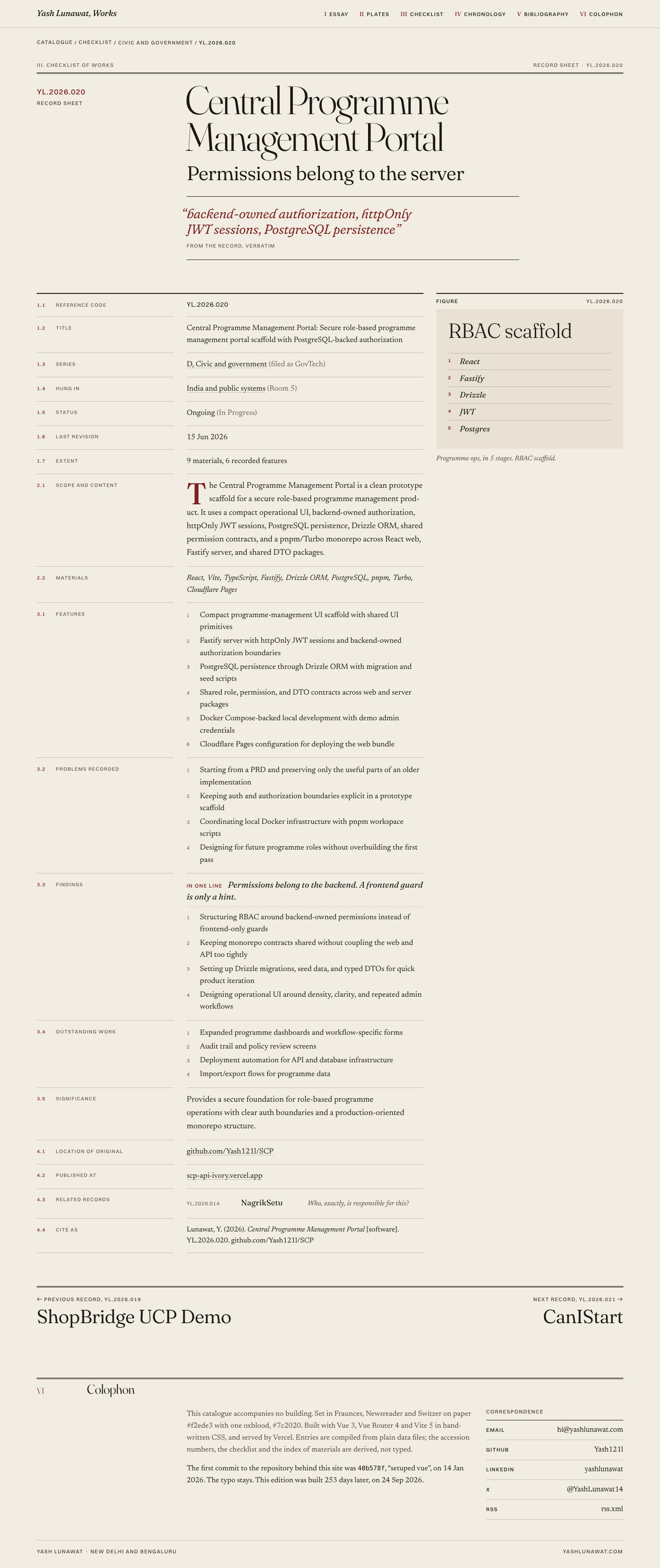
The deliverable. Hybrid A plus rooms with verified wall text, a recomposed cover plate, ranked section headings, redesigned typographic plates, accession numbers on the mobile checklist, record-sheet styling for blog and experience pages, a typeset No record page, self-hosted fonts with metric fallbacks and near-zero layout shift, oxblood focus rings, 44px tap targets, deterministic feeds, a generated Open Graph image, and tailwind, lenis and three removed. Read FINAL.md in the worktree for every change and the honest remaining-issues list.

35 screenshots
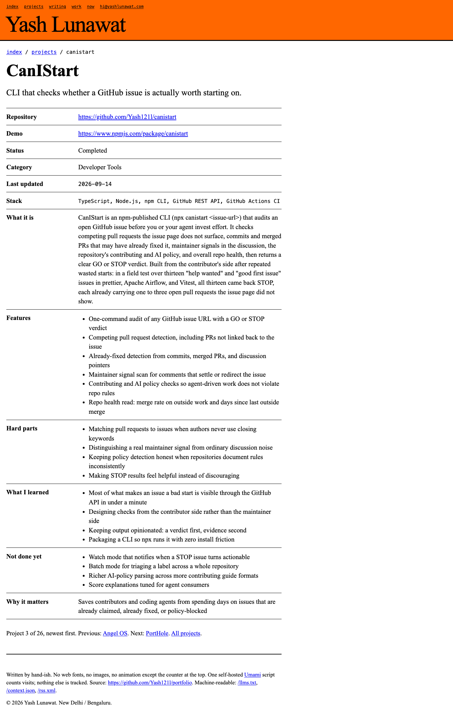
404-390.png
404-390.png
404-record.png
404-record.png
404-route.png
404-route.png
bibliography-1440.png
blog-detail-1440.png
blog-detail-390.png
blog-detail-390.png
cover-1024.png
cover-1024.png
cover-1440.png
cover-1440.png
cover-1920.png
cover-1920.png
cover-390.png
cover-390.png
experience-neutron-390.png
experience-rtp-1440.png
focus-keyboard-room-tab.png
focus-keyboard-row.png
home-1024-full.png
home-1024-full.png
home-1440-full.png
home-1440-full.png
home-390-full.png
home-390-full.png
home-768-full.png
home-768-full.png
hover-plate-panel-drawn.png
hover-plate-panel-typographic.png
og.png
og.png
plate-typographic-140.png
projects-390.png
projects-390.png
projects-empty-filter.png
projects-room-agents-768.png
projects-room-india-390.png
projects-room-venture.png
record-babel-room-1440-fold.png
record-babel-room-1440.png
record-central-programme-portal-1440.png
record-central-programme-portal-390.png
record-codesetu-1024.png
record-codesetu-1440.png
record-codesetu-768.png
record-railly-1440.png

16 Network map, second edition

https://v16.yashlunawat.com/ · worktree portfolio-16 · branch design/portfolio-16 · cd /Users/admin/.t3/worktrees/portfolio/portfolio-16 && npx vite --port 5217

Network map, second edition home

Thesis

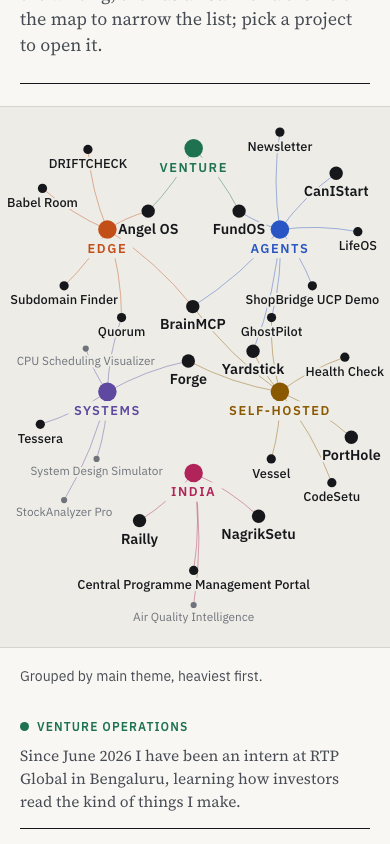
Yash's work is one map: six themes on a ring, the projects that belong to one theme fanned outward from it, the projects that cross themes sitting inside the ring, and the stack as an orbit around everything. After 30 seconds you should think: this is arranged, not generated, and I can see that the builder and the investor sides of this person connect.

Memorable device

Venture sitting at the top of a six-petal flower, RTP Global and E-Cell above it, FundOS and Angel OS just inside the ring, and clicking it to get a first-person serif paragraph about learning how investors read what he makes.

Self-critique

  • **First impression:** the rest state finally looks arranged, but it is still a node-link diagram, and anyone who has seen Obsidian or Kumu will file it there before reading a label. The orbit is the one move that is not a graph cliché, and its labels are grey and 11px, so the frame reads faint.
  • **Originality:** the petals-outside, crossovers-inside rule is a real idea, but nothing on screen explains it. Without the legend, nobody will notice that BrainMCP sits in the middle because it belongs to three themes.
  • **Typography:** disciplined and dull on the canvas. Plex Sans labels at four si

Worth stealing

  • Bake a layout in a real browser and ship positions as JSON: still first paint, identical on every load, with an overlap count as a test.
  • Crossovers inside, specialists outside: a radial rule that makes position mean something.
  • A finder that previews its selection on the map while you type.

Coordinator verdict

Owner-requested round. The rest layout is now composed: six themes on a ring, single-theme projects fanning outward, cross-theme projects in the centre, technologies on a dotted outer orbit, positions baked so the first paint is still. Panel changes only on click, pinned projects show a 02-style plate and verbatim quote, command palette shows the matched field, mobile keeps a real map, project pages open on a neighbourhood graph. Still a node-link diagram at heart, and venture needs a click. Best interactive reading experience of the map family.

26 screenshots

blog-detail-1440.png
blogs-1440.png
blogs-1440.png
blogs-390.png
blogs-390.png
experience-1440.png
experience-1440.png
home-390-full.png
home-390-full.png
home-390-india-full.png
home-390-pinched.png
home-390-venture.png
home-390.png
home-390.png
home-finder.png
home-finder.png
home-focus-tech-go.png
home-focus-venture.png
home-full-1440.png
home-full-1440.png
home-keyboard.png
home-keyboard.png
home-project-pinned-angel.png
home-project-pinned.png
home-reduced-motion.png
home-rest-1280.png
home-rest-1280.png
home-rest-1440.png
home-rest-1440.png
project-angel-1440.png
project-angel-390-top.png
project-angel-390.png
project-babel-1440.png
projects-1440.png
projects-1440.png
projects-390-map.png
projects-390.png
projects-390.png

17 Cinematic, second edition

https://v17.yashlunawat.com/ · worktree portfolio-17 · branch design/portfolio-17 · cd /Users/admin/.t3/worktrees/portfolio/portfolio-17 && npx vite --port 5218

Cinematic, second edition home

Thesis

The home page is a short film in four chapters: a title card, one establishing line, Infrastructure, Agents, India, Venture, a strip of short films, then end credits that serve as the CV and end on the email address. After 30 seconds a visitor should feel they are watching a well-edited three-minute documentary about someone who builds things, and should already know how long it runs, because the timecode tells them.

Memorable device

The Infrastructure chapter stacking its finished shots into slates at the top of the frame. Or the timecode reaching 00:03:00:00 on the email address, above "No projects were invented in the making of this film."
Self-critique

Worth stealing

  • **A plate whose viewBox follows its real pixel width** (Resi

Coordinator verdict

Owner-requested round. Under 16,000px, Newsreader as a second voice, name above metric, ten distinct 02-style plates, four different chapter cuts (slates, push, orange wipe, two-up), voiceover per chapter, both navigation bugs fixed, no dropped frames in a scripted scroll. The title card is still a big name on black, and the plates describe the stack rather than draw a number. A film someone finishes, but the map versions carry more of him.

41 screenshots
blogs-desktop-top.png
blogs-desktop.png
blogs-desktop.png
experience-desktop-top.png
experience-desktop.png
home-ch01-a.png
home-ch01-a.png
home-ch01-b.png
home-ch01-b.png
home-ch01-c.png
home-ch01-c.png
home-ch01-card.png
home-ch01-card.png
home-ch02-a.png
home-ch02-a.png
home-ch02-b.png
home-ch02-b.png
home-ch02-c.png
home-ch02-c.png
home-ch02-card.png
home-ch02-card.png
home-ch02-push.png
home-ch02-push.png
home-ch03-a.png
home-ch03-a.png
home-ch03-b.png
home-ch03-b.png
home-ch03-card.png
home-ch03-card.png
home-ch03-wipe.png
home-ch03-wipe.png
home-ch04-a.png
home-ch04-a.png
home-ch04-b.png
home-ch04-b.png
home-ch04-card.png
home-ch04-card.png
home-credits-a.png
home-credits-a.png
home-credits-end.png
home-establishing.png
home-shorts-a.png
home-shorts-a.png
home-shorts-b.png
home-shorts-b.png
home-title.png
home-title.png
mobile-credits-end.png
mobile-credits.png
mobile-credits.png
mobile-full.png
mobile-full.png
mobile-india.png
mobile-india.png
mobile-infra.png
mobile-infra.png
mobile-title.png
mobile-title.png
project-desktop-top.png
project-desktop.png
project-desktop.png
project-mobile-top.png
project-mobile.png
project-mobile.png
projects-desktop-top.png
projects-desktop.png
qa-return-from-detail.png
reduced-motion-full.png
reduced-motion-top.png

18 Hybrid C: the map is the film

https://v18.yashlunawat.com/ · worktree portfolio-18 · branch design/portfolio-18 · cd /Users/admin/.t3/worktrees/portfolio/portfolio-18 && npx vite --port 5219

Hybrid C: the map is the film home

Thesis

A documentary about a network: the force-directed map of Yash's work (concept 08) is the only image in the film, pinned on screen for the whole scroll, and the chapters of concept 04 are camera moves through it. After 30 seconds you should feel that you are travelling through one map, and that every project on it is real and connected to something else he built.

Memorable device

Scrolling from Agents into India: the camera slides down-left across the map, the whole frame floods orange, and the four India projects redraw themselves in ink.
Self-critique

Worth stealing

  • **Keyframes as data, camera as a pure function of scroll.** Each text section declares what the picture should frame and emphasise, and one interpolator does the rest. It is reversible for free and trivially testable.
  • **Fixed-world, deterministic graph layout** with hidden-until-needed hub nodes. The rest state becomes a composition instead of a hairball.
  • **"Back to the map, chapter N"** with exact scroll restore keyed by slug.

Coordinator verdict

SECOND FINAL DIRECTION, chosen on the owner's stated taste. One pinned map that the camera travels through as the chapters scroll: zoom into self-hosted for Vessel, the whole frame orange for India, credits beside the full map, then The map is yours with a command palette. Weak: several framings leave half the canvas empty, plates in the text column compete with the map, shot transitions overlap lines, 22,600px of scroll, CanIStart only a short. Polished in portfolio-final-film.

18 screenshots
blog-detail-desktop.png
blog-list-desktop.png
experience-desktop.png
home-1280.png
home-1280.png
home-desktop.png
home-desktop.png
home-focus-tech-cloudflare.png
home-focus-tech-go.png
home-focus-theme-venture.png
home-graph-rest.png
home-graph-rest.png
home-hover-project.png
home-keyboard.png
home-keyboard.png
home-mobile-chip.png
home-mobile.png
home-mobile.png
home-reduced-motion.png
project-detail-angel-desktop.png
project-detail-desktop.png
project-detail-mobile.png
projects-desktop.png

FINAL B The map is the film, final

https://film.yashlunawat.com/ · worktree portfolio-final-film · branch design/portfolio-final-film · cd /Users/admin/.t3/worktrees/portfolio/portfolio-final-film && npx vite --port 5220

The map is the film, final home

Thesis

A documentary about a network: the force-directed map of Yash's work (concept 08) is the only image in the film, pinned on screen for the whole scroll, and the chapters of concept 04 are camera moves through it. After 30 seconds you should feel that you are travelling through one map, and that every project on it is real and connected to something else he built.

Memorable device

Scrolling from Agents into India: the camera slides down-left across the map, the whole frame floods orange, and the four India projects redraw themselves in ink.

Self-critique

Worth stealing

  • **Keyframes as data, camera as a pure function of scroll.** Each text section declares what the picture should frame and emphasise, and one interpolator does the rest. It is reversible for free and trivially testable.
  • **Fixed-world, deterministic graph layout** with hidden-until-needed hub nodes. The rest state becomes a composition instead of a hairball.
  • **"Back to the map, chapter N"** with exact scroll restore keyed by slug.

Coordinator verdict

The second deliverable, chosen on the owner's stated taste. Hybrid C with 16's composed ring layout re-ordered so the camera sweeps one way round it, every keyframe authored and checked so no desktop frame is more than a third empty, plates removed from the scrolling shots, 15,486px of desktop scroll, CanIStart in the Agents chapter, a Neutron and Damru intertitle, phone-specific camera frames, 16's pinned panel and finder, self-hosted fonts, CLS 0, no frame over 25ms in dev, a real Open Graph image, deterministic feeds. Read FINAL.md in the worktree for every change and the remaining-issues list (three sparse phone frames, shorts pull all the way back, 102 kB main chunk, new projects need a hand-placed petal and a re-bake).

18 screenshots
blog-detail-desktop.png
blog-list-desktop.png
experience-desktop.png
home-1280.png
home-1280.png
home-desktop.png
home-desktop.png
home-focus-tech-cloudflare.png
home-focus-tech-go.png
home-focus-theme-venture.png
home-graph-rest.png
home-graph-rest.png
home-hover-project.png
home-keyboard.png
home-keyboard.png
home-mobile-chip.png
home-mobile.png
home-mobile.png
home-reduced-motion.png
project-detail-angel-desktop.png
project-detail-desktop.png
project-detail-mobile.png
projects-desktop.png